
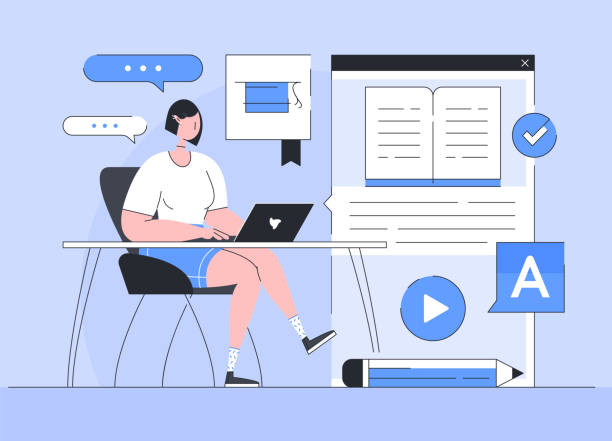
An Introduction to Responsive Web Design: A Necessity in Today’s World

#Responsive_Web_Design is no longer just a luxury feature; rather, it is an indispensable necessity for every website in the digital age.
Imagine a website that looks beautiful on a large desktop monitor, but the same website appears cluttered, with unreadable text and images out of frame on a small mobile screen.
This unpleasant experience immediately drives users away from your website.
Responsive web design is the answer to this challenge.
In this section (explanatory and educational), we introduce this concept.
Simply put, responsive web design is an approach that enables your website to automatically adjust its layout and elements to the user’s device screen size, without needing separate versions.
This adjustment includes resizing fonts, images, columns, and other visual elements to provide an optimal user experience on any device, from smartphones and tablets to laptops and smart TVs.
With the significant increase in mobile internet usage, ignoring this aspect of web design can mean losing a vast portion of your audience.
This is a smart investment for the future of your business.
Are you worried about losing customers because you don’t have a professional e-commerce website?
With e-commerce website design by Rasaweb, forget these worries!
✅ Significant increase in sales and visitor-to-customer conversion rate
✅ Professional and user-friendly design that gains customer trust
⚡ Get free consultation from Rasaweb
Why Did Responsive Web Design Become a Necessity? Before and After

#Web_History #Mobile_Challenges Not long ago, websites were primarily designed for desktop monitors.
However, with the advent of smartphones and tablets, a new conundrum emerged for web designers and developers: how to build a website that works well on every device? Previously, temporary solutions like creating separate “mobile-friendly” versions of websites were common.
This approach, in addition to increasing development and maintenance costs, often led to a different and sometimes inferior user experience for mobile users.
(Analytical and explanatory) It was questionable whether a specific version should be designed for each device? The answer was no.
With the increasing diversity of devices, this approach became illogical and unmanageable.
The idea of responsive web design was introduced by Ethan Marcotte in 2010 and revolutionized the web industry.
By introducing the concepts of Media Queries, flexible grids, and fluid images, he showed how a single website could be designed to intelligently adapt to the user’s environment.
This transformation not only made designers’ work easier but also improved the user experience unprecedentedly.
Now there is no need to change URLs or download separate applications; one website can meet all needs, and this is the power of responsive web design.
Fundamental Principles of Responsive Web Design: How Does It Work?

#Media_Queries #Flexible_Grids #Fluid_Images To understand how responsive web design works, we need to become familiar with its three key principles.
These principles include Media Queries, Flexible Grids, and Fluid Images, all of which work together to enable a website to dynamically adapt to the user’s screen dimensions.
This approach (technical and educational) is the foundation for building any modern website.
Media Queries in CSS allow the browser to apply different styles based on device characteristics such as screen width, height, orientation (landscape or portrait), and device type.
For example, you can specify that for widths less than 768 pixels, the website layout changes from 3 columns to 1 column.
Flexible grids use relative units like percentages (%) instead of fixed pixels.
This means that the width of elements adjusts based on the overall screen width instead of being static.
Fluid images also work similarly; by using the max-width: 100% property in CSS, images never overflow their container and always resize proportionally to the available space.
This clever combination is the key to the success of responsive web design.
Table 1: Fundamental Principles of Responsive Web Design
| Principle | Description | Practical Example |
|---|---|---|
| Media Queries | CSS rules for applying specific styles based on device characteristics (e.g., screen width). | @media screen and (max-width: 600px) { ... |
| Flexible Grids | Using relative units (e.g., percentage) for element layout instead of fixed units (pixels). | width: 50%; instead of width: 500px; |
| Fluid Images | Images automatically adjust to their container size to prevent overflow. | img { max-width: 100%; height: auto; } |
Exceptional User Experience with Responsive Web Design: Benefits for Users

#User_Experience #Accessibility The ultimate goal of any website is to provide an outstanding User Experience (UX).
In the past, mobile users often encountered websites that were not optimized for small screens, leading to constant zooming, unnecessary horizontal scrolling, and accidental clicks.
Responsive web design completely resolves these issues and brings countless benefits to users.
This section (guidance and explanation) examines these benefits.
The first and most important advantage is the reduction of friction in interacting with the website.
When a website is properly responsive, the user finds the content layout logical and readable on any device they access it from.
Texts automatically resize, buttons become suitable for finger touches, and images are displayed correctly.
This means easier navigation and greater user satisfaction.
Additionally, website Accessibility also improves.
People with different abilities or those using specific devices can easily access your content.
An excellent user experience not only keeps users satisfied but also encourages them to revisit and interact more with your website, which in itself means sustainable success in the digital world.
Are you dissatisfied with the low sales of your e-commerce website?
Rasaweb is your solution for having a professional and high-selling e-commerce site.
✅ Significant increase in sales and revenue
✅ Easy and enjoyable shopping experience for customers
⚡ Get a free consultation from Rasaweb right now!
Business and SEO Benefits with Responsive Web Design

#SEO #Business #Conversion_Rate In addition to user experience, responsive web design has very positive impacts on businesses and Search Engine Optimization (SEO).
In today’s competitive world, a strong and effective online presence is vital for any business, and responsive websites play a key role in this.
This is an (analytical and specialized) perspective on the business dimensions of RWD.
From an SEO perspective, Google and other search engines prioritize responsive websites.
Google has explicitly stated that it has Mobile-First Indexing on its agenda; meaning your website’s mobile version is used as the primary version for indexing and ranking.
Therefore, if your website is not optimized for mobile, your ranking in search results will suffer.
A responsive website, by having a single URL for all devices, prevents duplicate content issues and makes it easier for search engines to crawl and index your content.
This helps improve your ranking and increase organic traffic.
Additionally, the Bounce Rate on responsive websites is usually lower, as users have a positive experience and stay on the site longer.
This increased dwell time and reduced bounce rate send positive signals to search engines and significantly contribute to SEO improvement.
Ultimately, the Conversion Rate also improves, as an accessible and user-friendly website increases the likelihood of desired actions such as purchasing or filling out a form.
Therefore, responsive web design is an investment for the growth and success of your business.
Tools and Technologies for Building Responsive Web Design
#Frameworks #CSS_Preprocessors #Development_Tools To effectively implement responsive web design, developers utilize a set of modern tools and technologies.
These tools simplify and streamline the design and development process, enabling the creation of highly responsive websites.
In this section (educational and specialized), we introduce some of the most important ones.
CSS Frameworks like Bootstrap and Foundation are among the most popular choices.
These frameworks provide a set of pre-built HTML, CSS, and JavaScript components that are designed responsively.
By using their internal grid system, complex and responsive layouts can be created quickly and easily.
CSS Preprocessors like Sass and Less also help developers write CSS in a more organized and dynamic way, using variables, functions, and nesting to better manage styles, which is very useful in large responsive web design projects.
Browser Developer Tools are also crucial for testing and debugging responsive websites across various screen sizes.
Using these tools, you can quickly simulate how the website appears on different devices and identify and resolve issues.
Challenges and Common Mistakes in Responsive Web Design

#Challenges #Common_Mistakes #Performance Although responsive web design offers numerous advantages, its implementation is not without challenges.
Ignoring certain details can harm the user experience instead of improving it, and even negatively impact website performance.
In this section (thought-provoking content and guidance), we will explore some of the most important challenges and common mistakes in this area.
One of the biggest challenges is image management.
If images are not properly optimized, they can impose a large amount of data on the user, especially on mobile devices with slower internet.
This leads to slow website loading and a poor user experience.
Using high-resolution images for desktop and scaling them for mobile without actual optimization, is a common mistake.
Also, neglecting website performance on different devices, especially mobile, can lead to user loss.
Overly complex designs and excessive use of heavy scripts can also reduce loading speed.
Another mistake is not sufficiently testing the website on actual devices and screen sizes; simulators cannot always cover all aspects.
Finally, focusing solely on “responsive” rather than on “content” can also lead to a design that is technically responsive but whose content is not properly displayed across different sizes or whose main purpose is lost.
Table 2: Challenges and Common Mistakes in Responsive Design
| Challenge/Mistake | Explanation | Suggested Solution |
|---|---|---|
| Unoptimized Images | Loading high-volume images for all devices slows down the site. | Use srcset and picture, image compression, CDN. |
| Neglecting Performance | The site loads slowly on mobile. | Optimize CSS/JS, caching, Minify codes. |
| Overly Complex Design | Too many complex elements become difficult on small screens. | Simplicity in mobile design, content prioritization. |
| Insufficient Testing | Display errors on real devices. | Test on physical devices, use online testing tools. |
Testing and Debugging in Responsive Web Design: Ensuring Compatibility

#Responsive_Testing #Web_Debugging #Development_Tools After implementing responsive web design, the critical stage of testing and debugging is essential to ensure proper functionality across all devices and browsers.
A website might display well in simulators but face challenges on actual devices.
This section (guidance and educational) will help you properly test your website.
First, using browser developer tools (like Chrome DevTools) is an excellent starting point.
With the Device Mode feature in these tools, you can view your website across various screen sizes and simulate different devices.
This allows you to quickly inspect layout changes and element behavior.
However, simulations are never a substitute for testing on actual devices.
It is recommended to test your website on several physical mobile and tablet devices with different operating systems and browsers to identify device-specific issues.
Online responsive testing tools can also be useful.
Furthermore, paying attention to Page Speed on mobile devices is crucial.
Tools like Google PageSpeed Insights can help you identify and improve performance bottlenecks.
Continuous debugging and attention to user feedback ensure that your responsive web design remains optimal and efficient.
Are you losing potential customers due to an unprofessional website? Rasaweb is your answer! With our specialized corporate website design services:
✅ Enhance your business’s credibility and standing
✅ Experience attracting more targeted customers
⚡ Act now to get a free consultation!
The Future of Responsive Web Design and Beyond

#Future_of_Web #Adaptive_Design #Progressive_Enhancement Despite the importance and popularity of responsive web design, the web world never stands still.
New concepts and techniques are emerging that further enhance the user experience and go beyond merely being “responsive.”
This section (news and analytical) explores the horizons ahead in this field.
One such concept is Adaptive Design, which, although having similarities with responsive design, differs in its approach.
While responsive design fluidly adjusts a single website, adaptive design provides predetermined versions of the layout for specific screen sizes.
Also, Progressive Enhancement is an approach that provides core content and functionality for all browsers and devices, and then adds more advanced layers of user experience for more modern browsers.
This ensures that content is accessible even on older devices.
With the advent of wearable devices, virtual reality, and augmented reality, there is a need for greater flexibility in web design.
Websites must be able to function well in entirely different environments, not just different screen sizes.
Responsive web design is the foundation of these future developments, and its evolution will continue to meet the needs of the next generation of devices and users.
Choosing the Best Strategy for Responsive Web Design

#Design_Strategy #Prioritization #Right_Choice Choosing the best strategy for implementing responsive web design depends on various factors, including budget, time, business goals, and content type.
No single approach is ideal for all projects.
This section (guidance and specialized) will help you choose the right path.
Should you start with Mobile-First or Desktop-First? The Mobile-First approach means that website design begins with the smallest screen (mobile) and then gradually expands for larger devices.
This approach helps you focus on core content and functionality and avoid unnecessary overhead on mobile devices.
Since most users access websites via mobile, Mobile-First is a smart strategy.
Also, choosing the right framework (such as Bootstrap or building custom CSS) is important.
Frameworks accelerate development speed, but they might generate some extra code.
Custom coding offers more control but is more time-consuming.
Ultimately, it’s crucial to create a strategic content plan (Content Strategy) and information hierarchy for different devices before starting the design.
This meticulous planning ensures that your responsive web design is not only visually appealing but also functionally and content-wise optimized for all users on any device.
Frequently Asked Questions
| Question | Answer |
|---|---|
| What is Responsive Web Design? | It is a method for designing and implementing websites that causes the layout and content of the page to automatically adjust and display optimally based on the user’s device screen size (desktop, tablet, mobile, etc.). |
| Why is responsive design important? | With the increasing use of various devices to access the web, a responsive site improves user experience, reduces bounce rate, strengthens site SEO, and simplifies site management and maintenance (instead of having separate versions for mobile and desktop). |
| How does responsive design work? | This type of design uses techniques such as flexible grids and layouts (Flexbox, CSS Grid), flexible images and media, and most importantly, CSS Media Queries to change page styles and layouts based on screen characteristics (width, height, resolution, etc.). |
| What are the main tools for implementing responsive design? | The main tools include HTML5 (for content structure), CSS3 (especially Media Queries, Flexbox, Grid for responsive styling and layout), and sometimes JavaScript for more complex interactions. |
| What are the main benefits of using responsive design? | The main benefits include increased user accessibility (covering a wide range of devices), improved user experience, improved site ranking in search engines (especially Google), reduced development and maintenance costs, and increased visitor-to-customer conversion rates. |
And other services of Rasaweb Advertising Agency in the field of advertising
Smart Website Development: A novel service to enhance campaign management through user experience customization.
Smart SEO: Designed for businesses seeking to increase sales through Google Ads management.
Smart Advertising Campaign: An effective tool for campaign management with the help of user experience customization.
Smart Custom Software: A novel service to increase user engagement through user experience customization.
Smart Marketplace: An innovative platform to improve website traffic with attractive user interface design.
And over hundreds of other services in the field of internet advertising, advertising consultation, and organizational solutions
Internet Advertising | Advertising Strategy | Advertorial
Resources
Article: What is Responsive Web Design?
Blog: Evolution of the Web from Past to Present
Tutorial: Comprehensive Guide to Responsive Design
News: The Importance of Responsive Design in Modern Web
? Are you ready to transform your business in the digital world? Rasaweb Afarin Digital Marketing Agency provides innovative solutions for your growth and visibility by offering comprehensive services including personal website design, SEO, and content marketing.
📍 Tehran, Mirdamad Street, next to Bank Markazi, Southern Kazeroon Alley, Ramin Alley, No. 6


