
Introduction to Responsive Website Design and its Importance
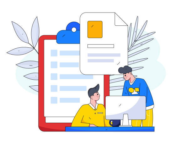
In today’s world, where technology is advancing at an incredible speed, an online presence is vital for every business and individual.
But merely having a website is not enough; what matters is how this website interacts with users on different devices.
This is where the concept of #Responsive_Website_Design comes into play.
Responsive website design means that your website should be able to intelligently adapt its shape and content to the screen size of the device the user is using (whether it’s a desktop computer, laptop, tablet, or smartphone).
This approach not only significantly improves user experience (UX) but also plays a crucial role in search engine optimization (SEO).
Google and other search engines rank websites that are optimized for mobile higher.
Therefore, if you are looking for online success, #Responsive_Design is no longer an option, but a necessity.
This type of design uses various components and methods such as fluid grids, adaptable images, and #CSS_Media_Queries to ensure proper and beautiful display of content in any dimension.
In the following, we will explore various aspects of this topic in an #educational and #explanatory manner and clarify its importance for you.
Is your online sales not as expected? With Rasav, solve the problem of low sales and poor user experience forever!
✅ Increase visitor to customer conversion rate
✅ Create a pleasant user experience and increase customer trust
⚡ Act now to receive a free consultation!
History and Evolution of Responsive Design

The concept of Responsive Web Design was first introduced by Ethan Marcotte in 2010.
Before that, web developers were forced to create separate versions (such as a desktop website and a mobile version m.domain.com) to provide a suitable user experience on different devices.
This approach was not only costly and time-consuming but also very difficult to maintain and update.
With the sudden and widespread emergence of smartphones and tablets, the need for an integrated and flexible solution became more apparent than ever.
Marcotte, with an article titled “Responsive Web Design” this idea was put forward that a website should react to the user’s environment rather than to the device.
This revolutionary idea changed the way we think about web design and was quickly adopted by the developer community.
Initially, there were many challenges in implementing this concept, especially regarding browser compatibility and image management.
But with the advancement of CSS3 and the emergence of frameworks like Bootstrap and Foundation, implementing a responsive site became much simpler.
Today, it is an industry standard, and most modern websites use this approach to ensure that their content is accessible and readable on any device.
This is considered a significant #news development in the history of the web that continues to evolve, with new methods introduced daily to improve it.
Fundamental Principles of Responsive Design
To create a responsive website design, three basic principles must be observed: Fluid Grids, Flexible Images, and Media Queries.
Fluid Grids mean that instead of using fixed pixel units, relative units such as percentages are used for element widths.
This allows the website layout to automatically adjust with screen size changes.
Flexible images work similarly; that is, images must also be coded so that their size automatically adjusts to the available space’s width, preventing overflow or excessive shrinking.
This is usually achieved using `max-width: 100%` in CSS.
But the most important principle is Media Queries, which allow designers to apply different CSS rules based on device characteristics (such as screen width, height, orientation, and resolution).
For example, you can transform a single column in a desktop view into two columns in a mobile view.
These principles are the cornerstone of any successful responsive design, and understanding them is essential for every web developer.
Below, a comparative table between the responsive approach and older approaches is presented, which further clarifies the #technical aspects of this field:
| Feature | Responsive Design | Adaptive Design | Separate Mobile Site |
|---|---|---|---|
| Base Code Count | One single codebase | Multiple fixed layouts | Two or more completely separate websites |
| Flexibility | Very high, adapts to any screen size | Medium, adapts to predefined breakpoints | Low, limited to target devices |
| SEO Optimization | Very suitable, one URL for each content | Medium, requires redirection | Complex, difficult for crawling and indexing |
| Development Complexity | Medium to high | Medium | Low to medium (for each version) |
Essential Tools for Responsive Designers
For successful implementation of responsive website design, designers and developers need a set of tools and frameworks.
One of the most widely used CSS frameworks is Bootstrap, which offers a collection of pre-built components and a flexible grid system that significantly simplifies the process of building responsive websites.
Other frameworks like Foundation and Bulma are also popular options.
Alongside frameworks, using CSS preprocessors like Sass (Syntactically Awesome Style Sheets) or Less can help in better code organization, using variables and functions, and ultimately increasing development speed and efficiency.
For testing and debugging a responsive site, browser developer tools (like Chrome DevTools) play a crucial role.
These tools provide device emulation capabilities, allowing you to see how your website looks and performs at different sizes.
Additionally, online tools such as Responsive Checker or Responsinator are useful for quickly checking a website’s responsiveness across multiple devices.
Image optimization tools like TinyPNG or Compressor.io are also essential for reducing image file sizes without compromising quality, as page load speed is paramount on mobile devices.
This set of tools enables designers to develop a responsive site in a #professional and efficient manner and minimize potential challenges.
Choosing the right tools is a critical step towards optimal and user-friendly design.
Tired of losing customers due to poor e-commerce website design? With Rasav, solve this problem forever!
✅ Increase sales and conversion rates from visitors to customers
✅ Smooth and engaging user experience for your customers⚡ Get a free consultation now!
Numerous Benefits of Responsive Design for Businesses

Adopting responsive website design for businesses, especially in the current era, brings countless benefits that go beyond mere visual aesthetics.
One of the most important advantages is the significant improvement in Search Engine Optimization (SEO).
Google has officially announced that it prefers mobile-friendly websites in its mobile search results.
This means higher rankings and consequently, more traffic for your business.
In addition to SEO, responsive design dramatically enhances user experience (UX).
Users accessing your website from any device will encounter a familiar and usable interface, which helps reduce the bounce rate and increases user engagement.
This is an #explanatory and analytical approach to deeply understanding its benefits.
Website management and maintenance also become simpler with this approach; as you have only one codebase that needs updating and maintenance, whereas in the past, multiple versions of the website required maintenance.
This leads to reduced costs and time spent on development and maintenance.
Increased conversion rate is another key benefit.
When users have a good experience on your website, they are more likely to perform your desired action (purchase, registration, contact, etc.).
Ultimately, given the increasing use of mobile devices for internet access, investing in responsive website design is a strategic and intelligent decision to ensure the success and sustainability of any business in the online space.
Challenges and Solutions in Implementing Responsiveness

Despite its many benefits, implementing responsive website design is not without its challenges.
One of the biggest challenges is managing content and images.
High-quality images optimized for desktop display may slow down loading speeds on mobile devices.
The solution to this problem is to use responsive image techniques such as `srcset` and `picture` in HTML5, which allows the browser to select the best image size based on the user’s device.
Also, using next-generation image formats like WebP and AVIF can help reduce file sizes.
Another challenge is designing navigation on small devices.
Large desktop menus occupy too much space on mobile.
Common solutions include using Hamburger Menus, dropdown menus, or tabbed navigation, which are more user-friendly on smaller screen sizes.
Performance is also a major concern.
A responsive site must load quickly to provide a good user experience.
This requires optimizing code, compressing files, using a CDN (Content Delivery Network), and caching.
Testing and debugging across different devices can also be complex; using simulators and actual testing on physical devices is essential.
This section is a comprehensive guide to facing potential problems.
Managing the complexities of responsive website design requires #technical knowledge and the use of best practices, but with careful planning and the right tools, these challenges can be overcome to create an efficient and user-friendly website.
Case Study of Successful Websites with Responsive Design

To better understand the power and effectiveness of responsive website design, looking at real and successful examples can be very inspiring.
Major websites like The New York Times, BBC, and even Amazon all leverage responsive design principles to ensure their content is displayed optimally on any device.
The New York Times website is an excellent example of how to manage a vast amount of content across different layouts; they use a fluid grid and intelligently scale images and videos.
BBC is also a great example of responsive design for delivering news and multimedia content across various platforms.
They have successfully provided a consistent user experience across devices through meticulous design.
Even entertainment websites like Netflix use responsive principles to deliver the same viewing experience on smart TVs, tablets, and phones.
These websites are successful not only because of their content but also because of the flawless user experience they provide.
This section is an entertaining yet #analytical approach to recognizing successful examples.
Below is a table of key criteria for a successful responsive website:
| Criterion | Explanation | Importance for User and Business |
|---|---|---|
| Page Load Speed | Time required for full content loading. | Reduced bounce rate, improved SEO, better user experience. |
| Accessibility | Usability for individuals with special needs. | Increased audience, compliance with legal standards. |
| Unified Visual Design | Maintaining visual identity and brand across all devices. | Brand reinforcement, building trust and professionalism. |
| Easy Interaction and Navigation | Ease of finding information and completing tasks. | Increased conversion rate, user satisfaction. |
The Future of Web Design and the Role of Responsiveness in It

The future of web design is inextricably linked with the concept of responsive website design.
With the advent of new technologies such as Progressive Web Apps (PWAs) and Accelerated Mobile Pages (AMP), the importance of responsiveness becomes more apparent than ever.
PWAs offer a combination of the best features of web and mobile applications, including offline functionality, push notifications, and access to native device capabilities, all while built upon a responsive design.
AMP is also designed to deliver incredibly fast web content on mobile devices, helping to improve user experience and SEO rankings.
Beyond this, with the expansion of Wearables, Augmented Reality (AR), and Virtual Reality (VR), the need for layouts that can adapt to vastly different dimensions and inputs increases.
Responsive website design is the foundation of this adaptability.
Furthermore, Artificial Intelligence (AI) and Machine Learning are changing how we interact with the web and can, in the future, help create automated and optimized layouts for every user and device.
This is a thought-provoking and at the same time #news content that indicates the future of the web is moving towards greater flexibility and intelligence, and responsiveness is the backbone of this transformation.
Is your current e-commerce website design not bringing you the expected sales?
Rasav is a specialist in professional e-commerce website design!
✅ An attractive and user-friendly site aimed at increasing sales
✅ High speed and security for an ideal shopping experience⚡ Get a free consultation on online store design with Rasav!
Key Tips for Choosing a Responsive Website Designer

Choosing a designer or development team for responsive website design that can meet your business needs is a critical decision.
The first and most important tip is to review their portfolio.
Check the websites they have previously designed on various devices (mobile, tablet, and desktop) to ensure the quality of their responsiveness.
Look for designs that are not only aesthetically pleasing but also functional and smooth.
Second, the team’s #technical experience and knowledge in HTML5, CSS3, and JavaScript, as well as responsive frameworks like Bootstrap, are important.
A good team should be familiar with the latest trends and techniques.
Third, communication and transparency in the work process.
The designer should be able to explain technical concepts in simple language and keep you informed throughout all project stages.
Fourth, post-design support.
A website needs updates and maintenance, so make sure your designer also provides support services.
Fifth, attention to SEO and performance.
Beautiful design alone is not enough; the website must be optimized for search engines and load quickly.
This section is a comprehensive guide for choosing the right partner for your responsive website design development.
By considering these tips, you can confidently entrust your website design project to a competent team.
Frequently Asked Questions about Responsive Design

In this section, we answer some frequently asked questions about responsive website design to provide a more complete understanding of this concept.
One common question is, “Does responsive design mean my site will look exactly the same on all devices?” The answer is no.
The goal of responsiveness is to provide the best user experience on each device, which may include changes in layout, hiding some elements, or resizing fonts to display content well on a smaller screen.
Another question is, “Is responsive website design really important for SEO?” Yes, it is very important.
Google has activated its “Mobile-Friendly” algorithm since 2015 and prefers mobile-compatible websites in its search results.
The absence of a responsive site can severely harm your SEO ranking.
“Is the cost of designing a responsive website higher?” Initially, it might seem a bit more, but in the long run, due to easier maintenance and no need to develop multiple versions, overall costs decrease.
Furthermore, the improved ROI (Return on Investment) through SEO and UX justifies this investment.
“Can I make my existing site responsive?” Yes, in many cases it is possible, but the complexity depends on the site’s current structure and the extent of changes required.
This is a #guide and educational section to answer common ambiguities and helps gain a more comprehensive view of this type of design.
Frequently Asked Questions
| Question | Answer |
|---|---|
| What is responsive website design? | Responsive Web Design is an approach that makes the design and layout of a website change and display optimally based on the screen size of the user’s device (computer, tablet, mobile, etc.). |
| Why is responsive design important? | Its importance is due to the increasing use of various devices to access the internet. Responsive design improves user experience (UX), reduces bounce rate, and is beneficial for SEO. |
| What techniques are used in responsive design? | The main techniques include using Fluid Grids, Flexible Images, and Media Queries in CSS. |
| What does Fluid Grids mean? | Instead of using fixed pixel units, relative units such as percentages or ems are used to define the width and height of elements so that the layout is flexible with screen size changes. |
| What is the application of Media Queries? | Media Queries allow you to apply different CSS styles based on user device characteristics such as screen width, height, orientation (landscape or portrait), and resolution. |
And other services of Rasav Advertising Agency in the field of advertising
Smart Data Analysis: A professional solution to improve SEO ranking with a focus on smart data analysis.
Smart Website Development: A new service to increase sales through marketing automation.
Smart Social Media: Revolutionize click-through rates with attractive UI design.
Smart Social Media: A professional solution to increase sales with a focus on smart data analysis.
Smart Direct Marketing: A new service to improve SEO ranking through Google Ads management.
And more than hundreds of other services in the field of internet advertising, advertising consultation, and organizational solutions
Internet Advertising | Advertising Strategy | Advertorial
Sources
Importance of responsive design on the web
What is responsive web design?
Benefits of a responsive site
Comprehensive guide to responsive design
? For a powerful and lasting online presence, Rasav Avarin Digital Marketing Agency offers innovative solutions including fast website design and professional services, as a constant companion for your business.
📍 Tehran, Mirdamad Street, next to Central Bank, Kazeroun Jonoubi Alley, Ramin Alley No. 6


