
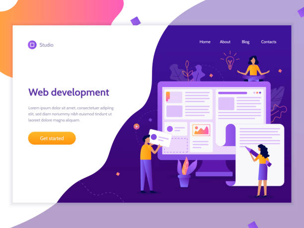
Introduction to Responsive Website Design and Its Importance in the Digital Age

In today’s world, where users access the internet from a variety of devices, #responsive_web_design is no longer a luxury option, but a vital necessity.
This web design approach ensures that your website is displayed optimally on any screen, from small mobile phones to tablets, laptops, and even smart TVs.
The main goal of this method is to provide a seamless and optimized #user_experience, regardless of device size or type.
With the ever-increasing use of smartphones for web browsing, the importance of #mobile_first and responsive design becomes more apparent than ever.
A website that is not properly adaptable can not only lose users but also negatively impact its #SEO and search engine rankings.
Understanding the basic principles and benefits of responsive design is crucial for any business and developer seeking online success.
This method not only contributes to the visual appeal of the website but also helps improve its performance and accessibility.
Responsive website design means creating a smooth and flawless user experience that automatically adjusts to the user’s environment.
This includes layout, images, and even interactive elements that must function correctly across different screen sizes.
This chapter provides a comprehensive and educational explanation to begin understanding this fundamental concept in modern web.
Did you know that 85% of customers check your company’s website before any interaction?
With Rasaweb, build a corporate website that truly reflects your credibility.
✅ Increase customer credibility and trust
✅ Attract high-quality leads
⚡ Get free website design consultation
Foundational Principles of Responsive Web Design Including Fluid Grids and Flexible Images

Responsive website design is based on three main pillars: Fluid Grids, Flexible Images, and Media Queries.
Fluid grids use relative units like percentages for element widths instead of fixed pixels.
This approach ensures that your website’s layout dynamically changes with the screen size, rather than just scaling or being cropped.
For example, if a column has a width of 30 percent, it will always occupy 30 percent of the available screen width, regardless of the device’s size.
Flexible images, by using `max-width: 100%;` in CSS, ensure that images never overflow their containers and are always scaled proportionally.
This prevents unwanted horizontal scrollbars and provides faster image loading for smaller devices, while maintaining quality on larger displays.
Media queries, a vital part of CSS3, allow you to apply different styles based on device characteristics, such as screen width, height, orientation, or media type.
This capability enables developers to apply specific design changes for defined breakpoints, such as changing a multi-column layout to a single-column one on mobile devices.
A deep understanding of these principles is essential for anyone who wants to succeed in web design.
These principles not only help you build adaptable websites but also significantly contribute to improving user experience and website loading speed.
Key Tools and Technologies for Building Responsive Websites

Building a website with responsive website design requires familiarity with a set of modern web tools and technologies.
HTML5, as the backbone of web content, provides the semantic structure vital for responsive layouts.
New elements like `header`, `nav`, `section`, `article`, `footer` help organize content better.
CSS3, with advanced capabilities such as Media Queries, Flexbox, and CSS Grid, provides powerful tools for controlling website layout and appearance across different screen sizes.
Flexbox is ideal for one-dimensional layouts (rows or columns) and CSS Grid for two-dimensional layouts (rows and columns simultaneously).
These CSS tools enable the creation of complex yet adaptable layouts with less code and greater readability.
Furthermore, CSS frameworks like Bootstrap and Foundation offer ready-made solutions for responsive website design.
These frameworks include grid systems, UI components, and JavaScript tools that significantly speed up the development process.
Using JavaScript and libraries like jQuery can also be beneficial for adding interactive features, responsive slideshows, and optimizing resource loading based on screen size.
For example, you can load images of different qualities based on device width using JavaScript.
Choosing the right tool depends on the project’s complexity, the development team, and the specific needs of the website.
A table of these tools’ advantages is provided below.
| Technology/Tool | Primary Use in Responsive Design | Key Advantage |
|---|---|---|
| HTML5 | Semantic content structuring | Support for new semantic elements and native video/audio |
| CSS3 (Media Queries) | Applying styles based on device characteristics | Ability to adapt layouts and styles for various displays |
| CSS3 (Flexbox/Grid) | Creating flexible layouts | Precise control over element layout in different dimensions |
| JavaScript/jQuery | Adding interactivity and dynamic optimization | Controlling element behavior, conditional content loading |
| Bootstrap/Foundation | CSS Frameworks | Speeding up development, providing ready-made components and grid system |
User Experience (UX) and Mobile-First Approach in Responsive Website Design

Responsive website design is not just about displaying the website correctly across different sizes, but is strongly linked to User Experience (UX) and the Mobile-First approach.
The Mobile-First approach means starting the design from the smallest screen and then expanding it to larger displays.
This method ensures that the most important content and functionalities are initially available to mobile users, where screen space is more limited and user attention is shorter.
This analytical approach helps designers focus on content prioritization and avoid unnecessary clutter that might be acceptable on desktop.
When you start from a mobile perspective, you are inevitably forced to think about the core content and functionality of your website.
This is a practical guideline that leads to cleaner and more user-friendly designs.
Responsive web design should focus on usability, loading speed, and easy access to information.
For example, buttons should be large enough to be easily touched with a finger, forms should be simple with minimal fields, and menus should be designed to be easily navigable in the limited mobile space (such as a hamburger menu).
Ignoring UX in responsive design can lead to a website that, while technically responsive, confuses or frustrates users.
Furthermore, given that a significant portion of internet traffic comes from mobile devices, optimizing for these devices is not only essential but directly impacts the success of your business.
Are you tired of your company’s website not meeting your expectations? With Rasaweb, design a professional website that truly showcases your business!
✅ Increase new customer acquisition and sales leads
✅ Enhance your brand’s credibility and trust with your audience
⚡ Get a free website design consultation right now!
Optimizing Responsive Website Performance for Speed and Efficiency

One of the main challenges in responsive website design is maintaining high speed and performance across all devices.
Slow websites, even if beautifully responsive, can drive users away and lower SEO rankings.
Performance optimization includes several important aspects.
First, image optimization is crucial.
Using modern image formats like WebP, compressing images without significant quality loss, and lazy loading images (i.e., loading images only when they enter the user’s viewport) can dramatically reduce page load times.
Second, compressing and minifying CSS and JavaScript files.
Removing whitespace, comments, and unnecessary code from these files can reduce their size and increase loading speed.
Using a CDN (Content Delivery Network) to deliver static files can also help reduce latency, as content is delivered from the server closest to the user.
Third, browser caching.
By setting appropriate cache headers, you can tell browsers how long to store your website’s static files, so they don’t need to be re-downloaded on subsequent visits.
Fourth, optimizing server-side code and using robust hosting.
Choosing a reputable hosting provider and optimizing the database can help speed up server responsiveness.
This specialized approach is essential for enhancing the efficiency of adaptable websites to ensure users receive a smooth and fast experience on any device.
These measures help your website achieve a higher score both in the eyes of users and search engines.
Common Challenges and Solutions in Implementing Responsive Design
Implementing responsive website design, despite its numerous advantages, is not without challenges.
One of the most problematic issues is managing large content and high-quality images on small devices.
Solutions such as Conditional Loading, which only loads necessary content for a specific device, or using the `picture` element in HTML5 and `srcset` for responsive images, which enables the browser to select the best image size based on the user’s device, can be effective.
Another challenge is the complexity of maintaining and debugging CSS and JavaScript codes for multiple breakpoints.
Using CSS preprocessors like Sass or Less and CSS frameworks with a more organized structure can simplify this process.
Furthermore, thorough testing of the website on various devices and browsers using simulators or actual devices is essential.
Browser developer tools (like Chrome DevTools) have the ability to simulate different devices, which are very useful for initial testing.
Compatibility with older browsers is also a perennial challenge.
Some advanced CSS3 or HTML5 features may not be supported in older browsers.
Using Polyfills (scripts that add new functionalities to older browsers) or Fallbacks (alternative styles for older browsers) can help maintain a minimum user experience.
This analytical section helps developers approach responsive web design projects with greater preparedness and implement better solutions by being aware of potential issues.
This is a practical guide for facing everyday problems.
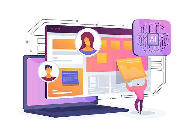
Future Trends in Responsive Website Design Including AI and VR
The web world is constantly evolving, and responsive website design is no exception.
The future of adaptable websites is intertwined with emerging and exciting technologies that elevate the user experience to new levels.
One of these trends is the use of Artificial Intelligence (AI) and Machine Learning (ML) for automatic personalization of layout and content based on user behavior and preferences.
Imagine a website that intelligently adjusts its user interface for you to provide maximum efficiency and comfort.
Virtual Reality (VR) and Augmented Reality (AR) also open new horizons for interactive and immersive design.
Although still in their early stages, 3D websites and immersive experiences in browsers are gradually emerging.
Responsive web design in the future must be able to adapt to these new environments and interactive platforms.
Additionally, new devices and flexible displays (such as foldable phones) and even wearables highlight the need for novel approaches in responsive design.
Developers must prepare for designs that adapt not only to screen size but also to the shape and state of the device.
Website adaptability design should go beyond just resizing and also consider how the user interacts with content across different platforms.
This news and entertaining section provides a glimpse into the future and raises important questions about how to prepare for the next generation of web.
The table below lists some of these technologies and their impact on websites.
| Future Technology | Impact on Responsive Design | New Opportunities |
|---|---|---|
| Artificial Intelligence (AI) and ML | Automatic personalization of UI and content | Hyper-personalized user experience |
| Virtual Reality (VR) and AR | Creating 3D and immersive web experiences | Completely new and immersive user interactions |
| Wearable web devices and smart gadgets | Designing for small displays and limited interactions | Expanding web access to wearable devices |
| Foldable/Flexible displays | Dynamic layouts based on device state | Exceptional flexibility in UI design |
Impact of Responsive Design on SEO and Search Engine Rankings

One of the most important reasons to adopt responsive website design is its direct and positive impact on SEO (Search Engine Optimization).
Google and other search engines have clearly stated that they prefer mobile-friendly websites in their search results.
In fact, since 2015, Google has updated its algorithms such that mobile compatibility is considered a significant ranking factor.
This means that if your website is not responsive web, it may rank lower than your competitors in search results for mobile users.
The main advantage of responsive design for SEO is having a single URL for all devices.
This avoids duplicate content issues that previously arose with separate mobile versions (e.g., m.example.com).
Search engines can easily crawl and index your website because there’s no need to manage multiple versions of a single page.
Furthermore, the improved user experience offered by responsive design (higher loading speed, easier navigation, larger clickable buttons) leads to a reduced Bounce Rate and increased Dwell Time.
These send positive signals to search engines, indicating that your website is useful and relevant to users.
This analytical section shows how investing in website adaptability not only enhances user experience but also directly impacts your online visibility and success.
Does your current website convert visitors into customers or drive them away? Solve this problem forever with professional corporate website design by Rasaweb!
✅ Build strong credibility and branding
✅ Attract target customers and increase sales
⚡ Get a free website design consultation right now!
Case Studies and Successful Examples of Responsive Website Design

To gain a deeper understanding and draw inspiration from the power of responsive website design, examining successful examples can be very helpful.
Many large and well-known brands worldwide have used this approach to provide a flawless experience to their users.
For example, websites like Netflix or Airbnb are fully responsive and clearly demonstrate how rich content and complex user interfaces can be optimized for various screen sizes.
They use flexible grids, adaptable images, and smart menus to ensure that users, whether browsing on a desktop or using a mobile phone, have easy and efficient access to information and services.
Furthermore, many major news platforms such as The New York Times or BBC News are also prominent examples of responsive website design.
News content, which needs to be quickly accessible on any device, leverages this capability excellently.
They not only optimize their layout for mobile but also utilize touch capabilities and gestures to enhance the user experience.
These real-world examples provide a clear explanation of how responsive design is successfully implemented and its positive outcomes.
Viewing these websites on different devices can help you gain a better understanding of how responsive web design works in practice and inspire your own projects.
These engaging case studies not only highlight the importance of this approach but also offer practical guidance for its implementation.
The Future of Websites is Not Possible Without Responsive Design

As we come to the end of this comprehensive article on responsive website design, it must be emphasized that in today’s world and the future, ignoring this approach means losing a significant portion of your audience and business opportunities.
The web without adaptability is heading towards extinction.
Given the ever-increasing variety of internet-connected devices – from smartwatches to smart TVs and even smart refrigerators – the need for a website that can adapt to any environment is more critical than ever.
Responsive design is a long-term investment that not only improves user experience but also helps increase conversion rates, improve SEO, and reduce maintenance costs (as you only have one version of the website to manage).
Analytical content shows that businesses that have embraced this approach have gained significant advantages in digital competition.
Ultimately, the question is not whether you should adopt responsive website design, but when and how you should do it.
This is a final explanation and a call to action for anyone who wants to succeed in today’s and tomorrow’s digital world.
It is not merely a recommendation, but a necessity for survival in the web ecosystem.
Frequently Asked Questions
| Question | Answer |
|---|---|
| What is responsive website design? | It is a web design approach that ensures a website is displayed correctly across different screen sizes (such as mobile, tablet, desktop) and its layout adapts to the user’s screen size. |
| Why is responsive design important? | Given the widespread use of various devices to access the internet, responsive design provides a consistent user experience for all users, reduces the website’s bounce rate, and improves its SEO. |
| How is responsive design implemented? | This type of design is often implemented using CSS3 Media Queries, Flexible Grids, and Flexible Images. |
| What are the main components of responsive design? | They include Media Queries for applying different styles based on device characteristics, using relative units (such as percentages and ems) for sizes and layouts, and using flexible images and media whose dimensions change proportionally with the available space. |
| What are the main advantages of using responsive design? | Improved user experience, reduced development and maintenance costs (compared to having separate versions for mobile and desktop), improved search engine rankings (as Google prefers it), and increased website accessibility for all users. |
And other services of Rasa Web Advertising Agency in the field of advertising
Smart Digital Branding: A novel service to increase customer acquisition through custom programming.
Smart Custom Software: A combination of creativity and technology to increase sales through intelligent data analysis.
Smart Custom Software: A combination of creativity and technology to improve SEO ranking through SEO-driven content strategy.
Smart Reportage: A creative platform to improve website traffic with marketing automation.
Smart Custom Software: A fast and efficient solution for user interaction focusing on marketing automation.
And over hundreds of other services in the field of internet advertising, advertising consultation, and organizational solutions
Internet Advertising | Advertising Strategy | Advertorial
Resources
Comprehensive Guide to Responsive Design
Key Tips for Responsive Web Design
Future of Responsive Web Design
Responsive Website Design Tutorial
? Rasaweb Afarin Digital Marketing Agency, your comprehensive solution for growth and visibility in the online space. With our specialized services, including multilingual website design, elevate your business to new heights.
📍 Tehran, Mirdamad Street, next to Bank Markazi, Southern Kazeroon Alley, Ramin Alley, No. 6


