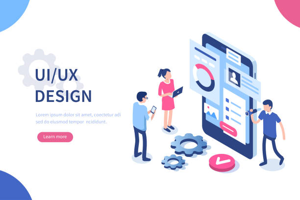
## 🎨 Color Psychology in UI/UX Design: A Comprehensive Guide for Designers
In the dynamic world of UI/UX #user_interface design, a deep understanding of color psychology goes beyond simply choosing beautiful colors. This knowledge is a powerful tool in the hands of designers, which they can use to evoke user emotions, guide their behavior, and ultimately create a memorable user experience. The purpose of this article is to provide a comprehensive guide to the importance of color psychology in UI/UX design. At Rasaweb Afarin, relying on our expertise in internet marketing, website design, and UX/UI, we help you optimize the #user_interface of your website and application and increase conversion rates by using the power of colors. From understanding the basic concepts of color psychology to examining its practical applications in design, this article will accompany you.
🤔 Basic Concepts of Color Psychology in UI/UX
Color psychology is a branch of psychology that examines the effect of colors on human behavior and emotions. Each color carries a specific message and meaning that can unconsciously affect our decision-making and perception. In UI/UX design, awareness of these concepts can help designers choose colors that align with the goals of the project and improve the user experience. For example, blue is often recognized as a symbol of trust, security, and tranquility, and for this reason, it is used in many banking and insurance websites. In contrast, red is an energetic and stimulating color that can attract users’ attention, but overuse may cause anxiety. Understanding these subtleties is the key to success in UI/UX design. The importance of choosing a suitable color palette in #optimization of user experience is obvious to everyone.
Do you want to reach your audience in the heart of popular mobile apps? Rasaweb Afarin promotes your brand with in-app advertising!
✅ Display your ads in popular apps
✅ Access your target audience based on interests and behavior
✅ Increase brand awareness and app installs
Contact 09124438174 for in-app advertising consultation!
🌈 The Impact of Colors on User Emotions and Behavior in UI/UX Design

Colors can evoke a wide range of emotions in users and influence their behavior. In UI/UX design, understanding these effects is very important. For example, yellow is often associated with happiness, optimism, and energy, and can be used to highlight important elements in the user interface. Green is a symbol of nature, health, and balance, and can create a sense of calm and confidence in users. Purple is often associated with creativity, spirituality, and luxury, and can be used to create a sense of distinction and exclusivity in design. Choosing the right color not only helps the visual beauty of the user interface but can also directly affect the conversion rate, user interaction, and overall satisfaction. Remember that cultural differences also play a role in the perception of colors and should be considered. Considering these points, the Rasaweb Afarin team takes steps toward creative and modern #website and application design.
| Color | Related Emotions and Meanings |
|---|---|
| Red | Energy, excitement, danger, urgency |
| Blue | Trust, security, tranquility, professionalism |
| Green | Health, nature, growth, balance |
| Yellow | Happiness, optimism, energy, warning |

Click here to preview your posts with PRO themes ››
👩🎨 Choosing the Right Color Palette for UI/UX Design
Choosing the right color palette is one of the most important steps in UI/UX design. The color palette should be consistent with the brand identity, project goals, and the taste of the target audience. To choose the right color palette, you can use various online tools such as Adobe Color, Coolors, and Paletton. These tools help you easily find complementary, similar, and contrasting colors and create a harmonious and attractive color palette. You can also get inspired by ready-made color palettes created by professional designers. The important point is to pay attention to the contrast of colors when choosing a color palette so that the important elements of the user interface are easily visible. By providing specialized advice in the field of color palette selection, the Rasaweb Afarin team in the #website_development section helps you create an attractive and efficient user interface.
✅ Practical Applications of Color Psychology in UI/UX Design
Color psychology has broad practical applications in UI/UX design. From choosing the color of call-to-action buttons to background coloring, every decision you make about colors can affect the user experience. For example, you can use green for confirmation buttons and red for cancel buttons. You can also use bright colors to draw users’ attention to important elements of the user interface. In the design of online stores, you can use warm and attractive colors to display products. In the design of educational applications, you can use relaxing and gentle colors to create a sense of focus and learning. At Rasaweb Afarin, we use color psychology to design #website and applications that are not only beautiful but also effectively communicate with users and achieve your business goals.
Are you looking to develop your website with the latest technologies? With Rasaweb Afarin’s website development services, build a powerful and scalable platform for the future of your business!
✅ Use of the latest technologies
✅ Development of complex and custom websites
✅ High security and flawless performance
Contact us now for professional website development!
⚪️ Color Theory in UI/UX Design
Color theory is a set of rules and principles that help us better understand how to combine and use colors. In UI/UX design, awareness of this theory can help designers choose colors that are harmonious with each other and create a pleasant visual experience for users. Some important concepts in color theory include the color wheel, primary colors, secondary colors, complementary colors, analogous colors, color contrast, and color harmony. Using these concepts, you can create diverse and attractive color palettes that align with your brand identity and project goals. Remember that color theory is only a guide and you can break its rules and create unique designs with creativity and innovation. The expert team of #Rasaweb_Afarin in the field of #content_marketing always uses the latest techniques to attract the audience.
| Concept | Description |
|---|---|
| Color Wheel | Circular representation of colors and the relationships between them |
| Primary Colors | Red, blue, yellow |
| Secondary Colors | Green, orange, purple (combination of primary colors) |
| Complementary Colors | Contrasting colors in the color wheel (e.g., red and green) |
Click here to preview your posts with PRO themes ››
📱 Mobile UI/UX Design and the Importance of Color

In mobile UI/UX design, colors play a more important role. Small mobile screens provide limited space for designers to display content. In this situation, smart use of colors can help highlight important elements, improve readability, and create an attractive user experience. For example, you can use bright colors for call-to-action buttons and dark colors for the background. You can also use different colors to separate different parts of the application. In mobile UI/UX design, pay attention to the accessibility of colors. Make sure that the colors you choose are distinguishable for users with low vision or color blindness. With expertise in mobile #application_design, the Rasaweb Afarin team designs applications that are both beautiful and functional, considering all these points.
🌐 The Impact of Culture on Color Perception and UI/UX Design

The perception of colors is different under the influence of different cultures. A color that is known as a symbol of happiness and good luck in one culture may have a negative and undesirable meaning in another culture. In UI/UX design, awareness of these cultural differences is very important, especially if you intend to offer your website or application to an international audience. For example, the color white is a symbol of purity and innocence in many Western cultures, but it is a symbol of mourning in some Asian cultures. The color red is a symbol of good luck and wealth in Chinese culture, but it is a symbol of danger and warning in some Western cultures. At Rasaweb Afarin, we design UI/UX in such a way that it is attractive and understandable for all audiences, taking these cultural differences into account. We also help you convey your message to the target audience in the best way with accurate knowledge of different cultures in the field of #internet_advertising and advertising campaigns.
🧪 Color Testing and Accessibility Tools in UI/UX Design
To ensure that the colors you use in UI/UX design are clearly visible and accessible to all users, including those with low vision or color blindness, you can use color testing and accessibility tools. These tools help you assess color contrast, identify safe colors for people with color blindness, and ensure compliance with web accessibility standards. Some popular color testing and accessibility tools include: Color Contrast Checker, WebAIM Contrast Checker, and Accessible Color Palette Builder. Using these tools, you can ensure that your UI/UX design is accessible and enjoyable for all users. At Rasaweb Afarin, we place special emphasis on web accessibility and use these tools in all UI/UX design projects.
Are you looking for a reliable way to increase your website visits and traffic? Rasaweb Afarin transforms your website into a traffic hub with a combination of SEO, content, and advertising strategies.
✅ Attract high-quality and targeted visitors
✅ Continuous improvement of site ranking in Google
✅ Increase conversion rates and sales
Take action today for a high-traffic and profitable website!
🚀 The Future of Color Psychology in UI/UX Design

Color psychology will always play an important role in UI/UX design. With the advancement of technology and the emergence of new design trends, the applications of color psychology will also become wider and more complex. For example, with the expansion of augmented reality and virtual reality, designers must be able to use colors to create immersive and interactive user experiences. Also, with the increasing importance of personalization in design, designers must be able to use colors to create user interfaces that are specifically customized for each user. At Rasaweb Afarin, we are constantly learning and updating our knowledge in the field of color psychology so that we can provide the best UI/UX design services to our customers. Our focus is on #optimization and continuous development.

Click here to preview your posts with PRO themes ››
| Question | Answer |
|---|---|
| Why is color psychology important in UI/UX design? | Colors can evoke user emotions, guide their behavior, and ultimately improve the user experience. |
| How can I choose the right color palette for UI/UX design? | You can use online tools like Adobe Color, Coolors, and Paletton, or get inspired by ready-made color palettes. |
| What colors are suitable for call-to-action buttons? | Bright and attractive colors like green, blue, and orange are usually suitable for call-to-action buttons. |
| How can I check the accessibility of colors in UI/UX design? | You can use color testing and accessibility tools like Color Contrast Checker and WebAIM Contrast Checker. |
| Are there cultural differences in color perception? | Yes, color perception varies under the influence of different cultures. |
| What color is suitable for designing a banking website? | Blue is usually considered a symbol of trust and security and is suitable for banking websites. |
| Is it appropriate to use a lot of colors in UI/UX design? | No, using a lot of colors can confuse users. It is better to use a limited and harmonious color palette. |
| How can I use colors to highlight important elements in the user interface? | You can use bright and contrasting colors to draw users’ attention to important elements. |
| Is it appropriate to use dark colors in mobile UI/UX design? | Yes, using dark colors can help reduce battery consumption in mobile devices. |
| What is the role of color psychology in UI/UX design for SEO? | By using colors optimally in design, improve the user experience (UX) and, as a result, improve your site’s SEO ranking. |
And other services of Rasa Web advertising agency in the field of advertising
• Analysis and optimization of website forms
• Development of Account-Based Marketing (ABM) strategy
• Design and implementation of online surveys
• Consulting in the field of cybersecurity for E-commerce websites
• Optimization for image search (Image Search SEO)
And more than hundreds of other services in the field of internet advertising, advertising consulting, and organizational solutions
Internet Advertising | Advertising Strategy | Reportage Advertising
Do you want to simplify and streamline your business processes?
Experience optimization by carefully analyzing processes and identifying bottlenecks.
✅ Process simplification and optimization.
✉️ info@idiads.com
📱 09124438174
📞 02126406207
📍 Tehran, Mirdamad Street, next to the Central Bank, South Kazerun Alley, Ramin Alley, No. 6