
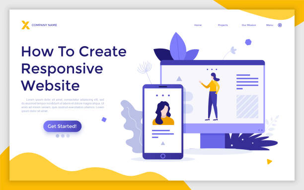
What is Responsive Website Design?

In this era, where the diversity of internet-connected devices, from smartphones and tablets to laptops and smart TVs, is rapidly increasing, responsive website design is no longer a competitive advantage, but rather a vital necessity.
Responsive Web Design (RWD) is an approach that ensures your website intelligently and flexibly adapts to the user’s screen size, providing the best possible user experience on any device.
This means that regardless of screen dimensions, website elements including text, images, menus, and overall layout are adjusted to ensure optimal readability and usability.
This approach, using concepts such as CSS Media Queries, flexible grids, and scalable images, enables developers to optimize a website for thousands of resolutions and screen sizes with just one version of the website code.
The main goal of responsive website design is to provide a seamless and desirable user experience, preventing user frustration when encountering non-optimized websites.
Websites that are not optimized for mobile often lead to constant zooming, unnecessary horizontal scrolling, and illegible text, which severely disrupts the user experience and increases user bounce rates.
In contrast, a responsive website, with a user-centric focus, provides easy and enjoyable access for everyone.
This educational and explanatory concept is vital for anyone looking to improve their online presence.
Tired of your e-commerce website not generating as much revenue as its potential? Rasaweb, specializing in professional e-commerce website design, solves this problem permanently!
✅ Increase sales and revenue conversion rates
✅ High loading speed and unparalleled user experience
⚡ Get free e-commerce website design consultation
Why is #Responsive Design so Important?
The importance of responsive website design goes beyond mere aesthetics; it is a key factor in the success of online businesses and achieving marketing goals.
First and foremost, from a user’s perspective, a well-responsive website provides an excellent user experience (UX).
This means easier access to information, smoother navigation, and ultimately, greater user satisfaction.
When users have a good experience with your website, their likelihood of returning, sharing your content, and becoming loyal customers increases.
In today’s world, more than half of web traffic comes from mobile devices, so ignoring mobile optimization means losing a large segment of your audience.
Secondly, from an SEO (Search Engine Optimization) perspective, Google and other search engines prioritize responsive websites.
Since 2015, Google has added the mobile-friendliness algorithm to its ranking factors and has recently moved towards mobile-first indexing.
This means that the mobile version of your website will be the basis for your ranking in search results.
Non-responsive websites may face SEO penalties, resulting in less organic traffic.
Using a responsive website design not only improves your ranking in search results but also reduces maintenance costs, as you have only one site with one codebase instead of two (one for desktop and one for mobile).
This is an analytical and specialized perspective that highlights the importance of investing in this area.
Technical Fundamentals of Responsive Web Design

To understand how responsive website design works, we need to delve into its three fundamental technical concepts: Media Queries, Fluid Grids, and Flexible Images.
CSS Media Queries are a core part of any responsive design.
These rules allow you to apply a set of CSS styles based on specific characteristics of the user’s device, such as screen width, height, orientation (portrait or landscape), and even resolution.
For example, you can define rules that if the screen width is less than 600 pixels, the navigation menu appears vertically instead of horizontally.
This flexibility enables designers to optimize the user experience for any screen size.
Fluid Grids use relative units such as percentages instead of fixed widths (like pixels).
This means that your columns and content, instead of having a specific width, occupy a percentage of the available space and automatically resize as the screen size changes.
This approach ensures that your layout scales correctly at any size and fills the available space in the best possible way.
Alongside this, Flexible Images ensure that images also resize with the screen display, preventing content overflow or unnecessary loading of high-resolution images on smaller devices.
This is often done using the max-width: 100%; property in CSS, which ensures the image never exceeds its parent container and scales proportionally.
These are fundamental and specialized concepts for the correct implementation of responsive website design.
For a better understanding of the difference, refer to the table below which highlights the advantages of responsive sites compared to non-responsive sites:
| Feature | Responsive Site | Non-Responsive Site |
|---|---|---|
| Mobile User Experience | Excellent and Optimized | Poor and Non-Optimized |
| Maintenance Cost | Low (one codebase) | High (multiple codebases) |
| SEO Ranking | Better (Google’s preference) | Worse (potential penalty) |
| Conversion Rate | Higher | Lower |
| Device Diversity | Full support for all sizes | Limited to specific sizes |
Popular Tools and Frameworks in Responsive Design

Implementing responsive website design can be facilitated by various tools and frameworks that speed up the development process and provide standardized code.
Among these tools, Bootstrap is undoubtedly the most popular and well-known option.
Bootstrap is an HTML, CSS, and JavaScript framework that includes design templates for typography, forms, buttons, tables, navigations, and other UI components, as well as optional JavaScript plugins.
Its most important feature is its 12-column grid system, which is responsively designed by default, allowing developers to easily adjust complex layouts for different screen sizes.
Using Bootstrap is highly recommended for educational and professional projects due to its excellent documentation and large user community.
In addition to Bootstrap, Foundation is another powerful framework developed by ZURB, offering greater flexibility for developers seeking more precise control over their design.
Like Bootstrap, Foundation also features a flexible grid system, UI components, and JavaScript plugins.
Other useful tools include Flexbox and CSS Grid, which are powerful and native CSS tools for creating responsive layouts.
CSS Grid allows you to create two-dimensional layouts (rows and columns), while Flexbox is ideal for one-dimensional layouts (row or column).
Combining these two, along with media queries, gives designers unparalleled control over how content is displayed on different devices, making professional responsive website design possible.
This information is guidance and specialized for any developer looking to build modern websites.
Is your current e-commerce website design causing you to lose customers and sales?
Rasaweb is your solution with modern and user-friendly e-commerce website designs!
✅ Significant increase in conversion rates and sales
✅ Strong branding and building customer trust
⚡ Get free e-commerce website design consultation from Rasaweb!
Challenges and Solutions of Responsive Web Design

Despite the countless advantages of responsive website design, its implementation is not without challenges.
One of the most important challenges is performance management.
Loading large images and heavy JavaScript on mobile devices with limited bandwidth can lead to slow loading speeds, which severely degrades the user experience and harms SEO rankings.
Solutions to this challenge include image optimization (using next-gen formats like WebP and compression), lazy loading for images and videos, and minimizing CSS and JavaScript code.
Using a CDN (Content Delivery Network) can also help improve loading speed.
Another challenge is the complexity of design and development.
Designing for multiple screen sizes requires more careful thought and and a different approach.
It may be necessary to consider different layouts for each breakpoint in media queries.
This complexity can increase development time.
The solution is to use a Mobile-First Design approach, meaning that design is first done for the smallest screen (mobile) and then gradually scaled up for larger screens (tablet and desktop).
This approach helps simplify the process and ensures an optimized mobile experience.
Testing and debugging can also be challenging, as you need to test the website on various devices and browsers with different screen sizes.
Using browser emulator tools, testing on real devices, and performance testing tools like Google Lighthouse are essential to ensure the correct and optimal functioning of responsive website design.
This section includes specialized tips and guidance for addressing common issues.
The Impact of Responsive Web Design on SEO and Online Businesses

The impact of responsive website design on SEO and the success of online businesses is profound and multifaceted.
As previously mentioned, Google has explicitly endorsed responsive websites as the recommended standard for mobile optimization.
This means that websites offering a consistent user experience across all devices achieve higher rankings in search results.
A responsive website reduces the bounce rate, as users quickly abandon websites that do not display correctly.
Reduced bounce rates and increased user time on site are important positive signals for search engines, indicating the high quality and relevance of your content.
From a business perspective, increased conversion rates are one of the biggest advantages of responsive website design.
When your website is easily usable on any device, users are more inclined to take your desired actions, such as purchasing a product, filling out a contact form, or subscribing to a newsletter.
A smooth user experience builds trust and encourages customers to engage more.
Furthermore, having a single website for all devices means easier content and analytics management.
You only need to manage one set of content and one set of analytics data, which simplifies the marketing and decision-making process.
This is particularly beneficial for small and medium-sized businesses with limited resources.
This section includes analytical and news-related information about the growing importance of this approach.
Responsive Design in Practice: Step-by-Step Implementation
Implementing responsive website design requires a structured, step-by-step approach to ensure an efficient and optimized final result.
The first step is planning and design.
Before writing any code, you need to decide what widths your breakpoints for media queries will be and how your layout will change at each of these points.
The Mobile-First approach is very useful at this stage, as it forces you to first think about the most important content and functionalities for the smallest screen, and then gradually expand it for larger screens.
This step is key guidance for getting started.
The second step is HTML and CSS implementation.
Ensure your HTML is semantic and clean.
For CSS, use relative units such as percentages, em, or rem for widths, padding, and margins.
For images, always use max-width: 100%; and height: auto; to ensure images scale correctly.
Using frameworks like Bootstrap or Foundation can simplify this process, but you can also do it manually using Flexbox and CSS Grid.
The third step is testing and optimization.
This is the most crucial part, often overlooked.
Test your website on various devices (mobile, tablet, desktop) and different browsers (Chrome, Firefox, Safari, Edge).
Use browser developer tools to simulate different screen sizes.
Look for layout issues, performance problems, and user experience issues.
Ensure that the loading speed on mobile devices is adequate.
This iterative testing and optimization process guarantees that your responsive website design is truly effective.
This information is educational and specialized for any developer.
Below is a table of key elements for implementing responsive design:
| Key Element | Description | Why It’s Important? |
|---|---|---|
| Viewports | Setting the viewport meta tag in HTML head | Controls how the page scales on mobile devices |
| Media Queries | Applying CSS styles based on device characteristics (width, height, orientation) | Changes layout and styles for different screen sizes |
| Fluid Grids | Using percentages or relative units for element widths | Layout automatically adjusts to screen size |
| Flexible Images | Using max-width: 100%; and height: auto; |
Images scale without breaking the layout |
| Fluid Typography | Using relative units (em, rem, vw) for font sizes | Text remains readable on different screen sizes |
The Future of Web Design and the Role of Responsive Web Design
The future of web design is rapidly evolving, and responsive website design will play a pivotal role in shaping it.
With the emergence of new technologies such as Virtual Reality (VR), Augmented Reality (AR), and the Internet of Things (IoT), the need for designs that can adapt to much more diverse environments and devices is increasingly felt.
Today’s websites are not just for phones and computers; they must also function well on smartwatches, car displays, and even internet-connected home appliances.
This raises a thought-provoking question: Will responsive design alone be sufficient, or do we need newer approaches?
It seems that the principles of responsive website design, namely flexibility and adaptability, will continue to form the foundation, but with greater complexities.
We are witnessing the emergence of more advanced approaches such as Progressive Web Apps (PWAs), which combine the benefits of websites and native applications, providing an app-like user experience in the browser, even offline.
These technologies also heavily rely on responsive design to function correctly on any device.
Furthermore, Artificial Intelligence and Machine Learning may also play a role in the future of web design, automatically optimizing layouts based on user and device data.
These developments indicate that responsive website design will not only endure but will combine with new technologies and migrate to more diverse and intelligent platforms.
This area of design brings news of exciting future developments and will be entertaining and inspiring for every designer.
Do you dream of a thriving online store but don’t know where to start?
Rasaweb is your comprehensive e-commerce website design solution.
✅ Attractive and user-friendly design
✅ Increased sales and revenue⚡ Get a free consultation
Common Mistakes in Responsive Design and How to Avoid Them

Even with the best intentions, designers and developers can make mistakes when implementing responsive website design that can harm the user experience.
Recognizing these common mistakes and knowing how to avoid them is crucial for success.
One common mistake is ignoring content on smaller devices.
Some designers focus solely on the website’s appearance and forget that content must be readable and accessible at any size.
Ensure that text is legible and images are scaled correctly.
Avoid extremely small fonts or overly condensed elements that become unusable on mobile.
Another mistake is not using the Viewport Meta Tag.
Without this tag, mobile browsers might render the page as a large desktop page and then shrink it, creating a terrible user experience.
Always use <meta name="viewport" content="width=device-width, initial-scale=1.0"> in your HTML <head> section.
Also, relying solely on media queries and ignoring fluid design is a mistake.
Media queries should be used for major layout changes, but the elements themselves should also be fluid between breakpoints.
Using relative units for sizes (percentages, em, rem) is crucial for creating this fluidity.
Insufficient testing is also a big mistake.
Your website must be tested not only in simulators but also on real devices with various operating systems and browsers to ensure the correct functioning of responsive website design in all scenarios.
This section provides guidance and specialized advice for anyone looking to avoid common problems.
Successful Case Study with Responsive Web Design

To fully understand the potential of responsive website design, a look at some real successful examples can be inspiring.
Leading companies worldwide have used this approach to improve user experience, increase accessibility, and boost their business results.
One classic and successful example is Nike.
Nike’s website is an excellent example of responsive design that works seamlessly across all devices, from desktops to the smallest smartphones.
By providing a smooth and visual shopping experience, regardless of the device the user is on, the company has been able to increase its conversion rates and strengthen customer loyalty.
The entertaining and news-related content in this section can demonstrate real achievements.
Another example is the website of TIME Magazine.
Given the vast amount of news and visual content, TIME needed a website that could present this content in a readable and appealing manner on any screen.
Their responsive website design has enabled readers to easily read articles, watch videos, and navigate photo galleries, whether they are using a tablet at home or browsing on a smartphone on the go.
This case demonstrates how even content-rich websites can benefit from this approach.
These case studies are just small examples of the widespread impact of responsive website design across various industries.
They show that investing in responsive web design is not only a step towards the future but also a smart strategy for achieving business goals in today’s digital world.
These examples clearly demonstrate the value of a high-quality responsive website design and can be inspiring for future projects.
Frequently Asked Questions
| Question | Answer |
|---|---|
| What is responsive web design? | It is a web design approach that ensures websites are well-displayed and usable across various screen sizes (mobile, tablet, desktop). |
| Why is responsive design important? | Due to the increasing use of diverse devices with different screen sizes (such as mobile and tablet) by users to access websites. |
| What are the main technologies used in responsive design? | It uses techniques such as CSS Media Queries, Flexible Grids, and Flexible Images. |
| What are the benefits of responsive design? | Provides a better user experience across all devices, improves website SEO, and reduces maintenance costs (compared to having a separate mobile site). |
| Is responsive design essential for all websites? | Mostly yes, because it ensures that your site is accessible and usable for a wide range of users and the devices they use. |
And other services of Rasa Web Advertising Agency in the field of advertising
Smart Custom Software: Designed for businesses seeking to increase sales through marketing automation.
Smart Google Ads: Professional optimization to increase sales using intelligent data analysis.
Smart UI/UX: A combination of creativity and technology to analyze customer behavior through precise audience targeting.
Smart Website Development: A combination of creativity and technology to increase click-through rates by managing Google advertising.
Smart Data Analysis: A creative platform to improve user interaction with custom programming.
And more than hundreds of other services in the field of internet advertising, advertising consultation, and organizational solutions
Internet Advertising | Advertising Strategy | Advertorials
Resources
Web Design Trends in Iran
Responsive Design Guide
Web Development News
What is Responsive Design?
🚀 See your business at the peak of competitiveness with Rasaweb Afarin Digital Marketing Agency’s services. From custom website design and SEO to targeted advertising campaigns, we offer comprehensive solutions for your growth and success. To learn more about our services and get a consultation, contact Rasaweb Afarin’s expert team today and build your digital future.
📍 Tehran, Mirdamad Street, next to Bank Markazi, Southern Kazeroon Alley, Ramin Alley, No. 6


