
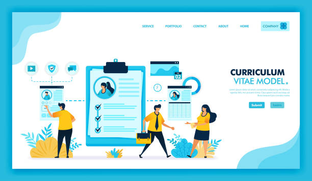
Introduction to #Responsive_Website_Design# Why Is It So Important Today?

In today’s fast-paced world, a digital presence is no longer an option, but a necessity.
With the increasing diversity of devices users employ to access the internet – from large desktops to tablets and smartphones of various sizes – the importance of responsive website design has become more evident than ever.
#Responsive_Design# is an approach that ensures your website provides an optimal visual and functional experience on any screen size and device.
This approach means flexibility and adaptability; meaning your website should be able to automatically adjust its content, images, and layout to the user’s screen dimensions.
Why is this topic so important? Firstly, user experience (#UX#) is paramount.
If users are forced to zoom in, scroll horizontally, or experience complex navigation to view your site’s content, they will quickly leave your site.
Secondly, search engines like Google prioritize responsive websites in their rankings.
With its Mobile-First Indexing approach, Google uses the mobile version of your site for indexing and ranking.
This means that if your site is not optimized for mobile, it might be overlooked in search results.
Therefore, responsive website design is not only crucial for user satisfaction but also a key factor for SEO (#SEO#) and your online visibility.
This approach is the foundation of any successful digital marketing strategy in the current era, helping you to always be accessible to your audience, regardless of the device they use.
Are you bothered by losing customers who visited your site to make a purchase?
Rasavab is your specialized solution for having a successful online store.
✅ Significantly increase your online sales
✅ Build trust and professional branding with customers⚡ Get a free consultation from Rasavab specialists!
Key Principles of #Responsive_Design# Fluid Grids and Flexible Images

To effectively implement #Responsive_Design# and ensure your website is displayed correctly on all devices, there are three key and important principles that must be understood and executed.
These principles include Fluid Grids, Flexible Images, and Media Queries, each playing a complementary role to create a truly responsive website.
Fluid grids use relative units like percentages for element widths instead of fixed pixel units.
This approach means that your site’s layout automatically adapts to the user’s screen width, rather than being locked to a specific size.
For example, if a column has a width of 20%, on a larger screen, it will have a greater actual width than on a smaller screen, but it will always occupy 20% of the available space.
This guidance is a foundational approach to flexibility.
Flexible images operate with the same logic.
By using the max-width: 100% property in CSS, images never overflow their container and scale up or down to fit the available space, without losing their quality.
This significantly helps prevent unwanted horizontal scrolling and improves page loading.
Media Queries are the most powerful tool among these three principles.
They allow developers to apply different CSS rules based on device characteristics such as screen width, height, orientation (portrait or landscape), and even resolution.
For example, you can define that on screens with a width less than 768 pixels, the site’s navigation menu changes to a hamburger menu or font sizes are reduced.
This feature provides precise control over the appearance and behavior of the website on various devices and is of high importance in creating a unified and optimized user experience across all dimensions.
The correct combination of these three principles creates a website that is literally responsive and future-proof.
Advantages of #Responsive_Web_Design# for Users and SEO

Responsive web design is not just a trend, but a necessity that brings countless benefits to users and, consequently, to business success.
This design approach directly impacts and improves the user experience (UX).
When visiting a responsive site, users see the content correctly and with an appropriate layout, regardless of the device they are using.
This reduces the Bounce Rate and increases the time users spend on the site, as they can easily find the information they need and interact with the site.
From an SEO perspective, responsive website design is a decisive advantage.
Google has explicitly stated that it prefers responsive websites, and this affects search result rankings.
Having a single URL for all devices helps search engines crawl and index your content more efficiently, preventing duplicate content issues that might arise with a separate mobile version.
Furthermore, this approach leads to reduced maintenance and development costs, as you only maintain one codebase for all devices instead of multiple versions of a site.
This is a smart investment for the digital future of your business.
Below, you will see a comparison table of the advantages of a responsive site versus a separate mobile site, demonstrating the superiority of this approach in the long run:
| Feature | Responsive Site | Separate Mobile Site |
|---|---|---|
| URL | One URL for all devices | Two separate URLs (one for desktop, one for mobile) |
| SEO | Higher SEO score, easier indexing, no duplicate content | Risk of duplicate content issues, need for complex redirects |
| Maintenance | One codebase for maintenance, reduced costs | Need to maintain two separate codebases, increased costs |
| User Experience | Unified and optimized experience across all devices | User experience may be inconsistent across different devices |
| Loading Speed | Optimized for different devices, with a focus on speed | May have slower speed due to redirects or lack of optimization |
Challenges and Important Tips in Implementing #Responsive_Website_Design#

Implementing responsive website design, despite all its undeniable advantages, is not without challenges.
One of the biggest concerns is website performance management.
Responsive websites must be able to optimize content and images to load quickly on mobile devices, which often have slower internet speeds and less processing power.
High-resolution images designed for desktops can slow down mobile loading and disrupt the user experience.
To address this challenge, it is essential to use techniques like “Responsive Images” with the srcset and sizes attributes, proper image compression, and Lazy Loading for images outside the user’s viewport.
Additionally, compressing CSS and JavaScript code significantly helps improve speed.
Another challenge is the complexity in testing and quality assurance.
With the countless variety of devices, browsers, and operating systems, ensuring that your website is displayed correctly in all scenarios is a difficult task.
Manual testing on every device is virtually impossible.
Therefore, using browser emulators, browser developer tools (like Inspect Element in Chrome), and automated testing platforms (like BrowserStack) to check site compatibility and performance across various dimensions and environments is crucial.
This specialized process requires sufficient time and knowledge.
Furthermore, content management for smaller screens is also a challenge.
Sometimes, rich and complex desktop content may appear confusing or too long on mobile.
Designers must consider a mobile-first content approach and ensure that key information is prioritized and easily accessible.
Meticulous planning and user-needs-based design for every screen size can transform these challenges into an opportunity to create a powerful and efficient website.
Are you tired of your e-commerce site having visitors but no sales? Rasavab solves your main problem with professional e-commerce website design!
✅ Significant sales increase with targeted design
✅ Flawless user experience for your customers
⚡ Get a free consultation!
Popular Tools and Frameworks for #Responsive_Website_Design#

Building a responsive website is not a complex task, but with the right tools and frameworks, this process can be significantly accelerated and its efficiency increased.
One of the most popular and well-known front-end frameworks for responsive design is Bootstrap.
Bootstrap, by providing a 12-column Grid System, pre-built UI components (such as navbars, buttons, forms, and carousels), and JavaScript plugins, helps developers quickly and easily build fully responsive websites.
This framework prioritizes the mobile-first approach and is therefore highly suitable for modern designs.
In addition to Bootstrap, other frameworks like Foundation also exist, offering similar capabilities, and the choice between them often depends on the development team’s preferences or specific project needs.
But beyond complete frameworks, the HTML and CSS languages themselves also offer powerful features for responsive website design.
Features like Flexbox (Flexible Box) and CSS Grid (CSS Grid System) have revolutionized web layout.
Flexbox is ideal for one-dimensional layouts (rows or columns) and distributing space between items, while CSS Grid is more suitable for two-dimensional layouts (rows and columns) and the overall structure of the web page.
These two features alone allow developers to implement complex and responsive layouts with high flexibility, without the need for large frameworks.
Using CSS preprocessors like Sass or Less can also make the CSS writing process more organized and efficient with features like variables, functions, and nested rules.
The choice of appropriate tools depends on the project’s complexity, team knowledge, and ultimate goals, but understanding the basic principles and foundational tools is an essential step for any developer looking to build modern and responsive websites.
The #Mobile_First# Approach in Responsive Website Design: Why Mobile First?

The Mobile-First approach is a design and development paradigm that has become an indispensable part of responsive website design in recent years.
Unlike the traditional method where design started for desktops and was then adapted for smaller devices, in the mobile-first approach, the design and coding process first focuses on the smallest screens and mobile devices.
Then, using Media Queries, the site’s layout and features are progressively enhanced for larger screens (such as tablets and desktops).
This approach is a deep #analysis# of user needs on the smallest platform.
The main reason for this approach’s importance is understanding the limitations of mobile devices.
Smartphones have smaller screens, less processing power, and more limited internet speeds.
By starting design with these limitations in mind, designers and developers are forced to focus on essential content and critical functionality.
This means simplifying the user interface, optimizing loading, and prioritizing content.
The end result is a faster, more efficient site with a better user experience that performs excellently on any device.
In terms of SEO, the mobile-first approach aligns with Google’s current policies, as Google first looks at the mobile version of sites for indexing.
This means that a mobile-optimized site has a higher chance of ranking well in search results.
Additionally, designing from small to large helps developers pay closer attention to details and avoid adding unnecessary features that might be cumbersome on mobile.
This approach is a significant step towards creating websites that are not only aesthetically pleasing but also functionally flawless, meeting the needs of today’s users anytime, anywhere.
This strategy prepares your website for a future where mobile devices dominate.
The Impact of #Responsive_Website_Design# on Businesses and the Digital Future

The impact of responsive website design on business success in the digital age is undeniable and extends beyond a simple technical aspect.
This design approach directly affects business Key Performance Indicators (KPIs) such as conversion rate, sales volume, and customer loyalty.
A responsive website provides a seamless and enjoyable experience for users, regardless of the device they are using.
This is especially crucial in today’s world, where a significant portion of web traffic comes from mobile devices.
When users can easily shop from your site on their smartphone, fill out a form, or interact with your content, the likelihood of performing the desired action (such as purchasing or registering) significantly increases.
This means increased conversion rates and, consequently, increased revenue.
Furthermore, responsive websites present your brand as a modern and customer-centric business.
This helps strengthen brand credibility and build trust with customers.
In fact, not having a responsive site currently can mean missing countless opportunities.
Given the rapid pace of change in digital technologies, investing in responsive design means “future-proofing” and ensuring the sustainability of your online presence for years to come.
This is important #news# for any business that wants to lead in digital competition and attract and retain its customers across all platforms.
The table below clearly illustrates the positive impacts of responsive design on key business indicators:
| Key Indicator | Impact of Responsive Design | Explanation |
|---|---|---|
| Conversion Rate | Significant increase | Better mobile user experience leads to completing purchase processes, registrations, etc. |
| SEO Ranking | Improvement and advancement | Google prioritizes responsive sites, and they have lower bounce rates. |
| Bounce Rate | Significant decrease | Users stay on the site longer due to a positive user experience. |
| Mobile Traffic | Increased attraction | Attracting and retaining a large segment of users who access the website via mobile. |
| Brand Credibility | Strengthening and improvement | Demonstrates modernity and attention to customer needs. |
| Maintenance Costs | Long-term reduction | Need to maintain only one codebase instead of multiple site versions. |
Common Mistakes in #Responsive_Design# and Ways to Prevent Them
Even with the best intentions and tools, mistakes can occur in the process of implementing responsive design that affect site efficiency.
Awareness of these common mistakes and knowing how to prevent them can help you create a truly efficient and optimized website.
One of the biggest mistakes is neglecting performance, especially on mobile devices.
Beautiful design alone is not enough; if the site loads slowly, users will leave it.
To prevent this problem, it is essential to optimize images (using modern formats like WebP, compression, and the srcset attribute), minimize CSS and JS files, and use a CDN (Content Delivery Network) for faster content delivery.
Another common mistake is the lack of sufficient and comprehensive testing on various devices.
A design might look correct in browser emulators, but perform differently on a physical device.
To fix this issue, performing frequent tests on real devices, using automated testing tools, and considering all common operating systems and browsers is highly important.
Additionally, overlooking the importance of content across different screen sizes is a grave mistake.
Content written for desktop may appear overly verbose or disorganized on mobile.
A content strategy for mobile should be considered, ensuring that key information is prioritized and easily digestible.
Finally, “over-engineering” is also a trap.
Sometimes designers try to make everything responsive, even elements that don’t need to be, which leads to complex and heavy code.
Focusing on actual user needs and designing based on principles of simplicity and efficiency can prevent these mistakes and ensure that your responsive website design is both beautiful and powerful.
Research shows that 80% of customers trust companies with professional websites more. Does your current website inspire this trust?
With Rasavab’s corporate website design services, permanently solve the problem of customer mistrust and a weak online image!
✅ Create a professional image and increase customer trust
✅ Attract more sales leads and grow your business
⚡ Get a free consultation
Future Trends in #Responsive_Web_Design# AI and PWAs

The web world is constantly evolving, and responsive web design is no exception.
Emerging trends and advanced technologies are shaping a future where websites will not only be responsive but also much smarter and more efficient.
One of the most exciting advancements is the integration of Artificial Intelligence (AI) into the web design and development process.
AI-powered tools can automatically optimize layouts, personalize content based on device and user behavior, and even suggest responsive design patterns based on user data.
This can help accelerate the design process and increase accuracy in delivering an optimal user experience.
Another important trend is the expansion of Progressive Web Apps (PWAs).
PWAs are websites that function like mobile applications; they can work offline, send push notifications, and be added to the user’s home screen, without needing to be installed from app stores.
This technology inherently aligns with the principles of responsive website design and enables businesses to provide a highly engaging and accessible user experience.
Given that PWAs use standard web technologies, they are also more feasible for developers than building Native Apps for various platforms.
Furthermore, continuous advancements in CSS, such as new viewport units (like svh, lvh, dvh for more precise viewport height management) and newer CSS Grid and Flexbox capabilities, give designers more control over responsive layouts.
The emergence of WebAssembly also means the ability to run high-performance code in the browser, which can allow developers to create more complex and powerful web experiences.
This is both #entertaining# and #specialized#, indicating that the future of the web is moving towards every website being a completely dynamic, intelligent, and always-accessible experience, regardless of how the user accesses it.
Final Summary: #Responsive_Website_Design# An Investment for Success

In conclusion, it can be stated with certainty that responsive website design is no longer a luxury feature or an option for websites, but an industry standard and a vital requirement for any business or individual who wants to succeed in today’s digital world.
Ever since mobile devices became the primary means of accessing the internet, providing a seamless and optimized user experience across all screen sizes has become a fundamental factor for attracting, retaining, and converting audiences.
Throughout this article, we explored various aspects of responsive website design; from its principles and benefits for users and SEO, to implementation challenges and necessary tools, and even a look at future trends.
The conclusion is clear: investing in responsive design not only means having a beautiful and user-friendly website but also means investing in SEO, increasing conversion rates, strengthening brand credibility, and ensuring the long-term sustainability of your online presence.
This is an essential #guide# for survival in today’s competitive landscape.
Businesses that embrace this approach are preparing themselves for a future where the boundaries between devices blur and user experience becomes the most critical factor for success at every touchpoint.
Ensure that your website delivers its best for every user, at all times, and on every device.
This is a vital step towards sustainable success in the digital age and a smart investment whose results will exceed expectations.
Frequently Asked Questions
| Question | Answer |
|---|---|
| What is responsive website design? | Responsive Web Design is an approach where a website’s design and layout automatically adjust to the user’s screen size and device (such as desktop, tablet, mobile) to provide the best user experience. |
| Why is responsive website design important? | With the increasing use of mobile devices and tablets for internet browsing, responsive design ensures that your website is displayed well on any size and users do not need to zoom or scroll horizontally, which leads to improved user experience and reduced bounce rate. |
| What are the main techniques used in responsive design? | The three main techniques include Flexible Grids, Flexible Images, and Media Queries in CSS. |
| What is a Media Query? | A Media Query is a CSS feature that allows you to apply different styles based on the user’s device characteristics such as screen width, height, orientation (portrait or landscape), and resolution. |
| What impact does responsive design have on SEO? | Google prefers responsive websites and ranks them higher in mobile search results. Also, improved user experience leads to a lower bounce rate and increased user time on site, which are positive signals for search engines. |
And other services of Rasavab Advertising Agency in the field of advertising:
Smart Website Development: A combination of creativity and technology for digital branding through precise audience targeting.
Smart Advertising Campaign: A professional solution for analyzing customer behavior with a focus on intelligent data analysis.
Smart SEO: A combination of creativity and technology to increase website traffic through Google Ads management.
Smart Customer Journey Map: Designed for businesses seeking online growth through user experience customization.
Smart SEO: An effective tool for digital branding with the help of attractive user interface design.
And over hundreds of other services in the field of internet advertising, advertising consulting, and organizational solutions.
Internet Advertising | Advertising Strategy | Advertorial
Sources
Importance of Responsive Website Design
Concept of Responsive Website Design
? For a significant leap in your business in the digital space, Rasavab Afarin Digital Marketing Agency, with a novel and specialized approach, is ready to offer services such as professional website design and comprehensive online marketing strategies to you.
📍 Tehran, Mirdamad Street, Next to Central Bank, Southern Kazeroun Alley, Ramin Alley, No. 6


