
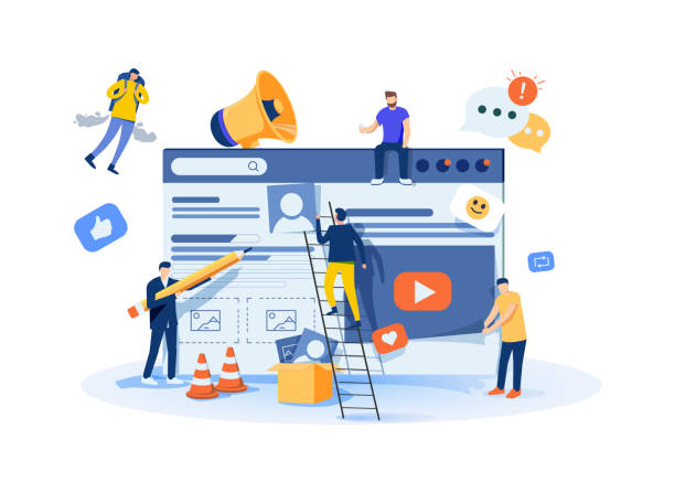
Introduction to Responsive Web Design and its Importance in the Digital Age

In today’s world, where users access the internet using a variety of devices—from smartphones and tablets to laptops, desktops, and even smart TVs with vastly different screen dimensions—having a website that can automatically and intelligently adapt itself to the various sizes and features of each display is no longer just an advantage; it is an undeniable necessity and an industry standard.
The concept of #Responsive_Web_Design precisely fulfills this vital need.
This design approach enables websites to provide an optimal, consistent, and uniform user experience, regardless of the device type (mobile, tablet, laptop, or smart TV) and its screen size.
This means users won’t have to zoom in, deal with annoying horizontal scrolling, or resize the page to view content completely, as the website intelligently adjusts its layout, font sizes, images, and other elements for the available display.
This not only leads to a significant improvement in #User_Experience (UX) and increased audience satisfaction, but also plays a crucial role in #Search_Engine_Optimization (SEO), because Google and other search engines clearly prefer responsive websites in their search results and give them a higher ranking.
With the increasing proliferation of smartphones, which today account for a large share of global internet traffic, ignoring this principle can mean losing a large portion of potential audience, reduced traffic, and missed commercial and competitive opportunities.
This chapter explains and educates by introducing the general concepts and importance of this progressive approach, laying a strong foundation for more specialized topics in subsequent chapters.
Responsive web design is more than just a coding technique; it is a modern design philosophy that emphasizes flexibility, content accessibility for everyone, and usability in any condition and on any device.
This approach means building websites whose content intelligently adapts to the available space and provides a seamless and enjoyable user experience.
This flexibility is the key to success and survival in the current digital ecosystem, characterized by an infinite variety of devices and screen sizes, with new devices emerging every day.
Do you have an e-commerce site, but your sales aren’t as expected? RasaWeb solves your problem forever with professional e-commerce site design!
✅ Significant increase in conversion rates and sales
✅ Unparalleled user experience for your customers
⚡ Click to get free consultation with RasaWeb!
Why is Responsive Design a Necessity? Impact on User Experience and SEO

Following the discussions from the previous chapter, a fundamental question arises: why is #Responsive_Web_Design no longer an optional or luxury choice, but a vital and undeniable requirement for any business and website aiming for success and sustainability in the online space?
The answer to this intriguing content is unequivocally rooted in fundamental changes in #User_Habits regarding information access and the strategic approach of search engines.
Global statistics show that today, a significant, and in many cases majority, portion of web traffic comes from mobile devices, and this trend is rapidly increasing.
Users who visit a website on their phone and encounter problems such as small, unreadable text, unclikable buttons, or the need for endless scrolling and annoying zooming to find content, quickly and without hesitation leave the website.
This high Bounce Rate not only severely degrades the user experience and causes audience dissatisfaction, but also sends a negative and damaging signal to search engines.
Google announced years ago that it has fully adopted “Mobile-First Indexing”, meaning that for ranking websites in search results, it prioritizes their mobile version, not the desktop version.
Therefore, websites that are not properly responsive and provide a poor mobile experience will have lower rankings in search results, risk losing organic traffic, and will significantly fall behind their competitors.
This is an important analysis of the current web trend that highlights the need for responsive website design more than ever, turning it into a key element in the digital strategy of any business.
A website with responsive website design presents all its content and functionalities in the best possible way, with an appropriate layout and smooth performance on any screen size.
This leads to increased user retention time on the site, reduced bounce rate, increased conversion rate, and ultimately improved search engine ranking.
This chapter analytically addresses these strategic impacts and emphasizes the strategic importance of this approach, showing how it can contribute to a business’s online success and create a sustainable competitive advantage.
Fundamental Principles of Responsive Design: Fluid Grids and Flexible Images

To effectively implement #Responsive_Web_Design, a deep understanding of three key and complementary principles is essential: #Fluid_Grids, #Flexible_Images, and #Media_Queries.
Fluid grids mean that instead of using fixed, static pixel units to define the dimensions and spacing of elements, relative units such as percentage, `em`, or `rem` should be used.
This causes page elements to resize proportionally to the screen size.
For example, if a column’s width is 20 percent, it will always occupy 20 percent of the screen’s width, regardless of how large or small the screen is.
This flexibility is the basis of compatibility with any display and the first step in the responsive approach.
Flexible images work similarly; using CSS, one can ensure that images never exceed the available space and resize proportionally to the width of their container.
This is usually done by setting `max-width: 100%;` and `height: auto;` for images, which allows them to shrink if necessary but never grow larger than their original size.
The most important tool in this regard is Media Queries.
Media queries allow you to apply different CSS styles based on device characteristics such as screen width (min-width, max-width), height, orientation (portrait or landscape), and even resolution.
This enables designers to define breakpoints and change the website’s layout at those points, for example, converting columns to rows or changing navigation to a Hamburger Menu.
This section is a specialized tutorial for understanding the technical foundations of this approach, explaining how these three elements work together to provide a seamless and optimal user experience on any device.
A deep understanding of these principles is vital for anyone looking to create a professional responsive website design, and without them, your website will not be able to adapt properly.
This table shows some commonly used Media Query features:
| Feature | Usage | Example |
|---|---|---|
min-width |
Apply styles for a minimum specified screen width (above this width) | @media (min-width: 768px) { /* Styles for tablets and desktops */ } |
max-width |
Apply styles for a maximum specified screen width (below this width) | @media (max-width: 767px) { /* Styles for mobile */ } |
orientation |
Apply styles based on device orientation (portrait or landscape) | @media (orientation: landscape) { /* Styles in landscape mode */ } |
resolution |
Apply styles based on screen resolution (DPI/DPPX), for Retina displays | @media (min-resolution: 2dppx) { /* Styles for high-resolution displays */ } |
By combining these three principles, developers can create websites that not only look good on any device but also perform well and provide a consistent user experience throughout the user’s interaction with the website.
This fundamental technical basis enables flexibility and dynamism in modern web design.
Popular Tools and Frameworks for Responsive Design

Implementing #Responsive_Web_Design from scratch can be time-consuming and complex, especially for large projects with intricate layout requirements and tight deadlines.
Fortunately, the web development community has provided #powerful_tools_and_frameworks that significantly facilitate this process, enabling developers to design and implement responsive websites with greater efficiency and speed.
Among the most popular and widely used are Bootstrap and Foundation.
These frameworks provide a comprehensive, pre-designed set of CSS and JavaScript components, including responsive grid systems, form components, buttons, navigations, typography, modals, carousels, and much more.
Their use helps developers build responsive websites more quickly and ensure their compatibility with various browsers, which itself is a major and time-consuming challenge in web development.
In addition to frameworks, native modern CSS features like Flexbox and CSS Grid have also revolutionized content layout, providing powerful tools for creating complex and responsive layouts without the need for external libraries.
Flexbox is designed for one-dimensional layout (either in a row or in a column), and CSS Grid for two-dimensional layout (rows and columns simultaneously), offering unparalleled capabilities for creating complex, overlapping, and responsive layouts.
These tools have made responsive website design much easier for web designers and developers, allowing them to focus on the creative aspects of design and user experience, rather than spending their time coding basic layouts and addressing browser compatibility issues.
The choice of the right tool depends on the project’s complexity, the development team’s preferences, existing technical knowledge, and the specific needs of the website.
This section serves as a guide and specialized insight into these tools, helping developers make the best choices for their projects and achieve the best results in responsive web design.
Does your current corporate website not reflect your brand’s credibility and strength as it should? RasaWeb solves this challenge for you with professional corporate website design.
✅ Increase visitors’ credibility and trust
✅ Targeted attraction of more customers
⚡ Click to receive free consultation!
Mobile-First Approach and Content Prioritization in Responsive Design
One of the most important strategies and fundamental principles in #Responsive_Web_Design is the #Mobile_First approach.
This approach means starting the design and development process from the smallest possible screen (such as small-sized mobile phones) and then scaling up and adding details for larger displays (tablts, laptops, and desktops).
This method fundamentally differs from the traditional approach, which first designed for desktop and then tried to adapt it for mobile (often leading to design and performance compromises), bringing higher efficiency.
The reason for the strategic importance of the mobile-first approach is that on small screens, there is very little space to display content.
This forced limitation compels designers to focus on the most essential content and functionalities and eliminate any superfluous, marginal, or less important elements.
This focus on the core user experience, in turn, leads to cleaner, more efficient, and more purposeful designs that provide a better user experience.
Consequently, when the design scales from small to large (using media queries), additional functionalities, richer visual details, and supplementary content can be gradually added, without imposing a heavy load on mobile devices or slow internet connections.
This approach is a very important and fundamental guide for anyone intending to have a successful and effective responsive website design.
Content prioritization is also an integral part of this strategy and must be done carefully.
It must be decided which information and features are prioritized for mobile users and ensure they are easily accessible and meet the user’s main needs.
Simple and touch-friendly navigation with large buttons and sufficient spacing, readable font sizes, simple forms, and clear and prominent Call-to-Actions are among the important considerations in mobile design.
This approach ensures that users on any device, especially under screen space and resource limitations, have access to the main content and experience a seamless and functional experience.
Ultimately, the mobile-first approach not only helps optimize user experience but also indirectly plays a vital role in improving SEO, as search engines clearly prioritize websites with excellent mobile experience and fast loading speeds in their rankings.
Testing and Debugging Responsive Design in Various Environments

After the initial implementation of #Responsive_Web_Design, the critical and often overlooked stage of #testing_and_debugging begins, which is essential to ensure proper functionality and a seamless user experience across all devices.
Ensuring that your website functions correctly and provides a consistent, problem-free user experience across various devices and screen sizes, from the smallest smartphones to the largest desktop monitors, is of paramount importance.
Browser developer tools (such as Chrome DevTools, Firefox Developer Tools, Edge DevTools) offer powerful capabilities for emulating different devices and testing the responsiveness of a website.
Using these tools, you can quickly view your website in various dimensions, inspect layouts, and identify and fix potential issues in CSS or JavaScript.
These simulations can cover various scenarios, including changing device orientation (portrait to landscape), simulating slow internet speeds, Retina display simulation, and even specific device simulations, which gives the developer a good initial overview.
However, testing in emulators and simulators can never fully replace testing on actual devices.
There are subtle differences in browser rendering engines, how touch events and gestures are managed, the actual pixel sizes, and even the hardware performance of various devices (especially older or less powerful ones) that can only be detected through real-device testing.
Therefore, it is strongly recommended to test your website on several smartphones and tablets with different sizes, resolutions, operating systems, and browsers to cover all common scenarios.
Online tools such as BrowserStack or CrossBrowserTesting can also be useful for more extensive testing in diverse environments (without the need to purchase a multitude of devices) and provide a comprehensive report on your website’s performance across different browsers and devices.
This stage is a comprehensive tutorial and guide to ensure the final quality of responsive website design.
Debugging CSS, JavaScript, and layout issues in responsive environments requires precision and patience.
Careful examination of how the website behaves when resizing the browser or rotating the device, precise observation of console errors, use of CSS inspection tools to find conflicting styles, and ensuring correct functionality of touch interactions are important parts of this process that guarantee your website appears in the best possible way and performs optimally under all conditions.
Performance Optimization in Responsive Design with Tables

One of the significant challenges in #Responsive_Web_Design is maintaining #optimal_performance across different devices, especially mobile with limited internet speeds.
Loading a heavy website on smartphones can create a very poor user experience and lead to quick user exits.
Therefore, Performance Optimization is an integral part of the responsive design process that should not be overlooked.
Several methods exist to achieve this goal, with their main focus on reducing the volume of data transmitted and improving response time.
Image optimization is one of the most important; using appropriate formats (like WebP, which have smaller sizes and offer high quality), compressing images without noticeable quality loss, and using `
Lazy Loading for images and videos can also help with the initial page load speed, so that content is loaded only when the user scrolls to it.
Reducing the size of CSS and JavaScript files through minification and removal of extra code, using Critical CSS (essential CSS for the first page display, inlined in HTML), and enabling GZIP compression on the server-side are other important measures.
This section is a specialized analysis of the performance aspects of responsive website design and clarifies its importance in a website’s success.
This table summarizes some key performance optimization techniques:
| Technique | Description | Impact on Performance |
|---|---|---|
| Image Optimization | Compression, smart resizing, using modern formats (WebP, AVIF) and the srcset attribute |
Reduced load time, bandwidth saving, improved Core Web Vitals |
| Lazy Loading (Lazy Loading) | Loading content (images, videos, iframes) only when they are in the viewport | Increased initial page load speed (FCP), reduced resource consumption |
| Critical CSS/JS | Direct loading of essential CSS and JS for displaying the first part of the page (Above-the-Fold Content) | Increased speed of first contentful paint (LCP, FCP), improved initial user experience |
| Caching | Storing files in the user’s browser (Browser Cache) or CDN for subsequent visits | Reduced server load, improved speed for repeated visits |
| Resource Compression | Compressing HTML, CSS, JavaScript files (with GZIP or Brotli) on the server | Reduced data transfer size, increased transfer speed |
By implementing these techniques, the performance of a responsive website can be significantly improved, ensuring that users on any device and with any internet speed will have a smooth and fast experience.
This optimization not only helps with better search engine rankings but also directly positively impacts conversion rates and customer satisfaction.
Common Challenges and Solutions in Responsive Design

Although #Responsive_Web_Design offers numerous advantages and is recognized as a golden standard in the industry, developers may encounter #multiple_and_complex_challenges during its implementation.
One such challenge is supporting older browsers, which may not fully and correctly support all modern CSS and JavaScript features (like Flexbox or CSS Grid).
To solve this problem, one can use “Polyfills” (small libraries that add new functionalities to older browsers so they can interpret modern code) and “Graceful Degradation” (designing in such a way that the website remains usable in older browsers, even with fewer features and a simpler appearance, but still retains its core functionality).
This is a thought-provoking content on how we can ensure that our responsive design is accessible and functional for all users, regardless of their device or browser, and how to strike a balance between an ideal experience and backward compatibility.
Another challenge is ensuring Accessibility for all users, including those with visual, motor, or cognitive disabilities.
The design must be such that navigation and content are usable by screen readers and other assistive technologies, providing an inclusive user experience.
Using correct and valid semantic HTML, providing meaningful alternative text for images (alt text), ensuring sufficient color contrast for better text readability, and providing full keyboard navigation (without needing a mouse) are among the measures that help improve accessibility.
Touch Interactions also require special considerations; buttons and links should be large enough (typically a minimum of 48×48 pixels is recommended) to be easily clickable with a finger, and sufficient spacing should be provided between them to prevent accidental and unintended clicks.
Furthermore, managing large or complex content such as bulky data tables, long forms, or interactive videos on small screens can be challenging and requires creative solutions like horizontal scrolling for tables, progressive hiding of non-essential elements, or using accordions for better content organization.
This section analytically addresses these challenges and provides practical and proven solutions for them, so that responsive website design is implemented in the best possible way and offers an inclusive and flawless user experience.
Deep attention to these details significantly enhances the final quality of the website, making it usable for a wider range of users in any condition and contributing to its long-term sustainability and success.
Does your current corporate website present a worthy image of your brand and attract new customers?
If not, transform this challenge into an opportunity with RasaWeb’s professional corporate website design services.
✅ Significantly enhances your brand’s credibility and image.
✅ Paves the way for attracting new leads and customers.
⚡ Contact RasaWeb now for free and specialized consultation!
The Future of Responsive Design Beyond Today

#Responsive_Web_Design, as a fundamental paradigm in web development, is constantly evolving and shaping the future of websites.
Beyond the current techniques based on media queries and grid systems, new concepts and #technologies are emerging that further enhance user experience and offer innovative and advanced approaches to website flexibility and performance.
Progressive Web Apps (PWAs) are one of these important and exciting trends, combining web capabilities with native app experiences, including offline functionality (thanks to Service Workers), Push Notifications, and the ability to install directly on the user’s device home screen without needing app stores.
This technology allows websites to deliver a fast, reliable, and engaging experience similar to native applications, without the need for separate platform development.
Server-Side Rendering (SSR) and Static Site Generation (SSG) have also gained increasing importance for improving initial performance and SEO, especially on mobile devices and with slow internet connections, as they prepare content before sending it to the user’s browser, significantly reducing initial loading time, which translates to a noticeable improvement in speed and user experience.
These approaches complement responsive design and help create faster, more reliable, and more engaging websites.
Furthermore, Artificial Intelligence (AI) and Machine Learning (ML) also hold great potential to change how websites are designed and personalized.
From intelligent and user-tailored content generation to automated layout optimization based on user behavior and preferences, AI can make the design process smarter, more dynamic, and highly personalized.
Concepts like Component-Based Design and Design Systems also help standardize, reuse, and accelerate the responsive website design process.
This section reports and entertains by exploring the future outlook of responsive website design and introduces new, exciting, and promising horizons in web development.
These advancements indicate that web design is moving towards a direction where every website can intelligently adapt to users’ needs and environments and provide an experience beyond expectations.
Conclusion and Best Practices for Implementing Responsive Design

Throughout this comprehensive article, we covered various aspects of #Responsive_Web_Design, from its fundamental importance in today’s digital world to essential technical principles, popular tools and frameworks, common challenges and their solutions, and even future outlooks in this field.
Now it is time to provide a summary of #best_practices and #recommendations for successfully implementing this approach to ensure that your website not only looks good but also performs flawlessly on all devices and maximizes user experience.
Always start with a “Mobile-First” approach to ensure an optimal and efficient user experience on small devices, and then scale up to larger displays.
Use relative units (such as percentages, `em`, and `rem`) for dimensions, spacing, and fonts to ensure the layout is naturally fluid and flexible.
Carefully plan media queries and use logical breakpoints that are determined by content and design needs, not just specific device dimensions.
Optimize images and multimedia content heavily and use techniques like smart compression, modern formats, and Lazy Loading to improve page load speed.
Never forget to test the website on multiple real devices and using browser emulation tools to ensure full compatibility and correct functionality across all environments.
Pay special attention to Accessibility issues and make your website usable and beneficial for all users, regardless of their abilities.
And finally, continuously monitor, analyze, and optimize your website to stay compatible with technological changes, new trends, and user behavior.
Responsive website design is an ongoing process, not a one-time project that is abandoned after completion.
By following these guidelines, you can build websites that are not only visually appealing and modern but also perform excellently on every device and offer a flawless user experience.
This article was a comprehensive explanation of this vital and growing concept, and we hope it serves as a useful guide for you to design and develop future-proof, user-friendly, and successful websites.
Frequently Asked Questions
| Question | Answer |
|---|---|
| What is Responsive Web Design? | It’s a web design approach that ensures a website displays correctly across different screen sizes (like mobile, tablet, desktop) and its layout adapts to the user’s screen size. |
| Why is Responsive Design important? | Given the widespread use of various devices to access the internet, responsive design provides a consistent user experience for all users, reduces website bounce rate, and improves website SEO. |
| How is Responsive Design implemented? | This type of design is often implemented using CSS3 Media Queries, Flexible Grids, and Flexible Images. |
| What are the main components of Responsive Design? | They include Media Queries for applying different styles based on device characteristics, using relative units (like percentage and em) for sizes and layout, and using flexible images and media whose dimensions change proportionally to the available space. |
| What are the main benefits of using Responsive Design? | Improved user experience, reduced development and maintenance costs (compared to having separate versions for mobile and desktop), improved search engine ranking (because Google prefers it), and increased website accessibility for all users. |
And other services of RasaWeb Advertising Agency in the field of advertising
Smart Digital Branding: A combination of creativity and technology for online growth through attractive UI design.
Smart Data Analysis: A combination of creativity and technology to attract customers through custom programming.
Smart Advertorials: Professional optimization for analyzing customer behavior using precise audience targeting.
Smart Website Development: Designed for businesses seeking to increase sales through optimizing key pages.
Smart SEO: An effective tool for user interaction with the help of custom programming.
And over a hundred other services in the field of internet advertising, advertising consultation, and organizational solutions.
Internet Advertising | Advertising Strategy | Advertorials
Sources
What is Responsive Web Design?
The Importance of Responsive Design
Principles of Responsive Design
Future Trends in Web Design
? With Rasaweb Afarin, specialists in secure website design and innovative digital marketing strategies, achieve your business goals precisely.
📍 Tehran, Mirdamad Street, next to Bank Markazi, Kazeroun Jonoubi Alley, Ramin Alley, No. 6


