
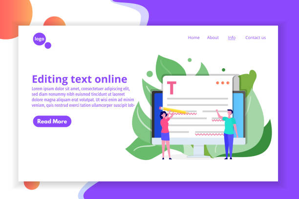
Introduction to Responsive Web Design: Why is it important?

In today’s world, where users access the internet from a variety of devices such as mobile phones, tablets, laptops, and even smart TVs, #Responsive_Website_Design is no longer a luxury option but a vital necessity.
The main goal of #Responsive_Site_Design or Responsive Web Design, is to create a seamless and optimized user experience, regardless of the screen size of their device.
This approach means that your website content, regardless of the device used, will display correctly and have high readability and interactivity.
This is a fundamental educational concept in modern web development.
The importance of responsive website design goes beyond aesthetics.
Google, as the largest search engine, has officially announced that it prefers responsive websites in its search results ranking, especially for mobile searches.
This is important news for any business that cares about being seen online.
Not having a responsive site can lead to loss of traffic, reduced conversion rates, and ultimately, falling behind competitors.
Have you ever wondered what percentage of your potential customers access your site via mobile? This is thought-provoking content whose answer doubles the necessity of implementing this type of design.
Google’s SEO guidelines also emphasize this.
In fact, this approach is a comprehensive explanation of how a website responds to its user environment.
This means that images, fonts, and page layouts all dynamically change to provide the best experience.
A website with responsive website design not only has greater efficiency but also significantly helps increase user satisfaction and improve their interaction with the content.
This topic is a foundation for all our subsequent chapters on more advanced details and techniques in this field.
Tired of your company’s website not getting the visibility it deserves and losing potential customers? Solve this problem forever with professional and effective website design by Rasawp!
✅ Increase brand credibility and attract customer trust
✅ Generate targeted sales leads
⚡ Contact us now for a free consultation!
Key Principles in Responsive Design: What should we know?

For successful implementation of #Responsive_Design, familiarity with three key principles is essential: #Fluid_Grids, #Flexible_Images, and #Media_Queries.
These principles are the backbone of any website that aims to provide a seamless user experience across various devices.
A specialized approach to these principles will ensure optimal performance for your site.
The first principle is Fluid Grids.
Instead of using fixed pixel dimensions, relative units like percentages are used to determine the width of elements.
This means that the page layout, instead of breaking or creating horizontal scrollbars on smaller screens, changes smoothly and proportionally to the screen dimensions.
This is an explanatory and very important guide to getting started.
For example, if a column is supposed to occupy half the width of the page, it will occupy 50% of the width instead of 500 pixels.
The second principle is Flexible Images.
Images and videos can be the main disruptors of responsive layouts, as they inherently have fixed dimensions.
To overcome this challenge, CSS should be used to ensure images never exceed the width of their container.
This is typically done using `max-width: 100%;` in CSS.
This ensures that images are properly scaled on smaller devices and do not overflow the page.
This section is a vital educational aspect for preventing common problems.
The third and perhaps most important principle is Media Queries.
Media queries allow CSS to apply different styles based on specific characteristics of the user’s device, such as screen width, height, resolution, or orientation (portrait/landscape).
This technique is the heart of responsive website design and allows you to precisely define how your content is displayed at different sizes.
This capability gives developers unparalleled control over the look and feel of the website in various environments and provides a deep analytical section on how to customize the user experience.
Media Query standards are defined by the W3C.
Tools and Techniques for Implementing Responsive Design

Implementing #Responsive_Website_Design requires knowledge and the use of specific tools that make the development process simpler and more efficient.
In this specialized section, we will discuss some of the most popular frameworks and CSS techniques that will greatly assist you in building responsive websites.
This is a practical guide for developers.
One of the most well-known frameworks is Bootstrap.
Bootstrap is a free and open-source CSS, JavaScript, and HTML framework that provides tools for creating responsive websites.
This framework includes design templates for typography, forms, buttons, navigation, and other user interface components, enabling fast and easy development.
Using it is an excellent educational option for getting started.
Another framework is Foundation, which also offers powerful tools for developing responsive websites and web applications.
Alongside frameworks, CSS techniques play a pivotal role.
The use of Flexbox and CSS Grid are two modern and very powerful techniques used for building complex and responsive layouts.
Flexbox is ideal for arranging elements in one dimension (row or column), and Grid is ideal for arranging in two dimensions (rows and columns).
Mastering these two will significantly increase your ability to create responsive website designs.
These are considered specialized and highly practical sections.
| Feature | Bootstrap | Foundation |
|---|---|---|
| User Community | Very large | Medium to large |
| Ease of Learning | Medium | Medium to high |
| Flexibility | High | Very high (more customizable) |
| Documentation | Comprehensive and user-friendly | Comprehensive and detailed |
| Main Goal | Rapid website development | Development of complex websites and web applications |
Also, the use of the Viewport Meta Tag in the <head> section of HTML is crucial for ensuring correct page scaling on mobile devices.
This tag tells the browser to set the page width to match the device’s width.
This is an important explanatory aspect for any developer pursuing responsive website design.
Responsive Design vs. Adaptive Design: Which is Better?

In the discussion of #Mobile_Website_Design, there are two main approaches: #Responsive_Design and #Adaptive_Design.
Although both have similar goals – providing an optimal user experience across different devices – the methods of achieving these goals are entirely different.
This section provides a precise analysis of their differences, which can be useful for your strategic decision-making.
Which approach is more suitable for your project? This is a key thought-provoking content.
Responsive Website Design (Responsive Design) is based on a single layout that fluidly and dynamically adapts itself to the screen size.
This approach uses fluid grids, flexible images, and media queries to seamlessly scale and rearrange content.
The main advantage of this method is the simplicity of code management, as there is only one set of code for all devices.
This topic is an important educational aspect for understanding its simplicity and efficiency.
However, in some cases, heavier content might be loaded for very small devices, even if not displayed, which can affect loading speed.
In contrast, Adaptive Design uses several fixed layouts that are predefined for specific screen sizes.
When a user accesses the site, the server or JavaScript identifies their device and serves the appropriate layout.
This approach gives you more control over the content presented for each device and can lead to faster loading and a highly optimized experience for each breakpoint.
This is a more specialized approach that can be advantageous when precise control over content on different devices is crucial.
The choice between the two depends on the specific project needs, budget, and developer resources.
Although responsive website design is more popular due to its ease of implementation and maintenance, adaptive design also has its advantages in specific scenarios.
As a guide, for most new and general websites, the responsive approach is recommended, while for very complex platforms or web applications with stringent performance requirements, adaptive design might be a better option.
Ultimately, both approaches aim to enhance the user experience on the global web.
Are your e-commerce website visitors leaving before making a purchase? Don’t worry anymore! With Rasawp’s professional e-commerce website design services, permanently solve the problem of not converting visitors into customers!
✅ Significant increase in conversion rate and sales
✅ Smooth and attractive user experience⚡ Get a free consultation
User Experience and Responsive Design: How to Keep Users Satisfied?

The ultimate goal of any #Website_Design is to provide a desirable #User_Experience (UX).
In the context of #Responsive_Website_Design, this issue gains double importance, as it must ensure that users, regardless of the device they use, can easily interact with content and access the information they need.
This section addresses the educational and guidance aspects regarding improving UX in responsive design.
One of the most important factors is content readability.
Fonts and text sizes should be adjusted to be easily readable across all screen sizes.
Ensure sufficient contrast between text and background.
Buttons and clickable elements should be large enough to be easily tappable on touch devices, without leading to unintended taps on adjacent elements.
This is a specialized tip for designers.
Page Load Speed is another critical factor in UX.
Mobile users often seek quick access to information, and the bounce rate significantly increases with slow loading.
Optimizing images, compressing CSS and JavaScript files, and using caching can all help improve speed.
This is an analytical recommendation for performance improvement.
In responsive website design, content optimization for different devices must be considered to prevent excessive data loading on low-power devices.
Website navigation must also be responsive and user-friendly.
Large menus may take up too much space on small screens.
Using hamburger menus or other navigation patterns that work well on mobile can be a suitable solution.
This is an engaging aspect for discovering new ways to interact with users.
Finally, continuous testing and feedback from real users on various devices are essential to ensure the best user experience in responsive website design.
The more you can put yourself in the user’s shoes, the more successful your website will be.
The Mobile-First Design Guide is also an important resource on this topic.
SEO Optimization with Responsive Design: Does Google Love It?

One of the most important advantages of #Responsive_Website_Design is its positive impact on #Search_Engine_Optimization (#SEO).
Google has explicitly stated that it recommends responsive website design as the best approach for configuring mobile sites.
This is key news that every website owner should pay attention to.
Why does Google prefer responsive website design? The main reason is that by having a single URL and HTML for all devices, #crawling and #indexing content becomes much simpler for search engines.
In the past, websites often had separate mobile versions (e.g., m.example.com), which led to duplicate content issues and increased complexity in maintenance and SEO.
With a responsive approach, Google can find and index all your content with just one crawl, which helps improve #crawl_efficiency and ultimately your #site_ranking.
This is an important explanation of the technical benefits.
Another factor is Mobile-First Indexing.
Since 2018, Google has gradually started indexing based on the mobile version of websites.
This means that the content of your mobile version will be the main determinant of your ranking in search results.
If your site is not responsive and does not have an optimized mobile version, you may fall behind competitors who have responsive website design.
This is an analytical and crucial section for your SEO strategy.
Furthermore, mobile page load speed, as mentioned earlier, is an important ranking factor for Google.
Responsive websites that are properly optimized can provide a fast user experience, which in turn leads to better SEO.
Given these considerations, it can be said that Google truly loves responsive website design and views it as the backbone of a successful SEO strategy in today’s world.
Therefore, investing in this area is a definite guide for your online success.
Google’s reference for mobile compatibility completes these explanations.
Challenges and Solutions in Responsive Design

Despite the numerous benefits of #Responsive_Website_Design, its implementation also comes with #challenges.
Understanding these challenges and being aware of their #solutions is crucial for your project’s success.
This section takes an analytical and informative approach to common problems.
One of the biggest challenges is Performance Management.
If images are not properly optimized or CSS/JS codes are too heavy, the site can load slowly on mobile devices.
The solution is to use Responsive Images, which load the appropriate version of the image based on the screen size (using srcset and sizes).
Also, optimizing and compressing files and using Lazy Loading for images and videos that are outside the initial viewport are highly recommended.
This is the most specialized tip for increasing speed.
Another challenge is the complexity of designing for various devices.
Initially, it might seem that one design is sufficient for all, but in practice, layouts for very small or very large sizes require precise adjustments.
This can lead to increased development time and cost.
The solution is to use a Mobile-First approach in design.
First, design for the smallest screen, and then gradually add features for larger screens (Progressive Enhancement).
This is valuable guidance for designers.
| Challenge | Solution |
|---|---|
| Slow loading speed | Image optimization (srcset), Lazy Loading, code compression |
| Layout complexity | Using Mobile-First, Flexbox/Grid, testing at different breakpoints |
| Heavy content management | Load Content Conditionally (JavaScript), Asset Delivery Strategy |
| Mobile navigation issues | Hamburger menus, Off-canvas menus |
Another issue is testing and debugging.
Despite the countless variety of devices and screen sizes, ensuring the correct performance of responsive website design across all of them is challenging.
Using browser developer tools (such as Chrome DevTools), device emulators, and even testing on real devices is essential.
This section provides a complete explanation of common problems and solutions in responsive website design.
The Future of Web Design: Is Responsive the Only Way?
While #Responsive_Website_Design has been established as an industry standard for years, the question always arises: where is the #Future_of_Web_Design heading, and will new approaches emerge to challenge or complement it? This is thought-provoking content and engaging for exploring new horizons.
Certainly, responsive website design will remain strong, as its foundation is built on flexibility and adaptability to a wide range of devices.
However, we are witnessing the emergence of complementary technologies and new approaches that can further enhance the user experience.
One of these is Progressive Web Apps (PWAs).
PWAs are websites that can work offline, send Push notifications, and even be added to the home screen of mobile devices, similar to a native application.
This technology has high potential for providing a fast and reliable experience, even in poor network conditions.
This is important news in the web industry.
PWA documentation by Google provides more information.
We are also seeing advancements in Component-Based Design and the use of modern JavaScript frameworks like React, Vue, and Angular.
These frameworks enable the creation of modular and reusable user interfaces, which can make the development of responsive websites more efficient.
This is a specialized approach that helps developers manage large projects optimally.
Emerging technologies like WebAssembly and continuous improvements in browser APIs also enable developers to build more complex and higher-performance websites.
This does not mean that responsive website design will become obsolete; rather, it means that its tools and techniques will evolve.
In the future, we will see websites that not only react to screen size but also respond to network speed, user preferences, and even location.
This is an analytical outlook on the exciting future of the web.
Are your e-commerce website visitors leaving before making a purchase? Don’t worry anymore! With Rasawp’s professional e-commerce website design services, permanently solve the problem of not converting visitors into customers!
✅ Significant increase in conversion rate and sales
✅ Unique and attractive user experience
⚡ Contact us now for a free consultation!
Successful Case Studies in Responsive Design
To better understand the impact of #Responsive_Website_Design, examining #successful_case_studies can be very inspiring.
These examples show how large and small companies have achieved #increased_users, #improved_SEO, and ultimately #increased_revenue by implementing this approach.
This section provides news and an analysis of real achievements.
One prominent example is The Boston Globe website.
This newspaper was one of the first major media organizations to fully migrate to responsive website design.
The result of this action was a significant improvement in user experience across various devices, reduced development and maintenance costs (as there was only one site), and ultimately, increased reader satisfaction.
This shows that investing in this area has a significant Return on Investment (ROI).
Another example is Airbnb.
The accommodation booking platform uses a responsive approach for its website, allowing users to easily search, view, and book accommodations on any device, from mobile to desktop.
This is an excellent example of a complex service that has simplified its accessibility and usability for millions of users worldwide through responsive website design.
This case demonstrates a specialized and successful aspect.
Even technology giants like Google themselves use responsive design in many of their products and tools, indicating their belief in this approach.
From PageSpeed Insights to the Google Search Console management panel, all provide a seamless user experience across different devices.
These examples show that responsive website design is not just a trend but an effective strategy that can help businesses grow and succeed in the digital world.
This serves as a guide and inspiration for anyone looking to improve their online presence.
Conclusion: A Big Step Towards an Inclusive Web

As explored in this #comprehensive article, #Responsive_Website_Design is no longer a luxury choice but an #essential standard for success in today’s digital world.
From enhancing user experience to improving search engine rankings and reducing maintenance costs, the benefits of this approach are numerous.
This section provides a final explanation and guide to summarize the topics.
We saw how key principles such as fluid grids, flexible images, and media queries enable the creation of websites that are displayed beautifully and efficiently on any screen size.
Also, by examining the differences between responsive and adaptive design, we concluded that for the vast majority of projects, responsive website design is the best and most efficient option.
This is an educational approach that should be firmly established in every developer’s mind.
The importance of this approach in the era of Google’s Mobile-First Indexing is also undeniable.
Websites that are properly responsive are not only better received by users but also achieve higher rankings in search results, which means increased traffic and revenue.
This is an analysis that has a direct impact on digital marketing strategies.
Although challenges such as performance management and design complexities exist, these obstacles can be overcome by utilizing appropriate techniques and tools like CSS frameworks, Flexbox, and Grid.
The future of the web is also moving towards a more inclusive and accessible web, where responsive website design and complementary technologies like PWAs play a pivotal role.
As the saying goes, the future web is in the hands of those who design it for everyone, everywhere.
By implementing a professional responsive website design, you will not only have a beautiful and efficient website but also establish a strong foundation for growth and success in the online space.
This is a smart investment in the future of your digital presence.
Frequently Asked Questions
| Question | Answer |
|---|---|
| What is Responsive Web Design? | It is a method of website design that optimizes the appearance and functionality of the website according to the screen size of the user’s device (mobile, tablet, laptop, etc.). |
| Why is responsive design important? | Due to the increased use of various devices to access the internet, responsive design provides a better user experience, improves site SEO, and reduces maintenance costs. |
| What are the most important responsive design tools? | Media Queries in CSS, use of relative units (such as percentage, em, rem, vw, vh), Flexible Images, and Grid Systems. |
| What role do Media Queries play in responsive design? | Media Queries enable the application of different CSS styles based on device characteristics (such as screen width, height, orientation, and screen type). |
| What is the Mobile First concept in responsive design? | It is an approach where design and development begin with the smallest screen (mobile) and then gradually expand to larger screens (tablet, desktop). |
| Does responsive design affect site SEO? | Yes, Google prefers responsive websites because they offer a better user experience and eliminate the need for separate mobile and desktop versions, which helps improve SEO rankings. |
| What does Fluid Layout mean? | It means that the width of page elements, instead of fixed pixel values, are defined using relative units (such as percentages) to automatically adjust with changes in screen size. |
| How are Flexible Images used in responsive design? | By setting the `max-width: 100%;` property for images in CSS, it ensures that the image never exceeds its container and its scale is maintained with screen size changes. |
| What are the differences between responsive design and adaptive design? | Responsive design uses a single layout that fluidly adapts to any screen size, while adaptive design uses several fixed and predefined layouts for specific screen sizes. |
| Are CSS frameworks like Bootstrap useful in responsive design? | Yes, frameworks like Bootstrap have a responsive Grid System and pre-designed components that make the process of building responsive websites much simpler and faster. |
And other advertising services from Rasaweb advertising agency:
- Smart Customer Journey Map: Designed for businesses looking to increase website traffic through user experience customization.
- Smart Social Media: A blend of creativity and technology to increase click-through rates through precise audience targeting.
- Smart Digital Branding: An exclusive service for growing customer acquisition based on precise audience targeting.
- Smart Custom Software: A fast and efficient solution for user interaction with a focus on marketing automation.
- Smart Digital Branding: A combination of creativity and technology for campaign management through attractive UI design.
And over hundreds of other services in internet advertising, advertising consultation, and organizational solutions
Internet Advertising | Advertising Strategy | Advertorials
Resources
What is Responsive Design?
Responsive Website Design Tutorial
Responsive Design Training
What is Responsive Design?
? Ready to transform your business in the digital world? Rasawp Afarin, with expertise in secure website design, professional SEO, and content marketing, paves the way for your success and visibility. With us, guarantee the future of your online business.
📍 Tehran, Mirdamad Street, next to Bank Markazi, Southern Kazeroon Alley, Ramin Alley, No. 6
