
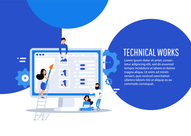
An Introduction to Responsive Web Design and its Importance in the Digital Age

In today’s world, where users access the internet from a variety of devices, the importance of #responsive_website_design has become more evident than ever.
From smartphones and tablets to laptops and desktop monitors, each device has its unique characteristics in terms of screen size, resolution, and touch capabilities.
A traditional website designed for only one screen size will provide a poor user experience on other devices.
This is where #responsive_design or #Responsive_Web_Design comes into play.
This approach ensures that your website has a beautiful appearance and flawless performance, regardless of the device the user is using.
This section explains the fundamentals of this concept to provide a complete understanding of why it is important in today’s web world.
The main goal is to provide educational content that familiarizes the audience with the basic principles and benefits of responsive website design.
In fact, this type of design not only helps improve user experience but also plays a vital role in the success of online businesses.
Websites compatible with various devices attract more visitors and result in higher conversion rates.
This introduction sets the stage for deeper discussions in subsequent chapters and highlights the importance of adopting this innovative technology.
Tired of losing customers due to poor e-commerce website design? With Rasawweb, solve this problem forever!
✅ Increase sales and visitor-to-customer conversion rates
✅ Smooth and engaging user experience for your customers⚡ Get Free Consultation
Why Responsive Web Design is Crucial for User Experience and SEO?

Responsive website design is no longer a luxury option, but an absolute necessity for any business or individual seeking online success.
This not only impacts User Experience (UX) but also plays a pivotal role in Search Engine Optimization (SEO).
From a user experience perspective, a website that is not properly responsive can lead to high bounce rates and user frustration.
Imagine a user visiting your site on their smartphone and having to zoom in or scroll horizontally to read text or click buttons; this experience will quickly drive them away from your site.
In contrast, a responsive website automatically adjusts its layout to the screen size, providing a seamless and enjoyable user experience on any device.
This section provides an in-depth analysis of the impact of this type of design on user satisfaction and search engine rankings.
Google, as the largest search engine in the world, has long considered Mobile-First as a crucial ranking factor.
This means that websites not optimized for mobile may rank lower in search results.
A responsive site helps Google index your content more easily and avoids creating multiple versions of the site for different devices, which significantly helps improve SEO.
This is a precise analysis of the competitive advantages that responsive website design brings and why it should be prioritized in web development plans.
Key Principles and Techniques in Implementing Responsive Web Design
Implementing responsive website design requires a deep understanding of specific principles and techniques that allow the website to dynamically adapt to various screen dimensions.
This section expertly and educationally examines the most important of these techniques.
Media Queries, one of the main pillars of responsive design, allow you to apply different CSS rules based on device characteristics such as width, height, resolution, and screen orientation.
Using media queries, layouts, fonts, and even the display of certain elements can be customized for specific devices.
The principles of Fluid Grids are also vital; instead of using fixed pixel widths, percentages are used for columns and overall width so that the layout automatically scales with screen size changes.
This gives the layout tremendous flexibility.
Flexible Images are also an integral part of this approach; images should be scalable so they never overflow their container, and their width is set to a maximum of 100% using CSS to fit their container size.
Also, adopting a Mobile-First approach instead of a desktop-first approach is a recommended method.
In this approach, design and development begin for the smallest screen (usually mobile) and then gradually expand to larger screens.
This method ensures an optimal user experience on mobile devices and avoids unnecessary complexities in larger designs.
The combination of these principles guarantees the creation of a powerful and efficient responsive website design.
| Feature | Traditional Design (Fixed) | Responsive Website Design |
|---|---|---|
| Dimension Approach | Fixed Pixel Dimensions | Percentage and Relative Dimensions (Fluid Grids) |
| Content Management | One version for all devices | Automatic content adjustment based on device |
| Images | Fixed image size | Flexible and Scalable Images |
| Optimization | Optimization for desktop | Optimization for mobile (Mobile-First) |
| Main Tools | Simple CSS, Tables | Media Queries, Flexbox, CSS Grid |
Popular Tools and Frameworks for Building Responsive Websites

To facilitate the responsive website design process, powerful tools and frameworks have been developed that help designers and developers quickly and efficiently create websites compatible with various devices.
This section, as a guide and specialized content, introduces some of the most popular of these tools.
Bootstrap is undoubtedly one of the most widely used front-end frameworks, enabling the creation of responsive websites using a 12-column grid system, pre-built UI components, and JavaScript plugins.
Its ease of use and large user community have made this framework an excellent choice for beginners and professionals alike.
Foundation is another framework that offers high flexibility and is suitable for larger and more complex projects.
This framework also features a responsive grid system, UI components, and development tools.
In addition to comprehensive frameworks, CSS Grid Layout and Flexbox (CSS modules) are native and highly powerful tools that provide more precise control over layout.
Flexbox is ideal for one-dimensional layouts (rows or columns), and Grid is for two-dimensional layouts (rows and columns), allowing for the creation of complex and fully responsive layouts without the need for external frameworks.
The use of CSS preprocessors such as Sass or Less can also improve the development process by adding features like variables, functions, and nesting.
The choice of the right tool depends on project needs, the developer’s skill level, and the complexity of the layout, but all these options are helpful in achieving the goal of a responsive website.
Don’t have a corporate website yet and missing out on online opportunities? With professional corporate website design by Rasawweb,
✅ Double your business’s credibility
✅ Attract new customers
⚡ Free consultation for your corporate website!
Challenges and Common Mistakes in Responsive Website Design

Despite the countless advantages of responsive website design, this process is not without its challenges, and many designers and developers may encounter common mistakes.
This section, presented as thought-provoking and cautionary content, examines these challenges and provides solutions to overcome them.
One of the biggest problems is the misunderstanding of the Mobile-First approach.
Many still start designing for desktop and then try to scale it down for mobile, which leads to irregular layouts and complex coding.
Whereas one should start from the smallest screen and move towards the largest.
Another challenge is managing images and videos.
High-resolution images optimized for desktop can slow down site loading on mobile devices and disrupt the user experience.
Using responsive images with the <picture> tag or `srcset`, and proper image compression are essential.
Ignoring content for different devices is also a common mistake.
Sometimes content is added without considering the layout on smaller screens, leading to overlap and illegibility.
Furthermore, insufficient testing on real devices and various browsers may fail to uncover hidden problems.
Some developers only use browser simulator tools, which do not always mimic real behavior.
Overly complex CSS and JavaScript can also make the site heavy and reduce loading speed.
These challenges underscore the need for careful planning, continuous testing, and a deep understanding of user behavior across different devices.
To achieve a successful responsive website design, special attention must be paid to these points.
The Future of Responsive Web Design and Emerging Trends

The world of web is rapidly evolving, and responsive website design is no exception.
This section, presented as news-oriented and analytical content, explores emerging trends and the future of this field.
One of the most important developments is an increased focus on performance and loading speed.
With the growing use of mobile devices and users’ expectations for high speed, Performance Optimization has become increasingly important.
This includes techniques such as advanced image compression, Lazy Loading, CSS and JavaScript code optimization, and the use of Content Delivery Networks (CDNs).
User Experience (UX) and User Interface (UI) design for wearables and the Internet of Things (IoT) is also expanding.
With the advent of devices like smartwatches and car displays, the need for designing websites that can adapt to these new form factors is increasing.
The development of Progressive Web Applications (PWAs), which offer a combination of the best features of web and native applications, is another important trend.
PWAs can work offline, receive push notifications, and load quickly, significantly improving the user experience.
Furthermore, the use of Artificial Intelligence (AI) in personalizing user experience and automating parts of responsive websites opens new horizons.
These technologies can help responsive website design to function dynamically not only in various dimensions but also in content and interaction.
The future of responsive web design lies in integrating these technologies and focusing on providing an unparalleled experience for users on every device and platform.
The Impact of Responsive Web Design on E-commerce Businesses

Responsive website design for E-commerce businesses is not just a competitive advantage, but a vital factor for survival and growth.
This section, presented as specialized and guidance content, examines how this type of design impacts increased sales, improved conversion rates, and customer satisfaction in online stores.
In today’s world, a significant portion of online purchases are made via mobile devices.
If an online store is not optimized for mobile, users will quickly abandon it and move to competitors.
A responsive website provides a seamless shopping experience across all devices, from browsing products to the payment process.
This leads to a reduction in shopping cart abandonment rates and an increase in conversion rates.
Furthermore, Search Engine Optimization (SEO), as mentioned earlier, plays a crucial role in attracting organic traffic for online stores.
Google prefers responsive sites in its ranking, which means greater visibility for your website and attracting potential customers.
Managing only one version of the website instead of several separate versions for desktop and mobile reduces maintenance costs and simplifies the process of updating content and products.
This allows businesses to focus their resources on improving customer experience and marketing, rather than maintaining multiple sites.
Also, providing a smooth and pleasant user experience builds customer trust and leads to their long-term loyalty.
Ultimately, investing in responsive website design for an e-commerce business is an investment in sustainable growth and long-term success.
| Factor | Positive Impact of Responsive Design |
|---|---|
| Conversion Rate | Significant increase due to seamless user experience |
| SEO and Visibility | Improved search engine ranking (Google’s preference) |
| Maintenance and Management | Reduced costs and simpler management of a single website |
| Customer Experience | Providing a smooth and flawless shopping experience on any device |
| Bounce Rate | Reduced bounce rate due to higher user satisfaction |
Testing and Debugging Responsive Websites for Optimal Performance

After implementing responsive website design, the critical stage of testing and debugging begins to ensure the website’s flawless performance across all devices and browsers.
This section, presented as educational and guidance content, describes the methods and tools required for this process.
The first step is testing on various browsers and devices.
Although browser simulation tools (like Chrome DevTools) are useful, for complete assurance, the website should be tested on real devices with different screen sizes (mobile, tablet, laptop) and operating systems (iOS, Android, Windows).
This helps identify issues related to touch interaction, font sizes, and element layouts.
Website speed testing tools such as Google PageSpeed Insights and GTmetrix are also essential for evaluating performance and identifying potential bottlenecks (such as unoptimized images or heavy JavaScript code).
These tools provide suggestions for improving loading speed, which significantly enhances the user experience.
Breakpoint Testing is also an important method where the website is tested at various screen sizes to ensure that the layout correctly changes at each breakpoint defined in media queries.
Paying attention to compatibility with older browsers is also important; although the main focus is usually on modern browsers, it should be ensured that users with older browser versions also have an acceptable user experience.
Debugging CSS and JavaScript using the browser’s developer console is a key process for identifying and resolving visual and functional errors.
By observing these points and using appropriate tools, you can ensure that your responsive website performs optimally and provides an excellent user experience.
Frustrated with your e-commerce website’s low conversion rate? Rasawweb transforms your online store into a powerful tool for attracting and converting customers!
✅ Significant increase in visitor-to-buyer conversion rate
✅ Unparalleled user experience to boost customer satisfaction and loyalty⚡ Get Free Consultation from Rasawweb!
Inspiring Examples of Successful Responsive Web Design

Seeing real examples of successful responsive website design can be very entertaining and at the same time explanatory, serving as inspiration for new designers and developers.
This section introduces several prominent websites that have successfully implemented responsive principles and provide an excellent user experience across various devices.
One of the best examples is the Google website.
All Google product and service pages, from Search to YouTube, are designed responsively and are accessible without any issues on any screen size.
This demonstrates Google’s commitment to a seamless user experience.
The Apple website is also an exceptional example.
Their products, with large images and minimal text, are beautifully displayed on desktop, and as the screen shrinks to mobile, they intelligently rearrange their layout to make key information easily accessible.
Scalable images and simple navigation are prominent features of this site.
Many large news sites like The New York Times or BBC News are also good examples.
They present a large volume of content with different layouts for desktop, tablet, and mobile, while maintaining readability and accessibility of information on every device.
These sites typically use complex grid systems and extensive media queries to present content in the best possible way.
These examples show that with careful planning, using the right techniques, and adhering to the principles of responsive website design, it is possible to create websites that are not only beautiful but also incredibly functional and accessible on any platform.
These cases are inspiring for anyone looking to build a responsive website.
The Importance of Responsive Website Design in Increasing Web Accessibility and Inclusivity

Responsive website design is not limited to improving user experience and SEO; it also plays a very important role in increasing web accessibility and inclusivity for all users.
This section, presented as explanatory and analytical content, examines this often overlooked aspect of responsive websites.
Accessibility means that your website is usable by people with various abilities, including those with disabilities (such as visual, auditory, motor, or cognitive impairments).
A properly designed responsive website can help achieve this goal.
For example, the ability to resize fonts and elements, compatibility with screen readers and other assistive tools, and logical content layout on any screen size all contribute to improved accessibility.
When a website is optimized for different devices, it indirectly addresses the needs of users with special conditions.
For instance, a user with low vision may need to enlarge font sizes significantly; responsive design ensures that even with larger fonts, the page layout remains intact and readability is maintained.
Furthermore, the availability of the website on various devices, especially mobile, helps individuals whose only way to access the internet is through a smartphone, to access online information and services.
This is particularly crucial in developing regions where desktop access is limited.
This inclusivity is not only a social responsibility but can also form the foundation of a successful and popular website, as it covers a larger community of users, and responsive website design provides this capability in the best possible way.
Frequently Asked Questions
| Question | Answer |
|---|---|
| What is Responsive Web Design? | A method for website design that ensures the website displays well across various screen sizes and devices (such as mobile, tablet, desktop) and provides a suitable user experience. |
| Why is Responsive Design important? | Improved user experience, better SEO (Google prefers responsive sites), time and cost savings (no need to build a separate site for mobile). |
| What are the main techniques in Responsive Design? | Using flexible grids and layouts (Fluid Grid), flexible images and media (Flexible Images), and utilizing Media Queries in CSS. |
| What are Media Queries in Responsive Design? | A part of CSS3 that allows you to apply different styles based on the characteristics of the device on which the website is displayed (such as screen width, resolution, media type). |
| What are the benefits of using Responsive Design? | Access to more users (especially mobile), improved user engagement rate, reduced maintenance costs (one site for all devices), and improved Conversion Rate. |
And other advertising services from Rasawweb Advertising Agency
Smart UI/UX: A fast and efficient solution for customer attraction focusing on attractive user interface design.
Smart Sales Automation: Designed for businesses looking to increase sales through intelligent data analysis.
Smart Direct Marketing: Professional optimization to boost sales using proprietary programming.
Smart Data Analysis: A fast and efficient solution for increasing click-through rates focusing on marketing automation.
Smart Data Analysis: A fast and efficient solution for campaign management focusing on marketing automation.
And over hundreds of other services in the field of internet advertising, advertising consultation, and organizational solutions.
Internet Advertising | Advertising Strategy | Advertorial
Resources
What is Responsive Website Design?Responsive Website Design TrainingComplete Guide to Responsive DesignConcepts of Responsive Website Design
? Are you ready for your business to leap forward in the digital world? Rasawweb Afarin Digital Marketing Agency, by providing comprehensive and specialized services, paves your path to growth and visibility. From SEO-optimized website design and search engine optimization to social media management and targeted advertising, we are by your side to ensure a powerful and effective online presence.
📍 Tehran, Mirdamad Street, next to Bank Markazi, Southern Kazeroun Alley, Ramin Alley, No. 6
