
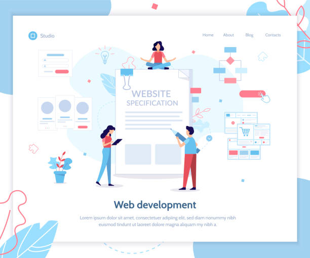
An Introduction to Responsive Website Design: Why It’s Essential Today

In today’s fast-paced world, an online presence is more vital than ever.
But just being present isn’t enough; your website must offer a seamless experience on every device, from desktop computers to tablets and smartphones.
This is where the concept of #Responsive_Web_Design comes in.
Responsive web design is no longer a luxury option but an absolute necessity for any business aiming to succeed in the digital space.
This approach allows your website to #dynamically and intelligently adjust its layout and content to the user’s screen size, without the need to develop separate versions for each platform.
Imagine a website that looks great on a large monitor suddenly losing its readability and aesthetics on a small phone.
This is where the concept of responsiveness comes in.
Non-responsive websites quickly frustrate users and lead to high bounce rates.
In contrast, a website with #responsive_design provides a unified and enjoyable user experience, which in turn leads to increased user retention, reduced bounce rates, and ultimately, improved #SEO rankings.
Google has also explicitly stated that it prefers mobile-friendly websites in its rankings.
This approach not only reduces development and maintenance costs but also ensures the long-term flexibility and sustainability of your website.
Next, we will delve deeper into the principles, benefits, and challenges of responsive website design to help you understand its importance and take effective steps to optimize your online presence.
#User_Experience #Mobile
Are you tired of losing business opportunities due to not having a professional corporate website?
RasaWeb, with its professional corporate website design, helps you:
✅ Build a powerful and reliable image for your brand
✅ Convert website visitors into loyal customers
⚡ Get a free consultation now!
The Evolution of the Web and the Mobile-First Approach

The history of the web has come a long way from its early days of static pages and desktop-centric designs.
In the past, websites were primarily designed for display on large computer monitors, and few people imagined that one day the majority of users would connect to the internet via mobile devices.
With the advent of smartphones and tablets in the 2000s, this reality quickly changed.
Users increasingly began to access the web through devices with highly diverse screen dimensions.
This evolution presented web developers with a major challenge: how to build a website that displays correctly on all these devices? The initial solutions involved creating separate versions for mobile (usually with m.example.com addresses), which was costly and troublesome.
This approach not only complicated content management but also resulted in an inconsistent user experience.
In 2010, Ethan Marcotte introduced the concept of responsive web design, which was a turning point in web design history.
This idea was based on three main pillars: Fluid Grids, Flexible Images, and Media Queries.
But this was just the beginning.
With the increasing share of mobile traffic, the “Mobile-First” approach emerged.
This philosophy means that the developer initially starts designing for the smallest screen (mobile) and then expands it for larger screens (tablet and desktop) by adding features and complexities.
This approach ensures that the core content and functionalities are optimized for mobile users, why because this group of users typically has lower internet speeds and smaller screens, and requires a lighter and faster experience.
Device-adaptive design thus not only became an essential tool for meeting user expectations but also evolved into an industry standard for the future of the web.
Key Principles and Technologies in Responsive Design

For effective implementation of responsive website design, understanding three key principles and technologies is essential: Fluid Grids, Flexible Images, and Media Queries.
These elements together enable the website to adapt to any screen size.
1.
Fluid Grids: Unlike fixed-pixel based designs that would break at different screen sizes, fluid grids use relative units like percentages (%) to define the width of columns and elements.
This means that instead of setting a fixed width for a column (e.g., 300px), we can say “30% of the available width”.
This flexibility ensures that your website’s layout naturally stretches or shrinks with different screen dimensions.
2.
Flexible Images: Like layouts, images must also be resizable to prevent content overflow or the creation of horizontal scrollbars.
Using CSS, we can specify that images never become larger than their container’s width (e.g., with `max-width: 100%;` and `height: auto;`).
This ensures images automatically adjust to the available space.
Furthermore, using the `srcset` attribute and `
3.
Media Queries: These are the most powerful tools in the responsive design toolkit.
Media queries allow you to apply specific CSS rules based on device characteristics (such as screen width, height, orientation, or even device type).
For example, you can specify that if the screen width is less than 600 pixels, the navigation menu should display vertically instead of horizontally, or fonts should become smaller.
This capability allows developers to design completely different experiences for various screen sizes and have precise control over how content is displayed.
Correct use of these three elements in implementing responsive website design, enables your website to perform optimally on any platform.
| Feature | Description | Implementation Tools |
|---|---|---|
| Fluid Grid | Use of relative units (like percentages) to define dimensions, instead of fixed pixels. | CSS (width: %, flex-basis: %) |
| Flexible Images | Images automatically adjust to their container’s width to prevent overflow. | CSS (max-width: 100%, height: auto), HTML (srcset, picture) |
| Media Queries | Applying specific CSS styles based on device characteristics such as screen width. | CSS @media rules |
| Adaptive Navigation | Navigation menus that optimize for different screen sizes (e.g., hamburger menu). | CSS, JavaScript |
| Viewports | Setting the initial width and scale of the viewport for mobile browsers. | HTML Meta Tag (viewport) |
Benefits of Responsive Design for Users and Businesses

Implementing responsive website design is not just an investment in technology, but a strategic investment for the future of your business.
This approach brings significant benefits to both users and business owners.
From the user’s perspective, an improved User Experience (UX) is the most important advantage.
A responsive website provides high readability, easy navigation, and effortless interaction, regardless of screen size.
No more tiresome zooming, annoying horizontal scrolls, or accidental clicks on small buttons.
This ease of use increases user satisfaction and boosts the likelihood of their return to your site.
For businesses, the benefits of responsive website design are multifaceted.
First and foremost, Search Engine Optimization (SEO) significantly improves.
Google and other search engines prefer mobile-friendly websites in their rankings.
Having a single URL for all devices avoids issues of duplicate content and sitemap complexities, which in turn helps with better content crawling and indexing.
This leads to greater visibility in search results and attracts more organic traffic.
Secondly, reduced development and maintenance costs.
Instead of designing, developing, and maintaining a separate version of your website for each device, with a responsive website, you only have one codebase that needs updating.
This dramatically reduces time and cost.
Thirdly, increased Conversion Rate.
When users have a positive and flawless experience on your website, they are more likely to take your desired action (such as purchasing a product, filling out a form, or signing up).
A website that works well on every device builds user trust and assures them that your business is professional and reliable.
Fourthly, sustainability and future-proofing.
Given the rapid pace of technological changes and the emergence of new devices with various sizes, a responsive website is ready for the future and can adapt to unknown devices yet to come.
This eliminates the need for continuous and costly redesigns.
In summary, responsive website design is not only about adapting to current needs but also a guarantee for sustained success in the growing digital ecosystem.
Is your company website as professional and trustworthy as it should be? With specialized corporate website design by RasaWeb, create an online presence that reflects your credibility and attracts more customers.
✅ Build a powerful and professional image for your brand
✅ Convert visitors into real customers
⚡ Get a free consultation now!
Common Challenges and Issues in Implementing Responsive Design
Despite the countless benefits of responsive website design, its implementation is not without challenges.
Web developers and designers often encounter obstacles that require specialized knowledge and creative solutions.
One of the most significant challenges is performance and loading speed management.
Responsive websites must optimize their content for various devices.
If large desktop-sized images are loaded uncompressed for mobile, the site’s speed will drastically decrease.
This not only disrupts the user experience but also negatively impacts SEO rankings.
Image Optimization, Lazy Loading, and Code Minification are solutions to combat this issue.
Another challenge is CSS complexity and style management.
As the number of media queries and CSS rules increases to cover various devices, CSS files can quickly become large and unmanageable.
Using CSS preprocessors like Sass or Less and CSS architectures like BEM or SMACSS can help in better code organization.
Testing and Debugging is also a significant challenge.
With countless devices, browsers, and operating systems, ensuring the website displays correctly on all of them is difficult.
Manual testing on real devices, using browser simulation tools, and cloud testing platforms (like BrowserStack) are essential to ensure correct and consistent performance across all environments.
Content Management can also be problematic.
Some Content Management Systems (CMS) are not optimized for responsive design by default and require complex customizations to display content correctly on various screen sizes.
Finally, designing for User Experience (UX Design) on smaller devices requires different thinking.
Limited screen real estate means designers must prioritize which content and functionalities are displayed first and how navigation is optimized for touch instead of clicks.
A deep understanding of user behavior on mobile and desktop is crucial for overcoming these challenges in responsive website design.
Tools and Frameworks for Building Responsive Websites

To facilitate the process of responsive website design, numerous tools and frameworks have been developed to help developers create device-compatible websites with greater speed and efficiency.
Using these tools can significantly reduce the complexities associated with layout and styling management.
One of the most popular and widely used frameworks is Bootstrap.
Bootstrap is a free and open-source Front-End framework that includes HTML and CSS-based design templates for typography, forms, buttons, tables, navigation, and other user interface components, as well as optional JavaScript plugins.
The most important feature of Bootstrap is its 12-column Grid System, which is designed to be responsive by default and, by using CSS classes, allows for the creation of complex yet device-compatible layouts.
Bootstrap is widely used for building fast and responsive websites.
Foundation is another powerful CSS framework considered Bootstrap’s main competitor.
Foundation also offers a flexible grid system, UI components, and JavaScript plugins.
This framework is particularly suitable for large projects and deeper customizations and supports the mobile-first approach.
In addition to complete frameworks, new CSS technologies like CSS Grid and Flexbox also play a pivotal role in responsive design.
Flexbox is excellent for designing one-dimensional layouts (rows or columns) and distributing space among items, while CSS Grid is designed for two-dimensional layouts (rows and columns) and creating more complex page structures.
These two technologies, alone or together, are very powerful tools for building fully responsive and complex layouts without the need for larger frameworks.
Other tools such as CSS preprocessors (Sass, Less) for writing more organized and efficient CSS, as well as browser testing tools and device simulators, are also very useful in the process of designing and developing responsive websites.
The choice of appropriate tools depends on project complexity, development team preferences, and timeline, but the ultimate goal is always the same: to deliver a flawless user experience on any device with responsive website design.
Testing and Optimizing Responsive Websites

After implementing responsive website design, the critical phase of testing and optimization begins.
Just because a website looks good on a few screen sizes doesn’t mean it performs flawlessly in all scenarios.
Comprehensive testing is essential to ensure a unified user experience and optimal performance across a wide range of devices, browsers, and network conditions.
Browser Developer Tools are the first line of defense.
All modern browsers (such as Chrome, Firefox, Edge) have developer tools that allow you to resize the screen to various dimensions, simulate mobile devices, and even throttle the network to assess website performance under different conditions.
These tools are very useful for initial tests and quick debugging.
However, simulations cannot fully replace testing on real devices.
Subtle differences in rendering, touch behavior, and processing speed between different devices can have unpredictable effects.
Creating a collection of popular devices (smartphones and tablets with various operating systems) for manual testing, is an ideal approach.
Cloud Testing Platforms like BrowserStack or Sauce Labs offer solutions that allow you to test your website on hundreds of combinations of real devices, browsers, and operating systems.
These tools are essential for large teams and complex projects that require broad device coverage.
Performance Optimization is another aspect of testing.
A responsive website must not only look good but also load quickly.
Tools like Google PageSpeed Insights, Lighthouse, and WebPageTest can provide valuable insights into loading speed, image optimization, code compression, and other performance factors.
Reducing file sizes, optimizing CSS and JavaScript, using a CDN (Content Delivery Network), and implementing lazy loading for images and videos are among the key measures for improving performance.
The ultimate goal is responsive website design that is both visually appealing and performs fast and smoothly on any device.
| Tool Type | Tool Name/Example | Usage |
|---|---|---|
| Browser Developer Tools | Chrome DevTools, Firefox Developer Tools | Device simulation, viewport resizing, CSS/JS debugging, performance testing. |
| Cloud Testing Platforms | BrowserStack, Sauce Labs, LambdaTest | Testing on real devices and various browsers via cloud. |
| Speed/Performance Testing Tools | Google PageSpeed Insights, Lighthouse, GTmetrix, WebPageTest | Analyzing loading speed, image optimization, code compression, Core Web Vitals. |
| HTML/CSS Validity Checkers | W3C Markup Validation Service, W3C CSS Validation Service | Checking HTML and CSS code validity based on web standards. |
| Accessibility Testing Tools | Axe, WAVE Web Accessibility Evaluation Tool | Checking website compliance with accessibility standards for people with disabilities. |
The Impact of Responsive Design on SEO and User Experience

Responsive website design is crucial not only for users but also for success in search engines.
Google has explicitly stated that it prefers mobile-friendly websites in its rankings and, with the introduction of Mobile-First Indexing, has made this approach a standard for ranking.
This means that Google primarily uses the mobile version of your website to evaluate and index content.
If your website does not perform well on mobile, even if its desktop version is excellent, it may lose its ranking.
From an SEO perspective, responsive website design has several advantages:
1.
A single URL: Having one URL for all devices prevents duplicate content issues that can harm SEO.
This also simplifies the crawling and indexing process for search engine bots.
2.
Reduced bounce rate and increased dwell time: As previously mentioned, a positive user experience leads to a reduced Bounce Rate and increased Dwell Time.
These metrics send positive signals to search engines, indicating the high quality and relevance of your site’s content.
3.
Improved conversion rate: Responsive websites, by providing easy access and a smooth user experience, increase the likelihood of completing business goals (such as purchasing, signing up, or contacting), which indirectly positively impacts SEO.
From a User Experience (UX) perspective, device-compatible design means creating a seamless user experience that puts the user at the center, regardless of the device they use.
This includes the following:
Easy navigation: Navigation menus that transform into hamburger menus on mobile and display fully on desktop.
High readability: Fonts, sizes, and color contrasts that are easily readable on any screen size.
Optimized interaction: Buttons and forms with appropriate sizes for touch interaction on mobile and desktop.
Ultimately, both SEO and UX are essential for website success, and responsive website design is the bridge that connects these two areas.
A website optimized for both users and search engines has the upper hand in today’s competitive market.
Is your company website as professional and trustworthy as it should be? With specialized corporate website design by RasaWeb, create an online presence that reflects your credibility and attracts more customers.
✅ Build a powerful and professional image for your brand
✅ Convert visitors into real customers
⚡ Get a free consultation now!
Beyond Responsiveness: Adaptive Design and Progressive Web Apps

While responsive website design is recognized as an industry standard for ensuring website compatibility across various devices, the web world is rapidly evolving, introducing new concepts to further enhance user experience and performance.
Two key concepts often compared with or complementing responsiveness are Adaptive Design and Progressive Web Apps (PWAs).
Adaptive Design: Unlike responsive design, which uses a fluid layout to adapt to any screen size, adaptive design involves a set of fixed layouts for specific breakpoints.
In other words, the designer creates multiple designed versions of the website for specific screen sizes (e.g., 320px, 768px, 1200px), and the browser loads the most appropriate layout based on the user’s screen size.
This approach can offer more precise control over the design at each breakpoint and sometimes lead to better performance, as only the necessary content for that screen size is loaded.
However, the need to design and maintain multiple layouts can increase complexity and costs.
Progressive Web Apps (PWAs): PWAs are an effort to combine the best features of web and native apps.
This technology allows websites to work offline, send push notifications, and even be installed as an icon on the device’s home screen, without needing to be downloaded from app stores.
PWAs use technologies like Service Workers, Web App Manifests, and HTTPS to provide a fast, reliable, and engaging experience.
A PWA must necessarily be responsive to function well across all devices, but beyond that, it brings native app capabilities to the browser.
This approach not only improves user experience but also reduces development and distribution costs, as there’s no need for separate development for iOS and Android.
In the future, the combination of responsive website design with more advanced concepts like PWAs and the utilization of AI for content personalization will blur the line between websites and applications, creating an unprecedented experience for users.
Future Outlook of Responsive Website Design
The future of the web is undoubtedly intertwined with the concept of responsive website design.
With the increasing proliferation of smart devices of various sizes and forms, from smartwatches to large augmented reality displays, the need for flexibility in web design is more critical than ever.
Responsive design is a foundation, but technological advancements are emerging that will push this concept further.
Advanced CSS Technologies: With the emergence of new CSS features like Container Queries and the :has() pseudo-class, developers will be able to have more precise control over the design of internal elements within a component, not just the entire viewport.
This translates to unparalleled flexibility and easier management of design at smaller scales.
Container Queries react based on the size of their parent container instead of the viewport, which is a significant step forward.
Artificial Intelligence and Machine Learning: Artificial Intelligence (AI) can play an increasing role in responsive website design.
Imagine a system that automatically optimizes layouts based on user behavior and device size, or even dynamically adjusts content based on the displayed device.
This could lead to unprecedented personalization and continuous optimization of the user experience.
New Devices and Novel User Interfaces: With the emergence of wearables, foldable displays, and virtual/augmented reality, new challenges for web design arise.
Responsive website design must adapt to these novel user interfaces, including voice inputs and gesture controls.
This means going beyond mere visual resizing and considering entirely new interactions.
Sustainability and Accessibility: The future of responsive web design will also focus on Sustainable Web Design and Accessibility.
Designs that are more energy-efficient and provide an inclusive experience for all users, regardless of their abilities, will become increasingly important.
Ultimately, responsive website design has evolved from a technique into a philosophy: a philosophy where websites must be inherently flexible, user-centric, and prepared for a constantly changing future.
This exciting path offers countless opportunities for innovation and creating unique digital experiences.
Frequently Asked Questions
| Question | Answer |
|---|---|
| What is responsive website design? | A web design approach where the website adapts to the screen size of various devices (desktop, tablet, mobile). |
| Why is responsive design important? | To provide an optimal user experience on any device the user uses and to improve SEO. |
| What are the main techniques of responsive design? | Using fluid grids, flexible images, and Media Queries. |
| What is a Media Query? | A CSS rule that allows applying different styles based on screen characteristics (such as width or height). |
| What are the benefits of responsive website design? | Increased user satisfaction, improved site ranking in search engines (SEO), reduced maintenance costs compared to having separate versions for each device. |
And other services of RasaWeb Advertising Agency in the field of advertising
Ads for anti-allergy hygiene products manufactured in directories
How hygiene product manufacturers can surpass competitors in advertising
Using FAQs in hygiene product sales advertisements
Ads focusing on customer experiences with manufactured care products
The role of customer storytelling in hygiene product advertisements
And over hundreds of other services in the field of online advertising, advertising consulting, and organizational solutions
Online Advertising | Advertising Strategy | Advertorial
🚀 Ready to shine and achieve sustainable growth in the digital world? RasaWeb Afarin Digital Marketing Agency, with its expertise in providing comprehensive services including SEO-optimized website design, Search Engine Optimization (SEO), and targeted advertising campaigns, is your reliable partner on the path to online success.
📍 Tehran, Mirdamad Street, Next to Central Bank, Southern Kazeroun Alley, Ramin Alley, No. 6


