")
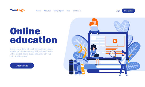
Introduction to Responsive Website Design: Why is it Important?
In today’s world, where users access the internet from a variety of devices, the importance of responsive website design is more evident than ever.
Imagine your website looking great on a desktop computer, but when a user visits it on their mobile phone or tablet, they encounter clutter, tiny texts, and unclickable buttons.
This is where #user_experience suffers and your #brand_reputation is jeopardized.
Responsive web design is a solution that ensures your website displays correctly and beautifully on any screen size, from the smallest smartphone to the largest monitors.
This approach not only improves #customer_satisfaction but is also a crucial factor for #successful_SEO and achieving higher rankings in search engines.
The main goal is to provide a seamless and optimal experience for every visitor, regardless of the device they use.
The concept of responsiveness in web design (Responsive Web Design) was first introduced by Ethan Marcotte in 2010 and has since become an industry standard.
The main reason for this transformation is the changing landscape of internet access, where mobile phones and tablets are not just an option but the primary access tools for millions worldwide.
A responsive website automatically adapts its layout and content to the user’s screen dimensions using techniques such as fluid grids, flexible images, and media queries.
This automatic adaptation eliminates the need to design and maintain separate mobile and desktop versions, ultimately saving time and cost.
In this educational and explanatory article, we aim to comprehensively examine various aspects of responsive website design and demonstrate why this approach is essential for the future of your online presence.
Did you know your company’s website is the first point of contact for 75% of potential customers?
Your website is the face of your brand. With **Rasawweb**’s corporate website design services, build an online presence that earns customer trust.
✅ Create a professional and lasting image for your brand
✅ Attract target customers and increase online credibility
⚡ Get free consultation from **Rasawweb** experts!
What are the Key Principles of Responsive Design?

To gain a deeper understanding of how responsive website design works, we need to delve into its three key principles.
These principles form the backbone of every responsive website, and understanding them is crucial for any web designer or business owner.
The first principle is the use of Media Queries.
This CSS3 feature allows developers to apply different styles based on device characteristics such as screen width, height, orientation (portrait or landscape), and even resolution.
For instance, you can define that if the screen width is less than 600 pixels, the navigation menu should display as a hamburger menu and font sizes should be smaller.
This flexibility enables you to optimize the user experience for each device.
The second principle is Fluid Grids or percentage-based layouts.
Instead of using fixed pixels for the width and height of elements, fluid grids use relative units such as percentages.
This means that a column’s width, instead of being 200 pixels, might be 30% of the total page width.
With this specialized approach, the website’s layout automatically expands or contracts with changes in screen size, preventing clutter or unnecessary horizontal scrolling.
This method is particularly effective for content and image arrangement, ensuring a dynamic and adaptable design.
Finally, the third principle is Flexible Images.
Using fixed-size images can cause them to overflow or appear too large on smaller screens.
By applying simple CSS like `max-width: 100%` to images, it’s ensured that images never exceed their parent container and automatically scale to fit the available space.
This method ensures that images are displayed correctly on various screen sizes without compromising quality.
Implementing these three principles in responsive design provides a comprehensive approach to ensure your website looks correct and at its best on all devices.
Countless Benefits of Responsive Website Design for Businesses

Implementing responsive website design is not just a design trend but a strategic investment for any online business.
The first, and perhaps most important, advantage is an improved User Experience (UX).
When users encounter a user-friendly and compatible website, regardless of the device they use, their likelihood of staying on the site, interacting with content, and performing desired actions (such as purchasing or signing up) increases significantly.
This is a key analytical advantage that directly impacts the Conversion Rate.
Websites with a poor mobile user experience typically suffer from a high Bounce Rate, as users quickly leave the site.
The second major advantage is improved SEO.
Google has officially stated that it considers responsive design as the best practice for mobile design and ranks responsive websites higher in mobile search results.
This approach means having a single URL for all devices, which helps Googlebot crawl and index your site more efficiently, leading to increased organic traffic and greater visibility in search engines.
The third advantage is reduced costs and maintenance time.
Instead of developing and managing separate versions for desktop, tablet, and mobile, there is only one website to update and maintain.
This significantly reduces initial development costs as well as ongoing costs for maintenance, hosting, and content updates.
The fourth advantage is increased sales and revenue.
Given that a high percentage of online purchases and decisions are made via mobile devices, a website that functions well on mobile has a higher chance of converting visitors into customers.
Finally, responsive website design allows your business to adapt to future web trends and be prepared for upcoming changes in technologies and user behavior.
This is an explanatory perspective demonstrating why this approach is a necessity, not a choice.
| Feature | Responsive Website | Non-Responsive Website |
|---|---|---|
| User Experience (UX) | Excellent on all devices | Poor on mobile devices |
| SEO Optimization | High score from Google (mobile-first) | Risk of lower ranking on mobile |
| Maintenance Costs | One codebase, easier maintenance | Multiple codebases, more complex maintenance |
| Conversion Rate | Significant increase | Decrease, especially on mobile |
| Accessibility | Improved accessibility for all users | Limitations for mobile users |
Challenges and Solutions for Implementing Responsive Design

Despite the countless benefits of responsive design, its implementation is not without challenges and requires a guiding and specialized approach.
One of the most significant challenges is Website Performance.
If not properly optimized, a responsive site might load slower on mobile devices, especially if it includes high-resolution images or large CSS and JavaScript files.
The solution to this challenge involves using techniques such as Image Optimization, Lazy Loading for images and videos, and code compression.
Additionally, using CSS and JavaScript only for specific devices can help improve speed.
Another challenge is the complexity of testing and Debugging.
Given the countless variety of devices, screen sizes, and browsers, ensuring that the website functions correctly in all scenarios can be time-consuming.
To overcome this challenge, it’s recommended to use browser simulation tools, actual tests on physical devices, and leverage automated testing frameworks.
The Mobile-First approach is also a powerful solution, where design starts with the smallest screen size and then expands to larger ones.
This method helps you focus on essential content and functionality first, preventing unnecessary overhead on mobile devices.
Content management is also a significant challenge; how do we present content that is equally readable and engaging on small and large screens? This is where the need for flexible and concise content on smaller devices, and the ability to expand it on larger displays, becomes apparent.
Finally, educating the development team on the principles and best practices of responsive design is essential.
Successful implementation of a responsive website requires a deep understanding of CSS, HTML, and JavaScript, as well as a clear grasp of user experience across various devices.
Addressing these challenges and implementing appropriate solutions provides a smoother path to creating an efficient and responsive website.
Did you know a poor corporate website loses you many opportunities daily? Solve the problem forever with professional corporate website design by Rasawweb!
✅ Create a powerful and reliable image for your brand
✅ Targeted acquisition of new customers and increased sales
⚡ [Get Free Website Design Consultation]
Popular Tools and Frameworks in Responsive Design

To facilitate and accelerate the responsive design process, numerous tools and frameworks have been developed to help designers and developers build responsive websites more efficiently.
These tools serve as a highly valuable educational and guidance resource.
One of the most well-known and widely used frameworks is Bootstrap.
Bootstrap is a CSS, HTML, and JavaScript framework that includes design templates for typography, forms, buttons, tables, navigation, and other user interface components, as well as JavaScript plugins.
Its responsive grid system feature makes structuring website layouts for different screen sizes extremely easy.
Simply add the relevant CSS classes to your HTML elements, and Bootstrap automatically adjusts the layout.
Another is the Tailwind CSS framework, which takes a different approach, providing a set of utility classes instead of complete components, allowing you to apply styles directly in your HTML.
This approach leads to greater design flexibility and is ideal for projects requiring highly customized designs.
In addition to frameworks, native CSS features like CSS Grid Layout and Flexbox have revolutionized how elements are arranged on web pages.
Flexbox is ideal for one-dimensional layouts (in a row or column), providing precise control over alignment and space distribution between items.
On the other hand, CSS Grid is designed for two-dimensional layouts (both rows and columns), allowing you to create more complex layouts with greater control.
Combining these two powerful CSS features with media queries enables designers to create fully responsive and customized websites without the need for external frameworks.
Browser developer tools (such as Chrome DevTools) are also essential for testing and debugging responsive layouts, allowing you to view your website on various screen sizes and simulate different devices.
Choosing the right tool and framework depends on project needs, team skill level, and personal preferences, but familiarity with these options is essential for anyone involved in responsive design.
Is Your Website Mobile-Ready? A Quick Test

This is an important and thought-provoking question that every website owner should ask themselves.
In this era, where more than half of web traffic comes from mobile devices, having a mobile-ready website is crucial.
But how can we quickly check our website’s current responsiveness status? This section provides simple guidelines for a quick and engaging test.
The first and simplest method is to resize your desktop browser window.
Open your website in your computer browser, then drag the corners of the browser window to shrink and enlarge it.
If your website is a responsive website, you will observe that the layout, images, and text dynamically adapt to the new browser window size without clutter.
Navigation menus might transform into a “hamburger” icon, columns might stack vertically, and images will scale.
If the website becomes cluttered, horizontal scrolling appears, or elements overflow, it’s an indication that your website lacks responsive optimization or needs improvement.
The second method is to use browser developer tools.
Almost all modern browsers (such as Chrome, Firefox, Edge) have built-in developer tools that allow you to simulate the website on various screen sizes.
In Chrome, by pressing F12 or right-clicking and selecting “Inspect,” then choosing the “Toggle device toolbar” icon, you can access this feature.
This tool allows you to view your website across various device dimensions, including iPhones, iPads, and Android phones, and even simulate touch functionality.
This is an excellent way to identify specific visual or functional issues on mobile devices.
The third method is to use Google’s online mobile-friendly test tools.
The Google Mobile-Friendly Test is an official tool that tells you whether your website is optimized for mobile and, if there are issues, what actions you should take.
This tool is very important for SEO, as Google penalizes websites that are not mobile-optimized.
So, a quick check can save you from a major SEO problem.
With these quick tests, you can gain a good understanding of your website’s responsiveness status and begin the necessary steps for improvement.
The Impact of Responsive Design on SEO, Ranking, and Traffic

Responsive design is not only crucial for user experience but also has a profound impact on your website’s SEO, search engine ranking, and consequently, increased visitors.
This is an analytical and specialized section that explains the details of these effects.
The first, and perhaps most important, point is Google’s Mobile-First Indexing.
Since 2018, Google has increasingly begun to use the mobile version of websites for crawling, indexing, and ranking.
This means that if your website does not have an efficient and optimized mobile version, even if its desktop version is excellent, it may experience a drop in search results ranking.
Responsive design, by providing a single URL and identical code for all devices, simplifies this process for Google and ensures that your content is correctly seen and indexed by Google’s bots.
The second impact is the improvement of Bounce Rate and Dwell Time.
When mobile users enter a site that is not optimized for their device, they quickly leave (increasing the bounce rate).
This sends a negative signal to Google that your site does not offer a good user experience and can lead to a drop in ranking.
Conversely, a responsive website provides a smooth experience that encourages users to spend more time on the site and view more pages, all of which are positive signals for SEO.
The third impact is a reduction in Crawl Errors.
By having only one version of the website, Google does not need to crawl multiple versions for different devices, which helps improve crawling efficiency and reduces the likelihood of errors.
Fourth, it reduces broken links and Redirects issues.
In the past, separate mobile websites often used `301` or `302` redirects, which could cause slow loading and SEO problems.
Responsive design eliminates these issues.
Ultimately, responsive design generally helps your website gain a better position in the competitive online search landscape.
| SEO Metric | Impact of Responsive Design | Why? |
|---|---|---|
| Mobile-First Ranking | Significant improvement | Google prefers and indexes responsive websites. |
| Bounce Rate | Decrease | Better user experience leads to longer dwell time. |
| Dwell Time | Increase | Users stay longer on user-friendly sites. |
| Page Load Speed | High optimization potential | Faster loading for mobile with appropriate techniques. |
| URL Management | Simpler and more unified | One URL for all devices, no need for extra redirects. |
Responsive vs. Adaptive Design: What Do You Know About the Differences?

This thought-provoking and specialized section addresses the subtle yet significant differences between two popular approaches to designing for various devices: Responsive Design and Adaptive Design.
While both share the same ultimate goal – providing an optimal user experience across diverse devices – their methods for achieving this goal differ.
Understanding this distinction is crucial for choosing the right strategy for your web project.
Responsive Design, which we have discussed in detail so far, operates based on a fluid approach.
This means that the website’s layout continuously scales with the user’s screen size.
Using fluid grids, flexible images, and media queries, the website dynamically reshapes itself to display well on any screen size.
This method is similar to water poured into a glass of various shapes, taking on the shape of the glass; a responsive website also adapts its form to the screen size.
Its main strength is endless flexibility and coverage of all screen sizes.
In contrast, Adaptive Design, sometimes also referred to as “Progressive Enhancement,” operates based on a set of predefined, fixed layouts.
This means that the designer creates separate layouts for a few specific breakpoints (e.g., 320px, 768px, 1200px).
When a user visits the website, the server or browser identifies the device and delivers the layout appropriate for that screen size.
This approach is like having multiple photos of an object, each designed for a specific frame.
The main advantage of adaptive design can be better performance, as the website only loads the necessary code for a specific size, whereas in responsive design, all codes are loaded for all sizes (although this can be mitigated with optimization techniques).
It also provides more precise control over the design at each breakpoint.
However, the need to design and maintain multiple separate layouts can increase complexity and cost.
Ultimately, while responsive design offers a comprehensive and flexible solution for most websites, adaptive design might be a better option for very large and complex projects with specific performance and design needs.
Are your e-commerce visitors leaving before purchasing? Worry no more! With Rasawweb’s professional e-commerce website design services, solve the problem of not converting visitors into customers forever!
✅ Significant increase in conversion rates and sales
✅ Unique and engaging user experience
⚡ Contact us now for a free consultation!
Future Trends and Innovations in Responsive Web Design

The world of responsive web design never stands still and is constantly evolving.
This section explores future news and analytical trends and innovations that will revolutionize the web landscape.
One of the most important future trends is an increased focus on Progressive Web Apps (PWAs).
PWAs are websites that can deliver user experiences similar to native applications, including offline functionality, push notifications, and the ability to install on the device’s home screen.
Responsive web design is an essential foundation for building PWAs, as it ensures that the user interface works well and is easily interactive on any device.
With increasing user expectations for fast and seamless experiences, PWAs and the role of responsiveness within them will become even more critical.
Another trend is continuous advancements in CSS and JavaScript.
New CSS features like Container Queries and Subgrid give developers unprecedented control over layout and responsiveness at smaller scales.
Container Queries respond to an element’s parent container size instead of the viewport, significantly increasing flexibility and reusability.
Subgrid also helps nested grid layouts achieve better alignment.
These innovations provide more powerful tools for creating more complex yet optimized websites.
Artificial Intelligence (AI) and Machine Learning will also play an increasing role in the future of web design.
AI-powered design tools can automate the responsive design and optimization process, dynamically adjusting layouts and elements by analyzing user behavior and device preferences.
This can lead to the generation of personalized and more optimized layouts for each user.
Finally, the focus on Accessibility is also growing.
Responsive websites must be designed to be usable by people with disabilities.
This includes attention to color contrast, screen reader navigation, and support for various inputs.
These future trends indicate that responsive web design will remain at the core of web development, but it will become more advanced, smarter, and more inclusive with enhanced tools and capabilities.
Conclusion: How to Have a Successful Responsive Website?

Ultimately, to have a successful responsive website, you must adhere to a set of guiding principles and actions that are not only technically sound but also deliver a flawless user experience.
The first step is always the Mobile-First approach.
Start designing from the smallest screen and then expand to larger ones.
This helps you focus on essential content and avoid adding unnecessary elements that can slow down mobile performance.
The second principle is the intelligent use of fluid grids, flexible images, and media queries.
These are fundamental tools to ensure your website’s compatibility with any screen size.
Always remember to optimize images and use lazy loading for improved speed.
The third important point is continuous testing across different devices and browsers.
The market for mobile devices and browsers is extremely diverse, and what works well in one environment might cause problems in another.
Use emulators, actual physical devices, and browser developer tools to ensure flawless performance across all platforms.
Fourth, prioritize User Experience (UX) and Accessibility.
Responsive design is not just about resizing elements; it’s about providing an appropriate visual and functional experience for all users, regardless of their abilities or devices.
Ensure that navigation, forms, and buttons are usable and understandable across all sizes.
Finally, stay updated with new web design trends and be ready to update your website.
The web world is constantly changing, and what is optimal today might not be tomorrow.
By following these principles, you can ensure that your website is not only a successful responsive website today but also ready for future challenges and opportunities.
Responsive design is no longer a luxury option but a necessity for any serious online presence.
Frequently Asked Questions
| Question | Answer |
|---|---|
| What is Responsive Web Design? | It’s a website design approach that ensures web pages display correctly and legibly on various devices and screen sizes (such as desktop, tablet, and mobile). |
| Why is Responsive Website Design Important? | Improved user experience across different devices, higher search engine rankings (SEO), and cost and time savings compared to building separate mobile or tablet versions. |
| What technologies are used in Responsive Design? | The main technologies include HTML for structure, CSS for styling (especially Media Queries), and the use of flexible images and grids. |
| What is a Media Query? | A Media Query is a CSS technique that allows applying different styles based on the characteristics of the device the user is employing (such as screen width, orientation, and resolution). |
| What is the Mobile First concept in Responsive Design? | It means starting the design and development of a site first for mobile devices with small screens, and then scaling it up for larger devices (such as tablets and desktops). This method ensures a focus on user experience on small devices. |
And other services of Rasawweb Advertising Agency in the field of advertising
Smart Digital Advertising: Designed for businesses looking to attract customers through Google Ads management.
Smart Custom Software: A combination of creativity and technology for customer behavior analysis through key page optimization.
Smart Digital Branding: A blend of creativity and technology for campaign management through attractive UI design.
Smart Content Strategy: A creative platform for improving customer behavior analysis with marketing automation.
Smart Marketing Automation: An effective tool for digital branding with the help of real data.
And over hundreds of other services in internet advertising, advertising consultation, and organizational solutions
Internet Advertising | Advertising Strategy | Advertorial
Sources
What is responsive website design and why is it important?
The Importance of Responsive Website Design in SEO
Responsive Design: A Complete Guide
Why is Responsive Website Design Important?
? Are you ready for your business to shine in the digital world? Rasawweb Afarin Digital Marketing Agency offers comprehensive solutions, from fast and professional website design to SEO and content marketing, to help you achieve your goals. Experience a powerful and impactful online presence with us.
📍 Tehran, Mirdamad Street, next to Bank Markazi, Southern Kazeroun Alley, Ramin Alley, No. 6


