
1. The Concept and Importance of Responsive Website Design in Today’s World
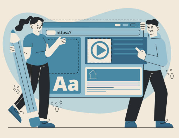
In today’s digital world, where users access web content from various devices such as smartphones, tablets, laptops, and even smart TVs, having a website that can provide a seamless and optimized user experience on any screen size is crucial.
This is where #Responsive_Web_Design comes into play.
This approach means designing a website that automatically and intelligently adapts its layout and visual elements to the user’s screen dimensions.
The main goal is to provide a smooth and flawless experience for every user, regardless of the type of device they are using.
This technique, beyond being an option, has today become a necessity, as the number of users connecting to the internet via mobile is increasing day by day.
Ignoring this need can lead to losing a large portion of potential audiences and customers.
Therefore, it is instructive on how a website should be displayed well on various devices.
In fact, this design method not only helps improve #User_Experience but also plays a key role in optimizing the website for search engines (SEO).
Search engines like Google rank websites with a good mobile user experience higher.
Thus, the importance of this approach is not limited to visual aesthetics but directly impacts the online visibility and success of businesses.
Responsive design allows developers to cover the needs of a wide range of devices with a single codebase, which in itself means saving time and cost.
Do you know that a poor corporate website daily deprives you of many opportunities? Solve this problem forever with professional corporate website design by Rasaweb!
✅ Create a powerful and reliable image for your brand
✅ Attract target customers and increase sales
⚡ [Get Free Website Design Consultation]
2. The Evolution of the Web and the Necessity of Responsive Design

Not long ago, website designs were primarily done for display on desktop monitors and had fixed, specific dimensions.
However, with the unprecedented emergence and expansion of mobile devices and tablets in the last decade, the concept of the web was completely transformed.
Users no longer accessed the internet solely through personal computers; instead, they searched, shopped, and interacted online anytime, anywhere, via their smartphones.
This massive transformation revealed the necessity for a change in the web design approach.
Old websites designed for desktop devices did not display correctly on small mobile screens; content flowed out of bounds, buttons were too small, and users were forced to zoom in and scroll excessively, all of which led to a very poor #User_Experience.
This is where the need for #Responsive_Design emerged as a vital solution.
This need was not just a preference, but a #specialized necessity for maintaining competitiveness in the digital market.
Websites that provided a poor mobile user experience quickly lost their users and experienced high bounce rates.
This paradigm shift forced web developers to move towards a single approach that could intelligently adapt to any screen size, instead of designing multiple different versions of a website for various devices.
This approach transformed the web from a static state to a dynamic and flexible state that can synchronize with any device.
3. Core Principles and Techniques in Responsive Website Design

Responsive website design is built upon three key principles: Fluid Grids, Flexible Images, and Media Queries.
Fluid Grids use relative units like percentages instead of fixed pixel units to define element widths.
This approach ensures that the website’s layout scales up and down proportionally with the screen dimensions.
For example, a column that occupies 50% of the screen width on a desktop will maintain the same ratio on a mobile device, adapting itself to the smaller screen width.
Flexible Images, similarly, use appropriate CSS coding to adjust their dimensions based on the available space, preventing them from overflowing or becoming excessively large.
The most crucial component of this system is #Media_Queries.
This powerful CSS3 tool allows developers to apply different styles based on device characteristics such as screen width, height, orientation (landscape or portrait), and resolution.
For instance, one can specify that if the screen width is less than 768 pixels (typically for tablets and mobiles), website columns should stack vertically instead of side-by-side, or font sizes should be reduced.
These techniques work in harmony to ensure a website can be displayed explanatorily and efficiently on any device.
Below is a table of the core concepts:
| Concept | Explanation | Key Benefit |
|---|---|---|
| Fluid Grids | Using relative units (percentage, em, rem) instead of fixed pixels for layout. | Flexibility and adaptability to different screen sizes. |
| Flexible Images | Automatic resizing of images to fit the available space. | Prevents horizontal scrolling and improves loading. |
| Media Queries | Applying different CSS styles based on device characteristics (width, height, orientation). | Precise control over website display on various devices. |
| Mobile-First | Starting design for the smallest screen and then expanding to larger ones. | Optimizes performance and user experience on mobile. |
4. SEO Benefits and Website Ranking Improvement with Responsive Design
One of the most important reasons to adopt responsive website design is its positive impact on Search Engine Optimization (SEO).
Google and other search engines increasingly prioritize mobile user experience.
Since 2015, Google introduced its “Mobile-Friendly Update” algorithm, which grants higher rankings to responsive and mobile-friendly websites in mobile search results.
This means that if your website is not optimized for mobile, you might lose your ranking in mobile searches, even if you have excellent content.
Having a responsive website means you only have one URL and one codebase, which greatly simplifies website management as well as its #crawling and #indexing by search engines.
This analysis shows that having separate versions (e.g., m.example.com) can lead to duplicate content issues and SEO complexities.
Furthermore, responsive website design leads to a reduction in bounce rate and an increase in user time on site, as users experience a better user experience and are less likely to leave the site quickly.
These factors also indirectly influence the site’s SEO ranking.
Google considers websites where users spend more time and leave less quickly as more useful and grants them a better ranking.
Therefore, investing in this type of design is a smart investment for visibility and growth in the online space.
Does your current website convert visitors into customers or drive them away? Solve this problem forever with professional corporate website design by Rasaweb!
✅ Build strong credibility and branding
✅ Attract target customers and increase sales
⚡ Get a free consultation now!
5. The Impact of Responsive Design on User Experience (UX)

User Experience (UX) is paramount for any website, and responsive website design is one of the main pillars of successful UX.
Imagine a user visiting your website to purchase a product, but the website does not display correctly on their phone: images are out of bounds, buttons are too small to click, and text is unreadable.
Most likely, this user will leave your website and go to a competitor who offers a better experience.
A responsive website, by automatically adapting to any device, ensures that the user, regardless of whether they are using a mobile, tablet, or desktop, experiences easy access to content, simple and seamless navigation, and optimal usability.
This is particularly important in the field of #E-commerce, where ease in the purchasing process can make the difference between a sale and a lost customer.
Responsive design also helps create a consistent brand, as users always experience a unified look and feel, regardless of the device they use.
This design consistency leads to strengthening #trust and #brand_recognition.
This approach is, in fact, a comprehensive guide to enhancing customer satisfaction and loyalty.
Today’s users have high expectations, and any flaw in the user experience can quickly discourage them.
A responsive design not only meets technical requirements but actively helps enhance user interaction with content and leads to an increase in conversion rates.
This means more profit for your business.
6. Challenges and Solutions in Implementing Responsive Design

Although responsive website design offers many benefits, its implementation also comes with challenges that developers must address.
One of the main challenges is image optimization.
High-quality images designed for desktop may load slowly on mobile, disrupting the user experience.
The solution to this problem is to use responsive image techniques such as the `srcset` attribute in HTML or using CDNs to deliver optimized images for each device.
Another challenge is content management.
Sometimes, too much content can appear cluttered on small mobile screens.
In these cases, techniques such as “smart hiding” of certain elements or using accordions for progressive content display can be employed.
Further explanation regarding challenges includes the complexity of navigation menus on mobile.
Traditional desktop menus take up a lot of space on mobile.
Common solutions include hamburger menus, slide-out menus, or bottom navigation.
Additionally, ensuring page load speed on mobile devices is very important.
This can be achieved by optimizing code, compressing files, and using caching.
These challenges compel developers to think professionally to find creative and efficient solutions for providing the best user experience across all devices.
Finally, continuous testing of the website on various devices and browsers is crucial to ensure its correct and optimal performance.
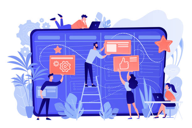
7. Popular Tools and Frameworks in Responsive Website Design

To facilitate the responsive website design process, numerous tools and frameworks have been developed that greatly simplify the work for web designers and developers.
One of the most well-known and widely used is Bootstrap.
Bootstrap is a CSS, HTML, and JavaScript framework that includes a collection of design templates for typography, forms, buttons, tables, navigations, and other UI components.
This framework is designed with a “Mobile-First” approach and provides powerful tools for creating responsive layouts.
Others include CSS Grid Layout and Flexbox.
These two CSS modules offer powerful approaches for organizing and arranging elements on web pages and provide very precise control over responsive layouts.
Flexbox is excellent for one-dimensional layouts (row or column), while CSS Grid is ideal for more complex two-dimensional layouts (rows and columns).
For managing responsive images, tools like Picturefill or using CDNs like Cloudinary and Imgix are helpful.
These tools, by providing comprehensive guidance and pre-built code, enable designers to build responsive websites with higher speed and efficiency.
The choice of the appropriate framework or tool depends on the project’s needs and the development team’s preferences, but all of them are designed with the common goal of facilitating the creation of websites compatible with any device.
Below is a table of common tools:
| Tool/Framework Name | Type | Key Feature |
|---|---|---|
| Bootstrap | CSS/JS Framework | Strong Grid System, Ready-to-use UI Components, Mobile-First. |
| Tailwind CSS | Utility-First CSS Framework | High Flexibility, Optimized Compilation, Low CSS file size. |
| CSS Flexbox | CSS Module | One-dimensional element layout, space distribution and alignment. |
| CSS Grid Layout | CSS Module | Two-dimensional element layout, complex page structuring. |
8. The Future of Web Design and the Enduring Role of Responsive Design

The future of web design is moving towards more immersive and personalized user experiences, but the role of responsive website design will remain central.
With the advent of new technologies such as Virtual Reality (VR) and Augmented Reality (AR), as well as the expansion of the Internet of Things (IoT), new challenges arise for displaying content on diverse devices.
However, the basic principles of responsiveness – flexibility and environmental adaptability – will continue to be instrumental.
It is predicted that the “Mobile-First” approach will not only persist but evolve into “Content-First” or “User-First,” meaning that design will first focus on content and user needs, and then its layout will be optimized for various devices.
This is important news for developers who must constantly keep themselves updated.
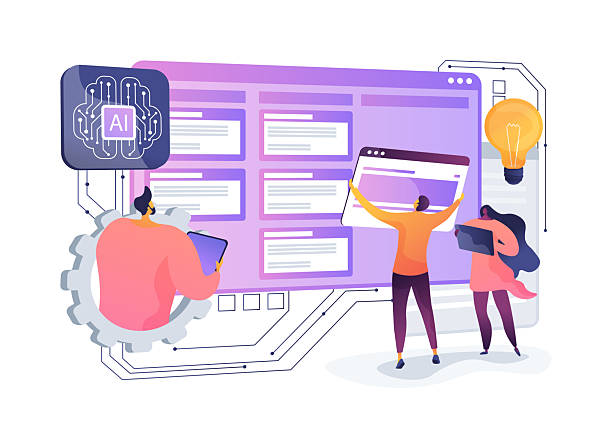
Artificial intelligence and machine learning can also play a significant role in responsive design in the future, with capabilities such as automatic layout and content optimization based on user behavior and device type.
Responsive website design is not just a trend but a fundamental paradigm in web design that prepares websites for an unknown future of devices and form factors.
With the increasing growth of Wearables and flexible displays, the need for design flexibility will never diminish; instead, it will gain more importance.
Did you know that poor online store design can drive away up to 70% of your potential customers? Rasaweb revolutionizes your sales with professional and user-friendly e-commerce website designs.
✅ Significant increase in sales and revenue
✅ Full optimization for search engines and mobile
⚡ [Get Free Consultation from Rasaweb Now!]
9. Is Your Website Ready for the Future? (Provocative Content)
At this stage, perhaps this provocative_content will form in your mind: Is my current website truly ready to face the challenges of the multi-device world? Are my users receiving the best possible experience on every device? To answer these questions, you can use various online tools such as Google’s Mobile-Friendly Test, which shows you whether your website is mobile-friendly according to Google.
Additionally, you should pay attention to metrics such as mobile user bounce rate, time spent on site, and conversion rates across different devices.
If these statistics are lower on mobile than on desktop, it indicates a problem with your mobile user experience.
Ignoring this issue not only harms your SEO but can also lead to lost sales and brand credibility.
Transitioning to a responsive website design might seem costly or time-consuming at first, but its long-term return on investment will be significant.
Consider how much of your website traffic comes from mobile and how many potential customers you are losing due to lack of compatibility.
This is not just an analysis of the current situation but a call to action to plan for the future of your website.
Are you ready to elevate your website to a higher level of performance and user satisfaction?
10. Conclusion: Responsive Design, the Backbone of the Modern Web

Ultimately, it can be said that responsive website design is no longer a luxury option but the backbone of the modern web.
With the continuous growth of smart devices and the increasing diversity of screen sizes, a website’s ability to adapt and provide a seamless and enjoyable user experience on any platform has become more important than ever.
From improving #SEO and increasing visibility in search engines to strengthening #brand and boosting conversion rates, the benefits of this approach are undeniable.
Investing in responsive website design not only addresses current user needs but also prepares your website for a future that introduces new devices every day.
This is an entertaining yet the most #specialized method to ensure that your business or idea is always accessible to the audience and delivers their digital experience in the best possible way.
In summary, responsive website design is not just about adapting to screen dimensions, but about designing with the #audience as a priority, so they can easily access information and interact with your website anytime, anywhere.
The future of the web is in the hands of websites that can adapt to any environment, and responsive design is the key to this adaptability.
Frequently Asked Questions
| Question | Answer |
|---|---|
| What is responsive website design? | A web design method that automatically adjusts and optimizes the layout and content of a website for display on various devices (mobile, tablet, desktop). |
| Why is responsive design important? | Due to the variety of devices users employ to access the web; better user experience, stronger SEO, and reduced bounce rate are among its benefits. |
| What are the main techniques in responsive design? | Using Media Queries in CSS, Fluid Grids, and Flexible Images. |
| What is a Media Query? | A CSS rule that allows you to apply different styles based on device characteristics (such as screen width, height, display orientation). |
| Is responsive design different from Mobile-First design? | Mobile-First is an approach within responsive design that initially designs the site for the smallest screen (mobile) and then gradually improves it for larger screens. |
And other services of Rasaweb Advertising Agency in the field of advertising
Smart Direct Marketing: Revolutionize click-through rates with Google Ads management.
Smart Marketing Automation: A professional solution for increasing website visits, focusing on customizing user experience.
Smart UI/UX: Professional optimization for campaign management using real data.
Smart Website Development: A dedicated service for online growth based on precise audience targeting.
Smart Digital Advertising: An innovative platform for improving customer acquisition with custom programming.
And over hundreds of other services in the field of internet advertising, advertising consultation, and organizational solutions
Internet Advertising | Advertising Strategy | Advertorial
Sources
What is Responsive Design?
Future Trends in Website Design
Comprehensive Guide to Responsive Website Design
The Evolution and Future of the Internet
? For your business to thrive in the digital world, Rasaweb Afarin, with its comprehensive and specialized services including custom website design, SEO, and content marketing, paves your path to growth. Experience a powerful and targeted online presence with us.
📍 Tehran, Mirdamad Street, next to Bank Markazi, Southern Kazeroon Alley, Ramin Alley, No. 6


