
An Introduction to Responsive Website Design: A Necessity in Today’s World
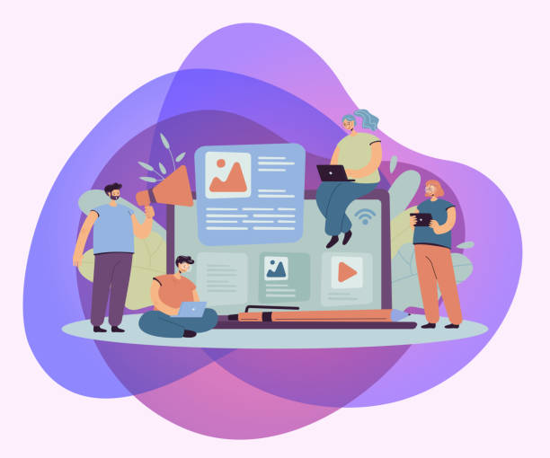
In today’s digital world, #responsive_website_design is no longer a luxury, but a vital necessity.
This design approach ensures that your website is displayed in the best possible way on any device, from smartphones to tablets and desktops.
This means a seamless user experience that attracts and satisfies your website visitors.
The main goal of #responsive_design is to provide a single, optimized experience for all users, regardless of their screen size.
This concept forms the foundation of accessibility and efficiency in the modern web space.
Websites that are not designed this way quickly fall behind the competition in today’s world.
It is important to understand that this is not just about appearance, but deeply connected to your site’s functionality and dynamism.
This approach allows your content to be properly adjusted and readable.
From an #SEO perspective, Google also prioritizes responsive websites and gives them a better ranking.
This directly affects the visibility of your business in search results.
Our team specializes in #responsive_web_design and is ready to provide you with comprehensive guidance.
Stay with us to delve into this vital topic and examine its importance from various angles.
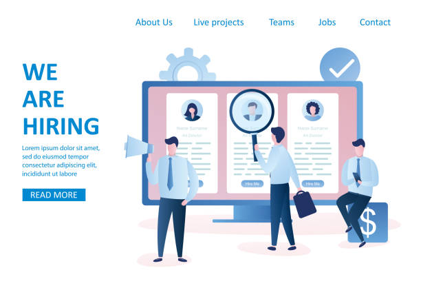
Does your current corporate website provide a worthy image of your brand and attract new customers?
If not, turn this challenge into an opportunity with Rasaweb’s professional corporate website design services.
✅ Significantly improves your brand credibility and image.
✅ Paves the way for attracting new leads and customers.
⚡ For free and specialized consultation, contact Rasaweb now!
History and Evolution of Responsive Web Design

The concept of Responsive Web Design was first introduced by #Ethan_Marcotte in 2010.
Before that, web developers had to design separate versions of websites for desktop and mobile, which was a costly and complex process.
With the increasing use of mobile devices and tablets with various screen sizes, the need for an integrated and flexible solution was felt more than ever.
Marcotte revolutionized this field by introducing three key elements – flexible grids, flexible images, and media queries.
Flexible grids allow page layouts to dynamically adapt to available space.
Flexible images ensure that images are displayed without loss of quality and at the appropriate size on any device.
Media queries, an integral part of #responsive_website_design, allow developers to apply different CSS rules based on device characteristics (such as screen width, orientation, and resolution).
These advancements simplified the web development process and significantly improved the user experience.
Today, #responsive_web_design has become an industry standard.
This approach not only saves time and money but also makes website maintenance easier.
This was a significant and #newsworthy development in the web industry that changed the direction of future designs.
Key Principles and Implementation Techniques of Responsive Design

To effectively implement #responsive_website_design, understanding and applying specific principles is essential.
The three main principles include flexible grids, flexible images and media, and the use of Media Queries in CSS.
Flexible grids mean using relative units such as percentages for element widths instead of fixed pixel units.
This allows the page layout to automatically adjust as the device screen size changes.
Flexible images and media should also be optimized to scale with their container size.
For this purpose, the `max-width: 100%;` property is usually used for images to ensure that they do not exceed the width of their parent element.
Media Queries are the most important tool in #responsive_design.
They allow designers to apply different styling rules based on specific device characteristics such as screen width, height, orientation (portrait or landscape), and even resolution.
For example, it can be determined that fonts become smaller or columns stack instead of being side-by-side on smaller screens.
This #specialized method provides precise customization of the user experience.
| Element | Description | Benefit for Responsiveness |
|---|---|---|
| Flexible Grids | Use of relative units (percentages, em, rem) instead of fixed pixels. | Dynamic adaptation to any screen size. |
| Flexible Images and Media | Automatic adjustment of image and video sizes based on available space. | Prevents horizontal scrolling and maintains visual appeal. |
| Media Queries | Apply different CSS styles based on device characteristics (width, height, type). | Enables full customization of appearance and user experience on different devices. |
| Mobile-First Approach | Start designing from the smallest screen and then expand to larger ones. | Optimizing performance and content for mobile devices from the beginning. |
These three elements form the foundation of any responsive website, and adherence to them is vital for any developer intending to do #responsive_web_design.
Benefits of Responsive Design for Users and SEO
Responsive website design offers numerous benefits for both users and search engine optimization (SEO).
From a user perspective, the most important benefit is improved user experience (UX).
A responsive site ensures that users can easily view, read, and interact with content, regardless of the device they are using.
This leads to a reduction in bounce rate and an increase in user time spent on the site.
Users are more satisfied with websites that do not require zooming, horizontal scrolling, or complex navigation.
This satisfaction ultimately leads to increased engagement, conversion, and customer loyalty.
From an SEO perspective, #responsive_website_design is preferred by search engines like Google.
Google has explicitly stated that it favors responsive websites over separate mobile versions.
This means that a responsive website has a better chance of ranking higher in mobile search results.
Having a single URL for all devices also helps prevent duplicate content issues and makes the crawling and indexing process easier for search engines.
A website that loads optimally and quickly provides a better experience, and this is also an important ranking factor in Google.
In other words, #responsive_design not only makes your users happy but also shows search engines that your website is a reliable and user-friendly resource.
This is an #analytical investment that will bring high returns for your business.
Did you know that poor online store design can drive away up to 70% of your potential customers? Rasaweb transforms your sales with professional and user-friendly e-commerce website designs.
✅ Significant increase in sales and revenue
✅ Full optimization for search engines and mobile
⚡ [Get free consultation from Rasaweb now!]
Popular Tools and Frameworks in Responsive Design

To facilitate and speed up the #responsive_website_design process, numerous tools and frameworks have been developed to assist designers and developers.
One of the most popular and well-known of these frameworks is #Bootstrap.
Bootstrap is a free and open-source Front-end framework that includes HTML and CSS-based design templates for typography, forms, buttons, navigation, and other UI components.
This framework makes building responsive layouts very easy due to its 12-column grid system.
Other popular frameworks include Foundation and Bulma, each with their own features and approaches.
In addition to frameworks, native CSS3 features like Flexbox and CSS Grid also play a vital role in #responsive_design.
#Flexbox is very efficient for designing one-dimensional layouts (e.g., rows or columns) and easily allows for space distribution and item alignment.
#CSS_Grid offers a more powerful approach for two-dimensional layouts and allows you to create more complex layouts with greater ease.
These #specialized tools and techniques enable designers to create flexible and dynamic user experiences.
Using these tools makes the #educational process of responsive website design an efficient and enjoyable experience for both beginners and professionals.
Familiarity with these tools is essential for anyone who wants to work in web design.
Common Challenges and Solutions in Responsive Design

Despite its many advantages, #responsive_website_design also comes with challenges that developers must be aware of and find appropriate solutions for.
One of the most important challenges is performance management.
Responsive websites can slow down due to loading heavy content (such as high-resolution images) for all devices, even those that do not require that resolution.
The solution to this problem is to use image optimization techniques such as #responsive_images using the `srcset` or `picture` attribute in HTML, which allows the browser to load the best image size based on the user’s device.
Another challenge is the complexity of testing and debugging.
Testing a website across hundreds of different combinations of screen size, browser, and device can be time-consuming.
Using browser development tools like Responsive Mode in Chrome DevTools, as well as automated testing services like BrowserStack, can help with this challenge.
Bulky content and complex design can also be problematic.
To prevent clutter and user confusion on small screens, the #Mobile-First approach should be considered, showing only essential content initially.
Compatibility with legacy browsers is also an issue, as some CSS3 features may not be supported in them.
Using Polyfills and tools like Autoprefixer can solve this problem.
These issues show that #responsive_design goes beyond simply resizing elements; rather, it is a comprehensive approach to providing the best experience in all conditions.
This section provides #practical_guidance for dealing with problems.
Comparison of Mobile-First and Desktop-First Approaches
In #responsive_website_design, there are two main approaches to starting design: Mobile-First and Desktop-First.
The Desktop-First approach, as its name suggests, means starting the design for larger screens (desktop) and then scaling it down for smaller devices.
This method is more traditional and was the dominant approach for years.
However, it can lead to complex and heavy code as it requires overriding desktop styles for mobile.
In contrast, the #Mobile-First approach is based on the idea of starting the design from the smallest screen size and then gradually enhancing it for larger screens (using `min-width` in Media Queries).
This approach is recommended by Google and many web professionals.
Its main advantage is that it forces you to focus on essential content and optimal performance from the outset, as there is limited space on mobile devices.
This results in a lighter and faster website, which is crucial for mobile users who typically have slower internet connections.
| Feature | Mobile-First Approach | Desktop-First Approach |
|---|---|---|
| Design Starting Point | Smallest screen (mobile) | Largest screen (desktop) |
| Media Queries | Uses `min-width` | Uses `max-width` |
| Performance | Usually faster and more optimized for mobile | May be slower on mobile |
| Content Focus | Focus on essential and functional content | May carry non-essential content for mobile |
| Code Complexity | Cleaner code with less need for overrides | May have a lot of override code |
The #specialized Mobile-First approach is generally recommended, as it offers long-term benefits for businesses given the increase in mobile traffic and Google’s emphasis on mobile-first indexing.
This is a #thought-provoking content whose correct choice can guarantee the future of your website.
Future Trends in Responsive Design
The field of #responsive_website_design is constantly evolving, and new trends are emerging that shape the future of this domain.
One of the most important future trends is #Adaptive_Design, which, although different from responsive, complements it and allows the website to load different content based on specific device characteristics.
This could include images of different qualities or even completely different user interface components.
The increasing use of Artificial Intelligence (AI) and Machine Learning in web design is also a promising trend.
For example, AI can automatically optimize layouts based on user behavior or provide personalized content for each device.
#Progressive_Web_Apps (PWA) technology will also play a significant role in the future of #responsive_design.
PWAs offer a combination of the best features of web and native applications, including offline functionality, push notifications, and quick access from the device’s home screen.
This significantly improves the user experience.
Attention to #Accessibility is also increasing.
Future responsive websites must be more accessible than ever for people with disabilities, including users with visual or motor impairments.
Emerging technologies such as Augmented Reality (AR) and Virtual Reality (VR) may also influence how we interact with websites in the near future and create the need for new responsive approaches.
This is exciting #news for designers and developers, as it opens up new opportunities to create creative and #engaging web experiences.
Tired of losing business opportunities due to not having a professional corporate website? Don’t worry anymore! With Rasaweb’s corporate website design services:
✅ Your brand’s credibility and professionalism will increase.
✅ You will attract more customers and sales leads.
⚡ Get a free consultation now to start!
Practical Steps for Implementing Responsive Design
Implementing #responsive_website_design is a step-by-step process that requires careful planning and correct execution.
The first step is #planning and research.
You need to identify your audience and the devices they use.
What screen sizes are most important to you?
What content should be prioritized for each device?
This stage involves gathering information and defining requirements.
The second step is choosing the right approach.
As discussed earlier, the #Mobile-First approach is generally recommended, as it optimizes the design for small devices from the ground up.
This results in a lighter and faster website and provides a better user experience.
The third step is selecting tools and frameworks.
You can use frameworks like Bootstrap or Foundation, or create completely custom designs using CSS Grid and Flexbox.
Choosing the right tools depends on the complexity of the project and your team’s skills.
The fourth step is implementing the design.
This includes writing HTML and CSS code, using media queries, optimizing images and fonts, and ensuring browser compatibility.
Paying attention to site loading speed is also crucial at this stage.
The fifth step is continuous testing and optimization.
Test the website on different devices and browsers to ensure its correct functionality.
Use tools like Google PageSpeed Insights to check performance and identify weaknesses.
Continuous optimization based on user feedback and analytical data is key to long-term success.
This is a comprehensive #educational #guide for anyone looking to create a fully responsive website.
Frequently Asked Questions
| Question | Answer |
|---|---|
| What is Responsive Web Design? | It is a method of website design that ensures web pages are displayed correctly and legibly on various devices and screen sizes (such as desktops, tablets, and mobiles). |
| Why is Responsive Website Design important? | It improves user experience across different devices, increases search engine rankings (SEO), and saves time and money compared to building separate mobile or tablet versions. |
| What technologies are used in Responsive Design? | The main technologies include HTML for structure, CSS for styling (especially Media Queries), and the use of flexible images and grids. |
| What is a Media Query? | A Media Query is a CSS technique that allows applying different styles based on the characteristics of the device the user is using (such as screen width, orientation, and resolution). |
| What is the Mobile First concept in Responsive Design? | It means starting the design and development of the site first for mobile devices with small screens, and then scaling it up for larger devices (such as tablets and desktops). This method ensures a focus on the user experience on small devices. |
And other services of Rasa Web Advertising Agency in the field of advertising
Professional website design for kitchen appliance manufacturing companies
Examining the role of discounts and special offers in increasing online sales
How to increase customer trust in the virtual space?
Analyzing consumer behavior in purchasing kitchen appliances online
Reviewing new content marketing methods for the home appliance industry
And over hundreds of other services in the field of internet advertising, advertising consultation, and organizational solutions
Internet Advertising | Advertising Strategy | Advertorials
🚀 Transform your business’s digital presence with Rasaweb’s internet advertising strategies and advertorials.
📍 Tehran, Mirdamad Street, next to Bank Markazi, Kazerun Jonubi Alley, Ramin Alley, No. 6

