
An Introduction to Responsive Web Design and its Importance in the Digital Age

In today’s world, where technology is advancing at a breathtaking pace and internet access through various devices such as #mobile, #tablet, #laptop, and even smartwatches has become commonplace, Responsive Web Design is no longer an option, but an undeniable necessity.
This approach means building a website that can adapt its appearance and functionality to the user’s screen size, providing the best possible user experience regardless of the device.
Before the emergence of this concept, websites were typically designed for desktop display and would offer an unpleasant experience on smaller devices.
This included unnecessary horizontal scrolling, oversized or excessively small images, and unclickable buttons.
Web design today must be flexible.
The main concept in Responsive Web Design is that content and page elements automatically resize and rearrange to be compatible with any device.
This not only improves user experience (UX) but also directly impacts SEO (Search Engine Optimization).
Google prefers responsive websites in its search results because they provide a better experience for mobile users.
One of the most important reasons for the importance of Responsive Web Design is the change in user behavior.
With the increasing use of smartphones and tablets for internet access, having a website that displays well on any device is crucial.
This makes it easier for users to interact with your website and increases your conversion rate.
In fact, Responsive Web Design has numerous benefits not only for users but also for businesses.
These benefits include saving time and maintenance costs (only one website is needed instead of two separate ones for desktop and mobile), increasing access to a wider audience, and improving search engine rankings.
In this article, we will delve deeper into various aspects of Responsive Web Design and provide practical guidelines for its implementation.
A correct understanding of these principles can transform your business in the online space and help you lead in the intense digital competition.
This approach means creating a single website that adapts itself to changes in screen dimensions instead of separate designs for each device.
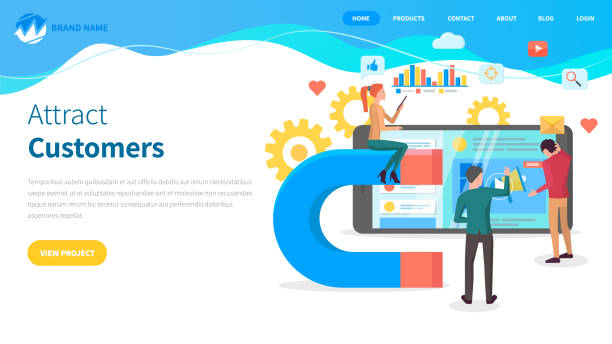
Tired of losing business opportunities due to not having a professional corporate website? Worry no more! With Rasaweb’s corporate website design services:
✅ Your brand’s credibility and professionalism will increase.
✅ You will attract more customers and sales leads.
⚡ Get a free consultation right now to get started!
Web Evolution and the Necessity of Responsive Websites
Rapid developments in the digital world, from the emergence of smartphones to the proliferation of tablets and wearable gadgets, have completely transformed the web landscape.
In the past, most users accessed the web via personal computers, and website design primarily focused on desktop screen dimensions.
However, with the mobile revolution, this situation completely changed.
Today, a significant percentage of web traffic comes from mobile devices, and this trend continues to increase.
This paradigm shift highlighted the need for a re-evaluation of website design methods more than ever.
Websites that were not optimized for mobile devices faced numerous problems; from extremely small and unreadable fonts to difficult-to-click buttons and distorted layouts.
These issues quickly led to a poor user experience and, consequently, the loss of visitors and customers.
In response to this challenge, the concept of Responsive Web Design was introduced by Ethan Marcotte in 2010 and quickly became an industry standard.
This approach is based on three key principles: flexible grids, flexible images, and Media Queries.
These principles allow developers to build websites that intelligently adapt to the user’s screen size and orientation.
For example, on a wide screen, content might be displayed in multiple columns, whereas on a mobile screen, the same content is organized in a single column with larger fonts for better readability.
This adaptability optimizes the user experience and ensures that, regardless of the device used, the user always has full and easy access to the content they need.
Furthermore, search engines like Google prefer responsive websites in their rankings, as these websites provide a better experience for mobile users and prevent SEO issues such as duplicate content.
The adoption of Responsive Web Design is not merely a passing trend, but a logical response to the evolution of user behavior and new technologies.
This approach enables businesses to have an effective presence across all platforms with a single investment and benefit from it in attracting and retaining customers.
Adaptive websites are shaping the future of the web.
Fundamental Principles and Techniques in Responsive Web Design

At the heart of Responsive Web Design lies a set of fundamental principles and techniques that enable websites to adapt to any screen size.
Understanding and correctly implementing these principles is key to successfully building an efficient responsive website.
The first and perhaps most important principle is the use of Media Queries.
Media queries allow you to apply different CSS rules based on device characteristics such as width, height, screen type, or orientation.
For example, you can define that for screens with a width less than 768 pixels, the website layout changes to a single column and fonts become larger, while for larger screens, the multi-column layout remains.
This flexibility allows designers to provide different visual experiences for different users.
The second vital principle is Fluid Grids.
Instead of using fixed pixel widths, relative units like percentages are used to define the width of elements.
This means that the width of a column or a section of the page, instead of being a fixed value, will be a function of the total screen width.
For instance, if a column occupies 50 percent of the total page width, regardless of whether the total page width is 1000 pixels or 320 pixels, it will always cover half of it.
This approach ensures that the website layout does not break at any size and the available space is used optimally.
The third important principle is Flexible Images.
Images can often cause layout problems in responsive design if their size is fixed and they overflow their container.
By using CSS, you can ensure that images never exceed the width of their parent container.
This is typically done by setting `max-width: 100%;` and `height: auto;` for `img` tags.
This setting makes images automatically adapt to the available space and prevents layout disruption.
Additionally, techniques such as using the `srcset` attribute in HTML5 to provide images with different resolutions based on screen size or pixel density help improve website performance and loading speed.
These three principles are the foundation of any successful Responsive Web Design, and a deep understanding of them is essential for any web developer.
For a better understanding, consider this table comparing design approaches:
| Feature | Responsive Design | Fixed Design | Adaptive Design |
|---|---|---|---|
| Number of Versions | One version for all devices | One version for desktop | Multiple versions based on breakpoints |
| Flexibility | Very High (Fluid and continuous) | Low (Fixed) | Medium (Only at specific points) |
| Implementation | Media queries, fluid grid, fluid images | Fixed pixel width | Media queries at specific points, fixed layouts |
| Maintenance | Easier (one codebase) | Harder (requires separate mobile version) | Medium (managing multiple layouts) |
| User Experience | Optimal across all sizes | Poor on small devices | Optimal at designed breakpoints |
Unparalleled Benefits of Responsive Design for User Experience and SEO

Responsive Web Design has not only become a technical standard but has also gained a special place due to its unparalleled benefits for User Experience (UX) and Search Engine Optimization (SEO).
From a user experience perspective, a responsive website allows users—regardless of the device they are using, whether it’s a small smartphone, a medium tablet, or a large desktop monitor—to easily and comfortably access and interact with content without the need for zooming, horizontal scrolling, or struggling to find small elements.
This consistency in experience increases user satisfaction, reduces the Bounce Rate, and increases time spent on the site.
When users have a good experience with your website, they are more likely to return and become loyal customers.
From an SEO standpoint, Responsive Web Design offers significant advantages that help improve your website’s ranking in search engines.
The most important benefit is that Google and other search engines prefer mobile-friendly websites.
In fact, since 2015, Google has updated its algorithms such that responsive websites achieve higher rankings in mobile search results.
The reason for this is simple: Google wants to provide the best experience for its users, and websites that display well on various devices fulfill this goal.
One another SEO advantage of Responsive Web Design is easier URL management.
With a responsive website, you only have one URL for each page that is consistent across all devices.
This prevents the creation of duplicate content, which can harm your SEO, and also simplifies the crawling and indexing process for search engines.
Instead of search engines having to crawl two versions of a page (one for desktop and one for mobile) to crawl, they process only one version, which increases crawling efficiency and better allocation of the crawl budget.
Finally, page loading speed is also an important factor in SEO and user experience.
A properly optimized responsive website can have better loading speeds on mobile devices, especially if techniques such as optimized image loading for smaller devices are used.
All these factors together make Responsive Web Design an essential investment for any business seeking success in the online space.
Are you falling behind in the competition with large online stores?
Rasaweb, with its professional e-commerce website design, brings your business online and increases your market share!
✅ Boost brand credibility and customer trust
✅ Easy shopping experience leading to more sales
⚡ Act now to get a free website design consultation!
Popular Tools and Frameworks for Responsive Website Design

To effectively implement Responsive Web Design, web developers and designers utilize numerous tools and frameworks that simplify and accelerate the process.
These tools provide ready-made functionalities and features that help websites quickly move towards responsiveness.
One of the most well-known and widely used front-end frameworks is Bootstrap.
Bootstrap is a CSS, HTML, and JavaScript framework that includes pre-designed components for typography, forms, buttons, tables, navigations, and many other user interface elements.
This framework is built upon a Mobile-First approach and features a 12-column responsive grid system that makes it easy to create different layouts for various screen sizes using CSS classes.
Its ease of use and strong documentation make it an ideal choice for many projects.
ZURB Foundation is another powerful framework for Responsive Web Design, offering more flexibility than Bootstrap and being more suitable for larger and more custom projects.
This framework is also built on a responsive grid and UI components.
In addition to comprehensive frameworks, fundamental CSS technologies also play a crucial role in responsive design.
CSS Flexbox and CSS Grid are two powerful CSS modules in CSS that offer new and efficient ways to lay out elements on web pages.
Flexbox is ideal for one-dimensional layouts (a single row or column), while Grid Layout provides more precise control over two-dimensional layouts (rows and columns).
These two modules together can be used very powerfully to create complex yet fully responsive layouts, without the need for large frameworks.
Furthermore, responsive testing tools are also vital to ensure the correct functioning of Responsive Web Design.
Modern browsers like Chrome, Firefox, and Edge have Developer Tools that allow you to simulate your website on various screen sizes.
These tools help developers quickly identify and fix layout issues.
By intelligently using these frameworks and native CSS tools, websites can be built that are not only beautiful and efficient but also provide a flawless user experience on any device.
The choice of appropriate tools depends on the project’s complexity, the development team’s needs, and the required level of customization.
Common Challenges and Solutions in Implementing Responsive Design

Responsive Web Design, despite its numerous advantages, is not without challenges.
Its correct implementation requires a deep understanding of techniques and anticipating potential problems.
One of the biggest challenges is website performance management, especially on mobile devices.
Responsive websites can sometimes become heavy because they must deliver content and images for a wide range of devices.
This can lead to slow loading speeds, which disrupts the user experience and negatively impacts SEO.
The solution to this problem involves optimizing images (such as compression, using next-gen formats like WebP, and serving images with appropriate resolution for each device using `srcset` or `picture` tags), lazy loading of non-essential elements, and compressing CSS and JavaScript files.
Additionally, using a Content Delivery Network (CDN) can help increase loading speed for users in different geographical regions.
Another challenge is testing and ensuring compatibility across different devices.
Given the countless variations of devices, browsers, and screen sizes, ensuring that the website displays correctly under all conditions can be difficult.
Using browser emulators (like Chrome’s developer tools) is helpful, but it doesn’t replace real testing on physical devices.
Establishing a precise testing process that includes testing on real devices and various browsers is essential.
Also, cloud testing platforms like BrowserStack or CrossBrowserTesting can be helpful in this regard.
The third major challenge is managing interactive content such as maps, videos, and forms across different screen sizes.
These elements must be designed to be usable and readable at any screen size.
For videos, a fixed aspect ratio can be used with CSS to ensure the video always scales proportionally to its container’s width.
For forms, designing single-column and simpler forms for mobile and using larger input fields for easy tapping is important.
Finally, adapting the design for older browsers can also be a challenge, as some CSS features like Flexbox or Grid might not be fully supported.
Using Polyfills or the “Progressive Enhancement” approach, where the design is first built for basic browsers and then advanced features are added for modern browsers, can solve this problem.
With a conscious and strategic approach, these challenges can be overcome, and a successful Responsive Web Design can be implemented.
Future Trends and Beyond Responsive Design

While Responsive Web Design has been established as a golden standard in modern web development, the web landscape is continuously evolving, and new trends are emerging that go beyond mere responsiveness.
These trends aim to provide even better, faster, and smarter user experiences.
One such concept is Adaptive Design.
While responsive design offers a single website that fluidly adapts itself, adaptive design creates a set of fixed layouts for specific and common device breakpoints (e.g., 320, 768, 1024 pixels) and loads the best layout based on the user’s device width.
This approach can, in some cases, lead to faster loading and more precise control over the appearance at specific sizes, but its maintenance is more complex than a fully responsive website.
Another important trend is the Mobile-First approach in design.
This approach means starting the design and development process with the smallest screen size (mobile) and then expanding the design towards larger screens (tablet and desktop).
The philosophy behind this approach is that designing for mobile constraints forces developers to focus on essential content and core functionality, preventing information overload.
This, in turn, leads to lighter, faster, and more focused websites that provide a better user experience across all devices.
Google also prefers this approach in its mobile-first indexing.
Progressive Web Apps (PWAs) are also a step beyond Responsive Web Design.
PWAs are websites that offer native app-like capabilities, such as offline functionality, push notifications, and adding to the home screen.
These technologies, using Service Workers and Web App Manifest, provide a much richer user experience that can bridge the gap between websites and native applications.
Furthermore, the emergence of Voice User Interfaces (VUIs) and Virtual/Augmented Reality (VR/AR) promises a future where interacting with the web through a screen will be just one of many access methods.
In this changing world, adaptive websites must also be able to adapt to these new forms of interaction.
These developments show that Responsive Web Design will remain the foundation, but it will evolve by adding layers of intelligence and advanced capabilities.
Here’s a look at technologies that go beyond responsive design:
| Technology | Brief Description | Key Benefit |
|---|---|---|
| Mobile-First Design | Designing first for the smallest screen, then expanding | Focus on core content and functionality, faster speed |
| Progressive Web Apps (PWAs) | Websites with native app capabilities (offline, push notifications) | App-like user experience, increased engagement |
| Accelerated Mobile Pages (AMP) | A framework for building extremely fast mobile pages | Instant content loading, optimized for news |
| Voice User Interfaces (VUIs) | Web interaction via voice (e.g., voice assistants) | High accessibility, hands-free experience |
| Virtual/Augmented Reality (VR/AR) | Integration of web content with virtual or real environments | Immersive experience, novel applications |
Best Practices for Effective Responsive Design Implementation

To ensure that your Responsive Web Design not only looks good but also performs flawlessly across different devices, adhering to best practices and development techniques is essential.
The first and most important principle is the Mobile-First approach.
Instead of designing for desktop first and then trying to condense it for mobile, start with the smallest screen size.
This approach forces you to focus on essential content and critical functionalities, preventing unnecessary clutter.
This not only helps improve performance but also simplifies the design and development process.
After designing for mobile, gradually add more complex features and layouts for tablets and desktops.
Secondly, smart use of Media Queries is crucial.
Media queries are the main tool for defining breakpoints in responsive design, but they must be used carefully.
Instead of defining breakpoints based on specific device dimensions (e.g., 768px for a tablet), it’s better to determine breakpoints based on when your website’s layout starts to break.
This “content-driven” approach ensures that your website displays correctly at any screen size, even those not predefined.
Also, using relative units like percentages, `em`, and `rem` for fonts and spacing, instead of fixed pixel units, significantly increases your design’s flexibility and ensures text and elements scale well at any size.
Thirdly, optimizing images and media is vital.
Large and unoptimized images can severely impact your website’s loading speed.
To counteract this, use techniques such as image compression, modern image formats (like WebP), and most importantly, leverage the `srcset` and `
Also, for videos, ensure they load responsively and maintain their aspect ratio.
Finally, continuous and comprehensive testing is of paramount importance.
Regularly test your website across different browsers and devices (mobile, tablet, desktop) and at various screen sizes.
Browser developer tools and cross-browser testing services can be extremely useful in this regard.
Following these practices will help you create a strong and sustainable Responsive Web Design that looks and functions excellently on any device and supports your business goals.
Frustrated with your e-commerce site’s low conversion rate? Rasaweb transforms your e-commerce site into a powerful tool for attracting and converting customers!
✅ Significant increase in visitor-to-buyer conversion rate
✅ Exceptional user experience to boost customer satisfaction and loyalty⚡ Get a free consultation from Rasaweb now!
Case Studies and Success Stories of Responsive Design

Responsive Web Design is no longer an abstract concept; it is a tangible reality in the web world, and many large and small companies have achieved significant success by successfully implementing it, transforming their user experience.
Reviewing these examples can be inspiring and provide valuable practical lessons for future implementations.
One of the best early and still inspiring examples is The New York Times website.
This website was a pioneer of responsive design in the news industry.
Through fluid layouts, flexible images, and intelligent use of media queries, they managed to provide a seamless reading experience across various devices, from small phones to large desktops.
This initiative helped them retain their audience during the mobile transition and increase their traffic from diverse devices.
Another example is the Microsoft website.
Microsoft, with a fully responsive website, not only presents its products and services attractively but also features a very clean and user-friendly interface that works well at any size.
Their design clearly demonstrates how to organize a website with abundant and diverse content in a way that is navigable and usable even on small devices.
Responsive Web Design at this level goes beyond merely resizing elements and includes rethinking the interaction experience for each screen size.
Shopify, the popular platform for building online stores, is also an excellent example of Responsive Web Design implementation.
Since Shopify’s customers build their own e-commerce websites, it’s essential that their core platform functions well on all devices.
Shopify’s responsive design ensures that both business owners and their customers can easily use the platform, whether they are managing inventory via a tablet or shopping from an online store on their smartphone.
This directly impacts store conversion rates and overall user satisfaction.
These examples show that Responsive Web Design is a powerful strategy for increasing accessibility, improving user experience, and ultimately achieving business goals in the digital world.
These websites, with their precise and forward-thinking approaches, demonstrated how to leverage the full potential of this technology and solidify their position in today’s competitive market.
Practical Tips and Tricks for Optimizing Responsive Websites

After understanding the principles and initial implementation of Responsive Web Design, the next stage is optimization and fine-tuning to make your website truly shine.
These practical tips can make a big difference in performance and user experience.
The first tip is to pay attention to the Type Scale (typography scale).
In responsive design, font sizes must scale correctly across different screen sizes to be both readable and visually appealing.
Using relative units like `rem` for fonts and line heights, instead of `px`, allows you to manage the typography scale fluidly and prevent text from breaking on different sizes.
Also, for smaller screens, reducing the number of words per line can significantly improve readability.
The second trick is managing Whitespace.
Sufficient whitespace around elements, especially on mobile devices, is essential to prevent clutter and difficulty in interaction.
This extra space helps users easily identify and interact with elements, and prevents accidental clicks.
Also, designing buttons and interactive elements with sufficient size for touch, especially for fingers, is of high importance.
The minimum recommended size for touchable elements on mobile is about 48×48 pixels so users can easily interact with them.
The third important point is hiding unnecessary content on smaller sizes.
Not all content displayed on desktop is necessarily essential or useful on mobile.
By using media queries, you can hide certain elements or content sections at specific screen sizes to prevent the page from becoming cluttered and allow the user to access the information they need faster.
Of course, this must be done carefully so that vital information is not lost.
Also, using optimized navigation menus for mobile, such as a hamburger menu or bottom navigation, is essential for providing a smooth user experience on small devices.
These menus should be easily accessible and clearly display all essential links.
Finally, don’t forget to test in Landscape Mode.
Many mobile users rotate their phones to landscape mode, and your website should display well in this orientation too.
This is especially important for video content or images that require more width.
By implementing these tips and tricks, you can deliver a powerful and user-friendly Responsive Web Design that looks and performs great on any device.
Frequently Asked Questions
| Question | Answer |
|---|---|
| What is Responsive Web Design? | Responsive Web Design is an approach that causes the design and layout of a website to change and display optimally based on the user’s device screen size (computer, tablet, mobile, etc.). |
| Why is Responsive Design important? | Its importance is due to the increasing use of various devices to access the internet. Responsive design improves User Experience (UX), reduces Bounce Rate, and is also beneficial for SEO. |
| What techniques are used in Responsive Design? | Key techniques include using Fluid Grids, Flexible Images, and Media Queries in CSS. |
| What do Fluid Grids mean? | Instead of using fixed pixel units, relative units like percentages or em are used to define the width and height of elements so that the layout remains flexible with changes in screen size. |
| What is the purpose of Media Queries? | Media queries allow you to apply different CSS styles based on the user’s device characteristics such as screen width, height, orientation (horizontal or vertical), and resolution. |
And other services of Rasaweb Advertising Agency in the field of advertising:
Smart Sales Automation: Professional optimization for increasing click-through rates using key page optimization.
Smart Website Development: A professional solution for online growth focusing on SEO-driven content strategy.
Smart Direct Marketing: Designed for businesses seeking to increase click-through rates through an SEO-driven content strategy.
Smart Advertorial: A new service to increase customer attraction through marketing automation.
Smart Sales Automation: A new service to increase click-through rates through marketing automation.
And over hundreds of other services in the field of internet advertising, advertising consultation, and organizational solutions.
Internet Advertising | Advertising Strategy | Advertorial
Resources
- Comprehensive Guide to Responsive Design
- The Importance of Responsive Design in User Experience (UX)
- What is Responsive Design? Tutorial and Tips
- The Future of the Web Depends on Responsive Design
✅
🚀 With “Rasaweb Afarin”, your business takes flight in the digital world! From fast and creative website design to comprehensive online marketing strategies, we are your partner in digital success.
📍 Tehran, Mirdamad Street, next to Bank Markazi, Southern Kazeroon Alley, Ramin Alley, No. 6


