
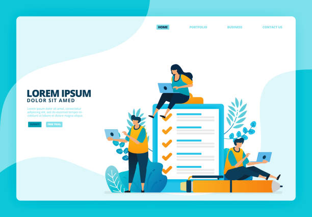
Introduction to Responsive Website Design and its Importance in the Current Era

In today’s digital world, where various devices including mobile phones, tablets, laptops, and even smartwatches are used to access the internet, #Responsive_Website_Design has become more vital than ever.
This approach ensures that your website is displayed in the best possible way, regardless of screen size.
The main concept of responsive design is based on flexibility and adaptability; meaning that your website’s layout, images, and content automatically adapt to the user’s screen dimensions and resolution.
This not only significantly improves #User_Experience but also plays a crucial role in #SEO rankings.
Google has announced for years that it prefers mobile-friendly websites in its search results, so having a #Responsive_Website is no longer an advantage, but a necessity.
This article comprehensively examines various aspects of responsive website design in an educational and explanatory manner.
Let’s delve into this paradigm shift in web design and understand why investing in flexible website design is essential for every business today.
Our goal in this section is to provide a general and comprehensive overview of what responsive website design is and why it’s important, so that readers become familiar with its significance and are prepared to delve into more technical details.
We will show you how this approach can increase your website traffic and improve conversion rates.
Does your current corporate website not reflect your brand’s credibility and power as it should? Rasaweb solves this challenge for you with professional corporate website design.
✅ Increase visitor credibility and trust
✅ Targeted attraction of more customers
⚡ Click to receive a free consultation!
Principles and Technical Foundations of Responsive Design

To effectively implement responsive website design, understanding the three main pillars of this approach is vital: Media Queries, Fluid Grids, and Flexible Images.
Media queries are CSS rules that allow the browser to apply different styles based on device characteristics (such as screen width, orientation, or resolution).
For example, you can specify that at widths less than 768 pixels, the navigation menu appears as a hamburger menu.
This capability is the heart and soul of responsive CSS and enables the creation of completely different user experiences across various devices.
Fluid grids use relative units like percentages for element widths instead of fixed pixel units.
This approach causes page elements to automatically expand or shrink to fill the available space.
Thus, your website’s layout adapts to any screen size without manual changes.
Flexible images, by using the `max-width: 100%` property in CSS, ensure that images never exceed their container and resize proportionally to their parent’s width.
These three principles together form a compatible website that can display optimally on any platform.
Without a deep understanding of these fundamentals, successfully implementing responsive website design is almost impossible.
This section provides a specialized and educational explanation of these fundamental principles.
Innumerable Benefits of Responsive Design for Business and SEO

Investing in responsive website design brings significant benefits to any business, especially in the areas of User Experience (UX) and Search Engine Optimization (SEO).
From a user experience perspective, a responsive website allows users to easily access your content without the need for zooming, horizontal scrolling, or other annoying actions.
This improvement in usability leads to a reduction in Bounce Rate, an increase in Dwell Time, and ultimately, an improvement in Conversion Rate.
Today’s users expect websites to work well on any device, and failing to provide this experience can lead to the loss of potential customers.
From an SEO perspective, Google has explicitly stated that it prefers mobile-friendly websites in its mobile search rankings.
By using a responsive website design, you have only one URL that is used for both desktop and mobile.
This helps search engines crawl and index your content easily, without the need to manage separate versions.
Furthermore, due to improved user engagement metrics, positive signals are sent to Google, which can lead to an increase in your website’s ranking in search results.
This section provides an analytical and explanatory discussion on the importance of responsive website design in the competitive online space.
Table 1: Comparison of Responsive Design with Older Approaches
| Feature | Responsive Design | Separate Design (m.site) |
|---|---|---|
| Number of URLs | One (Single URL) | Two or more |
| Content Management | Easier, one codebase | More complex, requires synchronization |
| SEO | Optimized, approved by Google | May have complexities |
| User Experience | Consistency across devices | May have differences |
| Development Time | More initial, less maintenance | Less initial, more maintenance |
Challenges and Important Considerations in Responsive Design

Despite numerous benefits, implementing responsive website design is not without its challenges.
One of the most important considerations is performance management.
If images or JavaScript code are not properly optimized, a responsive site can load extremely slowly on mobile devices with slow internet connections.
This issue is particularly critical for user experience in areas with weaker internet infrastructure and can significantly increase bounce rates.
Another challenge is content and UI element management.
Some elements that work well on large desktop screens may become unsuitable or unusable on small mobile screens.
Deciding which elements to hide, which to resize, and how to rearrange their order requires careful planning and continuous testing.
Also, comprehensive testing across different devices is a major challenge; you cannot simply test your website in a desktop browser by resizing the window, as actual mobile device behaviors (such as touch, orientation, different pixel resolutions) must be considered.
This section critically and expertly examines these challenges and offers solutions to overcome them.
Ultimately, it should be remembered that a compatible website is not just about resizing, but about intelligent redesign for each user context.
Don’t have a corporate website yet and missing out on online opportunities? With professional corporate website design by Rasaweb,
✅ Double your business’s credibility
✅ Attract new customers
⚡ Free consultation for your corporate website!
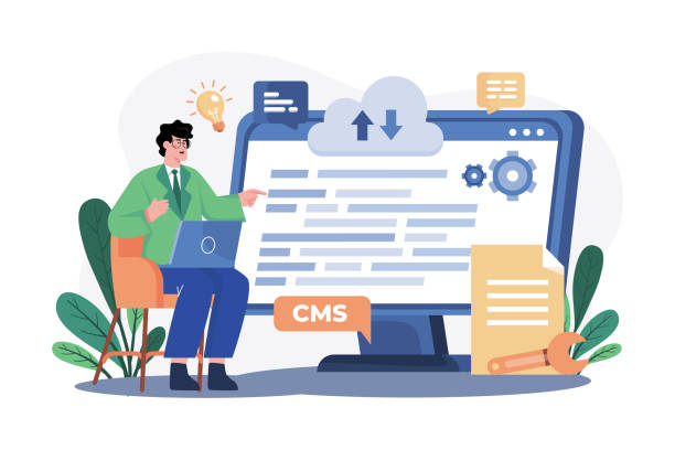
Popular Tools and Frameworks for Responsive Design

To facilitate the responsive website design process, developers have access to powerful tools and frameworks.
The most popular of these frameworks are Bootstrap and Foundation, both of which provide a collection of HTML, CSS, and JavaScript to quickly build responsive and mobile-friendly websites.
Bootstrap, developed by Twitter, is very popular due to its excellent documentation and large user community.
This framework includes a responsive grid system, pre-built UI components (such as navigation bars, forms, buttons), and JavaScript plugins that help developers quickly implement complex layouts with minimal coding.
Foundation is another powerful framework that offers more flexibility and is better suited for larger projects and deeper customizations.
In addition to frameworks, using CSS preprocessors like Sass or LESS can also help better organize CSS code and more easily manage media queries.
These tools, by offering features like variables, functions, and the ability to break down code into smaller sections, make the development process of a responsive site much more efficient.
Choosing the right tools depends on project needs and development team preferences, but using them is essential for guiding and specializing the process of flexible website design.
Guide to Testing and Debugging Responsive Websites
After the completion of responsive website design stages, the critical phase of testing and debugging begins.
To ensure correct functionality and optimal user experience across all devices, relying solely on browser window resizing is not enough.
Browser simulation tools, and even better, actual physical devices, should be used.
Browser developer tools like Chrome DevTools offer mobile device simulation capabilities, allowing you to view your website at various resolutions and screen sizes, and even simulate touch interactions.
However, simulators cannot replicate all aspects of a real user experience, including processor performance, battery consumption, and specific operating system behaviors.
For this reason, testing on a wide range of smartphones, tablets, and desktops with various operating systems and browsers is essential.
Additionally, using cloud testing services like BrowserStack or CrossBrowserTesting can help you access a diverse range of devices.
These services allow you to test your website on hundreds of virtual devices and browsers.
During the debugging process, paying attention to responsive images and JavaScript files is crucial to ensure they load correctly and do not cause performance degradation.
This section provides practical guidance and expert solutions for thorough testing of a compatible website to ensure the delivery of a high-quality final product.
The Future of Responsive Web Design and Emerging Trends

The world of responsive website design is not static and is constantly evolving.
Emerging trends indicate that the future of this field is moving towards faster, more integrated, and smarter user experiences.
One of the most important of these trends is the Mobile-First approach, where design and development begin with the smallest screens and then gradually expand to larger devices.
This approach ensures that the website is optimized for mobile from the outset and only the most essential content and functionalities are loaded first.
Progressive Web Apps (PWAs) are also another key trend that provides a native app-like user experience within the web browser.
PWAs can work offline, send notifications, and even be added to the user’s home screen, which significantly positively impacts user experience and engagement.
AMP (Accelerated Mobile Pages) was also introduced by Google to load web pages on mobile devices at incredibly high speeds, which is very useful for news and content websites.
These trends indicate that the focus on speed and accessibility on mobile devices remains a priority.
For a compatible website, understanding and adopting these trends is essential to maintain competitiveness in the future.
This section informatively and analytically examines these developments and provides a vision for the future of responsive website design.
Table 2: Comparison of Mobile Optimization Methods
| Technology | Main Application | Key Advantage | Potential Challenge |
|---|---|---|---|
| Responsive Design | Compatibility with all devices | One codebase, SEO-friendly | Requires careful planning, initial load |
| PWAs | Native app experience on the web | Offline work, notifications | Browser support, technical complexity |
| AMP | Fast loading of mobile pages | Unparalleled speed on Google | Technical and design limitations |
Successful and Unsuccessful Examples of Responsive Design

Examining real-world examples can be very useful in better understanding the importance and challenges of responsive website design.
Many large and well-known websites have made significant investments in responsive design and have seen the results in increased traffic and user satisfaction.
For example, websites like New York Times or Smashing Magazine are prominent examples of compatible websites that provide an enjoyable and accessible reading experience on any screen size.
These sites effectively use media queries to change layout, font size, and element display, while images and videos load fluidly and optimally.
On the other hand, some websites still provide a frustrating user experience on mobile devices.
This includes sites that don’t scale content well, have small touch targets, or require horizontal scrolling for mobile viewing.
These unsuccessful examples typically use older design approaches or have not performed sufficient mobile optimization.
In some cases, sites laden with pop-ups or heavy JavaScript elements that are not annoying on desktop completely disrupt the user experience on mobile.
This section, in an engaging and analytical manner, helps designers and developers avoid common mistakes and apply best practices in flexible website design by examining these examples.
Are you losing business opportunities because of an outdated website? With Rasaweb, permanently solve the problem of not attracting potential customers through your website!
✅ Attract more high-quality leads
✅ Increase brand credibility in customers’ eyes
⚡ Get a free corporate website design consultation
Costs and Return on Investment in Responsive Design

One of the common questions for businesses when considering responsive website design concerns costs and Return on Investment (ROI).
At first glance, responsive design might seem more expensive than building a static website or even a separate mobile site.
This perception is partly true, as it requires more meticulous planning, flexible coding, and extensive testing.
However, one must look at its long-term benefits.
By having only one codebase for all devices, maintenance and update costs are significantly reduced.
Instead of managing and updating two or three separate versions of a website, you manage only one, which leads to significant savings in time and resources.
Furthermore, as previously mentioned, responsive website design directly positively impacts SEO and user experience.
Improved search engine rankings mean more organic traffic, which in turn leads to increased sales and revenue.
Increased user satisfaction also leads to greater customer loyalty and their return to your website.
Together, these factors ensure a significant return on investment for businesses in the long run.
This section analytically and explanatorily discusses the financial aspects of responsive website design and helps businesses make more informed decisions.
Conclusion and Next Steps for a Modern Website

In this article, we comprehensively and fully examined various aspects of responsive website design.
From its fundamental importance in the current era and its governing technical principles to its significant benefits for user experience and SEO, potential challenges, available tools, and future trends, we analyzed everything.
It is now clear that responsive design is no longer a luxury option but a strategic necessity for any business that wants to remain competitive in the online space.
With the increasing use of mobile devices to access the internet, having a compatible website with all these devices is a condition for survival and success.
What are your next steps? If your website is not yet responsive, it’s time to invest in this area.
First, evaluate your current website using tools like the Google Mobile-Friendly Test.
Then, consult with a team specializing in responsive website design and develop an action plan for migrating or redesigning your website.
Remember that this process is not just a technical update, but a strategic investment for the future of your business that can lead to increased traffic, improved conversions, and enhanced brand credibility.
This section provides guidance and an explanation to conclude the discussion and encourages the reader to take action.
Frequently Asked Questions
| Question | Answer |
|---|---|
| What is Responsive Website Design? | Responsive Web Design is an approach that causes the design and layout of a website to change and display optimally based on the screen size of the user’s device (computer, tablet, mobile, etc.). |
| Why is Responsive Design Important? | Its importance stems from the increasing use of various devices to access the internet. Responsive design improves user experience (UX), reduces bounce rate, and is beneficial for SEO. |
| What techniques are used in Responsive Design? | The main techniques include the use of Fluid Grids, Flexible Images, and Media Queries in CSS. |
| What does Fluid Grids mean? | Instead of using fixed pixel units, relative units like percentages or ems are used to define the width and height of elements, so that the layout is flexible with changes in screen size. |
| What is the purpose of Media Queries? | Media queries allow you to apply different CSS styles based on the user’s device characteristics such as screen width, height, orientation (horizontal or vertical), and resolution. |
And other advertising agency services by Rasa Web in the field of advertising
Smart SEO: An effective tool for campaign management with the help of Google Ads management.
Smart Customer Journey Map: Professional optimization to increase click-through rates using Google Ads management.
Smart Link Building: A combination of creativity and technology for campaign management through precise audience targeting.
Smart Digital Branding: Designed for businesses seeking to attract customers through marketing automation.
Smart Advertising Campaign: A combination of creativity and technology for customer acquisition through marketing automation.
And over hundreds of other services in the field of internet advertising, advertising consultation, and organizational solutions
Internet Advertising | Advertising Strategy | Advertorial
Sources
Comprehensive Guide to Responsive Website Design
Impact of Responsive Design on SEO
Responsive Design Tutorial with CSS
The Future of Web and the Importance of Responsive Design
? Do you want your business to shine in the digital world? Rasaweb Afarin Digital Marketing Agency, by providing innovative solutions and targeted strategies, helps you establish a powerful online presence. From SEO and search engine optimization to online advertising management and user-friendly website design, we are committed to your growth and success. With Rasaweb Afarin, secure the future of your business in the digital space.
📍 Tehran, Mirdamad Street, next to Bank Markazi, Kazeroon Jonubi Alley, Ramin Alley, No. 6

