
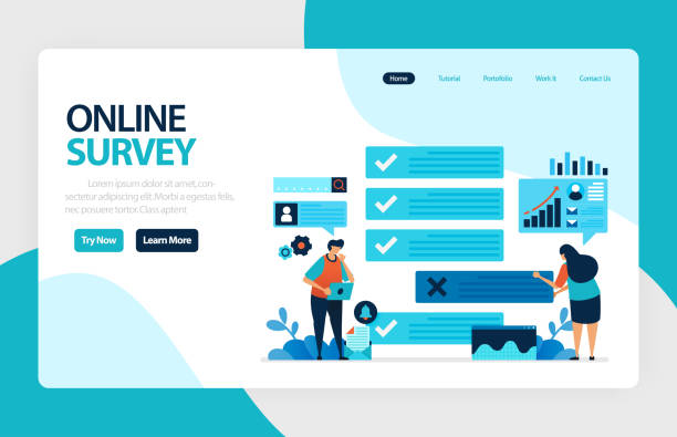
Introduction to Responsive Web Design and its Importance

In the current era, where the use of various digital devices such as smartphones, tablets, laptops, and even smart TVs has become widespread, #Responsive_Website_Design is no longer an option but a vital necessity.
This approach in #Web_Design ensures that your website is displayed in the best possible way, regardless of screen size or the type of device the user is using, providing a seamless and optimized experience.
The concept of #Responsive_Design is based on the adaptability of website layout, images, and content to different dimensions.
There was a time when websites were primarily designed for desktop viewing, but with the mobile revolution, the need for solutions that could address this challenge was strongly felt.
Responsive web design was the answer to this need, allowing websites to adapt to any environment with high flexibility.
This not only leads to improved user experience (UX) but also plays a significant role in enhancing SEO and website ranking in search engines, as search engines like Google prioritize websites with responsive design.
Websites that are not properly responsive can provide a frustrating user experience for mobile visitors, leading to high bounce rates and reduced engagement.
This is why large and small organizations invest significantly in this type of design to ensure their website is accessible and functional for all users, regardless of their device.
Are you frustrated with your online store’s low conversion rate?
Rasaweb is your definitive solution with professional e-commerce website design!
✅ Increase your sales and revenue
✅ Unparalleled user experience for your customers
⚡ Get a free consultation now!
Principles and Foundations of Responsive Design

The foundation of responsive web design is built upon three main pillars: Fluid Grids, Flexible Images, and Media Queries.
Fluid grids mean that the website’s layout is defined using relative units like percentages, rather than fixed pixels.
This approach allows the website to adjust its width according to the screen size.
Flexible images, by using CSS and setting their width to relative values (like `max-width: 100%`) ensure that images do not overflow their containers and adjust their size to the screen.
But perhaps the most important piece of this puzzle is media queries.
This CSS3 feature allows developers to apply different styles based on device characteristics such as screen width, height, orientation (portrait or landscape), and resolution.
For example, it can be set that for widths less than 768 pixels, the navigation menu changes to a hamburger icon.
The “Mobile-First” approach is one of the key strategies in responsive design, where the website is first designed and developed for the smallest screens, and then optimized for larger sizes (tablet and desktop) by adding styles through media queries.
This method ensures optimized performance and user experience on mobile devices, as it starts with minimal styles.
Properly setting the viewport meta tag () is also crucial, as it instructs browsers to adjust the page to the device’s width.
Using these principles ensures that responsive web design is optimized not only visually but also functionally across all devices.
Common Tools and Frameworks in Responsive Design
To effectively implement responsive web design, a set of tools and frameworks are available to developers that accelerate and standardize the process.
One of the most well-known of these frameworks is Bootstrap, which provides a complete set of CSS, JavaScript, and HTML for rapid development of responsive websites.
Frameworks like Foundation are also powerful options that offer high flexibility.
Alongside comprehensive frameworks, native CSS technologies such as Flexbox and CSS Grid have also revolutionized responsive design.
Flexbox is excellent for one-dimensional layouts and distributing space among items, while CSS Grid provides a powerful tool for two-dimensional layouts and overall page structure, significantly reducing layout complexities.
Responsive testing tools are also essential; browser extensions and built-in browser developer tools (like Chrome DevTools) allow you to simulate and test your website on various sizes and devices.
Furthermore, Content Management Systems (CMS) like WordPress also enable the creation of responsive websites even without deep coding knowledge, by offering responsive themes and plugins.
The choice of the right tool depends on the project’s complexity, the development team’s preferences, and the specific needs of the website.
Below, a table of some of these tools and their features is provided, which can help you in your selection:
| Tool/Framework Name | Type | Key Features | Main Use |
|---|---|---|---|
| Bootstrap | CSS Framework | 12-column grid system, ready-made components, customization capability | Rapid and standard creation of responsive websites |
| CSS Flexbox | CSS Module | One-dimensional layout, space distribution, item alignment | Layout of components and small sections |
| CSS Grid | CSS Module | Two-dimensional layout, overall page structuring, precise control over layout | Overall website layout and complex pages |
| Chrome DevTools | Browser Developer Tool | Simulation of different devices, real-time responsiveness display, element inspection | Testing and debugging responsiveness during development |
Common Challenges and Solutions in Responsive Design

Responsive web design, despite its countless advantages, also comes with its own challenges.
One of the main challenges is Performance management.
Loading high-quality images and heavy scripts can significantly increase page load time on mobile devices with slow internet connections.
The solution to this issue is image optimization (such as using modern web formats like WebP, compression, and utilizing the `<picture>` element or `srcset` for adaptive images) and lazy loading for off-screen content.
Another challenge is navigation complexity on small screens.
Large and complex desktop menus become inefficient on mobile.
Solutions include using hamburger menus, dropdown menus, or tab-based navigation, which occupy less space.
Additionally, touch interaction versus mouse clicks requires a different approach; button sizes and spacing between elements must be large enough for users to easily tap them with their fingers.
Should every website be responsive? Almost certainly, yes.
In today’s world, where most web traffic comes from mobile devices, neglecting responsive web design can mean losing a significant portion of your audience and revenue.
Maintaining a seamless user experience across all devices requires strategic thinking from the outset and continuous testing to ensure that the website is not only displayed correctly but also offers optimal performance and a pleasant experience at any size.
Developers should also consider optimizing CSS and JavaScript codes to prevent unnecessary loading and increase overall site speed.
Does your current e-commerce website design not generate the expected sales for you?
Rasaweb is an expert in professional e-commerce website design!
✅ An attractive and user-friendly website aimed at increasing sales
✅ High speed and security for an ideal shopping experience⚡ Get a free online store design consultation with Rasaweb!
Impact of Responsive Design on SEO and Ranking

The relationship between responsive web design and SEO is very deep and undeniable.
Google and other search engines are increasingly emphasizing the importance of mobile user experience.
Since 2015, Google announced that mobile-friendly websites would rank higher in mobile search results, and since 2018, with the introduction of “Mobile-First Indexing,” this has become even more serious.
This means that Google first considers the mobile version of your website for crawling and indexing, and then ranks it accordingly.
Therefore, if your website is not responsive, its ranking in search results will likely drop.
Responsive web design, by providing an optimized user experience across all devices, directly positively impacts important SEO factors such as Bounce Rate, Time on Site, and Pages per Session.
Users are more satisfied with sites that are easy to use on mobile and, as a result, spend more time on them, which is a positive signal for search engines.
Additionally, a single URL for all devices simplifies SEO management and prevents duplicate content issues that can arise with separate mobile versions (m.example.com).
Core Web Vitals, a set of performance metrics introduced by Google to measure user experience, are also heavily influenced by website responsiveness.
Load speed, interactivity, and visual stability across different devices all demand optimized responsive design.
Therefore, investing in responsive web design means investing in the future of your SEO and online business success.
The Role of User Experience (UX) in Responsive Web Design
User Experience (UX) is the core of every successful responsive web design.
The ultimate goal of responsive design is not just to display the website correctly across different sizes, but to ensure that the user, regardless of the device they are using, has a smooth, enjoyable, and efficient experience.
This includes understanding how users interact with different devices and adapting the design accordingly.
For example, on mobile, users mostly use one hand, and the thumb plays a key role, so touchable elements (like buttons and links) should be placed in accessible areas.
The visual hierarchy of content is also crucial; on small screens, there is less space to display all information simultaneously, so the most important content must be clearly highlighted and prioritized.
Responsive web design must ensure that the user flow is logical and continuous across all devices.
This means that the steps to perform a specific task, whether via desktop or mobile, should be equally easy and understandable.
Accessibility is also an integral part of UX; ensuring that the website is usable for people with disabilities (e.g., by using appropriate HTML tags, sufficient color contrast, and keyboard navigation) is of high importance.
Call-to-action (CTA) buttons must be clearly visible and touchable so that users can easily perform the desired actions.
A strong user experience increases conversion rates and encourages users to return.
Therefore, web designers should always put themselves in the user’s shoes and view the design from different perspectives to ensure that the website is not only beautiful but truly functional for all users.
Case Study of Successful Websites with Responsive Design

To gain a deeper understanding of the benefits of responsive web design, looking at successful examples can be very insightful.
Many global brands and large news websites have adopted this approach and witnessed positive results.
For example, websites like The New York Times are excellent examples of responsive design.
They have organized complex news and article layouts in such a way that readability and content access are maintained on any screen size.
Images and videos are correctly scaled, and navigation on mobile appears as a simple and efficient hamburger menu.
Large e-commerce websites like Amazon have also, through strong implementation of responsive web design, provided a seamless shopping experience via mobile, tablet, or desktop, which has significantly contributed to increasing conversion rates and customer loyalty.
The success of these websites is not only due to correct technical implementation but also due to focusing on user experience, load speed, and easy access to content and features.
This approach has allowed them to maintain and grow their market share across all platforms.
Below, a table of some of the success factors of these examples is provided, which can help you in your selection:
| Success Factor | Description | Impact on User/SEO |
|---|---|---|
| Image Optimization | Use of optimized formats and appropriate image sizes for each device | Increased load speed, improved Core Web Vitals |
| Simple and Intuitive Navigation | Hamburger menus or tab-based navigation on mobile | Improved user experience, reduced bounce rate |
| Content Focus | Prioritizing main content and presenting it in a readable format | Increased time on site, improved engagement |
| High Load Speed | Optimized coding, file compression, use of CDN | User satisfaction, improved SEO ranking, reduced bounce rate |
The Future of Web Design and Adaptability

With rapid advancements in technology, responsive web design is also evolving.
While responsive design primarily focuses on adapting to screen size, the future of web design is moving towards more comprehensive and intelligent solutions that respond not only to screen size but also to other factors such as device type, internet connection speed, user location, and even personal preferences.
Concepts such as Adaptive Design, which provides entirely different layouts based on predefined breakpoints, or Progressive Web Apps (PWAs), which offer a combination of the best features of web and native applications (such as offline functionality, home screen installation, and notifications), are among the future trends.
The emergence of new devices like smartwatches, augmented reality and virtual reality devices, and voice systems (Voice UI) also creates new challenges for responsive web design.
Will responsive design alone be sufficient to address this diversity? Probably not.
Web designers and developers must prepare for approaches that can optimize the user experience not only within a browser but also across diverse digital ecosystems of the future.
This means that the focus will shift from “how it is displayed” to “how it interacts with the user.”
The use of artificial intelligence for personalizing content and user interfaces based on user behavior can also play an important role in the future.
Ultimately, the concept of adaptability in web design will go beyond screen dimensions and will include the website’s ability to adapt to the user’s changing needs and environments.
Did you know that customers’ first impression of your company is your website? Multiply your business’s credibility with a powerful corporate website from Rasaweb!
✅ Custom and eye-catching design tailored to your brand
✅ Improved user experience and increased customer acquisition
⚡ Get a free consultation!
Key Tips for Successful Responsive Design Implementation

To ensure the successful implementation of responsive web design, adhering to several key points is essential.
Firstly, testing on real devices (not just simulators) is of paramount importance.
Simulators cannot accurately display all differences in touch performance, processing speed, and browser behavior across various devices.
Secondly, Performance Optimization should be a top priority.
As mentioned earlier, load speed on mobile devices is crucial.
This includes image compression, minifying CSS and JavaScript files, using caching, and leveraging a CDN (Content Delivery Network).
Thirdly, close collaboration between designers and developers from the early stages of the project is very important.
Responsive design requires a holistic approach where visual design and technical implementation are perfectly aligned.
Designers must understand technical limitations and possibilities, and developers must be aware of user experience goals.
Fourthly, continuous monitoring and iteration.
After launch, the website should be constantly monitored.
Using analytical tools to track user behavior on different devices and identify weaknesses can lead to continuous improvements in website design and user experience.
Finally, budget and time management are also important points.
Responsive web design may initially require more investment, but given the reduced maintenance costs (one codebase for all devices) and improved SEO, this investment is fully justifiable in the long run.
The development team should operate in an agile manner to quickly respond to user feedback and technological changes.
Summary and Outlook of Responsive Design

In this article, we have thoroughly examined various aspects of responsive web design.
From introducing its principles and foundations to its vital role in SEO, user experience, and implementation challenges and solutions.
It became clear that in today’s world, where digital devices with countless dimensions and form factors are available to users, a website without responsive design quickly loses its effectiveness and value.
Responsive web design is not just about correctly displaying the website in different sizes; it guarantees a smooth, pleasant, and efficient user experience for everyone, everywhere, and on any device.
This approach enables businesses to strengthen their online presence, expand audience reach, and ultimately increase conversion rates and customer loyalty.
Given the growing trend of mobile internet access and Google’s increasing emphasis on ranking mobile-friendly websites, ignoring responsive design means missing out on countless opportunities.
The future of web design is also built upon these principles of adaptability and flexibility, moving towards smarter and more advanced solutions that can adapt to users’ changing needs and environments.
Therefore, for any business or individual seeking a successful presence in the digital space, investing in and paying attention to responsive web design is an undeniable necessity and a strategic investment for the future.
By adhering to the points and principles discussed, you can create a website that not only meets today’s expectations but is also prepared for future challenges.
Frequently Asked Questions
| Question | Answer |
|---|---|
| What is responsive web design? | It is an approach to web design that aims to create websites that can automatically adapt to the screen size and user’s device (computer, tablet, mobile) and provide the best user experience. |
| Why is responsive design important? | Its importance has increased due to the growing variety of devices people use to access the internet. This design improves user experience, increases search engine ranking (SEO), and reduces maintenance costs. |
| How is responsive design implemented? | By using CSS techniques such as Media Queries (which allow you to change styles based on device characteristics like screen width), Fluid Grids, and Flexible Images. |
| What are the key principles of responsive design? | The three main principles are: Fluid Grids (using relative units like percentages instead of pixels for widths), Flexible Images (adapting image sizes to available space), and Media Queries (applying different styles based on screen features). |
| What are the benefits of having a responsive website? | Providing a seamless user experience across all devices, improved SEO, increased user time on site, reduced bounce rate, easier site management and updates (only one codebase exists). |
And other services of Rasaweb Advertising Agency in the field of advertising
Smart Website Development: Designed for businesses seeking to manage campaigns through custom programming.
Smart Custom Software: An innovative service to increase user engagement through user experience customization.
Smart Link Building: Designed for businesses seeking to manage campaigns through Google Ads management.
Smart Customer Journey Map: A fast and efficient solution to increase site traffic with a focus on marketing automation.
Smart Content Strategy: Designed for businesses seeking to attract customers through user experience customization.
And over a hundred other services in the field of internet advertising, advertising consultation, and organizational solutions
Internet Advertising | Advertising Strategy | Advertorial
Sources
What is Responsive Web Design?
Comprehensive Guide to Responsive Design
The Future of Web and Responsive Design
Website Design for the Digital Future
❓ For a powerful presence in the digital world, Rasaweb Afarin offers the best digital marketing services, including corporate website design, to support your business.
📍 Tehran, Mirdamad Street, next to Bank Markazi, Kazeroon Jonubi Alley, Ramin Alley, No. 6

