
Introduction to Responsive Web Design and its Necessity
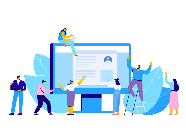
In today’s world, where users access the internet from a variety of devices such as smartphones, tablets, laptops, and even smart TVs, #طراحی_سایت_واکنش_گرا or Responsive Web Design is no longer an option, but a necessity.
This design approach ensures that your website provides an optimal and user-friendly experience regardless of screen size or device type.
The main goal of responsive website design is to eliminate the need to design separate versions for each device, which was a major challenge for developers in the past.
This concept, first introduced by Ethan Marcotte in 2010, quickly became a golden standard in the web industry.
By correctly implementing this type of design, your website gains unparalleled flexibility and will be able to display content dynamically and intelligently to suit different dimensions.
This change not only benefits users, who experience a unified and comfortable experience, but also offers numerous advantages for businesses, including improved search engine rankings and increased conversion rates.
In fact, not having a responsive website today means losing a significant portion of your audience.
How much does losing business leads due to an unprofessional website cost you? Solve this problem forever with professional corporate website design by Rasawp!
✅ Increase credibility and trust of potential customers
✅ Easier acquisition of new business leads
⚡ Get a free consultation now!
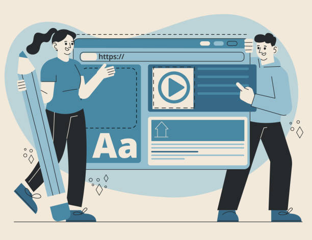
Principles and Fundamentals of Responsive Design

To gain a deeper understanding and correctly implement responsive website design, it is essential to familiarize ourselves with its fundamental principles.
These principles comprise three main pillars: Fluid Grids, Flexible Images, and Media Queries.
Fluid grids use relative units like percentages for element widths instead of fixed pixel units.
This approach ensures that the website layout automatically adapts to the screen size and optimizes available space.
Flexible images, by utilizing CSS properties like max-width: 100%;, ensure that images never overflow their container and always scale down or up to fit the available space.
The most crucial component is media queries, which allow designers to apply different CSS rules based on device characteristics (such as screen width, height, orientation, and resolution).
This powerful tool enables us to optimize the website’s appearance at various breakpoints—specific screen widths where the layout needs to change.
Understanding and mastering these three principles forms the foundation for success in responsive website design, and without them, achieving a seamless user experience across different devices is almost impossible.
These specialized fundamentals require knowledge of coding in CSS and HTML.
Choosing the Right Framework for Responsive Design

One of the crucial decisions in the responsive website design process is choosing the appropriate CSS framework.
Frameworks are collections of pre-written code and components that accelerate the development process and prevent the creation of repetitive code.
Among the most popular frameworks for responsive design are Bootstrap, Tailwind CSS, and Foundation, each with its unique features and design philosophies.
Bootstrap, by offering ready-to-use UI components and a 12-column grid system, is ideal for rapid and user-friendly development and is highly suitable for projects seeking a standard and predefined appearance.
In contrast, Tailwind CSS is a utility-first framework that allows developers to apply styles directly in HTML using small, single-purpose classes; this approach provides very high flexibility but might be somewhat challenging for beginners.
Foundation is another powerful option, favored by more advanced developers due to its high flexibility and customization capabilities.
The choice of framework depends on factors such as project complexity, development team’s skill, and specific design needs.
Each of these frameworks helps you implement the responsive website design structure more quickly and benefit from their advantages.
This is a guiding and specialized section.
| Framework | Advantages | Disadvantages | Suitable for |
|---|---|---|---|
| Bootstrap | Comprehensive, ready-made components, strong documentation | May create a uniform look, relatively high file size | Quick start, general projects, beginner developers |
| Tailwind CSS | High flexibility, low final file size, fast coding once accustomed | Needs getting used to utility-first philosophy, more cluttered HTML | Custom projects, experienced developers, scalability |
| Foundation | Flexibility, focus on UX, suitable for large projects | Smaller user community compared to Bootstrap, more complexity | Complex custom projects, professional developers |
Impact of Responsive Design on SEO and User Experience (UX)

Implementing responsive website design is not only beneficial for users but also has a profound impact on search engine optimization (SEO) and user experience (UX).
Since 2015, Google officially announced that website responsiveness is a significant ranking factor in mobile search results.
Websites with responsive design are accessible with a single URL and a single codebase across all devices, which helps Google’s crawlers easily index content and prevents duplicate content issues.
This leads to your site appearing higher in search results and attracting more organic traffic.
From a UX perspective, a responsive site provides a seamless and enjoyable browsing experience on any device.
Users no longer need to zoom or scroll horizontally, which leads to a reduction in Bounce Rate and an increase in time spent on the site.
The better the user experience, the higher the probability of users returning and converting into customers.
An excellent user experience not only results in customer satisfaction but also contributes to your website’s branding and credibility.
This is an important analysis of technical and marketing aspects.
Does your company’s website create a professional and lasting first impression in the minds of potential customers? Rasawp is your answer! With our specialized corporate website design services:
✅ Create a powerful and reliable brand image
✅ Attract target customers and increase sales
⚡ Get free consultation now!
Challenges and Solutions for Implementing Responsive Design
Despite numerous advantages, implementing responsive website design can also come with challenges.
One of the most significant challenges is Performance Management.
If images or heavy resources are not properly optimized, site loading time on mobile devices slows down significantly, severely degrading the user experience.
The solution to this problem is to use techniques such as Lazy Loading for images, image compression and optimization (e.g., using WebP formats), and minimizing CSS and JavaScript files.
Another challenge is the complexity of designing for a large number of screen sizes.
This requires a precise strategy in selecting breakpoints and continuous testing on various devices.
The intriguing question here is: how can we ensure that our content is displayed optimally at every size? The answer lies in designing flexible content and using a Mobile-First approach, meaning starting the design for the smallest screen and then expanding it towards larger screens.
Additionally, compatibility with older browsers can be troublesome, but this challenge can be mitigated by using Fallback and Polyfill tools.
Understanding these challenges and implementing specialized solutions is the key to success in responsive website design.
Testing and Optimizing Responsive Websites

After designing and implementing a responsive website, the testing and optimization phase is of paramount importance.
Without thorough testing, it’s impossible to ensure that the website displays correctly across all devices and browsers and provides a seamless user experience.
Browser developer tools (such as Chrome DevTools) enable the simulation of various screen sizes and devices, which are highly useful for initial testing.
Additionally, online tools like Google’s Mobile-Friendly Test and Responsinator are employed for quickly checking a website’s responsiveness on multiple devices.
Performance optimization is also a critical part of this stage.
Besides compressing images and code, attention must also be paid to the loading speed of fonts, scripts, and styles.
Using a CDN (Content Delivery Network) to deliver content faster to users, and enabling browser caching to reduce HTTP requests, can significantly increase site speed.
The ultimate goal of this phase is to ensure that your site is not only responsive but also fast and efficient.
A slow site, even if it benefits from responsive website design, can still drive users away.
This section provides practical guidance for developers.
The Future of Responsive Design and New Trends

The world of web is constantly evolving, and responsive website design is no exception.
The future of web design is moving towards even more personalized and immersive user experiences.
One of the most important trends is Progressive Web Apps (PWAs), which offer a combination of the best features of web and native applications; they can be installed on the home screen, work offline, and send notifications, while benefiting from the flexibility and accessibility of the web.
This technology naturally complements responsive design, as PWAs must also perform optimally across all devices.
Another trend is the emergence of Voice UIs and Artificial Intelligence in design, which highlights the need for designs compatible with these novel technologies.
Additionally, Dark Mode, used to reduce eye strain and save battery consumption, has become a standard feature in design.
The design of microinteractions and subtle animations to enhance user experience is also a growing trend.
With the advancement of AR/VR technologies and the emergence of the metaverse, the need for designs that can also be accessible in three-dimensional and immersive environments is felt more than ever.
These developments show that responsive website design was just the beginning, and designers must constantly align themselves with these news and analytical changes to build websites suitable for the future of the web.
| New Trend | Impact on Responsiveness | Example |
|---|---|---|
| Progressive Web Apps (PWAs) | Enhances mobile experience, installability, and offline functionality on all devices | Twitter Lite, Pinterest |
| Dark Mode | Provides visual options tailored to user preferences and environment | News websites, social platforms |
| Microinteractions | Increases user engagement and feedback across all screen dimensions | Like button animation, form feedback |
| AI-Powered Personalization | Displays customized content based on user behavior on each device | Product recommendations in online stores |
Common Mistakes in Responsive Design and How to Avoid Them
Despite the great importance of responsive website design, designers and developers may make mistakes that disrupt the user experience.
One common mistake is not focusing on a Mobile-First approach.
Many designers still start by designing for desktop and then try to scale it down for mobile, which often leads to inappropriate layouts and poor performance on smaller devices.
The solution is to start designing from the smallest screen and then add complexities for larger screens.
Another mistake is using high-resolution, unoptimized images for mobile devices, which severely reduces loading speed.
Responsive Images and modern formats like WebP should be used.
Ignoring the size of buttons and links for touch screens is also a common error; clickable elements should be large enough for mobile users to easily tap them.
Additionally, some designers forget that mobile users often have lower bandwidth, and excessive use of JavaScript and heavy animations can disrupt the user experience.
Avoiding these mistakes requires deep knowledge and a training and guidance approach throughout the design process to deliver an efficient and user-friendly website.
Are you losing potential customers due to an unprofessional website? Rasawp is your answer! With our specialized corporate website design services:
✅ Enhance your business’s credibility and standing
✅ Experience attracting more targeted customers
⚡ Act now to receive a free consultation!
Successful Case Studies in Responsive Design

To better understand the effectiveness of responsive website design, we can look at some successful websites that have implemented this approach well.
These case studies are inspiring examples of how to provide a seamless user experience across various devices.
For example, New York Times website was one of the pioneers in adopting responsive design.
By implementing a flexible layout and optimized images, they were able to present their news content in a readable and engaging manner across different devices, from smartphones to large desktops.
This significantly helped them retain their wide audience during the era of mobile growth.
Another example is the Apple website, which, with its minimalist design and focus on high-quality images, has succeeded in delivering a stunning visual experience on any screen size.
E-commerce websites like Amazon also effectively demonstrate how a website with thousands of products can provide easy navigation and a simple purchasing process on both mobile and desktop through responsive design.
These cases show how responsive website design can contribute to business growth, increased user engagement, and brand strengthening.
This analytical section demonstrates that by investing correctly in adaptive design, brilliant results can be achieved.
The Importance of Using Responsive Website Design in Businesses

In today’s competitive landscape, an online presence is vital for every business.
However, simply having a website is not enough; that website must be designed to meet the needs of users across various devices.
This is where the importance of responsive website design for businesses becomes clear.
Firstly, with the increasing use of mobile devices to access the internet, having a mobile-compatible website means accessing a large segment of potential customers.
Recent statistics show that over half of web traffic originates from mobile devices.
Therefore, if your site is not optimized for mobile, you have practically lost half of the market.
Secondly, as previously mentioned, Google ranks responsive websites higher in mobile search results, which translates to increased visibility and attraction of new customers through organic searches.
Thirdly, a good user experience leads to an increase in conversion rates; meaning more users perform your desired actions (such as purchasing, registering, or contacting).
This explains the commercial and economic aspects of responsive website design.
Furthermore, maintaining a single codebase for all devices is considerably easier and more cost-effective than maintaining multiple separate versions of the website, which itself is a financial advantage for businesses.
Frequently Asked Questions
| Question | Answer |
|---|---|
| What is responsive website design? | A web design approach that ensures a website’s layout and content automatically adjust and display optimally across various devices (mobile, tablet, desktop). |
| Why is responsive design important? | Due to the diversity of devices users employ to access the web; better user experience, stronger SEO, and reduced bounce rate are among its benefits. |
| What are the main techniques in responsive design? | Using Media Queries in CSS, Fluid Grids, and Flexible Images. |
| What is a Media Query? | A CSS rule that allows you to apply different styles based on device characteristics (such as screen width, height, display orientation). |
| Is responsive design different from Mobile-First website design? | Mobile-First is an approach within responsive design that initially designs the site for the smallest screen (mobile) and then gradually improves it for larger screens. |
And other advertising services from Rasaweb Advertising Agency
Smart Customer Journey Map: An innovative platform for improving online growth by optimizing key pages.
Smart Advertorial: A professional solution for increasing sales with a focus on precise audience targeting.
Smart Marketing Automation: Professional optimization for increasing sales using custom programming.
Smart Marketplace: A fast and efficient solution for increasing sales with a focus on Google advertising management.
Smart Content Strategy: Revolutionize SEO ranking improvement with the help of intelligent data analysis.
And over hundreds of other services in the field of internet advertising, advertising consulting, and organizational solutions
Internet Advertising | Advertising Strategy | Advertorial
Resources
Responsive Website Design GuideFuture of Web and Responsive DesignPrinciples of Mobile Web DesignImportance of Responsive Design in SEO
✨ To elevate your business in the digital world and reach the peaks of success, contact “Rasawp Afarin” today and benefit from our professional services in multilingual website design, SEO, and digital marketing.
📍 Tehran, Mirdamad Street, Next to Central Bank, Southern Kazeroun Alley, Ramin Alley, No. 6

