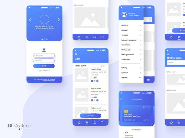
📱 The Importance of Responsive UI/UX Design in Today’s World

Well, let’s start this way: responsive UI/UX design is no longer an option; it’s a necessity! Think about it, back in the day everyone only viewed websites on their home computers, but what about now? Tablets, phones, laptops, smartwatches… they all have different screen sizes. If your site can’t adapt to these screens, what is the poor user supposed to do? They’ll have to zoom and scroll all over the place just to see something! This means saying goodbye to the user and hello to competitors whose sites are okay for mobile too.
There are some very important points in the middle that must be followed. For example, the size of the buttons should be large enough for the user’s finger to easily hit them, the fonts should be readable, and the images should not be so large that they slow down the site’s loading speed. In fact, the goal is for the user to be able to use your site without any effort, with whatever device they have. If it’s otherwise, the user will run away, and you’ll lose your customers. So take this issue seriously!
Let me mention another point. Google has also understood how important mobile is for a long time. Because of this, it lowers the ranking of sites that are not optimized for mobile in search results. That is, if your site is not responsive, not only will users run away from it, but Google won’t look kindly on you either. This means saying goodbye to Google entries and hello to a lot of losses!
So if you want to succeed in this crowded digital world, you have to think about the UI/UX design of your site. A responsive and user-friendly design keeps users happy, makes Google happy, and brings you a lot of customers. It’s that simple!
📐 Key Principles of Responsive UI/UX Design for Every Device

Well, now that we understand how important responsive design is, let’s go a little deeper and see what principles we need to follow to have a responsive and user-friendly site. The first and most important principle is Mobile First Design. What does that mean? It means design the site for mobile first, then move on to the other devices. Why? Because mobile has more limitations, such as a smaller screen and slower internet speed. When you optimize the site for mobile, it automatically gets better for other devices as well.
The next principle is Using a Grid System. A grid system is a structural framework that helps you arrange the various elements of the site in an organized and orderly manner. This way, your site has a better appearance, and users can easily browse it. Remember, a messy and cluttered site drives the user away!
The third principle is Using Optimized Images and Videos. Images and videos have a large volume and can severely slow down the site’s loading speed. So be sure to reduce their volume before uploading them. Of course, be careful that their quality should not be too low either. A blurry and low-quality image, like a slow site, annoys the user!
The fourth principle is Using Readable Fonts. Fonts should be large enough for the user to read them easily. Also, the font colors should have enough contrast with the background color. An unreadable font is like a scratchy sound in a beautiful song, it ruins the mood altogether!
Do you know how important a unique UX/UI design is? Rasaweb Afarin captivates your users with creative designs!
✅ Stunning and modern visual design
✅ Flawless and smooth user experience
✅ Increased user engagement and retention
Call 09124438174 for a unique design!
🎨 Responsive UI/UX Design Techniques for a Better User Experience

So far, we have learned about the general principles of responsive design, now let’s get a little more specialized and examine some practical techniques. One of the most important techniques is the use of Media Queries. Media queries allow you to apply different styles depending on the screen size of the user’s device. For example, you can make the font size larger on mobile, or change the position of various elements on a tablet.
Click here to preview your posts with PRO themes ››
The next technique is to use SVG (Scalable Vector Graphics) Images. SVG images are vector images whose quality is preserved at any size. That is, if you enlarge an SVG image, it will not be blurry. These images are very suitable for icons and logos.
The third technique is to use CSS Frameworks such as Bootstrap and Foundation. These frameworks provide you with a series of ready-made tools and components that make responsive design much easier. Of course, using these frameworks requires a little coding knowledge, but it’s worth it!
The fourth technique is Testing the site on different devices. Never think that because you tested your site on a computer, everything is okay. Be sure to test your site on different phones, tablets, and laptops to make sure everything is working properly. If you don’t have different devices yourself, you can use online tools like BrowserStack.
| Technique | Explanation |
|---|---|
| Media Queries | Applying different styles depending on the screen size |
| SVG Images | High quality vector images at any size |
| CSS Frameworks | Ready-made tools and components for responsive design |
| Testing on Different Devices | Ensuring the site works correctly on all devices |
✅ Final Checklist for Perfect Responsive UI/UX Design

Okay, let’s assume that you have done all the design steps and your site is ready. Before you publish the site, review this checklist one more time to make sure you haven’t missed anything. First of all, check the site loading speed. Your site should load in less than 3 seconds. If it takes longer than this, users will run away. You can use tools like Google PageSpeed Insights to test the site speed.
Second, check the Usability of the site. Can users easily browse your site and find the information they need? Do the buttons and links work correctly? Are the forms being submitted correctly? You can use A/B testing to test usability.
Third, check the Readability of the site. Are the fonts big enough? Does the font color have enough contrast with the background color? Are the paragraphs short enough? A long and unreadable text tires the user and causes them to leave the site.
Fourth, check Compatibility with Different Browsers. Your site should work properly in all major browsers such as Chrome, Firefox, Safari, and Edge. If your site doesn’t work in one browser, you’ll lose a lot of users.
📊 Practical Tools for Testing and Improving Responsive UI/UX Design
To make sure your site is really responsive and has a good user experience, you need to use some tools. One of the best tools is Google Chrome DevTools. This tool allows you to test your site on different devices with different screen sizes. Also, you can check the site’s loading speed with this tool.
The next tool is BrowserStack. This tool allows you to test your site on different browsers and devices without having to have them all. BrowserStack simulates a lot of different browsers and devices and shows you what your site looks like on each.
The third tool is Google Analytics. This tool allows you to monitor the behavior of users on your site. You can see which pages users visit the most, how long they stay on your site, and which pages they leave from. This information helps you find problems with your site and fix them.
There is another tool called Hotjar. Hotjar is a screen recording tool that allows you to see exactly what users are doing on your site. You can see where they are moving their mouse, which buttons they are clicking, and how they are browsing your site. This information is very useful because it shows you what problems users are facing and how you can improve their experience.
Does your website need technical and performance improvements to increase speed and efficiency? Rasaweb Afarin optimizes the technical structure of your site with website development services and creates a better user experience for visitors, which also helps your site’s SEO!
✅ Increase website loading speed and performance
✅ Improve website security and stability
✅ Optimize website codes
Make your website more powerful with Rasaweb Afarin!
🌐 The Impact of Responsive UI/UX Design on SEO and Google Ranking
As I said before, Google cares a lot about responsive design. In fact, Google has officially announced that it lowers the ranking of sites that are not optimized for mobile in search results. Why? Because Google wants to provide the best user experience for its users. And well, a site that is not optimized for mobile, does not have a good user experience at all.

Click here to preview your posts with PRO themes ››
But the impact of responsive design on SEO is not limited to this. A responsive site usually has a higher loading speed. And loading speed is one of the important ranking factors of Google. Google likes to bring sites to the top of search results that load quickly because users don’t like slow sites.
In addition, a responsive site usually has a lower Bounce Rate. Bounce rate means the percentage of users who leave the site after seeing only one page of your site. A responsive site keeps the user on the site longer because the user can easily browse it and find the information they need. And Google likes this!
Let me mention another point. When your site is responsive, you don’t need to have a separate version for mobile anymore. This means you don’t have Duplicate Content. And duplicate content is one of the worst enemies of SEO. Google doesn’t like sites that have duplicate content and penalizes them.
💰 How Important is Calculating the ROI of Responsive UI/UX Design?
You might think that responsive design is an extra cost and not worth it. But the reality is that responsive design is an investment that brings you a lot of profit. How? Well, first of all, a responsive site attracts more traffic. Because Google ranks your site higher, and users stay on your site longer and visit more pages.
Second, a responsive site has a higher Conversion Rate. Conversion rate means the percentage of users who do something that you want, for example, make a purchase, fill out a form, or subscribe to the newsletter. A responsive site makes it easier for the user to do these things.
Third, a responsive site reduces your marketing costs. Because you don’t need to run a separate advertising campaign for mobile anymore. A responsive site is good for both computer and mobile.
Fourth, a responsive site increases your brand credibility. A responsive site shows that you care about your users and want to provide them with the best experience. And this makes users trust your brand more.
| Benefit | Explanation |
|---|---|
| More Traffic | Improve Google ranking and increase visits |
| Higher Conversion Rate | Easier guidance for users to take desired actions |
| Reduced Marketing Costs | No need for separate advertising campaigns for mobile |
| Increased Brand Credibility | Showing importance to users and improving user experience |
💡 Successful Examples of Responsive UI/UX Design on Iranian Websites
In Iran, there are also many websites that have good responsive design and have been able to provide a good user experience for their users. One of these websites is Digikala. Digikala is a large online store that offers a variety of products. The Digikala site is optimized for mobile, and users can easily browse it and find the products they need.
Another example is the Aparat website. Aparat is a video sharing service that is very popular in Iran. The Aparat site is also optimized for mobile, and users can easily watch videos and post their comments.
Let me give another example, the Varzesh3 website. Varzesh3 is a sports news site that covers the latest news and results of sports competitions. The Varzesh3 site is also optimized for mobile, and users can easily follow the news and results.
These sites show that responsive design is not just a theory, but a practical reality. If these sites have been able to have a good responsive design, you can too!
🚀 What Will the Future of Responsive UI/UX Design Look Like?

The world of web design is always changing and evolving. And responsive design is no exception. In the future, responsive design will probably be smarter and more automated. That is, sites can automatically adapt to different devices and conditions without you having to do a lot of coding.

Click here to preview your posts with PRO themes ››
Another trend that is taking shape is Voice Design. With the increasing popularity of voice assistants such as Siri and Alexa, voice design is becoming more important. In the future, sites should be able to communicate with users through voice as well.
Another trend that you should pay attention to is Augmented Reality. Augmented reality allows you to combine digital elements with the real world. In the future, sites can use augmented reality to provide more engaging and interactive experiences to users.
In my opinion, the future of web design is very exciting. And responsive design will play an important role in this future. So if you want to succeed in this industry, you must always be up to date and use the latest trends and technologies.
**5.**
Do users quickly leave your website and do you have a high bounce rate? With Rasaweb Afarin’s specialized UX/UI design services, completely transform the user experience of your site and fully guarantee the satisfaction, retention, and loyalty of your audience!
✅ Appealing, modern and completely user-friendly visual design
✅ Improved website navigation and easy access to information
✅ Fantastic increase in user engagement and a significant reduction in bounce rate
Create a unique and memorable experience for your users!
🎯 Final Tips and Recommendations from Rasaweb Afarin for Responsive UI/UX Design
Well, we said everything that was necessary so far. But before we finish, let me give you a few final tips and recommendations from Rasaweb Afarin. First of all, always consider the user. Responsive design is not just a technique, it’s a philosophy. You should always think about how users use your site and how you can improve their experience.
Second, keep it simple. A complex and cluttered site confuses the user and causes them to leave the site. Try to design your site simply and clearly so that users can easily find the information they need.
Third, test, test, test. Never think that your design was perfect. Always test your site on different devices and browsers and get feedback from users. User feedback is the best way to improve your design.
Rasaweb Afarin is ready to help you have a responsive and user-friendly website by providing UI/UX design, website development and SEO and website optimization services. Relying on our experience and expertise, we offer the best solutions for designing and developing your website so that you can achieve your business goals.
| Question | Answer |
|---|---|
| What is responsive design? | Designing a website that automatically adapts to the screen size of the user’s device. |
| Why is responsive design important? | Better user experience, improved SEO, reduced costs. |
| How can a responsive website be designed? | Using media queries, grid system, optimized images. |
| Is responsive design important for SEO? | Yes, Google gives responsive websites a better rank. |
| What tools are available to test responsive design? | Google Chrome DevTools, BrowserStack. |
| What is mobile-first design? | Designing a website first for mobile, then for other devices. |
| How can website loading speed be improved? | Optimizing images, using CDN, reducing code size. |
| What is Bounce Rate? | The percentage of users who leave the website after seeing one page. |
| How can Conversion Rate be increased? | Improving user experience, providing attractive content, designing suitable CTA buttons. |
| Where is the future of web design headed? | Becoming smarter, voice design, augmented reality. |
And other services of Rasa Web Advertising Agency in the field of advertising
• Cloud Security Posture Management (CSPM)
• Cloud Workload Protection Platform (CWPP)
• Container Security
• Serverless Security
• API Security
And more than hundreds of other services in the field of internet advertising, advertising consulting and organizational solutions
Internet Advertising | Advertising Strategy | Advertisement Report
Lack of vital information is preventing your growth? Rasaweb Afarin puts the solution in your hands. ✅ Easy access to essential business information.
✉️ info@idiads.com
📱 09124438174
📞 02126406207
Tehran, Mirdamad Street, next to the Central Bank, South Kazerun Alley, Ramin Alley, No. 6
