🌟 What is Brand Visual Identity? From Logo to Your Story
![]()
![]()
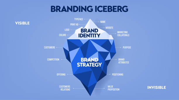
# Alright, let’s talk straight. When the name “brand visual identity” comes up, many people only picture a logo in their minds, maybe a few colors at most. But it’s much more than that, my friend. Your brand’s visual identity is essentially its face, the attire your brand wears to present itself to the world. It’s not just a pretty logo, but all the visual elements that attract your audience and make them recognize and remember you among hundreds of competitors. You know? It’s like your unique signature, something only you have and no one else does.
This identity encompasses a lot of things: from the very logo I mentioned, to the color palette you choose, the fonts used for your texts, the style of photography and images you employ, icons, and even the overall visual tone you maintain across all your advertising messages and communications. Each of these is a piece of a larger puzzle that, together, creates a complete and coherent image of your brand. And well, if this image isn’t assembled correctly, the audience gets confused, doesn’t know what they’re dealing with, and will probably quickly move on.
Imagine someone who comes to work every day with a completely different and unrelated style of clothing. One day a suit, another day shorts and a T-shirt, another day traditional attire! Isn’t it confusing? Your brand is the same. It needs a distinct and consistent style to clearly convey its message. The main goal of brand visual identity design is precisely this: to create and transmit a unified, powerful, and memorable message. This message should be such that even before the audience reads or hears a word from you, they understand who you are, what value you offer, and what you do.
This issue has become doubly important, especially in today’s crowded and noisy digital world. A place where eyes quickly scan over content and there’s little opportunity to grab attention. A strong visual identity can engrave you in the audience’s mind in those first few seconds. This identity gives your business a “face,” endowing it with a personality through which it can connect with people. Without it, you’re just a name on a long list of competitors, without any special feature that distinguishes you. And well, who wants to be like that? Certainly no one.
💡 Deep Understanding of Audience and Brand Values Before Design
![]()
![]()
Before you pick up a pen and even draw a line on paper for brand visual identity design, there’s an incredibly crucial step that many people overlook, or perhaps just rush through. This stage is like the foundation of a building. If it’s not strong, the whole structure might collapse. What do I mean? I mean a deep and real understanding of the target audience and, of course, of the brand itself and its values. After all, how can you design a perfect outfit for someone when you don’t know their size, what colors they like, and for what occasion they want it?
First and foremost, the audience. Who is going to buy or use your products or services? What’s their gender? Age? Occupation? What are their concerns? What are their dreams? What matters to them? What’s their lifestyle like? For example, if your customers are mostly young, tech-savvy people, your visual identity should definitely be modern, dynamic, and perhaps with bold colors. But if your audience is traditional, large businesses, you might need something more formal and trustworthy. Rasaweb Afarin always emphasizes that market research and building “customer personas” is the first step; without these, any design is like shooting in the dark.
Then we come to the brand itself. Who are you? Why do you exist? What is your mission? What problem are you going to solve in people’s lives? What value do you offer that others don’t? What’s your future vision? For example, is your brand innovative and bold, or does it focus more on stability and tradition? Are you friendly and approachable, or formal and authoritative? The answers to these questions are like your brand’s DNA. This DNA must be reflected in all your visual elements.
Successful brands, like Apple or Coca-Cola, have a visual identity that completely aligns with their values. Apple, with its simplicity and minimalist design, conveys a sense of innovation and luxury. Coca-Cola, with its red color and distinctive font, conveys a sense of joy and authenticity. These are not accidental. They are the result of years of thought, research, and purposeful design. So, before anything else, have a serious brainstorming session with yourself, your team, and perhaps an expert consultant like us at Rasaweb Afarin to truly solidify these foundations. This work will not only clear the path for the designer but also assure you that the final result is exactly what you had in mind from the beginning and is aligned with the heart of your brand.
==
Do you want to be seen more effectively in the online space and attract new customers? Rasaweb Afarin, with its targeted online advertising campaigns, delivers your brand message to millions of online users and increases your sales!
✅ Access to a wide and diverse audience
✅ Precise targeting based on interests and behavior
✅ Accurate performance measurement and optimization
For smart online advertising, contact 09124438174!
🎨 The Power of the Logo: A Lasting Symbol for Your Business
“A picture is worth a thousand words.” This old proverb rings truer than ever when it comes to a logo. The logo is the crown of your brand, the first thing that imprints itself on the audience’s mind, and it can, in one glance, shout out your brand’s entire story. Brand visual identity design without a strong and memorable logo is like a king without a crown; incomplete and ineffective. This small symbol sometimes has so much power that it transforms an ordinary brand into a global icon.
But what makes a logo powerful? Simplicity is the first and most important characteristic. A logo must be so simple and clear that it is understandable and memorable in a fraction of a second. Excessive complexity only confuses the audience. Think of the Nike logo; a simple, dynamic swoosh that evokes a sense of movement and victory. Or the Apple logo; a bitten apple that symbolizes innovation and knowledge.
The second characteristic is “timelessness.” A logo should be designed so that it doesn’t become outdated over time and maintains its appeal. Fleeting trends in logo design can make your brand quickly appear unfashionable. A professional designer always thinks about the logo’s sustainability and timelessness. “Adaptability” is also very important. The logo must be able to maintain its readability and appeal at any size and on any platform, from a small business card to a large billboard or even an app icon. This means it must perform well in various dimensions and in black and white versions.
There are different types of logos, each with its own advantages. “Pictorial” logos (like Apple or Twitter) are based on a specific symbol. “Wordmark” logos (like Google or Coca-Cola) are based on the brand name with a specific font. “Combination” logos (like Adidas) include both text and image. Choosing the right type of logo depends on the brand’s nature, the message you want to convey, and of course, the target audience’s taste.
Right here, at Rasaweb Afarin, we are well aware of these points. That’s why when it comes to brand visual identity design, especially logos, a team of designers and strategists gathers to ensure that not just a pretty design, but a meaningful and lasting symbol is created for your business. Something that finds a place in the audience’s heart and stays there for years. This is truly the difference between an ordinary brand and a legendary brand, you know?

Click here to preview your posts with PRO themes ››
| Characteristics of a Successful Logo | Explanation |
|---|---|
| Simplicity | Easy to understand and remember. |
| Timelessness | Does not become outdated and remains appealing over time. |
| Adaptability | Usable in various sizes and platforms. |
| Uniqueness | Distinct from competitors and original. |
| Consistency | Appropriate to the brand’s message and identity. |
🌈 The Psychology of Colors and Their Impact on Visual Identity

Have you ever wondered why some brands always use a particular color? Or why seeing a specific color unconsciously evokes a certain feeling in your heart? These are not accidental, my friend. Behind every color choice in brand visual identity design, there’s a world of psychology. Colors have an uncanny power; they can stimulate emotions, revive memories, and even influence our purchasing decisions. It’s as if each color has its own language that speaks without the need for words.
Let’s take a few examples: Red is usually associated with energy, passion, love, and excitement. That’s why many fast-food brands (like McDonald’s or KFC) use it to stimulate hunger and urgency. Blue conveys a sense of calm, trust, security, and professionalism. It’s a very good choice for banks, tech companies, and brands related to water and health. Green reminds us of nature, growth, health, and wealth, and is excellent for organic, financial, or environmental brands.
Yellow symbolizes joy, optimism, and positive energy. Orange shows creativity and friendliness. Purple represents luxury, creativity, and sophistication. And Black displays power, elegance, and luxury. Of course, these are general rules and may have different interpretations in various cultures and societies. For example, in some cultures, white symbolizes purity, and in others, it symbolizes mourning.
When we choose a color palette for a brand, we’re not just looking for pretty colors. We’re looking for colors that align with the “brand’s personality” and strengthen the message the brand intends to convey. If a brand is supposed to give a sense of innovation and youth, a bright and vibrant palette might be suitable. If it’s supposed to convey trust and expertise, darker and more serious colors might work better. The point is that colors, without words, speak to the audience, and a skilled visual identity designer knows how to use this power to the brand’s advantage.
At Rasaweb Afarin, we always emphasize that color selection should be based on thorough research into the target audience and brand values. This isn’t just a matter of taste; it’s a strategic decision that can have a huge impact on how the audience perceives your brand. The right color palette can make your brand memorable, while a wrong choice can lead to your brand not being seen as it should, or even worse, conveying the wrong message. It’s like wanting to wear a wedding dress to a funeral; you see how strange it is and sends the wrong message, right?
✒️ The Art of Typography; Your Brand’s Written Voice
![]()
![]()
Imagine someone speaking to you in a very loud and harsh voice, or conversely, in a quiet and shaky voice. How would you feel? The way words are expressed affects the message you receive just as much as the words themselves. The same is true in the world of brand visual identity design. “Typography,” or the art of selecting and arranging fonts, plays the role of your “brand’s written voice.”
Choosing the right font is much more than just picking a “pretty” font. Fonts, just like colors, have personality. Some are formal and serious, some are friendly and approachable, some are modern and minimalist, and some are traditional and dignified. Fonts can convey a sense of trust, innovation, calm, or even excitement to the audience. For example, “serif” fonts (like Times New Roman, which have small decorative lines at the ends of strokes) usually evoke a sense of tradition, seriousness, and credibility, and are more suitable for long, formal content. But “sans-serif” fonts (like Arial or Helvetica, which lack these decorative lines) are more modern, cleaner, and have better readability for use on websites and digital displays.
In brand visual identity design, it’s not just the choice of a single font that matters. How that font is used is also very important. This includes font size, line spacing, kerning (spacing between letters), and of course, typographic hierarchy. That is, what font, size, and color should headings have? What about the main text? What about captions? This hierarchy helps the audience digest information more easily and understand which parts are more important.
A strong visual identity usually uses a combination of two or three fonts: one font for headings, which can be a bit bolder and more striking, and another font for the main text, which should be very readable and calming. This combination should have harmony and complement each other, not each going its own way. For example, if you use a very fancy font for the heading and a very stiff and formal font for the main text, your message will likely become ambiguous.
When we work on brand visual identity design at Rasaweb Afarin, we pay close attention to these details. Because we know that a small mistake in font selection can derail the brand’s entire message. A suitable font can increase readability, build trust, and ultimately help your brand remain memorable in the audience’s mind. It’s like choosing a good voice for dubbing a movie; if the voice doesn’t match the character, the whole movie can be ruined, right?
Is your in-app advertising failing to target the right audience?
Rasaweb Afarin, with smart in-app advertising, puts your product in front of relevant users!
✅ Increased app installs and engagement
✅ Precise targeting based on interests
Consult us for effective in-app advertising!
📸 Visual Language and Complementary Graphic Elements
Logos, colors, and fonts are the main pillars of brand visual identity design. But are these alone enough? Absolutely not. A powerful brand needs a “complete visual language” that includes all complementary graphic elements. These elements, just like food seasonings, add flavor and depth to your logo and color palette, making your brand convey a familiar and cohesive feeling with every interaction with the audience.
Illustrations, patterns, icons, and even photography style are all part of this visual language. For example, if your brand leans towards a modern and minimalist style, using abstract images or simple, linear icons might be a suitable choice. But if you have a brand that conveys a traditional and handcrafted feel, perhaps textured and warm photography, or watercolor paintings, would be more appropriate.
Let’s explain further:
• Photography Style: This isn’t just about choosing pretty photos. Your brand needs to have a specific photography style. Are your photos bright and airy, or dark and dramatic? Do the models in your photos always smile, or are they serious and contemplative? Even the type of filter or photo editing matters. This consistency makes the audience understand that it’s from your brand as soon as they see a photo, even before seeing the logo.
• Icons and Illustrations: These can convey complex concepts simply and are an excellent way to add personality to your brand. For example, the icons used on your website or app should align with the brand’s overall style. If your logo is geometric and linear, fancy and cartoonish icons will definitely look inconsistent. The same goes for illustrations; do you use vector designs or hand-drawn paintings? Each tells its own story.
• Patterns and Textures: Sometimes, a specific pattern or texture can give your brand more depth and identity. These patterns can appear in the website background, on product packaging, or even in social media content. For example, a luxury fashion brand might use a delicate and complex pattern, while a children’s brand might use cheerful and colorful patterns.
The goal of all this is “visual consistency.” From business cards to websites, from product packaging to Instagram posts, everything must belong to one family. When all these elements work together and speak a unified language, your brand not only looks more professional but also firmly embeds itself in the audience’s mind. This is where Rasaweb Afarin’s expertise truly shines, because we consider all these details to create a complete and impeccable visual identity for you that stands out in any environment and conveys your brand message clearly and articulately.

Click here to preview your posts with PRO themes ››
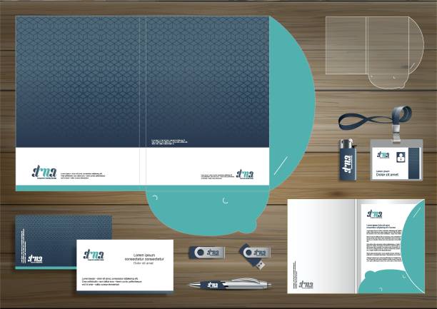
📘 Brand Guidelines: A Roadmap for Consistency
![]()
![]()
A great visual identity can be designed, but what good is it if no one knows how to use it? This is where “Brand Guidelines” or the “Brand Manual” comes into play. This document is like a roadmap or a constitution for your brand, a comprehensive document that defines all the details related to your brand visual identity and even its tone of voice. If we want to give an example, imagine you have a symphony orchestra. The brand guidelines are the notes and score of that orchestra, ensuring that all musicians play your brand’s tune flawlessly and in perfect harmony.
What can you find in good brand guidelines?
• Logo: The most important part. The correct way to use the logo, its clear space, minimum allowed size, different color variations (e.g., monochrome or full color), and even things that should not be done (like stretching or distorting the logo).
• Color Palette: Precise color codes (RGB, CMYK, Hex) for use in various media, primary colors, and secondary colors.
• Typography: Primary and secondary fonts, size and weight of each font for headings, subheadings, and body text. We’ve explained these so that anyone wanting to write content knows which font and size to use.
• Imagery and Graphic Style: Guidelines on photography style, use of icons, illustrations, and graphic patterns. Should images be realistic or abstract? Color or black and white?
• Tone of Voice: This section is mostly related to content, but it’s an inseparable part of brand identity. Does your brand speak in a friendly and humorous way, or formally and seriously?
The main goal of having brand guidelines is “consistency and coherence.” Imagine you have a marketing team active on social media, another team updating the website, and an advertising agency collaborating with you on campaigns. Without clear guidelines, each might march to their own beat, and as a result, your brand might have a different look and feel on each platform. This lack of coordination leads to audience confusion and decreased trust. Brand guidelines ensure that your visual and verbal message is conveyed correctly and consistently everywhere and by everyone.
Rasaweb Afarin’s team, with its experience in brand visual identity design and digital marketing, truly understands how vital brand guidelines are. We not only design your visual identity but also provide comprehensive and practical guidelines to ensure your brand always shines with power and consistency everywhere. This is truly an investment in your brand’s future, not an additional cost.
| Key Elements of Brand Guidelines | Importance |
|---|---|
| Logo and its Application | Maintaining visual consistency of the logo across all platforms. |
| Color Palette | Creating a consistent brand mood and feel through colors. |
| Typography | Conveying brand personality through fonts and readability. |
| Image and Graphic Style | Consistency in selecting and using visual elements. |
| Tone of Voice | Consistency in messaging and communicating with the audience. |
🌐 Visual Identity in the Digital World; From Website to Social Media
Well, we’ve talked a lot about the general principles of brand visual identity design, but now we get to another very important part: how to implement this identity in the digital world? You know, once upon a time, branding focused more on print, television, and billboards. But now, your brand’s digital presence is more essential than ever. Website, application, social networks, email marketing, online advertising… each of these is a crucial touchpoint with the audience and must display your visual identity in the best possible way.
When we say “brand visual identity design for the digital world,” it means we have to consider a lot of things that might not have been so important in the offline world. For example, “responsiveness” of the design. Your logo should look good on a large laptop screen as well as on a small mobile phone. Your colors should be seen with consistent quality and clarity across different displays. Your fonts should be readable on any device, even if the screen is very small.
Your website is your brand’s main storefront in the digital world. The UX/UI (User Experience/User Interface) design of the website must be completely consistent with the brand’s visual identity. The site’s color scheme, element layout, buttons, icons, images used; all must be integrated and reinforce the feeling your brand is meant to convey. If you are a luxury brand, your website should convey a sense of elegance and luxury, not be cluttered and messy.
Then we get to social networks. Instagram, Telegram, LinkedIn, and other platforms. Each of these has its own environment and rules. But your brand’s visual identity must be consistent and recognizable across all of them. From your profile picture and page cover to the theme of your posts, stories, and even your communication tone. Using consistent graphic templates, a specific color palette, and brand fonts helps the audience quickly identify your posts in their crowded feed and develop a sense of familiarity with your brand.
This is where Rasaweb Afarin’s services truly come in handy. We specialize not only in brand visual identity design but also in optimizing it for all digital platforms. From website and application design adhering to UI/UX principles to social media management and visual content creation, and even digital advertising campaigns like Google Ads or Instagram ads. We ensure that wherever your audience sees you in the online world, they see a consistent, professional, and trustworthy face of your brand. Because in the digital world, the first impression is often also the last impression if not done right.
📈 Measuring Visual Identity Success: Feedback and Optimization

Okay, now let’s assume we’ve carefully completed all the steps of brand visual identity design and have a stylish and professional visual identity. Is the job done? No, it’s just the beginning of the real work! Like any other part of a business, the success of visual identity must also be measured. How do we know if all this effort has truly paid off and is helping us achieve our branding goals? This is where feedback, analysis, and of course, optimization come into play.
The first and perhaps most important criterion is “Brand Recognition.” Do people easily recognize your brand? For example, if they only see your logo without the name, can they guess who this product or service is from? Are your visual elements, such as colors or fonts, ingrained in the audience’s mind? You can measure brand recognition through surveys, focus groups, and even online tools.
The second is “Audience Perception and Impression.” Does your visual identity convey the message you intended? For example, if you wanted your brand to feel modern, did it actually convey that feeling to the audience? You might think blue evokes trust, but your audience might feel coldness from it. This is where direct feedback from target customers and audiences is crucial. By asking specific questions about their feelings towards the brand’s visual elements, you can gain this understanding.
Third, “Increased Engagement and Loyalty.” An attractive and consistent visual identity can increase audience engagement with the brand. When you publish a post on Instagram, does it get more likes and comments? Has your click-through rate (CTR) on ads improved? Do customers feel a closer connection and greater loyalty to your brand? These are all indicators that can show the success of your visual identity.
Click here to preview your posts with PRO themes ››
And finally, “Impact on Sales and Revenue.” All these efforts should ultimately lead to business growth. Has your brand visual identity design helped attract new customers and increase sales? Has the perceived value of your products or services increased? These are key questions that need to be answered.
The important thing is that branding is not a static process. The world changes, tastes evolve, competitors surge ahead. So, brand visual identity also needs periodic review and optimization. Perhaps after a few years, a “rebranding” or at least a “brand refresh” will be necessary. Rasaweb Afarin, in addition to design services, also specializes in data analysis and feedback collection to help you ensure your brand’s visual identity always remains fresh, relevant, and effective, and has something to say in this competitive market.
Are you tired of potential customers leaving your site due to poor design?
Rasaweb Afarin designs websites and applications focused on UX/UI, creating an unparalleled experience for your users and increasing conversion rates!
✅ Beautiful and intuitive user interface
✅ Smooth and enjoyable user experience
✅ Increased user retention time on the site
Make your website more user-friendly today!
🚀 Brand Visual Identity Design with Rasaweb Afarin: A Path to Sustainable Growth

Up until now, we’ve thoroughly discussed the importance of brand visual identity design, from its definition and components to the psychology of color and the role of typography. We understood how a simple logo can speak a thousand words and how crucial it is to understand the audience and brand values before taking any step. We also saw how brand guidelines can act like a compass, clarifying our brand’s direction, and the importance of a strong digital presence with a cohesive visual identity. But, the question is, how can all of this be implemented in practice, in the best possible way?
This is precisely where the expertise and experience of a professional team like Rasaweb Afarin come into play. You know, talking about branding and visual identity is one thing; actually implementing it is another. Being able to apply all these principles in a coherent and powerful package for a specific business requires high knowledge, experience, and creativity. Rasaweb Afarin is not just a brand visual identity design company. We are a strategic partner for the sustainable growth of your business.
Our team at Rasaweb Afarin, with a comprehensive approach to digital marketing, accompanies your brand from start to finish. We begin with the very first step: thorough research and understanding of your target audience and brand values. Then, with a team of creative and experienced graphic designers, we create a unique visual identity for you that is not only beautiful and eye-catching but also conveys a powerful and lasting message. This is not just a logo; it’s a complete visual system that includes color selection, fonts, photography style, icons, and all graphic elements.
After the design, our work doesn’t end. We help you establish comprehensive “brand guidelines” so that all your team members and even your collaborators know how to use your visual identity. And because Rasaweb Afarin is professional in digital marketing, we optimize this entire identity for a powerful presence in the digital world, from website and application design to professional social media management and online advertising campaigns.
Our ultimate goal is for your brand to not only be seen in the market but to be ingrained in the audience’s mind and experience sustainable and continuous growth. A strong visual identity is the backbone of successful marketing. When this backbone is solid, all other marketing activities, such as SEO, content marketing, and advertising campaigns, become many times more impactful. If you want your brand to shine in today’s crowded world and have a unique story to tell, Rasaweb Afarin is ready to be by your side on this journey and use its experience and expertise for your success. Let’s build a legendary brand!
| Question | Answer |
|---|---|
|
What exactly does brand visual identity mean? |
Brand visual identity is a collection of all visual elements such as the logo, color palette, fonts, image style, and icons that distinguish a brand from others and convey its message and personality to the audience. It’s not just an appearance, but the visual heart of your brand. |
|
Why is brand visual identity design important for my business? |
A strong visual identity helps your brand get recognized in today’s crowded market, builds audience trust, clearly displays its values, and ultimately leads to growth and customer loyalty. It’s the first encounter and the strongest visual memory of your brand. |
|
How important is the logo in visual identity? |
The logo is the heart and primary symbol of visual identity. It is often the first element audiences encounter and must be simple, memorable, adaptable, and reflective of the brand’s personality. |
|
How is color psychology used in brand visual identity design? |
Colors have a profound impact on audience emotions and perception. By understanding color psychology, designers can choose a color palette that aligns with the brand’s personality and unconsciously conveys specific messages (such as trust, energy, or calm). |
|
What role does typography or font selection play in visual identity? |
Typography is the written voice of the brand. Chosen fonts can convey formality, friendliness, modernity, or tradition. Readability, hierarchy, and consistency in font usage are crucial for effective brand message delivery. |
|
What are brand guidelines and why do I need them? |
Brand guidelines or a brand manual is a comprehensive document that defines all rules and instructions for using visual identity elements (logo, colors, fonts, etc.) and even the brand’s tone of voice. This document ensures the consistency and coherence of your brand across all platforms and by all individuals. |
|
How can I optimize my brand’s visual identity in the digital world? |
To optimize for the digital world, you need to ensure your visual identity is responsive (adaptable to different devices), aligns with your website and application’s UI/UX principles, and is used with complete consistency and harmony across all social platforms. |
|
How can I measure the success of my brand’s visual identity? |
The success of visual identity can be measured through indicators such as brand recognition, audience perception of the brand, the level of user engagement with visual content, and ultimately, its impact on business sales and revenue. Direct customer feedback is also very important. |
|
How can Rasaweb Afarin help me with brand visual identity design? |
Rasaweb Afarin, with a team specialized in graphic design and digital marketing, accompanies you from the research and brand understanding stage to comprehensive visual identity design, creating brand guidelines, and optimizing it for a strong digital presence, helping your brand achieve sustainable growth and success. |
|
Is brand visual identity design a one-time thing or does it need updates? |
Brand visual identity, like any other aspect of a business, should be reviewed periodically. With changing tastes, trends, and competitors, you may need to update (brand refresh) or even redesign (rebranding) to ensure your brand always remains fresh and relevant. |
And other services of Rasa Web Advertising Agency in the field of advertising
• Planning and executing webinars
• Programmatic advertising
• Optimizing banner display ads
• Designing and developing organizational portals
• SEO for news websites
And over hundreds of other services in internet advertising, advertising consultation, and organizational solutions
Internet Advertising | Advertising Strategy | Advertorials
What do you need for innovation?
Create new products by accessing the latest research and technological trends.
✅ Inspiring innovation in products and services.
✉️ info@idiads.com
📱 09124438174
📞 02126406207
Tehran, Mirdamad Street, next to Bank Markazi, Southern Kazeroun Alley, Ramin Alley, No. 6