
Introduction to Responsive Website Design: A Necessity in Today’s World

In this era where users access the internet from various devices such as smartphones, tablets, laptops, and even smart TVs, having a fixed and inflexible website means losing a large portion of the audience.
This is where the concept of #Responsive_Web_Design introduces itself as an urgent need.
Responsive web design is a solution that enables your website to provide the best user experience on any screen size and any device.
This approach not only improves #User_Experience but also holds significant importance in various aspects, including #SEO.
The main goal of implementing responsive design is to ensure that your content is displayed legibly and accessibly across all platforms, without the need to develop separate versions for each device.
This issue, namely compatibility and flexibility, is no longer a competitive advantage but an industry standard for any website seeking success in the online space.
This has been a paradigm shift in web design, moving from a desktop-first approach to a #Mobile_First approach, meaning designing for small screens first and then larger ones.
Are you worried about your online store’s low conversion rate and not achieving your desired sales?
RasawWeb is your specialized solution for a successful online store.
✅ Significant increase in conversion rates and sales
✅ Professional and user-friendly design to attract customer satisfaction
⚡ Ready for a revolution in online sales? Get a free consultation!
Technical Principles of Responsive Design: Structure and Implementation

To understand #Responsive_Website_Design more deeply, it is necessary to become familiar with its technical principles.
The three main pillars of this approach include #Media_Queries, #Fluid_Grids, and #Flexible_Images.
Media Queries, a part of CSS3, allow designers to apply different CSS rules based on device characteristics such as screen width, height, orientation, and resolution.
For example, you can specify that the website layout changes to a single column for widths less than 768 pixels.
Fluid grids work based on relative units like percentage (%) instead of pixels (px).
This means that the width and height of website elements change relative to the screen dimensions, and the content dynamically fills the available space.
Flexible images also ensure, using the `max-width: 100%` property in CSS, that images never overflow their container and their size automatically adjusts to the available space.
The intelligent combination of these three principles allows for creating a seamless and optimized user experience on any device.
This technical approach forms the core of every modern #Responsive_Web_Design project.
Amazing Benefits of Responsive Design for Businesses and Users

Implementing #Responsive_Website_Design brings numerous benefits for both businesses and users.
From a business perspective, one of the most important achievements is #Improved_SEO and search engine rankings.
Google has officially stated that it prefers responsive websites over separate mobile and desktop sites, as there is a single URL for content, which is easier to manage and avoids duplicate content issues.
This directly leads to an increase in #Organic_Traffic and business visibility.
Furthermore, the Conversion Rate also increases; when users have a smooth user experience across all devices, there is a higher probability of purchase, registration, or any other desired action.
Reduced development and maintenance costs are another economic advantage, as there is only one single version of a website to maintain instead of multiple versions.
From the user’s perspective, an #Optimized_User_Experience and easy access to content anytime, anywhere, holds invaluable worth.
This design ensures easy navigation, faster loading times, and correct content display, which in turn increases customer loyalty.
| Feature | Responsive Website | Non-Responsive Website |
|---|---|---|
| User experience on different devices | Excellent and consistent | Poor and unusable on mobile |
| SEO and Google ranking | Optimized and preferred by Google | Vulnerable, reduced ranking on mobile |
| Development and maintenance costs | Lower (one codebase) | Higher (multiple codebases) |
| Conversion Rate | Higher | Lower |
| Loading time | Usually optimized | May be slow on mobile |
Common Challenges in Implementing Responsive Design and Solutions

Despite numerous advantages, implementing #Responsive_Website_Design can also come with challenges that developers need to address.
One of the #Responsiveness_Challenges is managing performance and loading speed.
If unnecessary images and code for desktop versions are loaded in the mobile version without optimization, the site speed will drastically decrease.
The solution to this problem is to use techniques such as Lazy Loading for images and optimizing CSS and JavaScript codes.
Another challenge is #Testability across different devices.
With countless variations in screen sizes and browsers, ensuring the website displays correctly on all of them is difficult.
Using browser simulator tools and real tests on physical devices can help overcome this challenge.
Also, content compatibility and User Interface (UI) design for different screen sizes is a concern.
A layout that looks great on desktop might not have enough space on mobile.
Here, a Mobile-First Design approach and prioritizing content from the outset is an effective guide.
Managing dynamic content and advertisements can also be complex, as they must be scalable in a way that does not compromise the user experience on any device.
Does your current corporate website present a worthy image of your brand and attract new customers?
If not, with RasawWeb’s professional corporate website design services, turn this challenge into an opportunity.
✅ Significantly improves your brand’s credibility and image.
✅ Smooths the path for attracting new leads and customers.
⚡ For a free and specialized consultation, contact RasawWeb now!
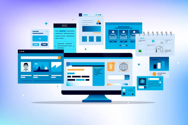
Key Tools and Frameworks in Responsive Design
To facilitate the process of #Responsive_Website_Design and increase development speed, numerous tools and frameworks are available, and their use is highly recommended.
One of the most widely used frameworks is #Bootstrap.
This framework includes a set of pre-written CSS and JavaScript that allows for rapid implementation of responsive elements, from grid systems to navigation components and forms.
Bootstrap, due to its large user community and rich documentation, is a popular choice for many developers.
In addition to Bootstrap, CSS Grid and Flexbox are also powerful CSS3 capabilities that have revolutionized web layout.
#CSS_Grid is a two-dimensional layout tool that provides precise control over rows and columns, while #Flexbox (CSS Flexible Box Layout) is suitable for one-dimensional layouts (row or column) and offers high flexibility in aligning and distributing space between items.
Together, these two are invaluable tools for implementing complex and responsive layouts.
Using these tools makes the #Responsive_Design process not only easier but also more efficient and standardized.

Click here to preview your posts with PRO themes ››
Unparalleled Impact of Responsive Design on Website SEO
As mentioned earlier, #Responsive_Website_Design has a significant impact on #SEO and your website’s position in search engine results.
This impact became even more prominent after Google’s #Mobile_First_Indexing algorithm was introduced in 2018.
According to this algorithm, Google primarily considers the mobile version of a website for indexing and ranking content.
Therefore, if your website does not provide a suitable user experience on mobile, even if it is excellent on desktop, its ranking in search results may decrease.
A website with #Responsive_Web_Design uses a single URL and a single codebase for all devices, which greatly helps Google in crawling, indexing, and organizing content.
This prevents issues such as duplicate content and broken links that might occur if separate versions for mobile and desktop are maintained.
Furthermore, the improved user experience, a direct result of responsive design, also indirectly affects SEO.
Lower Bounce Rate, longer user dwell time on the site, and higher engagement are all positive signals for search engines that contribute to #Site_Ranking.
News and expert information indicate that businesses that have adopted this design have experienced a significant increase in mobile traffic and an improvement in their keyword positions.
The Future of Responsive Design: Beyond Today

The concept of #Responsive_Website_Design, while the current standard, is not merely about simple scalability in the future of web design.
Future trends include Adaptive Design, which goes beyond simple flexibility and specifically presents content and layout based on particular device characteristics.
Progressive Web Apps (or #PWA) also have a bright future.
PWAs are a combination of the best features of websites and mobile applications; they are fast, reliable, and installable on the phone’s home screen, and can even work offline, providing an excellent user experience.
Furthermore, the role of Artificial Intelligence in #Responsive_Website_Design is increasing.
AI can dynamically and personally optimize layout and content by analyzing user behavior, improving the user experience even without direct designer intervention.
These analytical and news trends show that web design is moving towards greater intelligence and personalization, where websites react not only to screen size but also to the individual needs and preferences of users.

Click here to preview your posts with PRO themes ››
| Item to check | Status (Yes/No) | Description |
|---|---|---|
| Does the website display correctly on different devices (mobile, tablet, desktop)? | Check by resizing the browser or using developer tools. | |
| Is the navigation (menus) user-friendly on mobile (e.g., hamburger menu)? | Ensure easy access to all sections. | |
| Do images and videos scale and load correctly? | Check for lack of clutter or excessive loading. | |
| Are forms and buttons usable on mobile? | Check button sizes for easy touching. | |
| Is the website loading speed on mobile adequate? | Use tools like Google PageSpeed Insights. | |
| Is the content readable and understandable on all devices? | Check font size, line spacing, and paragraphs. |
Successful Examples of Responsive Design: Inspiring and Practical

To better understand the power of #Responsive_Website_Design, looking at a few successful examples can be very inspiring.
Websites like Forbes, The Guardian and even Apple, all use this approach to provide a flawless user experience across all devices.
These websites with flexible layouts, optimized images and smart media queries, display their content in such a way that whether on a wide desktop or a small smartphone, the user feels comfortable and has easy access to information.
For example, the Forbes website on its mobile version converts menus into a compact and accessible form and adjusts advertisements so they don’t interfere with content readability.
The Guardian also presents its long articles in a way that reading them on small screens is not tiring.
These #Successful_Examples not only prove the high efficiency of #Responsive_Design but also show how one can achieve better business goals and user experience by adhering to correct principles.
They offer valuable lessons in #Case_Study design and implementation and can be a good source of inspiration for future projects.
Does your current online store design cause you to lose customers and sales?
RasawWeb is your solution with modern and user-friendly online store designs!
✅ Significant increase in conversion rates and sales
✅ Creation of strong branding and building customer trust
⚡ Get a free online store design consultation from RasawWeb!
Step-by-Step Process for Implementing Responsive Design

Implementing #Responsive_Website_Design is a systematic process that includes several key stages.
The first step is #Planning and Research.
In this stage, target audiences, the devices they use most frequently, and business objectives must be accurately identified.
Determining breakpoints (Breakpoints) for media queries is crucial at this stage.
The second stage is #Website_Design, which should begin with a mobile-first approach.
First, the layout and main elements should be designed for the smallest screen, and then gradually expanded for larger screens.
This approach ensures that the core user experience is optimized from the ground up for mobile devices.
The third stage is Development, where coding is done using HTML, CSS, and JavaScript.
Using the frameworks and tools mentioned in previous sections can help accelerate this process.
The fourth and very critical stage is #Responsiveness_Testing.
The website must be tested across a wide range of devices, browsers, and operating systems to ensure it functions correctly on all of them.
Using automated and manual testing tools is essential.
Finally, after launch, monitoring performance and gathering user feedback for future improvements is important.
These #Implementation_Stages provide a comprehensive guide for any team intending to create a responsive website.
Why Responsive Design Is a Smart Investment

At the end of this comprehensive review, it is clear that #Responsive_Website_Design is no longer a luxury option but a strategic necessity for every business and individual operating in the online space.
This approach not only helps you keep pace with the evolving needs of today’s users but also directly impacts your long-term success in the digital world.
Investing in #Responsive_Design means investing in #User_Experience excellent, improved search engine rankings, increased conversion rates, and ultimately, the sustainable growth of your business.
With a responsive website, you will be ready for the #Future_of_Web, as this design provides the flexibility needed to adapt to emerging technologies and devices.
This #Digital_Investment reduces maintenance costs and simplifies content management.
Finally, embracing the #Importance_of_Responsiveness allows you to reach a wider audience and have a powerful and effective presence in the online market.
So, if your website is not yet equipped with this technology, it’s time to take action and prepare your site for today’s changing world and the future.
Click here to preview your posts with PRO themes ››
Frequently Asked Questions
| Question | Answer |
|---|---|
| What is Responsive Web Design? | It’s a method for designing websites that optimizes the appearance and functionality of the website according to the screen size of the user’s device (mobile, tablet, laptop, etc.). |
| Why is responsive design important? | Due to the increasing use of various devices to access the internet, responsive design provides a better user experience, improves website SEO, and reduces maintenance costs. |
| What are the most important tools for responsive design? | Media Queries in CSS, use of relative units (such as percentage, em, rem, vw, vh), Fluid Images, and Grid Systems. |
| What role do Media Queries play in responsive design? | Media Queries enable the application of different CSS styles based on device characteristics (such as screen width, height, orientation, and screen type). |
| What is the concept of Mobile First in responsive design? | It’s an approach where design and development begin first for the smallest screen (mobile) and then gradually expand to larger screens (tablet, desktop). |
| Does responsive design affect website SEO? | Yes, Google prefers responsive websites because they offer a better user experience and eliminate the need for separate mobile and desktop versions, which helps improve SEO ranking. |
| What does Fluid Layout mean? | It means that the width of page elements is defined using relative units (such as percentages) instead of fixed pixel values, so they automatically adjust as the screen size changes. |
| How are Flexible Images used in responsive design? | By setting the `max-width: 100%;` property for images in CSS, it is ensured that the image never exceeds its container and its scale is maintained with screen size changes. |
| What are the differences between responsive design and adaptive design? | Responsive design uses a single layout that fluidly adapts to any screen size, while adaptive design uses several fixed, predefined layouts for specific screen sizes. |
| Are CSS frameworks like Bootstrap useful in responsive design? | Yes, frameworks like Bootstrap have a responsive Grid System and pre-designed components that make the process of building responsive websites much simpler and faster. |
And other services of Rasaw Web advertising agency in the field of advertising
Smart Content Strategy: A fast and efficient solution for digital branding with a focus on intelligent data analysis.
Smart SEO: An effective tool for online growth with the help of Google Ads management.
Smart Direct Marketing: A combination of creativity and technology to improve SEO ranking by optimizing key pages.
Smart Sales Automation: An effective tool for online growth with the help of attractive UI design.
Smart Link Building: Professional optimization for customer acquisition using key page optimization.
And over hundreds of other services in the field of internet advertising, advertising consultation, and organizational solutions
Internet Advertising | Advertising Strategy | Advertorials
Resources
The Importance of Responsive Design in the Current Era
How Responsive Website Design Transforms Your Business?
The Future of Web Design: Why Think About Responsiveness?
Advanced Techniques in Responsive Website Design
? To shine in the digital world and reach the pinnacle of success, RasawWeb Digital Marketing Agency offers comprehensive services including professional website design and SEO, accompanying you to elevate your business to the position it deserves.
📍 Tehran, Mirdamad Street, next to Bank Markazi, Kazeroun Jonoubi Alley, Ramin Alley, No. 6


