
What is Responsive Website Design and Why is it Important?

In today’s world, where various devices with diverse screen sizes are available to users, the concept of #Responsive_Website_Design (#Responsive_Web_Design) has become more important than ever.
Responsive design is an approach in web design where the content and layout of a website automatically adapt to the user’s screen size.
This means your website will be displayed in the best possible way, whether on a desktop computer, tablet, or smartphone, providing a seamless and optimized user experience.
The importance of this approach is not limited to visual aesthetics; it directly impacts vital factors such as conversion rates, user retention on the site, and even search engine rankings.
Failure to use a responsive website design can lead to losing a large segment of your audience, as users quickly leave websites that provide a poor user experience on their devices.
This discussion explains the fundamentals of this vital concept.
Today, with the increasing use of mobile phones for internet access, having an adaptive and dynamic design is not just an advantage, but an undeniable necessity for any business aiming for an effective presence in the digital space.
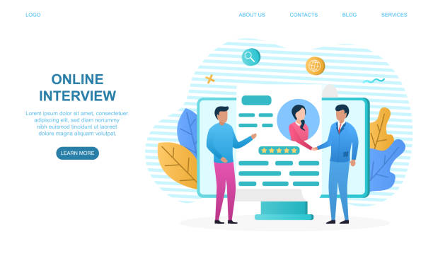
Losing potential customers due to an unprofessional website? RasaWeb is your answer! With our specialized corporate website design services:
✅ Enhance your business’s credibility and standing
✅ Experience attracting more targeted customers
⚡ Act now to receive a free consultation!
Why is Responsive Design a Necessity Today?

In the current era, where smartphones and tablets have become the primary tools for internet access, the fundamental question is why responsive website design is not just an option, but a vital requirement for any online business? #Current_trend_analysis shows that a significant percentage of web traffic comes from mobile devices.
Therefore, if your website cannot adapt to these devices, you will effectively lose a large portion of your potential market.
Search engines like Google also place high importance on website responsiveness, and websites that do not provide a good user experience on mobile may rank lower.
This directly affects your site’s SEO and can lead to reduced visibility in search results.
Furthermore, poor user experience (Poor UX) leads to an increase in bounce rate and a decrease in user retention time on the site.
A non-responsive website may display images incorrectly, place text outside the frame, or make navigation elements inaccessible, all of which lead to user frustration and quick exit from the site.
Responsive website design ensures that users, regardless of the device they use, can easily access information and have a positive experience interacting with your brand.
Ultimately, this significantly helps improve brand credibility, increase customer trust, and consequently, grow your business.
Ignoring this issue can leave your business behind your competitors who are leaders in this field.
Fundamental Principles in Implementing Responsive Design

Implementing a successful #responsive_design requires a deep understanding of its fundamental principles.
These principles include the use of #Fluid_Grids, Flexible Images, and Media Queries.
Fluid grids, instead of using fixed pixels, use relative units like percentages to determine element widths, allowing them to scale up or down according to screen size.
Flexible images are also adjusted using CSS to change their dimensions proportional to their container, preventing them from overflowing or appearing distorted.
But perhaps the most important tool in responsive website design is Media Queries.
This CSS capability allows developers to apply different styles based on device characteristics such as screen width, orientation (horizontal or vertical), and device type.
For example, you can define that on pages with a width less than 768 pixels, the navigation menu is displayed as a Hamburger Menu.
Correct understanding and application of these principles are the foundation of a strong and efficient responsive design.
| Principle | Explanation | Tool/Technology |
|---|---|---|
| Fluid Grid | Uses relative units (percentages) for element layout instead of fixed pixels. | CSS (Flexbox, CSS Grid) |
| Flexible Images | Adapting image sizes to the parent container, without losing quality or overflowing. | CSS (max-width: 100%), picture tag |
| Media Queries | Applying different styles based on screen characteristics (width, height, orientation). | CSS Media Queries |
| Mobile-First Approach | Starting design from the smallest screen size and then expanding to larger ones. | Design Approach |
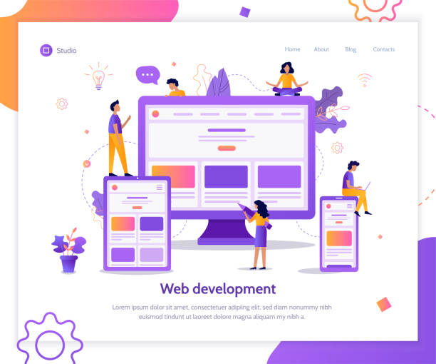
Modern Tools for Responsive Web Development

Web developers utilize a set of #modern_tools for effective #responsive_website_design implementation.
These tools facilitate the design and coding process, helping them build efficient websites compatible with various devices.
One of the most common tools is CSS frameworks like Bootstrap and Tailwind CSS.
These frameworks significantly increase development speed by providing a set of predefined classes for grids, navigation, forms, and other UI elements, ensuring that the design displays correctly across different devices.
In addition to frameworks, Browser Developer Tools also play a crucial role in the #responsive_web_development process.
These tools, built into browsers like Chrome and Firefox, allow developers to simulate the website on various screen sizes, inspect elements, and test CSS changes live.
These capabilities are invaluable for debugging and optimizing the user experience across different devices.
The use of CSS preprocessors like SASS or LESS also helps organize and manage CSS code in large projects, providing the ability to use variables, functions, and mixins, which are very useful in a complex responsive website design.
These educational and specialized tools make the process of converting an idea into a fully compatible website much easier.
Does your current corporate website present a worthy image of your brand and attract new customers?
If not, transform this challenge into an opportunity with RasaWeb’s professional corporate website design services.
✅ Significantly improves your brand’s credibility and image.
✅ Paves the way for attracting leads and new customers.
⚡ Contact RasaWeb now for a free and specialized consultation!
Challenges and Solutions for Responsive Website Design

Despite numerous advantages, implementing #responsive_website_design is not without its challenges.
One of the biggest challenges is #content_and_image_management for optimal display on various screen sizes.
High-quality images may load slowly on mobile devices, while lower-quality images can degrade the user experience on larger displays.
The solution to this issue is to use Responsive Images, which utilize HTML5 features like the `<picture>` tag or the `srcset` attribute to allow the browser to select the best image size and format based on the user’s device characteristics.
Another challenge is maintaining site performance and loading speed across all devices.
An unoptimized responsive website may slow down on mobile due to excessive CSS and JavaScript loading.
Guidance in this area includes code optimization, using GZIP compression, reducing HTTP requests, and lazy loading images and videos.
Also, navigation complexity on smaller screens can be a challenge.
Designing user-friendly mobile menus, such as hamburger or accordion menus, is a solution to this problem.
Finally, extensive testing of the website on various devices and browsers to identify and resolve potential issues is of high importance.
These challenges can be managed with careful planning, using appropriate tools, and adhering to best practices in responsive website design.
The Impact of Responsive Design on SEO and User Experience

The #impact_of_responsive_design on SEO and user experience (UX) is undeniable.
From an SEO perspective, Google has explicitly stated that it prefers mobile-friendly websites and ranks them higher in mobile search results.
This is because Google aims to provide the best possible experience to its users, and websites that do not display well on mobile devices fail to meet this goal.
A responsive website design, by having a single URL for all devices (unlike separate mobile sites with m.example.com), prevents duplicate content issues and simplifies the crawling and indexing process for search engines.
From a user experience standpoint, a responsive website increases accessibility.
Users can easily view your content on any device without needing to zoom or horizontal scroll.
This seamless and comfortable experience leads to increased user satisfaction, reduced bounce rate, and longer time spent on the site.
These factors not only directly impact conversion rates but also indirectly contribute to SEO improvement through positive signals to search engines.
Therefore, investing in responsive web design is not only vital for your business but also a smart strategy to strengthen your online presence and improve visibility in the digital space.
Case Study: The Success of Responsive Design

To better understand the impact of #responsive_website_design, a look at a real #case_study can be very insightful.
Suppose an online clothing store named ‘Mod Rooz’ (Fashion of the Day) had a website before 2015 that was optimized for desktop and provided a very poor user experience on mobile.
Mobile users had to zoom in and scroll extensively to view products, and the payment process was very difficult.
The result was a high bounce rate (around 70%) and a very low conversion rate (less than 0.5%) from mobile traffic.
After ‘Mod Rooz’ decided to implement a fully responsive website design and rebuilt its site using modern frameworks, they achieved stunning results.
Within six months of launching the responsive version, the mobile bounce rate decreased to 30%, and the mobile conversion rate increased to 2%.
This significant change was due to a dramatic improvement in user experience: product images were optimized and displayed correctly, the navigation menu became simpler and more accessible, and the payment process could be completed in just a few simple steps.
Furthermore, the site’s ranking in mobile search results also improved, and organic traffic from mobile increased by 40%.
This news example is a clear illustration of how a responsive website design can directly impact a business’s revenue and growth, and make the online shopping experience much more pleasant for customers.
| Indicator | Before Responsive Design (Mobile) | After Responsive Design (Mobile) |
|---|---|---|
| Bounce Rate | ~70% | ~30% |
| Conversion Rate | <0.5% | ~2% |
| Organic Traffic (SEO) | Low | 40% Increase |
| User Session Duration | Low | Significant Increase |
The Future of Website Design and the Role of Responsiveness
Given the rapid advancements in technology and the emergence of new devices, the question arises: what direction is the #future_of_website_design heading, and what will be the role of #responsive_website_design in this future? Will responsiveness remain the dominant approach, or will new technologies render it obsolete? The answer is that #responsiveness will not only not become obsolete, but with its evolution, it will become an inseparable part of every digital experience.
The emergence of devices such as smartwatches, virtual reality (VR) and augmented reality (AR) devices, and even flexible displays, raises the need for design approaches beyond merely responsive.
Concepts such as Adaptive Design, where the website is optimized for a few specific screen sizes, or Atomic Design, which focuses on building reusable components, will complement the responsive approach.
Furthermore, focusing on Web Performance and loading speed, especially for devices with slower internet connections, will become increasingly important.
Artificial intelligence and machine learning can also be used in the future to automatically optimize layout and content based on user behavior and device characteristics.
Ultimately, although implementation details may change, the fundamental principle of responsive website design, which is to provide an optimal user experience on any device, will remain the cornerstone of web design and will even become deeper and more intelligent.
This thought-provoking content makes us ponder how to prepare for a dynamic future.
Is your e-commerce site ready to attract maximum customers and increase sales? RasaWeb transforms your online business with modern and efficient e-commerce website designs.
✅ Increased speed and improved SEO
✅ Excellent user experience on mobile and desktop⚡ Get a free e-commerce website design consultation from RasaWeb!
Golden Tips for Ordering a Responsive Design
If you intend to order a #responsive_website_design for your business, knowing #golden_tips can help you get the best return on your investment.
The first and most important tip is to collaborate with a #professional and experienced_team in responsive design.
It is essential to review their previous portfolios and ensure that the websites they have designed genuinely perform well on various devices.
Second, emphasize #user_experience (UX).
A beautiful design without a good user experience is worthless.
Ensure that the design team adheres to the principles of User Experience Design and prioritizes analyzing user behavior across different devices.
Third, prioritize optimizing website loading speed.
A responsive website that loads slowly degrades the user experience and negatively impacts your SEO.
Discuss with your team the use of compression techniques, lazy loading, and image optimization.
Fourth, agree on continuous testing after launch.
The web environment is dynamic, and new devices and browsers are constantly being released.
A responsive website design requires continuous maintenance and updates to ensure it functions correctly over time.
Finally, being clear about your goals and expectations for the website is very important.
The more you can share your vision with the designers, the closer the final results will be to your desires.
These guidelines can pave your way to achieving an excellent responsive website.
Beyond Display on Various Devices

#Responsive_website_design is not just about correctly displaying a website on various screen sizes; it has a meaning #beyond_simple_display.
This approach means #providing_a_different_and_optimized_experience based on #user_context.
For example, a mobile user might be looking for quick contact information or navigation, while a desktop user might be interested in in-depth articles or product details.
A truly responsive design adapts content and user interface elements not only visually but also functionally to the needs and expectations of users on each device.
This includes optimizing touch interactions for mobile users, using readable fonts on small screens, and even altering the display priority of content based on available space.
For instance, on a news website, all columns and advertisements might be displayed on desktop, but on mobile, the primary focus would be on article readability, with secondary elements either removed or moved to the bottom of the page.
This level of thought and planning is what distinguishes a responsive website design from a merely adaptive design.
This engaging and creative approach to design allows you to establish more effective communication with your audience at any time and in any location, enriching their digital experience.
Ultimately, the main goal is for the user to feel that your website was designed for them, and for the device they are holding.
Frequently Asked Questions
| Question | Answer |
|---|---|
| What is responsive website design? | Website design whose appearance and layout automatically adapt to the screen size of the user’s device (e.g., computer, tablet, mobile) to provide an optimal user experience. |
| Why is responsive design important? | Given the variety of devices users employ to view websites, responsive design improves user experience, reduces bounce rate, increases time spent on site, and enhances SEO. |
| What are the main principles of responsive design? | The three main principles include Fluid Grids, Flexible Images, and Media Queries. |
| What is a Media Query and what role does it play in responsive design? | A Media Query is a CSS feature that allows you to apply different styles based on display device characteristics such as screen width, height, resolution, and media type. This tool is considered the heart of responsive design. |
| What is the difference between Mobile First and Desktop First approaches in responsive design? | In the Mobile First approach, design and coding are first done for small screens (mobile), and then styles are added for larger screens using media queries. In the Desktop First approach, the opposite is done; it’s first designed for desktop and then adapted for smaller screens. The Mobile First approach is generally recommended. |
And other services of RasaWeb Advertising Agency in the field of advertising
Smart Digital Branding: A dedicated service for growth and sales increase based on marketing automation.
Smart Content Strategy: Designed for businesses seeking to manage campaigns through attractive user interface design.
Smart Sales Automation: A combination of creativity and technology to improve SEO ranking through SEO-driven content strategy.
Smart Digital Branding: Transform online growth with the help of custom programming.
Smart Content Strategy: A combination of creativity and technology for campaign management using real data.
And over hundreds of other services in the field of internet advertising, advertising consultation, and organizational solutions
Internet Advertising | Advertising Strategy | Advertorial
Sources
Principles of Responsive DesignWhat is a Responsive Site?Modern and Responsive Website Design TutorialWhy Do You Need a Responsive Site?
? RasaWeb Afarin, by providing comprehensive digital marketing services, from multilingual website design and SEO to content marketing and social media, guides your business to new horizons of success. Contact us for consultation and to enhance your online presence.
📍 Tehran, Mirdamad Street, next to Bank Markazi, Southern Kazeroon Alley, Ramin Alley, No. 6


