
The Importance of Responsive Web Design in the Era of Diverse Devices

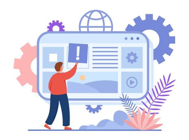
In today’s world, where users access web content from a wide range of devices including smartphones, tablets, laptops, and desktop monitors, the concept of Responsive Web Design has become an undeniable necessity.
This web design approach enables websites to automatically and intelligently adjust their layout and elements to the screen size and orientation of the user’s device.
The main goal of #Responsive #Design is to provide a seamless and optimized user experience for all users, regardless of the device they are using.
Previously, designers had to create separate versions for desktop and mobile, which significantly increased costs and maintenance complexity.
However, with Responsive Web Design, a single codebase covers the needs of all devices.
This not only saves time and cost but also significantly helps improve SEO and website ranking in search engines, as Google prioritizes mobile-friendly sites.
Understanding and correctly implementing this concept is crucial for any business and organization with an online presence.
Losing potential customers due to an unprofessional website? Rasavob is your answer! With our specialized corporate website design services:
✅ Enhance your business’s credibility and standing
✅ Experience attracting more targeted customers
⚡ Act now to receive a free consultation!
Key Principles and Underlying Technologies of Responsive Design

The implementation of Responsive Web Design is based on three fundamental principles: Fluid Grids, Flexible Images, and Media Queries.
Fluid grids use relative units like percentages for element widths instead of fixed pixels.
This approach ensures that the website layout adapts to the screen size.
Flexible images, by using the max-width: 100%; property in CSS, adjust their size to their parent container to prevent overflow and layout disruption.
However, the main element in responsive design is media queries.
Media queries allow designers to apply different CSS rules based on device characteristics such as screen width, height, and orientation (landscape or portrait).
For example, it can be specified that for widths less than 768 pixels, elements are displayed vertically, and for larger widths, horizontally.
Also, using the <meta name="viewport" content="width=device-width, initial-scale=1.0"> tag in the <head> section of the HTML document is crucial, as it forces the browser to consider the page width equivalent to the actual device width and prevents default scaling.
These techniques combined provide a single, efficient website for a wide range of devices.
Competitive and Commercial Advantages of Responsive Design

Adopting Responsive Web Design brings significant benefits for businesses and users that go beyond mere aesthetics.
From the user’s perspective, improved user experience, easier access to content, and smooth navigation on any device lead to higher satisfaction.
This directly results in a lower bounce rate and increased time spent on the site.
From a commercial standpoint, this type of design significantly strengthens Search Engine Optimization (SEO).
Google has clearly stated that it prefers responsive websites over separate mobile versions, as a single URL for all devices simplifies crawling and indexing for search bots.
This means that a responsive site is likely to achieve a higher ranking in mobile search results.
Furthermore, Responsive Web Design is also economically cost-effective.
Maintaining and updating a single website is much easier and cheaper than managing multiple separate versions.
This saving in development and maintenance costs allows businesses to focus their resources on other important aspects of marketing and product improvement.
Also, the reliability and future-proofing of this design make your website resilient to the emergence of new devices and reduces the need for frequent redesigns.
| Feature | Responsive Design | Separate Versions (Mobile and Desktop) |
|---|---|---|
| Development and Maintenance Cost | Lower (single codebase) | Higher (multiple codebases) |
| User Experience | Seamless and optimized across all devices | May vary |
| SEO and Ranking | Improved (Google’s recommendation) | More complex, requires canonical settings |
| Content Management | Easier (single version) | More difficult (multiple versions) |
| Future Reliability | Very high (compatible with new devices) | Lower (may be incompatible with new devices) |

Common Challenges and Solutions in Implementing Responsive Design

Despite its many advantages, implementing Responsive Web Design is not without its challenges.
One of the most important issues is performance optimization.
If images, JavaScript, and CSS codes are not properly optimized, a responsive site can perform slowly on mobile devices, even if it is responsive in terms of layout.
The solution is to use responsive images with srcset and sizes attributes so that the browser can load the most appropriate image size for the device.
Additionally, code minification and lazy loading for images and videos can improve loading speed.
Another challenge is testing and debugging across various devices.
Since the variety of devices is vast, ensuring the website’s correct performance on all of them is difficult.
Using browser developer tools, simulators, and actual tests on physical devices is essential.
Another issue is content management; some content may lose its effectiveness on smaller screens or require redesign.
In these cases, techniques such as hiding specific elements or redesigning their display for smaller dimensions can be utilized.
With precise planning, the use of correct tools, and a “mobile-first” design approach, these challenges can be overcome, and an efficient and fast responsive website can be delivered.
Did you know a weak corporate website costs you many opportunities daily? Solve this problem forever with professional corporate website design by Rasavob!
✅ Create a powerful and reliable image for your brand
✅ Attract targeted new customers and increase sales
⚡ [Get Free Website Design Consultation]
Mobile-First Approach: The Cornerstone of Responsive Design
In today’s world, where mobile internet traffic has surpassed desktop, the Mobile-First approach emerges as a key strategy in Responsive Web Design.
This approach means starting the website design and development process by considering the smallest screen (typically smartphones) and then progressively expanding the layout and functionalities for larger screens (tablets and desktops).
The philosophy behind mobile-first is that in the limited mobile space, the most essential content and functionalities must be prioritized.
This helps designers identify and prioritize the core content and key message of the website.
By starting with mobile, designers are forced to provide the most optimized experience under limited conditions, which in turn leads to simplification and efficiency in the overall design.
After ensuring excellent performance on mobile, additional features, more complex navigation, and wider layouts can be added for larger screens using media queries.
This approach not only helps improve site performance on mobile devices but also ensures your website is optimized from the outset for Google’s mobile-first indexing, which is a critical factor for modern SEO.
Therefore, in every Responsive Web Design project, mobile-first should be the first step in the thought and design process.
Impact of Responsive Design on SEO and Digital Marketing

One of the most important reasons Responsive Web Design has become an industry standard is its significant positive impact on SEO and digital marketing strategies.
Google, as the world’s largest search engine, has long emphasized the importance of mobile user experience and introduced mobile-first indexing as its primary approach.
This means that Google primarily considers the mobile version of your website for crawling and indexing, not the desktop version.
A responsive site simplifies the crawling and indexing process for search engines and prevents duplicate content issues because it has only one URL and one codebase.
This helps improve rankings in search results.
Furthermore, the improved user experience provided by Responsive Web Design leads to a reduced bounce rate and increased user time on the site.
These metrics are important signals for search engines, indicating the quality and relevance of your website’s content.
Consequently, a well-designed responsive site not only attracts more organic traffic through mobile searches but also achieves higher conversion rates due to a better user experience.
Collectively, these impacts make Responsive Web Design a vital investment for any successful digital marketing campaign.

Click here to preview your posts with PRO themes ››
Common Tools and Frameworks for Responsive Design

To facilitate the process of Responsive Web Design, numerous tools and frameworks have been developed to help designers and developers create adaptive websites with greater efficiency.
Bootstrap is undoubtedly one of the most popular front-end frameworks, offering a comprehensive set of HTML, CSS, and JavaScript components for responsive design.
Its 12-column grid system makes developing fluid layouts very easy.
Frameworks like Foundation are also powerful options with similar features that offer more control over customization.
Apart from frameworks, native CSS techniques also play a crucial role in responsive design.
Flexbox (CSS Flexible Box Layout) is highly efficient for designing one-dimensional layouts and aligning elements in a row or column, while CSS Grid Layout is ideal for creating more complex two-dimensional layouts and the overall structure of a web page.
Combining these techniques with media queries provides incredible flexibility in design.
Other tools like browser developer tools (such as Chrome DevTools), with their ability to simulate different devices, simplify testing and debugging responsive websites.
The choice of appropriate tools depends on project needs and development team preferences, but familiarity with these tools is essential for anyone involved in Responsive Web Design.
| Name/Technique | Type | Main Use | Advantages |
|---|---|---|---|
| Bootstrap | Front-end framework | Fast and responsive design, with ready-made components | High development speed, rich documentation, large community |
| Foundation | Front-end framework | High flexibility, for custom projects | More design control, high compatibility |
| Flexbox (CSS Flexible Box Layout) | CSS technique | Aligning and distributing elements in one dimension (row or column) | Ideal for components, space management |
| CSS Grid Layout | CSS technique | Designing two-dimensional layouts (entire page) | Precise control over overall layout, separation of content from presentation |
Future Trends and Innovation in Responsive Web Design
The world of the web is constantly evolving, and Responsive Web Design is no exception.
The future of this field will witness further integration and the emergence of more innovations.
One of the key trends is content personalization based on device and user behavior.
With advancements in artificial intelligence and machine learning, websites will be able to dynamically adapt content and even layout based on the user’s device, location, and browsing history.
This elevates the user experience to an unprecedented level of customization.
Furthermore, with the advent of new devices like foldable phones and flexible displays, new challenges emerge for Responsive Web Design, requiring more creative solutions in space and interaction management.
Interactive design and micro-interactions will also play a more prominent role, contributing to a more engaging and fluid user experience.
The use of WebAssembly to enhance performance in complex web applications and further advancements in CSS, such as new features in Grid and Flexbox, will also give developers more power to build complex and optimized layouts.
These exciting trends promise a future where websites will not only be responsive but also smart and predictive of user needs, taking Responsive Web Design into a new phase.
Are you dissatisfied with the low conversion rate of visitors to customers on your e-commerce site?
Solve this problem forever with professional e-commerce website design by Rasavob!
✅ Increase visitor-to-customer conversion rate
✅ Create an excellent user experience and build customer trust
⚡ Get Free Consultation
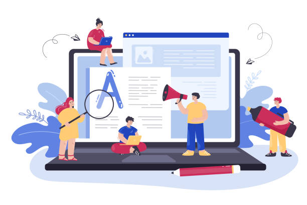
Successful Case Studies and Best Practices in Responsive Design

To gain a deeper understanding and draw inspiration from practical implementations of Responsive Web Design, examining successful websites can be highly instructive.
Many large news organizations, such as The New York Times and The Guardian, are prominent examples of Responsive Web Design.
They provide a flawless reading experience across all devices using a fluid layout, flexible images, and media queries.
Their content is easily readable, navigation is simple and accessible, and images are correctly scaled.
Large online stores also heavily rely on responsive design.
For example, Amazon and eBay, despite their vast volume of products and information, allow users to easily shop on both mobile and desktop.
On these sites, buttons and forms are large enough to be usable on a touch screen, and the checkout process is optimized.
Key lessons to be learned from these patterns include content prioritization (essential content takes precedence), simple and user-friendly navigation (hamburger menus for mobile), image and performance optimization (lazy loading and compression), and continuous testing (across different devices and browsers).
By analyzing these examples, best practices can be identified and applied to your own Responsive Web Design projects, preventing potential failures.

Click here to preview your posts with PRO themes ››
Conclusion and Best Practices for Responsive Web Design
In conclusion, it is clear that Responsive Web Design is not merely an option, but a fundamental necessity for a successful presence in today’s and future web world.
This approach not only significantly improves user experience but also strengthens search engine optimization and reduces development and maintenance costs.
To achieve a successful responsive website, several best practices must be followed.
Firstly, always start with a “mobile-first” approach.
This helps you focus on core content and essential functionality, then progressively expand for larger screens.
Secondly, correctly utilize fluid design principles including fluid grids, flexible images, and media queries.
Thirdly, take your website’s performance seriously; image optimization, code minification, and lazy loading are of high importance.
Fourthly, prioritize continuous and comprehensive testing on real devices and simulators to ensure full compatibility.
Finally, pay attention to new trends and technologies in Responsive Web Design to keep your website always up-to-date and competitive.
By following these tips, you can ensure that your website provides an unparalleled user experience for all visitors, regardless of their device type, and achieve your business goals.
Frequently Asked Questions
| Question | Answer |
|---|---|
| What is Responsive Web Design? | A web design approach that automatically adjusts and optimizes a website’s layout and content for display across various devices (mobile, tablet, desktop). |
| Why is Responsive Design important? | Due to the diversity of devices users employ to access the web; it offers better user experience, stronger SEO, and reduced bounce rate. |
| What are the main techniques in Responsive Design? | Using Media Queries in CSS, Fluid Grids, and Flexible Images. |
| What is a Media Query? | A CSS rule that allows you to apply different styles based on device characteristics (such as screen width, height, display orientation). |
| Is Responsive Design different from Mobile-First design? | Mobile-First is an approach within Responsive Design that initially designs the site for the smallest screen (mobile) and then progressively enhances it for larger screens. |
And other services of Rasavob Advertising Agency in the field of advertising
Smart Social Media: A combination of creativity and technology for online growth through the use of real data.
Smart Advertorial: A novel service to increase digital branding through custom programming.
Smart Marketing Automation: A specialized service for increasing website traffic growth based on intelligent data analysis.
Smart Custom Software: A fast and efficient solution for improving SEO ranking with a focus on custom programming.
Smart Content Strategy: A professional solution for campaign management focusing on marketing automation.
And over hundreds of other services in the field of internet advertising, advertising consultation, and organizational solutions
Internet Advertising | Advertising Strategy | Advertorial
Sources
What is Responsive Web Design? – Hamyar Web
What is Responsive Web Design? – Rayanak
Responsive Website Design – Web Ramz
Why is Responsive Design Important? – Mizbanfa
? Are you ready to take your business to the top in the digital world? Rasavob Afarin Digital Marketing Agency, with expertise in professional website design, SEO optimization, and comprehensive content marketing strategies, is your guide to achieving great goals. With us, you will have a powerful and lasting online presence.
📍 Tehran, Mirdamad Street, next to Bank Markazi, Kazeroon Janubi Alley, Ramin Alley, No. 6


