✨ Why User-Friendly UI/UX Design Comes First?
![]()
![]()
# Look, honestly, in today’s fast-paced world where we see a ton of new products and digital services every day, just having a good product isn’t enough anymore. What matters is how we deliver that product to the user and how we make their experience of using it enjoyable and hassle-free. This is exactly where user-friendly “UI/UX design” comes in and changes the whole game. Many people think UI/UX is just about aesthetics or button placement, but the issue is deeper than that. Remember those times when you opened a website or app and knew from the very first moment that you were going to run into a lot of trouble? Or that feeling of frustration when you filled out a form a hundred times and kept getting errors? Well, those are exactly the bitter experiences that prevent a business from reaching its goals and damage its credibility.
The point is, UI/UX design isn’t just a luxury; it’s a vital necessity for any digital business. When you provide a user-friendly design, you’re essentially telling your user, “We respect your needs and your time.” This respect quickly turns into customer loyalty. Imagine a customer easily making a purchase on a site, quickly getting the information they want, and constantly feeling that someone truly cares about them. Well, of course, they’ll come back to you next time, right? This is where Rasaweb Afarin, with years of experience in “internet marketing” and “website development,” has recognized the importance of this issue and emphasizes that every successful project is rooted in strong, user-centric UI/UX design. We believe that a website or application should primarily speak to the user, not just be a tool.
At Rasaweb Afarin, we know how good “UI/UX design” can increase conversion rates, boost customer satisfaction, and ultimately lead to greater profitability. Think about how much an online store can benefit from a smooth user experience, or a service application whose users reach their destination without confusion. These are all direct results of a proper design. User interface and user experience are two sides of the same coin; one deals with appearance and beauty, and the other with feeling and functionality. If these two are not in sync, it’s like a luxury car that’s difficult to drive! The ultimate goal is to create a path where the user, from the beginning to the end of their journey—whether it’s a purchase, finding information, or using a service—proceeds without any obstacles and with a good feeling. This means true user-friendliness, something Rasaweb Afarin always pursues.
🎯 The Foundation of Every Successful Design is Empathy with the User
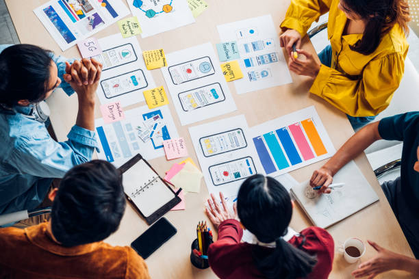
You might ask, “Where do we start?” The answer is simple: empathy with the user. It’s like walking in their shoes, step by step. This means you need to know them, understand what’s on their mind, what needs they have, what challenges they face, and why they are using your product or service in the first place. Without this deep understanding, no matter how beautiful your design is, it’s like shooting in the dark. That’s why the first step in any successful UI/UX design is user research. This is where Rasaweb Afarin’s “UX/UI Design and Development” teams begin their work.
User research involves various methods: from one-on-one interviews to surveys, competitor analysis, and even field observations. The main goal is to discover users’ behavioral patterns, motivations, and pain points. After collecting this information, we usually create user “personas.” Personas are fictional characters that represent the characteristics of real users. For example, “Maryam, a 35-year-old housewife looking for an easy way to buy groceries online,” or “Ali, a 22-year-old student who wants to find the quickest way to get his class notes.” These personas help us to act more purposefully throughout all stages of UI/UX design and always keep the user in mind.
But personas alone are not enough. We also need to map out “User Journeys.” This means, what paths does the user take to achieve their goal? Where do they start? What actions do they perform? Where might they get stuck or frustrated? By mapping this out, we can identify strengths and weaknesses and ensure that every step is logical and easy for the user. This approach is the core of modern “User Experience Design” methodologies, and Rasaweb Afarin, by utilizing its experts in this field, guarantees that every website and application design project is fundamentally built upon a deep understanding of the user. Let’s remember, a good design is not the one we like, but the one the user likes and feels comfortable with. This is the main philosophy behind every successful “UI/UX design” and can make the difference between an ordinary product and an extraordinary one.
Are you looking for new opportunities to sell your products in online marketplaces? Rasaweb Afarin maximizes your sales on these platforms with marketplace entry strategies!
✅ Increased access to a broad customer base
✅ Optimized product listings for sales
✅ Professional management and development of marketplace presence
Sell your products in online marketplaces with Rasaweb Afarin!
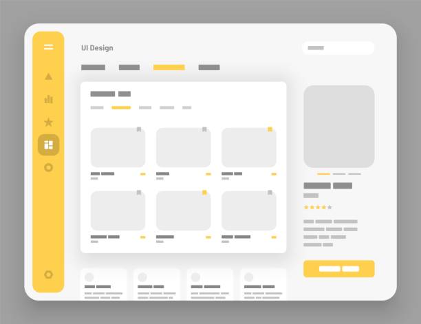
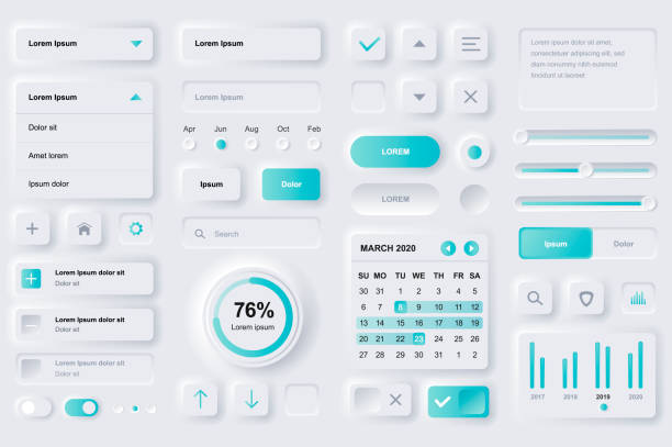
🎨 The Art of Intuitive and Attractive User Interface (UI) Design
Alright, now that we’ve really connected with our users and understood them, it’s time to dive into the art of User Interface (UI) design. UI is that visual and interactive part that the user interacts with: buttons, icons, colors, fonts, and basically everything they see and touch. The goal is to create a user interface that is both beautiful and eye-catching, as well as intuitive and understandable, meaning the user knows what to do without thinking. Remember when they used to say a picture is worth a thousand words? It’s the same in UI; a correct icon can provide a lot of guidance.
The first principle in UI design is “simplicity” and “clarity.” The more cluttered and complex the user interface, the more confused the user becomes, and they might give up entirely. Imagine a busy page full of different buttons, each performing a different task! Who has time to figure all that out? We need to create a proper “visual hierarchy” so that the user’s eye is naturally guided towards important information. For example, headings should be larger, main buttons should have a different color, and there should be enough space between elements so the page can breathe. These are subtle yet important points that Rasaweb Afarin’s design teams pay special attention to in “UX/UI Design and Development.”

Click here to preview your posts with PRO themes ››
“Consistency” also comes first. If a button is blue on one page and green on another, or if menu placements constantly change, the user loses trust and gets frustrated. We need to have a unified visual language, from colors and fonts to button shapes and error display methods. This consistency makes the user feel secure and familiar, allowing them to navigate the environment easily. “Feedback” is also very important. When a user performs an action, such as clicking a button, they should see an indication that their action is complete or in progress. A small color change, a simple loading spinner, or a success message—all of these are feedback that reassure the user. We always consider these points in UI/UX design to make the user’s experience memorable. It’s these small details that differentiate your product.
| UI Design Principle | Explanation |
|---|---|
| Simplicity and Clarity | Removing superfluous elements and presenting information directly. |
| Visual Hierarchy | Guiding the user’s eye towards the most important elements. |
| Consistency and Harmony | Using uniform patterns throughout the entire system. |
| Appropriate Feedback | Informing the user about the status of their activities. |
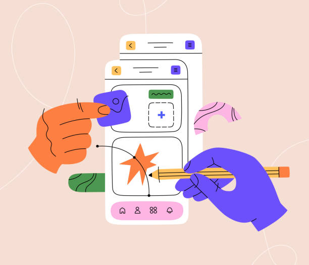
⚙️ Building a Seamless and Integrated User Experience (UX)
After creating a beautiful and intuitive appearance for our product (UI), now it’s time to delve into the depths of the matter: building a seamless and integrated user experience (UX). UX goes beyond aesthetics; it’s about how the user interacts with the product, how easily they can accomplish their tasks, and overall, what feeling they get from this interaction. If UI is like a person’s clothes, UX is their soul and personality. Well, beautiful clothes without a charismatic personality might soon be forgotten, right? This is where we at Rasaweb Afarin focus on “UX/UI design and development” in the true sense of the word to ensure both aspects go hand in hand.
One of the most important aspects of UX is Information Architecture. This means how we organize information so that the user can easily find what they are looking for. Think of library shelves; if books are not organized by subject and author, finding a specific book is almost impossible. The same applies in the digital world. The structure of menus, categories, and links must be logical and predictable. This reduces confusion and increases user satisfaction. Our teams, by performing “Google keyword research” and analyzing user needs, structure information in the best way so that the user never gets lost on the site.
The discussion of “Usability” is also an inseparable part of UX. That is, how easy is our product to use? How long does it take for a user to complete a task? How many errors do they make? A product with high usability is one that the user can interact with from the very first moment, without needing any special training. This includes simplicity of processes, clarity of messages, and prevention of common errors. And finally, “Accessibility”, which is often overlooked but essential for an inclusive and human user experience. We must create a product that people with special needs (e.g., those with low vision or physical disabilities) can also easily use. This means using colors with appropriate contrast, the ability to change font size, and compatibility with screen readers. A true “UI/UX design” considers all users, without exception.
🧪 The Power of Prototyping and Testing in Design Improvement

Alright, so far we have good ideas and have even implemented initial designs. But how do we ensure that these ideas actually work and are useful to the user? This is where the power of prototyping and testing reveals itself. This stage is like building a small model of a house before you fully construct it, just to see how functional it is. In the world of UI/UX design, we call these small models “prototypes.”
Prototypes can range from simple paper sketches to interactive, near-realistic models. The main goal of prototyping is to test our ideas with minimal cost and time and gather feedback. For example, we don’t need to fully code an application to understand if users have problems with a particular button. We can build an interactive prototype that only simulates that section and ask a few users to interact with it. This iterative design approach allows us to constantly improve the design and prevent major errors from the outset.
After building the prototype, it’s time for “User Testing.” This part is crucial. We ask real users to interact with our prototype, and we observe their behavior closely. Where do they get stuck? What questions do they ask? What makes them uncomfortable? This information is incredibly valuable and helps us understand if our UI/UX design is truly user-friendly. Remember the curiosity of children when they see something new and how unreservedly they give their opinions about it? User testing gives us exactly that feeling. At Rasaweb Afarin, we also emphasize “optimization consulting” and the use of A/B tests. For example, we show two different versions of a page to two groups of users to see which one performs better. This data-driven approach helps us make design decisions based on actual user behavior, not just guesswork. This way, we ensure that everything we deliver is not only beautiful but also completely functional and desirable.
Does your website need a new and updated design to provide an unparalleled experience for users? Rasaweb Afarin, with creative and modern website designs, transforms your website into a powerful tool for attracting customers!
✅ Responsive design compatible with all devices
✅ Attractive and user-friendly interface
✅ Increased user retention and engagement on the site
For a unique website, contact Rasaweb Afarin now!
🧠 Psychology in UI/UX: Smartly Guide the User

You might find it interesting that the best UI/UX designers are almost like psychologists! Yes, that’s right. A large part of successful UI/UX design is understanding how the human mind works and how we can use this knowledge to create better experiences. We don’t want to deceive the user; rather, we want to smartly guide them to reach their goal and feel satisfied. This is where psychological principles come into play in design.
One important concept is “Cognitive Load.” This refers to the amount of mental effort a user must exert to understand and process information. The lower the cognitive load, the smoother the user experience. For example, if a form is full of extra fields or information is arranged in a disorganized manner, cognitive load increases, and the user gets frustrated. To reduce this load, we must divide information into smaller sections, use simple language, and display only essential information. This is exactly what Rasaweb Afarin pays special attention to in “optimizing” processes and “designing websites and applications.”

Click here to preview your posts with PRO themes ››
Have you ever noticed how most users scan web pages? Research has shown that many people read pages in an F-pattern. This means they pay more attention to the top and left side of the page. Knowing this, we can place important information and key elements in these areas to increase their visibility. Hick’s Law also states that the more options a user faces, the longer it takes for them to make a decision. So, it’s better to present options limited and clear so that the user reaches a conclusion faster. For example, instead of ten buttons, have three with clear functions. These are just a few examples of how psychology is used in UI/UX design. By understanding these principles, we can create not only a beautiful user interface but also a deeply impactful and effective user experience that gently and satisfactorily nudges the user towards performing the actions we desire.
🌍 Accessibility: Designing for Everyone Without Exception

Remember when I said a good UI/UX design should be for everyone? Well, this is where the concept of Accessibility comes into play, showing how humane and inclusive a design can be. Accessibility means ensuring that people with different abilities, whether they have varying vision, hearing, mobility, or cognitive differences, can easily and unimpededly use our digital products and services. This is no longer just a technical issue; it’s a social responsibility for every business.
You might think, “Well, the number of such people is small, why should we pay so much attention to them?” But the truth is that our society is full of people who may have special needs. From an elderly person with poor eyesight to someone whose hand is temporarily broken and cannot use a mouse. Even we ourselves might find ourselves in situations where we need accessibility; for example, when we can’t read the screen under bright sunlight or are in a noisy environment and can’t hear the audio. Good accessibility benefits everyone. Rasaweb Afarin always adheres to this principle in “website and application design” and “UI/UX design.”
Global standards like WCAG (Web Content Accessibility Guidelines) provide specific guidelines to ensure accessibility. These standards state that we should use appropriate color contrast for text and background so that people with low vision can easily read the text. Or, for example, provide alternative text (Alt Text) for all images so that screen readers can describe the image content to the visually impaired. Text zoom capability, keyboard navigation instead of a mouse, and using subtitles for videos are all part of this effort to build a more inclusive digital world. A UI/UX design that considers accessibility is not only ethically correct but also increases audience reach and brand credibility. Neglecting this aspect means losing a large part of market potential and excluding a segment of society. Let’s work together to build a world where technology is accessible to everyone, without any limitations.
| Accessibility Principle | Impact on User |
|---|---|
| Appropriate Color Contrast | Better readability for people with low vision. |
| Alternative Text for Images | Understanding visual content for the blind through screen readers. |
| Keyboard Navigation | Enables use for individuals with motor limitations. |
| Subtitles and Captions for Videos | Usable for deaf individuals or in noisy environments. |
✍️ The Role of Content and Microcopy in Shaping User Experience
Many people think UI/UX design is just about images and buttons. But honestly, words also have their magical power! Content, and especially “microcopy,” play an indispensable role in shaping user experience and usability. Good text can guide the user, reassure them, and even bring a smile to their face. The opposite is also true; unclear or cold text can cause many problems and drive users away. At Rasaweb Afarin, which also operates in the field of “content marketing,” we know well how important words are.
Microcopy refers to those short, small texts you see in every corner of a user interface: from button and field labels to error messages, success messages, and small explanations. For example, instead of “Submit,” we might write “Register your request,” or instead of a dry, technical error message, we might say, “Oops, something went wrong! Please try again.” These small but cool changes can convey your brand’s tone and personality to the user and create a friendly and intimate feeling. This is exactly what excellent “UI/UX design” achieves with the help of good content.
Main content, of course, goes without saying. This includes product descriptions, help articles, and any long text the user needs to get information. We must ensure that this content is clear, concise, and useful and speaks the user’s language. We should avoid specialized jargon that the average user doesn’t understand. “Call to Action” (CTA) is another area where the power of words truly shines. A good CTA should encourage the user to take the next step; for example, “Order Now,” “Start for Free,” or “Learn More.” The right words in the right place can make a huge difference in conversion rates, which is vital for any “product marketing campaign” or “website traffic increase.” In short, in any “UI/UX design,” do not underestimate content. They are the bridge between your product and the user’s mind and can transform the user experience from good to excellent.
🚀 Always Up-to-Date: Future Trends in UI/UX Design
In the digital world, the only constant is change! The same applies to UI/UX design. New trends constantly come and go, and if we want to truly remain user-friendly, we must always pay attention to these changes and adapt to them. It’s like a professional chef always looking for new recipes and fresh ingredients to keep their customers excited, right? Rasaweb Afarin’s “website development” and “UX/UI design and development” teams have exactly this perspective and continuously update themselves.
Click here to preview your posts with PRO themes ››
One of the biggest recent and future trends is Artificial Intelligence and Machine Learning in UI/UX. AI can significantly personalize experiences. Imagine an application that knows exactly what you want, even before you think of it! This means systems use user behavioral data to adjust the user interface to be unique for each individual. This isn’t just a dream; Rasaweb Afarin also works on “AI agent creation” and “automation,” and knows how much these technologies can revolutionize the user experience. Another important trend is “Mobile-First Design.” Given that most users access the internet via mobile, the priority is designing for small mobile screens first, and then for larger screens. This ensures that the user experience on any device is smooth and enjoyable.
“Dark Mode,” which has gained a lot of popularity these days, is another trend that has become popular due to user eye comfort, especially at night. And of course, Microinteractions; those tiny animations that happen when you click on something or hover your mouse over it. These seem small, but they can add a lot to the attractiveness and responsiveness of the user interface and give it a lively feel. Maintaining freshness and innovation in UI/UX design is the only way to stay competitive and attract new users. We must always be ready to embrace new technologies and intelligently incorporate them into our designs; otherwise, we will quickly fall behind and be covered by the dust of competitors. This means a realistic view of the future and acceptance of change.
8. Are you looking for a way to increase online sales and expand your market? Rasaweb Afarin, with online sales strategies and marketplace presence, guides your business to its peak!
✅ Design effective online sales strategies
✅ Increase conversion rate of visitors to customers
✅ Expand access to a broader target market
Multiply your sales with Rasaweb Afarin now!
📊 Measuring Success and Continuous Improvement: The Unending Cycle
![]()
![]()
Well, we’ve done everything: research, design, prototyping, testing… Now it’s time to see if all this effort has truly paid off. Measuring success and continuous improvement is the last, but perhaps most important, part of the user-friendly UI/UX design cycle. This stage is like asking customers for feedback after cooking a meal, and then improving the recipe based on their comments. No design is perfect from the start, and there’s always room for improvement. At Rasaweb Afarin, where we work on “SEO and website optimization” and “growth engine consulting,” we know well how crucial data is at this stage.
The first step is defining “Key Performance Indicators” (KPIs). That is, how do we want to measure success? For example, is the Conversion Rate important to us? Or user retention time on the site? Or the Click-Through Rate on a specific button? With tools like Google Analytics and other data analysis platforms, we can closely monitor user behavior and understand where our performance is good and where we need improvement. This data determines our future roadmap and tells us where we should invest more or where we need to make fundamental changes.
But quantitative data alone is not enough. We also need to gather “Qualitative Feedback” from users. What does this mean? It means going back to users, conducting more interviews, surveys, and even reviewing comments registered on social media or in the support section. These comments give us a deeper insight into why users exhibit a particular behavior. For example, analytics might show us that many people exit a page, but qualitative feedback might tell us that the reason was a confusing term or an issue with image loading. Combining these two types of data gives us a complete picture of the current situation and allows us to continuously pursue the improvement cycle. In UI/UX design, this cycle never stops. There’s always room to get better, always room to make the user happier, and always room to create a more exceptional experience. This is an endless game where the winner is always the user and ultimately your business.
| Frequently Asked Questions | Answer |
|---|---|
| What is UI/UX design? | UI (User Interface) refers to the visual appearance and interactions of a product, and UX (User Experience) refers to the user’s feeling and ease of use during interaction. |
| Why is user-friendly design important? | User-friendly design increases customer satisfaction, improves conversion rates, enhances loyalty, and ultimately leads to business success. |
| What is the first step in UI/UX design? | Empathy with the user and conducting thorough research to understand their needs and behaviors is the first and most important step. |
| What role do user personas play? | Personas are fictional characters that help designers consider the needs of real users throughout the design process. |
| What are the benefits of prototyping and user testing? | Prototyping and testing with real users allow us to test ideas with minimal cost and time and improve the design. |
| How is psychology applied in UI/UX? | By understanding psychological principles (such as cognitive load or Hick’s Law), we can intelligently guide users toward desired actions. |
| What does accessibility mean in design? | Accessibility means that the digital product or service can be used by people with various abilities (visual, auditory, motor). |
| How does microcopy affect user experience? | Microcopy (short texts) can guide, convey brand tone, and improve the user’s feeling towards the product. |
| What are the future trends in UI/UX? | AI and personalization, mobile-first design, dark mode, and microinteractions are among the important future trends. |
| How do we measure design success? | Success can be measured by defining KPIs (Key Performance Indicators), analyzing quantitative data, and gathering qualitative feedback from users. |
And other services of Rasaweb Advertising Agency in the field of advertising
• Interactive content production (e.g., surveys, quizzes)
• Value-Based Marketing Strategy
• Corporate Social Responsibility Campaigns (CSR Marketing)
• Consulting for Employer Branding
• Internal Marketing
and over hundreds of other services in the field of internet advertising, advertising consulting, and organizational solutions
Internet Advertising | Advertising Strategy | Advertorials
How can internal budgets be optimized? We help you save costs through detailed expense analysis. ✅ Identify opportunities for saving internal costs.
✉️ info@idiads.com
📱 09124438174
📞 02126406207
Tehran, Mirdamad Street, next to Central Bank, Kazeroon Jonubi Alley, Ramin Alley, No. 6