
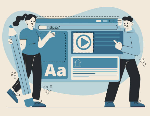
The Necessity of Responsive Web Design in Today’s World

Today, with the unprecedented rise in the use of smartphones and tablets for internet access, it’s no longer sufficient to design a website solely for proper display on desktop screens.
Responsive Web Design is an essential answer to this shift in user behavior.
This approach ensures that your website displays optimally, regardless of the screen size of the device the user is employing.
From small phones to large smart TVs, website content must adapt to provide a consistent and optimal user experience.
This not only helps increase visitor satisfaction but also plays a vital role in maintaining and increasing your site’s traffic.
Non-responsive websites perform poorly on various devices, and users quickly abandon them, which harms the site’s credibility and search engine ranking.
In the past, there were several solutions for delivering content to mobile users, including building separate mobile versions (m.example.com), but these methods presented numerous maintenance and SEO challenges.
Responsive Web Design eliminates these complexities with a single codebase and consistent content, making website management much simpler.
This approach signifies a comprehensive “explanatory project” that enables web developers and designers to prepare their website for a future of unknown devices with a single codebase.
Can one truly expect a website to compete in today’s market without this capability? This question occupies the minds of many business owners, and the answer is clearly no.
This is a fundamental guide for anyone seeking online success and is recognized as a specialized approach.
Falling behind in competition with large online stores?
Rasaweb, with professional e-commerce website design, brings your business online and increases your market share!
✅ Boost brand credibility and customer trust
✅ Easy shopping experience leading to more sales
⚡ Contact us now for a free website design consultation!
Key Principles of Responsive Design

Responsive design is built upon three fundamental principles that every web developer should be familiar with: Media Queries, Fluid Grids, and Flexible Images.
Media queries are the heart of this process; they allow the browser to apply different CSS styles based on device characteristics such as screen width, resolution, orientation, and screen type (print, screen).
For instance, you can use a media query to specify that if the screen width is less than 768 pixels, the navigation menu should display as a hamburger menu.
This capability provides unparalleled power to control website display across various devices and constitutes a significant portion of specialized training in web design.
Fluid Grids, instead of using fixed pixel units, utilize relative units like percentages.
This means that the width and height of page elements are set based on a percentage of the available space, so as the screen size changes, the website layout intelligently adapts.
This “analytical” approach allows you to optimize the layout for any device without needing a complete rewrite.
Flexible images are also a crucial part of this puzzle.
Images should not overflow their containers; they must be adjusted to fit proportionally within their parent elements.
This is often achieved by setting the max-width: 100% property in CSS for images, ensuring the image never exceeds its container and avoids creating a poor visual experience.
Understanding these three fundamental pillars is vital for anyone looking to implement responsive web design and serves as a comprehensive guide, paving the way for developers.
Popular Tools and Frameworks for Responsive Design

To accelerate and facilitate the responsive web design process, numerous tools and frameworks have been developed to help designers and developers reduce repetitive tasks and focus on creativity.
Bootstrap and Foundation are two of the most popular CSS frameworks, offering a rich collection of pre-built UI components, responsive grid systems, and JavaScript plugins.
Bootstrap, developed by Twitter, is the first choice for many beginner and professional developers due to its ease of use and large community.
This framework significantly reduces development time with ready-to-use CSS classes for everything from buttons and forms to navigation systems.
In contrast, Foundation, created by ZURB, focuses slightly more on flexibility and customization, making it more suitable for projects requiring greater control over design.
Using these frameworks provides a specialized approach, but choosing the right framework depends on your project and team needs.
Both frameworks are continuously updated with new features and performance improvements, which is good news for developers.
Other tools also exist, such as CSS Grid Layout and Flexbox, which are native CSS features and allow for the creation of complex and responsive layouts without the need for external frameworks.
While frameworks offer a quick start, mastering Grid and Flexbox gives you greater control over design.
These comparison tables provide a complete “guide” for choosing the right framework and can be beneficial for any web design.
Comparison of Responsive Frameworks
| Feature | Bootstrap | Foundation |
|---|---|---|
| Ease of Learning | High (Rich documentation, large community) | Medium (Requires deeper understanding) |
| Customization Capability | Medium (With customization tools) | High (‘Mobile-first’ approach and more flexibility) |
| Default Components | Very rich and ready-to-use | Medium (Principle-based, not quantity-focused) |
| Browser Support | Extensive and up-to-date | Extensive and up-to-date |
| File Size | Larger (Due to more components) | Smaller (More minimal) |
Impact of Responsive Design on User Experience (UX)

User Experience (UX) plays a pivotal role in today’s web world, and responsive design directly impacts it.
A responsive website ensures that users can easily access content and interact with the site, regardless of the device type.
This means easy navigation, high readability, and usable forms, even on a small screen.
Imagine visiting a website where fonts are so small you can’t read them, or buttons are so close together that you accidentally click on the wrong one.
Such an experience leads to user frustration and likely drives them away from your site.
Responsive web design solves these problems by automatically adjusting font sizes, element spacing, and overall page layout, providing a clear explanation of its importance.
Furthermore, good UX in a responsive website also means optimizing loading speed.
Heavy images or unnecessary scripts can severely degrade the user experience, especially on slow mobile connections.
An analytical approach to responsive design includes optimizing images (e.g., using responsive images or next-gen formats), lazy loading for images and videos, and compressing code to ensure the website loads quickly and provides a smooth user experience.
Ultimately, responsive design helps build a strong brand.
Consistency in the website’s appearance and functionality across different devices conveys a sense of professionalism and trustworthiness to users, directly impacting user satisfaction and loyalty to your brand.
This is not a questionable content but a proven truth in the world of UX/UI.
Does your current e-commerce website design lead to lost customers and sales?
Rasaweb is your solution with modern and user-friendly e-commerce website designs!
✅ Significant increase in conversion rates and sales
✅ Strong branding and building customer trust
⚡ Get a free e-commerce website design consultation from Rasaweb!
Common Challenges and Smart Solutions in Responsive Design
While responsive web design offers numerous advantages, it also comes with challenges that must be addressed expertly.
One of the biggest challenges is website performance.
Loading all content of a desktop website for a mobile device can severely slow down the site, especially if it includes high-resolution images and heavy scripts.
Solutions to this challenge include optimizing images for different devices (e.g., using the srcset attribute in HTML or server-side solutions), lazy loading for images and videos, and compressing CSS and JavaScript files.
Additionally, Code Splitting techniques can be used to load only the necessary code for each screen size.
Another challenge relates to navigation and input experience on touch devices.
Large desktop menus might occupy too much space on mobile.
Common solutions include using hamburger menus, off-canvas menus, or accordion menus.
Also, ensuring that buttons and links have sufficient touch target area is crucial.
This requires precise training and touch-focused design.
Advertising content and pop-ups can also be annoying on mobile devices and harm the user experience.
Optimizing ad display for different screen sizes and using less intrusive or well-timed pop-ups are solutions to this problem.
This is a questionable content point on how user experience can be improved without sacrificing ad revenue.
With these “guidance” and “analytical” solutions, many obstacles in the path of successful responsive design implementation can be overcome, ensuring your website performs optimally on any device.
Critical Role of Responsive Design in Search Engine Optimization (SEO)

In the competitive world of SEO, responsive web design is not just an advantage, but an absolute necessity.
Google, as the world’s largest search engine, has explicitly stated that it prefers responsive websites over non-responsive ones.
This preference has logical reasons; Google aims to provide the best possible experience to its users, and websites that do not display well on mobile create a poor experience.
Since 2015, Google’s algorithms began penalizing websites that were not “Mobile-Friendly,” and with the introduction of “Mobile-First Indexing,” this importance doubled.
This means that Google first considers the mobile version of your website for crawling and indexing, and then moves on to the desktop version.
Therefore, if your mobile version is not optimized, your ranking in search results will be severely affected.
This is important news and a critical explanation for any business owner.
Using responsive design also helps reduce the bounce rate, as users can easily view your content on any device without needing to zoom or scroll horizontally.
This indirectly positively impacts SEO, as Google considers a low bounce rate as a sign of user satisfaction and content relevance to keywords.
Furthermore, having only one URL and a single codebase for all devices simplifies the task of crawling and indexing for Google’s robots, which can lead to improved rankings.
This approach also prevents duplicate content issues that might arise from having separate mobile and desktop versions.
In summary, responsive web design is a smart investment for your website’s future that both enhances user experience and solidifies your position in search engines.
This is a practical and proven guidance for online success.
Successful and Inspiring Examples of Responsive Web Design

Observing successful examples of responsive web design can be very inspiring and demonstrate best practices in action.
Many large and well-known brands worldwide utilize this approach to provide a seamless experience to their users.
For example, consider news websites like New York Times or The Guardian.
They have a massive volume of content, but by implementing responsiveness, they organize the content in a way that is easily readable and navigable on both desktop and mobile.
Images are optimized, columns rearrange, and menus collapse to make the best use of screen real estate.
This is a news-related and analytical example of how to manage extensive content.
E-commerce websites like Amazon or Nike are also among the leaders in this field.
The online shopping experience on a smartphone should be as smooth and efficient as on a desktop computer.
These websites ensure that users can easily search for products, add them to their cart, and complete the checkout process by using flexible layouts, adjustable product images, and simplified payment processes.
Even government and organizational websites have recognized the importance of responsive web design and are updating their infrastructures to make access to public information easier for all citizens, regardless of the device used.
These examples demonstrate how responsive design can contribute to web success across various industries and provide an engaging and efficient experience.
Examples of How Websites Display on Different Devices
| Website | Desktop View | Tablet View (Portrait) | Mobile View (Portrait) |
|---|---|---|---|
| New York Times | Multi-column, large images, full navigation | 2-3 columns, optimized images, hamburger menu | Single column, smaller images, hamburger menu |
| Amazon | Product grid, advanced search, sidebar | Product layout changes, larger buttons | Vertical product list, bottom navigation |
| Nike | Large images, extensive horizontal navigation | Optimized images, more compact navigation | Vertical layout, large touch buttons |
The Future of Responsive Web Design and Upcoming Developments
The future of the web is constantly evolving, and responsive web design is no exception.
While the fundamental principles of responsiveness will remain, new technologies and approaches are emerging that elevate the responsive experience to a higher level.
One of the most significant advancements is the increasing adoption of Progressive Web Apps (PWA).
PWAs offer a combination of the best features of web and native applications, including offline functionality, push notifications, and home screen access, all contributing to a responsive and fast experience.
This is a specialized and news-worthy approach that warrants attention.
Technologies like CSS Grid Layout and Flexbox are also becoming primary tools for creating more complex and flexible layouts, without the need for heavy frameworks.
These native CSS capabilities provide developers with greater power and control to create designs that dynamically adapt to any screen size.
Furthermore, with advances in artificial intelligence and machine learning, we might see systems in the future that automatically adjust website layouts based on user preferences, device type, and even network conditions.
This envisions a future where responsive web design becomes even smarter and more dynamic.
This could be a questionable content point for future discussions: Will AI eventually replace web designers? Ultimately, the focus on website performance and efficiency will never diminish.
Developers will continue to seek ways to reduce file sizes, optimize images and scripts, and deliver content in the fastest and most efficient way possible to ensure the user experience is always at its peak.
This is an analysis of the web’s future trajectory.
Are you worried about losing customers because you don’t have a professional e-commerce website?
With e-commerce website design by Rasaweb, forget these worries!
✅ Significant increase in sales and conversion rate from visitor to customer
✅ Professional and user-friendly design that builds customer trust
⚡ Get a free consultation from Rasaweb
Step-by-Step Guide to Implementing Responsive Design

Implementing responsive design for a website requires a step-by-step and systematic approach.
The first step is planning and a mobile-first design approach.
This means considering the website layout for the smallest possible screen first, and then expanding it towards desktop.
This approach ensures that the most important content and functionalities are prioritized, and the mobile user experience is optimized.
The second step is to use relative units instead of fixed units (pixels) in CSS.
For width, height, margins, and fonts, use percentages, em, or rem.
This ensures layout flexibility.
This is a practical and educational guidance.
The third step is to implement media queries to adjust the layout at different breakpoints.
Breakpoints are points where your website’s layout needs significant changes to adapt to a specific screen size (e.g., from mobile to tablet or tablet to desktop).
The fourth step is optimizing images and media.
Use responsive images that load the appropriate size and resolution based on the device’s screen size.
Also, videos and other media should be able to resize automatically.
The fifth and final step is testing and optimization.
Test your website on various devices and browsers to ensure its correct display and proper functionality.
Use browser Developer Tools and online responsive testing tools.
This process ensures that your responsive web design performs optimally and provides a flawless user experience.
These steps are presented expertly and with the necessary details for implementation.
Conclusion: Responsive Web Design – The Key to Web Success

Ultimately, it can be said that responsive web design is no longer a luxury option, but an undeniable necessity for the success of any website in the digital age.
Given the increasing number of mobile and tablet users, and the growing importance of user experience and SEO in search engine rankings, ignoring this approach can mean losing a large portion of your audience and business opportunities.
Responsive design allows you to present your content optimally and accessibly for a wide range of devices with a single codebase, which not only simplifies site management and maintenance but also reduces costs.
This is a comprehensive explanation and a guide for the future.
The countless benefits that responsive web design offers, from improving user experience and increasing conversion rates to enhancing search result rankings and reducing bounce rate, make it a smart investment.
In a world where technology is advancing at lightning speed and new devices enter the market daily, having a website that can adapt to these changes is a significant competitive advantage.
This not only helps your business survive in the online space but also prepares it for an uncertain future.
So, if your website is not yet responsive, it’s time to implement this crucial change to stay on the path of web success.
This final summary emphasizes the importance and necessity of this technology and is essential education for all web professionals.
Frequently Asked Questions
| Question | Answer |
|---|---|
| What is responsive web design? | A web design approach that causes a website’s layout and content to automatically adjust and display optimally on various devices (mobile, tablet, desktop). |
| Why is responsive design important? | Due to the variety of devices users employ to access the web; better user experience, stronger SEO, and reduced user bounce rate are among its benefits. |
| What are the main techniques in responsive design? | Using Media Queries in CSS, Fluid Grids, and Flexible Images. |
| What is a Media Query? | A CSS rule that allows you to apply different styles based on device characteristics (such as screen width, height, display orientation). |
| Is responsive design different from mobile-first design? | Mobile-First is an approach within responsive design that initially designs the site for the smallest screen (mobile) and then progressively enhances it for larger screens. |
And other services of Rasaweb Advertising Agency in the field of advertising
Smart SEO: An effective tool for customer attraction using real data.
Smart Sales Automation: A combination of creativity and technology to improve SEO ranking through SEO-centric content strategy.
Smart Google Ads: Revolutionize campaign management with the help of SEO-centric content strategy.
Smart Data Analysis: A fast and efficient solution for improving SEO ranking, focusing on smart data analysis.
Smart Advertising Campaign: A dedicated service for growth in SEO ranking improvement based on precise audience targeting.
And over hundreds of other services in internet advertising, advertising consultation, and organizational solutions
Internet Advertising | Advertising Strategy | Advertorial
Resources
Responsive Web Design GuideThe Difference Between UI and UX in Web DesignThe Future of Web Design and Tips About ItWhat is Responsive Web Design?
📍 Are you ready to transform your business in the digital world? Rasaweb Afarin Digital Marketing Agency, by providing professional services including WordPress website design and SEO optimization, paves your way to online success. Build a bright future for your brand with us.
📍 Tehran, Mirdamad Street, next to Bank Markazi, Kazeroun Jonoubi Alley, Ramin Alley, No. 6


