
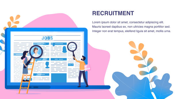
What is Responsive Website Design and Why is it Essential?
In today’s world, where users connect to the internet via various devices including smartphones, tablets, laptops, and even smart TVs, having a website that displays correctly on every screen size is not a choice, but a necessity.
#Responsive_Web_Design is an approach that ensures your website provides an optimal user experience, regardless of the size or orientation of the user’s device screen.
This concept is based on the use of flexible grids, flexible images, and media queries, so that the content and layout of the site automatically adapt to the screen dimensions.
The importance of this approach is such that search engines like Google prioritize responsive websites in their rankings, which itself means improved SEO and greater visibility.
The ultimate goal of responsive website design is to create a seamless and enjoyable user experience across all platforms, so that the user does not need to zoom or horizontal scroll to view content.
This educational and explanatory approach is based on modern web design principles and helps businesses attract and retain more audiences.
Are you dissatisfied with the low visitor-to-customer conversion rate on your e-commerce site?
Solve this problem forever with professional e-commerce website design by Rasawob!
✅ Increase visitor-to-customer conversion rate
✅ Create an excellent user experience and build customer trust
⚡ Get free consultation
The Evolution of Web Design from Desktop to Mobile

When the internet began to grow in the late 1990s and early 2000s, websites were primarily designed for display on desktop monitors.
Screen sizes were relatively standard and lacked much variety.
But with the advent of smartphones and tablets in the late 2000s, the web landscape completely changed.
Suddenly, users accessed the web through devices with much smaller and different screen sizes.
This sudden change necessitated a new approach to web design; an approach that could effectively display content on all devices.
Before the advent of responsive website design, developers had to maintain separate versions of websites for mobile and desktop, which led to increased costs and maintenance complexities.
The concept of “responsive design” was first introduced by Ethan Marcotte in 2010 and quickly became an industry standard.
This news and analytical approach was a response to the challenge of device proliferation and ensured that websites remain future-proof and flexible, able to adapt to new devices that have not yet been introduced.
Key Principles and Basic Techniques of Responsive Website Design

For successful implementation of responsive website design, there are three key principles: the use of media queries, flexible grids, and flexible images.
Media queries are CSS rules that allow the browser to apply different styles based on device characteristics (such as screen width, orientation, or resolution).
This allows us to change the layout and appearance of the site for smaller or larger devices.
Flexible Grids use relative units like percentages instead of fixed pixel units.
This means that columns and layout elements are dynamically scaled as the screen size changes.
Similarly, flexible images use CSS to adjust their size to their parent container to prevent overflow or overly large display.
The combination of these three principles forms the foundation of designing a responsive website and is of great importance for any developer intending to create a website with high visibility and functionality potential.
These principles form the specialized and educational basis of every responsive website design course.
| Technique | Description | CSS Example |
|---|---|---|
| Media Queries | Applying different styles based on device characteristics (e.g., screen width) | @media (max-width: 768px) { body { font-size: 14px; } } |
| Flexible Grid | Using relative units (percentages) for layout | .column { width: 50%; float: left; } |
| Flexible Images | Automatically resizing images with the parent container | img { max-width: 100%; height: auto; } |
Countless Benefits of Responsive Website Design for Your Business
Implementing responsive website design is more than a trend; it’s a smart investment for any business.
One of its most important advantages is SEO improvement (Search Engine Optimization).
Google has explicitly stated that it prefers mobile-friendly websites in its search results, especially for mobile searches.
A responsive site has only one URL, which helps its crawling and indexing by search engines, whereas maintaining separate mobile and desktop versions can lead to duplicate content issues.
Furthermore, user experience (UX) significantly improves; users enjoy a smooth and consistent experience across all devices, which helps increase conversion rates and reduce bounce rates.
Website maintenance and updates also become simpler, as there is only one codebase to manage.
This leads to reduced long-term development and maintenance costs.
The ability to reach a wider audience, including mobile users who constitute a significant portion of web traffic, is another crucial advantage.
This analytical approach shows that responsive website design not only helps your business survive in a competitive market but also paves the way for its growth and development.
Did you know your company’s website is the first point of contact for 75% of potential customers?
Your website is the face of your brand. With **Rasawob**’s corporate website design services, build an online presence that earns customer trust.
✅ Create a professional and lasting image for your brand
✅ Attract target customers and increase online credibility
⚡ Get a free consultation from **Rasawob** experts now!
Challenges and Hidden Pitfalls in Responsive Design

Despite numerous advantages, the path to implementing responsive website design is not without challenges and can present developers with hidden pitfalls.
One of the biggest challenges is website performance.
Although responsive design helps with a single codebase, managing and optimizing resources (such as high-resolution images) for different devices can be complex.
Loading large images optimized for desktop on mobile devices with poor connections can drastically reduce site loading speed and harm the user experience.
Complexity in testing and debugging is another obstacle.
Ensuring that the site works correctly across hundreds of different combinations of screen sizes, browsers, and operating systems requires precise testing tools and processes.
This can consume significant time and resources.
Also, deciding how to display content in different sizes, especially for complex content or data tables, can be questionable.
This section on questionable content and guidance helps you face these challenges with greater preparedness and avoid common pitfalls in responsive website design.
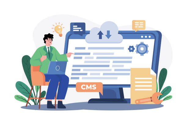
Powerful Tools and Frameworks for Responsive Design
To facilitate the responsive website design process, numerous tools and frameworks have been developed that greatly simplify the work for developers.
One of the most well-known and widely used is Bootstrap.
This CSS and JavaScript framework includes predefined HTML and CSS templates and components that enable rapid creation of responsive websites.
For developers seeking more control and higher flexibility, CSS Grid Layout and Flexbox are very powerful tools.
CSS Grid is ideal for two-dimensional layouts (rows and columns), while Flexbox is optimized for one-dimensional layouts (row or column) and is used for arranging elements within a container.
The combination of these two allows for the creation of highly complex and fully responsive layouts.
These tools help developers implement the principles of responsive website design without needing to write a large amount of CSS code from scratch, and quickly achieve desired results.
This specialized and guidance section is a gateway to the world of modern web design tools.
Modern Approaches to Testing and Debugging Responsive Design

Testing and debugging responsive websites is a critical step in the development process, as ensuring proper site functionality across all devices and screen sizes requires precise and organized approaches.
One of the main tools in this regard is Browser Developer Tools, such as Chrome DevTools or Firefox Developer Tools.
These tools provide the ability to simulate various devices by changing screen dimensions and even selecting predefined device profiles, which is very useful for quick and local testing.
Additionally, using online emulators and cross-browser testing services like BrowserStack or CrossBrowserTesting allows you to test your site on dozens of real devices and various browsers (even older versions).
Manual testing on physical devices also remains of particular importance, as no simulation can fully reproduce the actual user experience.
Focusing on “Mobile-First” in design and testing is also an effective educational and guidance approach that helps developers consider optimization for the smallest screens from the outset and then scale up to desktop.
This method ensures that your responsive website design is solid and reliable from the ground up.
| Tool/Method | Application | Advantages | Disadvantages |
|---|---|---|---|
| Browser Developer Tools | Simulating screen dimensions, testing quick CSS changes | Free, easy access, fast | Does not provide a complete simulation of the actual device environment |
| Online Emulators (e.g., BrowserStack) | Testing in various browser and device environments (real and simulated) | High variety of devices and browsers, real testing environment | Costly, requires stable internet connection |
| Testing on Physical Devices | Real user experience on different devices | Most accurate feedback on user experience | Requires physical access to devices, time-consuming |
| Using Mobile-First | Designing and developing for mobile first, then for desktop | Improved mobile performance, code compression, better user experience | Requires a shift in thinking in the design process |
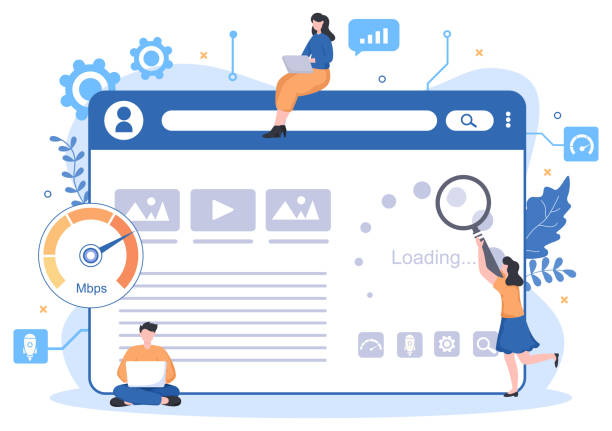
Optimizing Responsive Site Performance for Greater Speed

Simply having a responsive website design is not enough; your site must also be fast.
Website loading speed is one of the key factors in user experience and SEO, especially for mobile users who may be using slow internet.
Image optimization is one of the most important steps; using appropriate image formats (like WebP), compressing images without noticeable quality loss, and employing the lazy loading technique for off-screen images can make a significant difference in speed.
Optimizing CSS and JavaScript is also crucial; combining and compressing files (Minification) and removing unnecessary code (Purging Unused CSS) helps reduce file sizes.
Using Critical CSS, which only loads the CSS necessary for displaying the initial page content and asynchronously loads the rest, can significantly improve the initial page display speed.
Furthermore, using Content Delivery Networks (CDN) and browser caching is also beneficial for reducing latency and increasing speed.
These specialized and guidance measures ensure that your website not only looks good on all devices but also loads at high speed.
Tired of losing business opportunities due to not having a professional corporate website? Worry no more! With Rasawob’s corporate website design services:
✅ Your brand’s credibility and professionalism will increase.
✅ You will attract more customers and sales leads.
⚡ Get a free consultation now to start!
Exceptional User Experience with Multi-Device Compatible Design
The ultimate goal of any responsive website design is to provide an exceptional user experience (UX), regardless of the device the user is using.
This means that not only should the page layout be responsive, but all interactive elements and content should also be designed to be accessible and usable at any size.
For example, mobile navigation should be simple and intuitive, usually utilizing hamburger menus or smaller options that take up less space.
Font sizes and buttons should be adjusted to be both legible on small screens and provide sufficient touch-friendly design for easy finger interaction.
Avoiding overly dense content and focusing on providing key information concisely, especially on small devices, is of high importance.
A website with multi-device compatible design can entertainingly and engagingly allow users to navigate seamlessly between different sections of the site and access the information they need.
This analytical approach is based on user psychology and their behavioral patterns across various platforms to provide an optimal and flawless user experience.
The Future of Responsive Web Design Beyond Today

As technology rapidly advances, the future of responsive website design also faces new horizons.
With the emergence of new smart devices, smartwatches, virtual and augmented reality, and even flexible displays, the concept of “responsive” will gain broader dimensions.
The role of Artificial Intelligence (AI) in automatically optimizing design based on user and device behavior is also increasing.
Also, Progressive Web Applications (PWA), which offer a combination of the best features of web and native applications, are becoming a standard and further highlight the need for compatible and flexible design.
In addition to responsive design, other approaches like Adaptive Design, which changes the layout based on predefined breakpoints, are also evolving.
This news and thought-provoking content indicates that the web never stands still, and developers must always be ready to embrace changes and new technologies to build websites that provide a flawless user experience anytime, anywhere.
Frequently Asked Questions
| Question | Answer |
|---|---|
| What is Responsive Web Design? | It is a method for designing and implementing websites that automatically adjusts the layout and content of the page based on the user’s device screen size (desktop, tablet, mobile, etc.) and displays it in the best possible way. |
| Why is responsive design important? | With the increasing use of various devices to access the web, a responsive site improves user experience, reduces bounce rates, strengthens site SEO, and makes site management and maintenance easier (instead of having separate versions for mobile and desktop). |
| How does responsive design work? | This type of design uses techniques such as flexible grids and layouts (Flexbox, CSS Grid), flexible images and media, and most importantly, CSS Media Queries, to change the styles and layout of the page based on screen characteristics (width, height, resolution, etc.). |
| What are the main tools for implementing responsive design? | The main tools include HTML5 (for content structure), CSS3 (especially Media Queries, Flexbox, Grid for responsive styling and layout), and sometimes JavaScript for more complex interactions. |
| What are the main advantages of using responsive design? | The main advantages include increased user accessibility (covering a wide range of devices), improved user experience, improved site ranking in search engines (especially Google), reduced development and maintenance costs, and increased visitor-to-customer conversion rates. |
And other advertising services of RasaWeb Advertising Agency
Smart Link Building: A combination of creativity and technology for campaign management through precise audience targeting.
Smart Website Development: A combination of creativity and technology for campaign management through SEO-driven content strategy.
Smart Data Analysis: A novel service to increase customer acquisition through marketing automation.
Smart Advertorials: An effective tool for digital branding by optimizing key pages.
Smart Google Ads: A combination of creativity and technology to increase sales by optimizing key pages.
And over hundreds of other services in the field of online advertising, advertising consulting, and organizational solutions
Online Advertising | Advertising Strategy | Advertorials
Sources
Responsive Design at Iran WebResponsive Site Article at Parsian HostThe Future of Web Education at Hamyar WebResponsiveness in Webirani Site Design
? For a great leap in your business and reaching the peak of success, Rasaweb Afarin Digital Marketing Agency is by your side with its specialized services. Have a powerful online presence right now with fast and professional website design.
📍 Tehran, Mirdamad Street, Next to Central Bank, Southern Kazeroun Alley, Ramin Alley, No. 6

