
An Introduction to Responsive Website Design and Its Importance in the Digital Age

In today’s world, where users access the internet from various devices such as mobile phones, tablets, laptops, and even smart TVs, #responsive_website_design has become an undeniable necessity.
It’s no longer possible to expect all users to have an optimal experience by designing a fixed website optimized only for desktops.
The main goal of responsive website design is for your website to provide the best display and performance, regardless of the user’s device screen size. This approach means adapting content and layout to different dimensions, ensuring that not only is information displayed correctly, but user interaction is also optimized.
This educational topic clarifies the importance of this type of design in the current era.
In fact, website design without considering responsiveness no longer makes sense.
The importance of this approach is not limited to visual aesthetics; it also significantly impacts #user_experience (#UX) and even #search_engine_optimization (#SEO).
When a website displays well on various devices and the user doesn’t need to zoom or horizontal scroll, their satisfaction increases.
This satisfaction leads to a reduced bounce rate and increased user time on site, which are positive signals for Google and other search engines.
Therefore, responsive website design is not just a technical technique, but a business strategy for retaining and attracting customers. This explanatory section will help you gain a deeper understanding of why this technology is important.
Did you know that poor online store design can drive away up to 70% of your potential customers? Rasaweb transforms your sales with professional and user-friendly e-commerce website designs.
✅ Significant increase in sales and revenue
✅ Full optimization for search engines and mobile
⚡ [Get Free Consultation from Rasaweb]
The Evolution of Web Design and the Emergence of the Responsive Approach

Before the advent of #responsive_design, web developers typically designed separate versions of websites for desktop and mobile. This approach was not only #costly but also posed many difficulties in #management and #maintenance.
The #challenging_content was how to provide a unified and efficient experience with the explosion of smart devices and significant differences in their screen sizes? The answer emerged in 2010 with #Ethan_Marcotte’s introduction of the concept of “Responsive Web Design.”
This idea marked a turning point in the history of web development.
An analysis of web evolution shows that with the increase in mobile internet users and the unprecedented diversity of devices, the need for a scalable solution was felt more than ever.
Search engines, especially Google, also prioritized responsive websites with their policies, granting them better rankings in search results.
This action by Google, in a way, pushed all webmasters and companies towards #adopting_responsive_website_design.
Having a responsive website was no longer just an advantage; it became an #industry_standard.
Analytical approaches show that companies that adopted this change faster were able to capture a larger share of the online market and significantly improve their #user_experience.
This is the main reason for the world’s shift towards responsive website design.
Key Principles and Techniques in Responsive Website Design

To effectively implement #responsive_website_design, one must be familiar with its three main concepts: #Fluid_Grids, #Flexible_Images, and #Media_Queries.
These three pillars form the foundation of any responsive website, and a specialized understanding of them is essential for every developer.
#Fluid_Grids means that the website layout is defined using relative units like percentages, instead of fixed units like pixels.
This ensures that elements automatically adapt their size to the page width.
Flexible images, using properties like `max-width: 100%` in CSS, ensure that images never overflow their container and are displayed correctly on various devices.
But perhaps the most important component is #Media_Queries.
Media queries allow developers to apply different CSS rules based on device characteristics such as screen width, height, orientation, and even resolution.
This provides precise control over how content is displayed on different devices.
Here is an explanatory table for a better understanding of these concepts:
| Key Principle | Explanation | CSS Example |
|---|---|---|
| Fluid Grids | Using relative units (like percentages) to define the width of columns and elements. | .column { width: 33.33%; } |
| Flexible Images | Ensuring images do not become larger than their container and are scaled appropriately. | img { max-width: 100%; height: auto; } |
| Media Queries | Applying different CSS styles based on device characteristics (such as screen width). | @media screen and (max-width: 768px) { .header { font-size: 24px; } } |
These techniques together form the backbone of #responsive_website_design_implementation, providing a unified and optimized user experience across all devices.
A deep understanding of these principles is crucial for anyone intending to undertake #responsive_website_design.
Advantages of Responsive Website Design for SEO and User Experience

#Responsive_website_design is more than just a visual change; this approach brings significant benefits for #Search_Engine_Optimization (#SEO) and #User_Experience (#UX), which doubles its importance.
A precise #analysis of these benefits shows why every business should invest in this area.
In terms of SEO, #Google has clearly stated that it prefers responsive websites.
The main reason for this preference is the ease of crawling and indexing.
When a website has only one URL accessible across all devices, Google doesn’t need to crawl and index multiple versions of the site, which improves SEO rankings.
Additionally, a #reduced_bounce_rate and #increased_dwell_time, which are direct results of a good user experience on a responsive site, send strong positive signals to Google’s ranking algorithms.
In the dimension of user experience, #responsive_website_design allows users to access your content without any problems, regardless of the device they are using.
This means no need for zooming, no annoying horizontal scrolling, and a logical and readable layout at any size.
A positive user experience leads to increased engagement, higher conversion rates, and greater customer loyalty. Today’s users have high expectations for websites, and failing to provide a responsive experience can quickly lead to losing them.
This issue is not just a competitive advantage, but a requirement for business sustainability in the online space.
This section is a guide to understanding the depth of responsive design’s benefits.
Does your current website inspire the trust that potential customers should have in your business? If the answer is no, it’s time to have your professional and impactful corporate website with Rasaweb.
✅ Fully custom design tailored to your brand identity
✅ Increased lead generation and business credibility in the eyes of customers⚡ Contact us for a free consultation!
Popular Tools and Frameworks for Responsive Website Design

To facilitate the #responsive_website_design process, numerous tools and frameworks have been developed that help developers build responsive websites more efficiently and quickly.
These tools will be particularly useful for those looking for an educational and fast approach.
One of the most popular frameworks is #Bootstrap, developed by Twitter.
Bootstrap includes a collection of predefined #HTML, #CSS, and #JavaScript that allows you to quickly build responsive UI components (such as navigation bars, forms, and buttons).
This framework is designed with a “Mobile-First” approach and is widely used in the industry.
Another framework worth mentioning is #Foundation.
Foundation also offers a powerful set of tools for building responsive websites and applications and has high flexibility.
In addition to frameworks, core CSS technologies like #CSS_Grid and #Flexbox also play a key role in #responsive_website_design_implementation.
These two give developers unparalleled control over layout, making the creation of complex and responsive designs much easier.
Learning these tools is crucial for anyone looking to advance their skills in #responsive_website_design.
Common Challenges and Solutions in Responsive Design

Although #responsive_website_design has many advantages, we will also face #challenges in its implementation.
This section, with its thought-provoking content, examines some of these challenges and provides practical solutions to overcome them.
One of the biggest challenges is website #performance.
When a website is designed for desktops, it may include high-quality images and heavy scripts, which take time to load on mobile devices with slow internet connections.
The solution to this issue is to use #responsive_images, which load different sizes of an image, as well as #optimizing_JavaScript_and_CSS_code for faster loading.
Another challenge is #managing_legacy_content.
Older websites designed for a specific screen size may contain content that is not easily compatible with responsive principles.
In such cases, #partial_rebuilding or #complete_rewriting_of_some_sections may be necessary.
Finally, #testing_and_debugging across various devices is also a significant challenge.
With countless devices and browsers, ensuring the website functions correctly on all of them is difficult.
Using #browser_emulator_tools and #testing_on_real_devices can be helpful in this regard.
These guidelines will help you better identify and overcome obstacles on the path to #responsive_website_design.
Future Trends and Innovations in Responsive Website Design

The #web_design industry is constantly evolving, and #responsive_website_design is no exception.
A news and analytical look at future trends shows how innovations will transform the user experience.
One of the most important upcoming trends is the #increasing_use_of_Artificial_Intelligence (AI) and #Machine_Learning (ML) in the design process.
Tools are emerging that can automatically optimize layouts based on user data and device preferences, which will make the responsive website design process much smarter and more efficient.
#Progressive_Web_Apps (PWAs) will also play a prominent role in the future.
PWAs provide a native app experience through the web browser, offering capabilities such as offline access, push notifications, and home screen installation without needing to download from app stores.
This technology is a powerful complement to responsive design.
Additionally, #Dark_Mode and #Soft_Shadows design, which help improve readability and reduce eye strain, will gain more attention in the future as part of #layout_adaptability.
Finally, the focus on #outstanding_performance and #Lighthouse as a tool for evaluating user experience has become a vital phenomenon in the #responsive_web_development process.
The table below shows some important innovations:
| Future Trend | Explanation | Impact on Responsive Design |
|---|---|---|
| AI in Design | AI tools for automatic optimization of layout and content based on user device. | Increased efficiency and personalization in responsive website design. |
| Progressive Web Apps (PWAs) | Providing a native application experience through the web browser with advanced capabilities. | Strengthening offline capabilities and interactivity in responsive websites. |
| Dark Mode and Soft Shadows | Visual options to improve viewing experience and reduce eye strain. | Increased flexibility and visual comfort in responsive layouts. |
| Outstanding Performance | Focus on fast loading and high responsiveness across all devices. | Further optimization of code and resources for a smooth user experience in responsive websites. |
These innovations show how #responsive_website_design is not just a static technique, but a dynamic and growing field.
Comparing Responsive Design and Adaptive Design

In the discussion of #web_design_for_different_devices, the two terms #responsive_design and #adaptive_design are often used interchangeably, but there are important technical differences between them.
Understanding these differences is crucial for making correct decisions in #website_design projects.
This explanatory section helps clarify these distinctions.
#Responsive_Website_Design operates based on a “Fluid” approach.
This means there is a single layout that flexibly adjusts itself to the user’s screen size and, in a way, “flows.”
This is primarily achieved through media queries, fluid grids, and flexible images.
In this method, content and layout continuously change with browser resizing, without any jumps.
In contrast, #Adaptive_Design uses multiple fixed layouts for predefined breakpoints.
For example, you might have one layout for mobile, one for tablet, and one for desktop.
When a user accesses the site with a device, the system detects which breakpoint their screen size falls into and loads the appropriate layout.
This method is less “flexible” and more “discrete.”
Although adaptive design may offer more precise control over content display at each breakpoint in some cases, it requires maintaining and developing several separate layouts, which can increase complexity.
Ultimately, #responsive_website_design is often the preferred option due to its flexibility and ease of maintenance in the long run.
Are you dissatisfied with the low conversion rate of visitors to customers on your e-commerce site?
Solve this problem forever with professional e-commerce website design by Rasaweb!
✅ Increase visitor-to-customer conversion rate
✅ Create an excellent user experience and build customer trust
⚡ Get a free consultation
Best Practices for Implementing Responsive Design and Performance Optimization
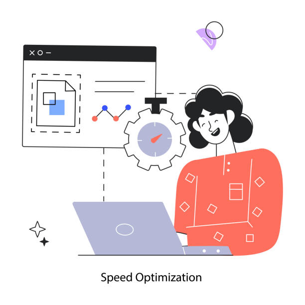
Successful implementation of #responsive_website_design is not limited to technical knowledge; it also requires adherence to #best_practices and #performance_optimizations to provide a flawless user experience.
This section will be a practical guide for developers and website administrators.
The first and most important principle is the #Mobile_First approach.
Instead of designing for desktop first and then adapting it for mobile, you should first design the layout and user experience for the smallest screen (mobile).
Then, gradually expand the design for tablets and desktops using media queries.
This approach ensures that your site performs best on mobile devices and prevents the loading of unnecessary code and resources.
#Image_optimization is also crucial.
Using next-generation image formats like WebP, compressing images without noticeable quality loss, and implementing #Lazy_Loading for off-screen images can significantly increase loading speed.
Additionally, #reducing_HTTP_requests, #compressing_CSS_and_JavaScript_files, and using #Content_Delivery_Networks (CDNs) also play a significant role in improving performance.
Finally, #continuous_testing of the website across different devices and browsers is essential to ensure full compatibility of #responsive_web_design.
These specialized actions guarantee the stability and efficiency of your website.
The Impact of Responsive Design on Business Success in Today’s World

In today’s competitive business world, a strong online presence is crucial for success.
#Responsive_website_design is no longer just an optional feature, but a decisive factor for #business_success and #customer_retention.
This analytical section examines how this type of design impacts companies’ bottom lines.
Firstly, responsive design helps to #expand_market_reach. Given that a significant portion of internet traffic comes from mobile devices, failing to provide a suitable user experience on these devices means losing a large volume of potential customers.
A responsive website ensures that every user, regardless of the device they use, can easily access your products or services.
Secondly, this type of design helps to #increase_brand_trust_and_credibility.
A website that looks good and functions correctly on every device indicates professionalism and customer focus.
This, in turn, leads to increased conversion rates, improved SEO rankings, and reduced marketing costs.
Because Google also prefers responsive sites.
Finally, #responsive_website_design helps to #reduce_development_and_maintenance_costs in the long run, because instead of managing multiple versions of a website, there is only one codebase.
This justifies the initial investment in responsive design and yields a significant return on investment.
This engaging yet analytical section clarifies the strategic importance of responsive website design for the future of any business.
Frequently Asked Questions
| Question | Answer |
|---|---|
| What is Responsive Web Design? | It is a method of website design that optimizes the appearance and functionality of the website according to the screen size of the user’s device (mobile, tablet, laptop, etc.). |
| Why is responsive design important? | Due to the increasing use of various devices to access the internet, responsive design provides a better user experience, improves site SEO, and reduces maintenance costs. |
| What are the most important tools for responsive design? | Media Queries in CSS, using relative units (such as percent, em, rem, vw, vh), Fluid Images, and Grid Systems. |
| What role do Media Queries play in responsive design? | Media Queries allow applying different CSS styles based on device characteristics (such as screen width, height, orientation, and screen type). |
| What is the Mobile First concept in responsive design? | It is an approach where design and development begin first for the smallest screen (mobile) and then gradually expand to larger screens (tablet, desktop). |
| Does responsive design affect SEO? | Yes, Google prefers responsive websites because they offer a better user experience and eliminate the need for separate mobile and desktop versions, which helps improve SEO rankings. |
| What does Fluid Layout mean? | It means that the width of page elements is defined using relative units (like percentages) instead of fixed pixel values, so they automatically adjust with screen size changes. |
| How are Flexible Images used in responsive design? | By setting the `max-width: 100%;` property for images in CSS, it is ensured that the image never exceeds its container and its scale is maintained with screen size changes. |
| What are the differences between responsive design and adaptive design? | Responsive design uses a single layout that fluidly adapts to any screen size, while adaptive design uses several fixed, predefined layouts for specific screen sizes. |
| Are CSS frameworks like Bootstrap useful in responsive design? | Yes, frameworks like Bootstrap have a responsive Grid System and pre-designed components that make the process of building responsive websites much simpler and faster. |
And other services of Rasaweb Advertising Agency in the field of advertising
Smart Digital Advertising: An effective tool for digital branding with user experience customization.
Smart Advertising Campaign: A fast and efficient solution for user engagement, focusing on intelligent data analysis.
Smart Customer Journey Map: A dedicated service for increasing website visits based on intelligent data analysis.
Smart Customer Journey Map: A fast and efficient solution for improving SEO ranking with a focus on Google Ads management.
Smart Brand Identity: Professional optimization for improving SEO ranking using SEO-driven content strategy.
And over hundreds of other services in the field of internet advertising, advertising consulting, and organizational solutions
Internet Advertising | Advertising Strategy | Advertorials
Resources
Iran Host – Responsive Website Design
Radis – What is Responsive Design?
Tavandis – Responsive Design
HostNegar – Responsive Website Design
? Is your business ready for a big leap in the digital world? Rasaweb Afarin Digital Marketing Agency, specializing in professional website design and providing comprehensive online marketing solutions, paves your path to growth and visibility.
📍 Tehran, Mirdamad Street, next to Bank Markazi, Kazeroun Jonoubi Alley, Ramin Alley, No. 6

