
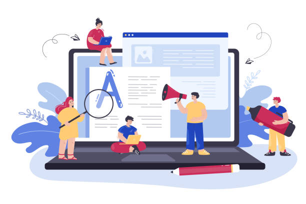
What is Responsive Website Design and Why Is It Important?

In today’s world, where users access the internet from various devices including smartphones, tablets, laptops, and even smart TVs, #website #design can no longer be based solely on a fixed size.
The concept of #Responsive Website Design is precisely the answer to this need.
This approach means designing and developing websites that can automatically adapt their appearance and layout to the screen size and features of the user’s device. In other words, a responsive website provides an optimal and pleasant experience, regardless of the device the user visits it from.
This flexibility not only ensures content is displayed correctly but also significantly increases the website’s usability. The importance of this becomes even more apparent when we consider that a significant portion of today’s internet traffic comes from mobile devices.
Ignoring this segment of users means missing out on countless opportunities for businesses and personal websites.
Responsive Website Design is no longer a luxury option, but a vital necessity for a successful online presence.
This approach ensures that your message is conveyed without any barriers to your audience, wherever they are and whatever device they use.
Can one, in this era, imagine a website that only displays well on a desktop? The answer is emphatically no.
Tired of losing customers due to poor e-commerce site design? With RasaWeb, solve this problem forever!
✅ Increase sales and visitor-to-customer conversion rates
✅ Smooth and engaging user experience for your customers⚡ Get free consultation
Fundamental Principles and Architecture of Responsive Website Design
The foundation of responsive website design rests on three main pillars: Fluid Grids, Flexible Images, and Media Queries.
Fluid grids mean that instead of using fixed pixel units, relative units like percentages are used for element widths.
This allows the website’s layout to change proportionally to the screen size and fill the available space optimally.
Flexible images also work similarly to fluid grids; instead of defining fixed dimensions for images, CSS is used to set a maximum width (max-width: 100%) so that images never spill out of their container and scale up or down to fit the available space.
These two principles form the basis of responsiveness.
But media queries are the beating heart of responsive design.
Media Queries allow designers to apply different CSS rules based on device characteristics such as screen width, height, orientation (portrait or landscape), and even resolution.
For example, one can specify that if the screen width is less than 600 pixels (e.g., on a smartphone), the navigation menu should change to a hamburger icon and font sizes should be increased.
Media Queries empower developers to design completely different user experiences for various devices without the need to create separate website versions.
A deep understanding of these three principles is key to successfully implementing an efficient and effective responsive website design.
Countless Benefits of Responsive Website Design for Users and Businesses

Responsive website design has evolved beyond a technical trend into a competitive advantage and even a necessity.
One of its most important advantages is improved user experience (UX).
A website that displays well and is navigable on any device leads to user satisfaction and increases their likelihood of returning.
This directly impacts the Conversion Rate, as users can more easily achieve their goals, such as purchasing products, completing forms, or signing up.
From an SEO perspective, Google has long emphasized the importance of website responsiveness.
Responsive websites have an advantage in mobile search rankings, which is crucial news for any business that values online visibility.
Furthermore, maintaining a single codebase for all devices means reduced development and maintenance costs.
Instead of separate development for desktop, tablet, and mobile, only a single website is managed, which itself is a huge saving in time and resources.
Additionally, responsive websites send positive signals to search engines by reducing the Bounce Rate and increasing user time spent on the site.
These benefits apply not only to commercial websites but also to blogs, portfolios, and any other type of online content.
Comparison of Responsive and Non-Responsive Websites:
| Feature | Responsive Website | Non-Responsive Website |
|---|---|---|
| User Experience | Excellent on all devices | Poor on different devices |
| SEO and Ranking | Improved mobile ranking, Google preference | Penalty in mobile ranking |
| Maintenance Cost | Integrated and lower | Multiple and higher |
| Bounce Rate | Lower | Higher |
| Loading Speed | Can be optimized | Usually slower on mobile |
Today, a business that does not have a correct understanding of mobile users’ needs virtually deprives itself of a large segment of the market.
Adaptive web design is a smart investment for the digital future.
Key Techniques and Technologies Required for Responsive Design

For successful implementation of responsive design, familiarity with a specific set of tools and techniques is essential.
The core of these techniques is built upon HTML5 and CSS3.
HTML5, by providing new semantic elements and formatting features, offers the necessary infrastructure for organized content.
But the real magic happens in CSS3, and particularly in Media Queries.
Media queries allow you to apply different styles based on various device characteristics, for example, making fonts larger for smaller screens or changing content columns from multi-column to single-column.
Additionally, techniques such as Mobile First have gained increasing importance in responsive website design.
In the Mobile First approach, design and development begin for the smallest screens and then gradually expand to larger devices.
This method ensures an optimal mobile user experience and prevents the addition of unnecessary code for larger devices.
Also, using the Viewport Meta Tag in HTML is essential for the browser to know how to adjust page dimensions and prevent default zooming.
Finally, managing images and videos on a responsive website is also challenging.
Techniques like Responsive Images, using `srcset` and `sizes` attributes in the `` tag or `
This significantly helps improve site loading speed, especially for mobile users who may have slower internet connections.
Responsive website design requires a deep understanding of these tools and techniques to achieve the best results.
How much does losing business leads due to an unprofessional website cost you? With professional corporate website design by RasaWeb, solve this problem forever!
✅ Increase credibility and trust of potential customers
✅ Easier acquisition of new business leads
⚡ Get a free consultation now!
Challenges and Critical Points in Implementing Responsive Design

Despite the numerous benefits of responsive design, its implementation is not without challenges.
One of the biggest obstacles is content and image management.
How can one ensure that high-quality images load quickly on small devices while maintaining their clarity on larger ones? This issue requires precise image optimization and the use of techniques such as conditional images or next-generation image formats like WebP.
Another challenge is the complexities of CSS and JavaScript.
With an increasing number of media queries and different logics for various sizes, managing CSS code can become difficult and requires precise organization and the use of CSS preprocessors like Sass or Less.
Is merely resizing elements enough, or should user interaction also be considered? This is a key question.
Responsive design is not just about changing dimensions; it’s about redefining the user experience for each device.
For example, navigation on mobile should be completely different from desktop.
Hamburger Menus or fixed navigation bars at the bottom of the screen are much more common and practical for mobile.
Also, ensuring touch-friendliness for interactive elements like buttons and links is essential, as mobile users use their fingers for navigation.
Finally, testing and debugging across different devices is a significant challenge.
Despite simulators, nothing replaces actual testing on physical devices.
Ensuring that the website works correctly across various browsers and operating systems requires considerable time and resources.
Overcoming these challenges requires high technical knowledge, a systematic approach, and attention to detail.
Helper Tools and Frameworks in Adaptive Web Design
To simplify the process of adaptive web design, numerous tools and frameworks have been developed that make the work much easier for designers and developers.
Bootstrap is undoubtedly one of the most popular and powerful front-end frameworks, providing a comprehensive set of HTML, CSS, and JavaScript for building responsive and mobile-first websites.
With its 12-column grid system, Bootstrap offers great ease in designing complex layouts and includes ready-to-use components such as forms, buttons, navigations, and modals, all of which are responsive by default.
Foundation is another popular framework that provides more flexibility and control for developers and is suitable for larger projects and deeper customizations.
In addition to frameworks, responsive testing tools also play a vital role.
Tools like Responsive Design Mode in Chrome and Firefox browsers allow developers to simulate the website’s appearance on different screen sizes and find potential issues.
Also, online tools such as Responsinator or Am I Responsive are very useful for quickly previewing the website on various devices.
The use of CSS preprocessors like Sass or Less also helps in managing CSS code and enables writing cleaner and more maintainable code by offering features such as variables, functions, and mixins.
Finally, Content Management Systems (CMS) like WordPress, with responsive themes and related plugins, have made the process of building a responsive website accessible even to non-technical users.
Choosing the right tool depends on project needs and team skills.
Impact of Responsive Websites on SEO and Mobile-First Indexing

The topic of responsive websites and Google’s Mobile-First Indexing are inextricably linked.
Since 2018, Google has gradually started using the mobile version of websites for crawling, indexing, and ranking, meaning that if your website is not optimized for mobile, even if its desktop version is excellent, it may drop in search results.
This change has made responsive website design a vital factor for SEO.
A responsive website allows Google to crawl and index only one version of the site, which makes the process more efficient for the search engine.
This means there’s no longer a need to manage separate URLs (like m.example.com) or use `rel=”alternate”` links, which significantly reduces SEO complexities.
Also, the improved user experience on mobile devices provided by responsive design indirectly positively impacts SEO.
Lower bounce rates, longer time spent on the site, and higher engagement are all positive signals for Google, indicating that your website provides valuable content.
Impact of Responsiveness on SEO Factors:
| SEO Factor | Positive Impact of Responsiveness | Description |
|---|---|---|
| Mobile Ranking | Increase | Google prefers responsive websites in mobile search results. |
| Bounce Rate | Decrease | Better user experience leads to longer user retention. |
| Time on Site | Increase | Readable and easily navigable content attracts users. |
| Crawling and Indexing | Improvement | A single URL simplifies the work of Googlebot. |
| User Signals | Positive | Better site interaction sends positive signals to search engines. |
In this era, responsive website design is crucial not only for users but also for search engines and directly impacts your online visibility and success.
User Experience (UX) Considerations in Responsive Website Design
Responsive website design goes beyond merely resizing elements; it requires a reconsideration of the user experience.
A website might be technically responsive, but if it offers a poor user experience on different devices, it will not succeed.
One of the most important UX considerations is Navigation.
Traditional desktop menus are not suitable for small mobile screens.
Using patterns like hamburger menus, bottom sheet menus, or tabbed navigation at the bottom of the screen can improve the mobile navigation experience.
Also, ensuring that buttons and links are large enough and have sufficient space for finger tapping (Hit Area) is crucial.
Content should also be presented intelligently. On smaller screens, content may need to be displayed in a more compact form and with more precise prioritization.
For instance, multi-column content on desktop should be displayed as single-column on mobile.
Also, attention to loading speed is a key UX element.
Mobile users often have less patience and face slower internet connections.
Optimizing images, reducing CSS and JavaScript code, and using a CDN (Content Delivery Network) are essential for improving loading speed across all devices.
Responsive website design must answer the question: “How can I provide the best possible experience for the user, regardless of the device they are using?” This includes continuous testing, gathering user feedback, and ongoing optimization based on data.
A truly responsive website stands out not only technically but also in terms of user experience.
Frustrated with your e-commerce site’s low conversion rate? RasaWeb transforms your online store into a powerful tool for attracting and converting customers!
✅ Significant increase in visitor-to-buyer conversion rate
✅ Unparalleled user experience to boost customer satisfaction and loyalty⚡ Get a free consultation from RasaWeb now!
Future Trends in Responsive and Adaptive Web Design

The world of web is constantly evolving, and responsive website design is no exception.
New trends are emerging that will shape the future of this field.
One such trend is Adaptive Design, which, while having similarities to responsive design, offers a slightly different approach.
In adaptive design, the site is designed for a limited number of screen sizes, rather than for a completely fluid range.
This can give developers more control over the user experience at each breakpoint, although it may require more work.
Progressive Web Apps (PWA) will also play an increasing role in the future.
PWAs are websites that can work offline, send notifications, and be installable on the device’s home screen, similar to a native application.
This technology elevates the user experience to a new level and reduces reliance on a stable internet connection.
These create new opportunities for responsive website design, allowing websites to become closer to native applications in terms of performance and capabilities.
Also, with the emergence of new devices like smartwatches, Augmented Reality (AR), and Virtual Reality (VR), the concept of “responsive” can take on new dimensions.
How will websites adapt to entirely new user interfaces and three-dimensional experiences? These challenging questions are pushing the field of responsive website design towards exciting innovations.
A future where websites respond not only to screen size but also to the user’s context, such as location, time, and even emotional state, is not far-fetched.
Why Every Business Needs Responsive Website Design?

In the current era, the question “Does my business need responsive website design?” is no longer relevant; instead, it should be “How can I implement the best responsive website design for my business?” There are numerous reasons why every business, from the smallest startups to the largest multinational corporations, needs a responsive website.
The first and foremost reason is widespread customer access.
Given that the majority of internet users access the web via mobile devices, ignoring this market segment means losing a vast volume of potential customers.
A non-responsive website disappoints mobile users and drives them toward competitors who offer a better user experience.
The second reason is its direct impact on SEO and Google rankings.
As previously mentioned, Google prefers responsive websites in search results.
Failure to comply with this standard means reduced visibility in search engines and loss of organic traffic, which is crucial for many businesses.
The third reason is reduced costs and increased efficiency.
By having a single website that works across all devices, the need to develop and maintain multiple separate versions of the site is eliminated, which itself means significant savings in time and resources.
Finally, a professional responsive website design increases your brand’s trust and credibility. This shows that your business is modern, customer-centric, and up-to-date with current technologies.
In today’s competitive world, these factors can be the difference between a business’s success and failure.
Frequently Asked Questions
| Question | Answer |
|---|---|
| What is responsive website design? | A web design approach where the website adapts to the screen size of various devices (desktop, tablet, mobile). |
| Why is responsive design important? | To provide an optimal user experience on any device the user uses and to improve SEO. |
| What are the main techniques of responsive design? | Using flexible grids, flexible images, and Media Queries. |
| What is a Media Query? | A CSS rule that allows applying different styles based on screen characteristics (such as width or height). |
| What are the benefits of responsive website design? | Increased user satisfaction, improved website ranking in search engines (SEO), reduced maintenance costs compared to having separate versions for each device. |
And other advertising services from RasaWeb Advertising Agency
- Smart Marketing Automation: Transform website traffic growth with the help of real data.
- Smart Marketplace: A fast and efficient solution for customer acquisition, focusing on attractive user interface design.
- Smart Conversion Rate Optimization: A fast and efficient solution for digital branding, focusing on SEO-driven content strategy.
- Smart Marketplace: Designed for businesses looking to manage campaigns through the use of real data.
- Smart Social Media: A creative platform for improving online growth with custom programming.
And over a hundred other services in the field of internet advertising, advertising consulting, and organizational solutions
Internet Advertising | Advertising Strategy | Advertorial
Resources
Comprehensive Guide to Responsive DesignThe Importance of Responsive Design in SEO and User ExperienceFuture Trends in Responsive Website DesignWhat is Responsive Design and How to Implement It?
? Are you ready to take your business to the top? RasaWeb Afarin Digital Marketing Agency, with expertise in SEO, content marketing, and multilingual website design, paves your path to digital success.
📍 Tehran, Mirdamad Street, next to Bank Markazi, Kazeroun Jonoubi Alley, Ramin Alley No. 6


