
Introduction to Responsive Web Design: Why is it Critical Now?

In today’s world, where the pace of technological change is dizzying, having a static and unchanging website means losing a large portion of your audience.
This is where the concept of #Responsive Web Design comes into play; an approach that ensures your website is displayed optimally on any device, from the smallest smartphone to the largest desktop screen.
This is not just a trend, but a business and technical necessity that determines your online success.
Imagine a user visiting your website and being forced to scroll horizontally or constantly zoom due to the content not fitting their device’s screen.
What happens? They will most likely leave your website.
This is where the importance of responsive design shows itself.
This approach means inherent flexibility in layout, images, and content, so that the user experience always remains smooth and pleasant.
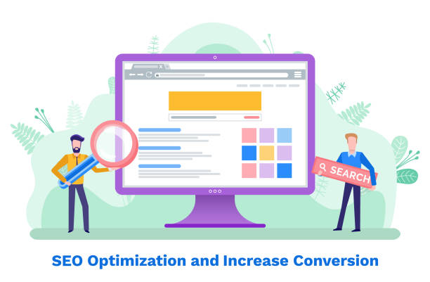
Responsive websites not only help improve user experience but also play a very important role in search engine optimization (SEO), as Google and other search engines give higher priority to mobile-friendly websites.
Therefore, if you are looking for a powerful presence in the digital space, investing in responsive web design is no longer an option, but a smart and unavoidable strategy that opens the doors to success for you and prepares your website for a new future.
Does your company’s website create a professional and lasting first impression on potential customers? Rasawap, with its professional corporate website design, not only represents your brand’s credibility but also paves a path for your business growth.
✅ Create a powerful and trustworthy brand image
✅ Attract target customers and increase sales
⚡ Get free consultation
The Evolution of Web Access: From Desktop to Mobile and the Need for Adaptability

The internet world has undergone tremendous transformations over the past two decades.
Initially, websites were primarily designed for display on large desktop monitors, assuming users would access content from a fixed space with specific dimensions.
However, the explosive emergence and growth of smartphones and tablets completely changed this equation.
Today, a significant portion of web traffic comes from mobile devices; devices with a wide variety of screen dimensions, from the smallest pocket phones to large tablets.
This paradigm shift revealed the urgent need for a new approach to web design: an approach that could display content without compromising quality and usability, regardless of size.
This is where the concept of responsive web design emerged as a response to this need.
It is no longer possible to cater to this diversity with separate designs for each device.
Responsive design techniques such as Media Queries, Flexible Grids, and Fluid Images allow designers and developers to create a single website that automatically adapts to the user’s screen dimensions.
This adaptability is not only visually important but also crucial for ease of use and user experience.
Users expect websites to load immediately and have easy navigation, without the need for unnecessary zooming or scrolling.
Ignoring these changes and failing to implement responsive web design means losing countless opportunities and falling behind competitors in this competitive space.
The future of the web lies in flexibility and adaptability.
Fundamental Principles and Techniques: Media Queries, Flexible Grids, and Fluid Images

To implement a successful responsive web design, there are three main pillars whose understanding and application are essential: Media Queries, Flexible Grids, and Fluid Images.
These three principles form the foundation of a responsive website’s structure and, working together, enable the adaptability of content to different screen dimensions.
Media Queries, powerful features of CSS3, allow the browser to apply different CSS styles based on device characteristics (such as width, height, orientation, and screen type).
For example, a media query can be used to specify that if the screen width is less than 768 pixels (e.g., for tablets), the navigation menu should be displayed vertically instead of horizontally.
This capability allows developers to create completely different experiences for different devices, without the need to develop multiple separate websites.
Flexible Grids, on the other hand, use relative units like percentages instead of fixed pixel units to define the width of columns and elements.
This means that the website layout, instead of being limited to a fixed width, dynamically changes with the screen width, and content fits beautifully into any space.
Finally, fluid images ensure that images used on the website never overflow their container and are always scaled proportionally to the available space.
This is typically achieved by setting the `max-width: 100%;` property for images in CSS.
By combining these three techniques, a responsive website not only becomes visually appealing but also performs optimally on any device, providing a flawless user experience.
These elements form the backbone of any modern responsive web design.
Example of Common Breakpoints in Media Queries
| Device Type | Screen Width (Example) | Application |
|---|---|---|
| Small Phones | Up to 375px | Maximum optimization for limited space |
| Smartphones | 376px – 767px | Single-column layout, hamburger menu |
| Tablets | 768px – 1023px | Two-column layout, optimized navigation |
| Laptops & Desktops | 1024px – 1439px | Three-column layout, full navigation |
| Large Displays | More than 1440px | Increased white space, more details |
User Experience and Search Engine Optimization Benefits: How Responsive Design Improves Both?

One of the most important reasons that has made responsive web design a necessity is its direct impact on User Experience (UX) and Search Engine Optimization (SEO).
These two factors are inextricably linked, and a responsive website simultaneously strengthens both.
From a UX perspective, a responsive website ensures that users, regardless of the device they use, encounter an optimized and understandable user interface.
No need to zoom, horizontal scroll, or search for disappeared buttons provides an enjoyable experience for the user.
This ease of use naturally leads to an increase in user time on the site, a decrease in the Bounce Rate, and ultimately an increase in Conversion probability.
Today’s users are impatient, and if your site is not usable within a few seconds, they will quickly turn to your competitors.
On the other hand, the impact of responsive web design on SEO is also significant.
Google has explicitly stated that it prefers mobile-friendly websites in its search results.
Google’s algorithms increasingly operate based on mobile-first indexing, meaning they consider the mobile version of your website as the primary version for ranking.
A responsive website, with only one URL and one codebase, eliminates the need to maintain separate versions (such as m.website.com), which significantly helps SEO.
Also, duplicate content issues that may arise on separate mobile and desktop sites do not exist in a responsive design.
In addition, better loading speed and performance on mobile, which are characteristics of a responsive site, directly affect SEO ranking positively.
In summary, investing in responsive web design is not only vital for your users’ satisfaction but also a smart step towards achieving higher ranks in search engines and consequently increasing your website’s visibility and traffic.
This is a win-win strategy for any business.
How much does losing business leads due to an unprofessional site cost you? Solve this problem forever with professional corporate website design by Rasawap!
✅ Increase credibility and trust of potential customers
✅ Easier attraction of new business leads
⚡ Get a free consultation now!
Popular Tools and Frameworks for Implementing Responsive Design

Implementing responsive web design is much easier today than in the past, thanks to powerful tools and frameworks that simplify and speed up the development process.
Choosing the right framework depends on project needs, team skills, and desired scalability.
One of the most popular and widely used frameworks for responsive design is Bootstrap.
Bootstrap is an HTML, CSS, and JavaScript toolkit that includes design templates for typography, forms, buttons, tables, navigations, and other UI elements.
Using its 12-column grid system, responsive layouts can be quickly and easily implemented.
The main advantage of Bootstrap is its development speed and high compatibility with various browsers.
Another popular framework is Foundation, developed by ZURB, known for its flexibility and “Mobile-First” philosophy.
Foundation also provides a comprehensive set of components and tools for building responsive websites and complex web applications.
In addition to comprehensive frameworks, other tools also exist to facilitate responsive web design.
CSS preprocessors like Sass and LESS allow developers to write CSS code with variables, functions, and nesting, which significantly improves code organization and maintenance.
Also, image management tools like Cloudinary or Imgix help optimize and deliver images with appropriate quality for different devices, which is a critical component in the performance and loading speed of responsive websites.
These tools and frameworks not only accelerate the construction process but also help ensure the quality and standardization of responsive web design, allowing developers to focus on more creative and functional aspects of the project.
Common Challenges and Solutions in Responsive Design: Debugging, Performance, and Legacy Content

Although responsive web design has countless advantages, you may also encounter challenges in its implementation.
Understanding these challenges and knowing their solutions is essential for creating a powerful and flawless responsive website.
One of the common challenges is debugging.
Given the countless variations of devices and screen dimensions, ensuring that the website displays correctly in all conditions can be difficult.
Browser developer tools (such as Chrome DevTools) with their ability to simulate different devices are a vital tool for this purpose.
Using online testing tools like Responsinator or BrowserStack can also help you simulate your site in various environments.
Another challenge is website performance.
Large and unoptimized images, too many fonts, and heavy JavaScript code can slow down site loading on mobile devices, which severely reduces user experience.
Solutions such as image optimization (using modern formats like WebP, compression, and Lazy Loading), code minification, and using Content Delivery Networks (CDNs) can help improve performance.
Additionally, legacy content that may have been designed for non-responsive environments can be challenging.
This content may include tables with fixed widths, images with specific pixel dimensions, or videos with fixed dimensions.
For these cases, a gradual approach is necessary.
For old images and videos, CSS can be used to scale them (e.g., `max-width: 100%`).
For large tables, they can be placed in a `div` with `overflow: auto` to allow horizontal scrolling on small devices, or they can be redesigned in a more flexible way.
With careful planning and the use of appropriate tools, these challenges can be overcome, and a strong and stable responsive web design can be delivered that performs well in any environment.
Testing Responsive Websites: Emulators, Device Testing, and Real Scenarios

After implementing responsive web design, the crucial testing phase begins.
Without rigorous testing, it is impossible to ensure that the website functions correctly across all devices and user scenarios.
There are various testing methods, each with its own advantages and limitations.
One of the most common and accessible methods is the use of browser emulators.
Most modern browsers (such as Chrome, Firefox, and Edge) have developer tools that allow for simulating various screen dimensions, orientations (portrait/landscape), and even network speeds.
These emulators are very useful for initial testing and quick debugging, but they cannot fully replicate the real experience of a physical device, as factors such as touch performance, hardware capabilities, and different operating systems are not taken into account.
For greater assurance, real device testing is essential.
This method involves testing the website on a collection of actual smartphones and tablets with different screen dimensions and operating systems.
This helps you identify issues related to touch, performance, and the exact rendering of the website in real environments.
Platforms like BrowserStack or Sauce Labs allow you to access a range of physical or virtual devices remotely and conduct tests on a larger scale.
In addition to technical tests, considering real user scenarios is also important.
This means how real users will interact with your website under different conditions (e.g., on the go, with a poor internet connection, or in noisy environments).
Testing accessibility for users with special needs is also part of these scenarios.
Using user feedback through usability testing can reveal hidden weaknesses.
Combining these testing methods ensures that your responsive web design is not only technically sound but also provides a flawless user experience in the real world.
This is the final step to ensure the success of your website.
Common Tools for Testing Responsive Websites
| Tool/Platform Name | Type | Primary Use |
|---|---|---|
| Chrome DevTools (Device Mode) | Browser Emulator | Quickly test dimensions and responsiveness in the browser |
| Responsinator | Online Simulator Test | Simultaneously display site in different device dimensions |
| BrowserStack | Real/Virtual Device Testing Platform | Test on over 2000 real devices and browsers |
| Sauce Labs | Cloud Testing Platform | Automated and manual testing on various platforms |
| Google Mobile-Friendly Test | Google SEO Tool | Check site’s mobile compatibility from Google’s perspective |
Future Trends in Responsive Web Design: Beyond Resizing – Adaptive Content and Progressive Enhancement

Responsive web design, although a significant transformation itself, continues to evolve, and its future trends extend beyond mere content resizing.
In the future, we will see a greater focus on adaptive content and progressive enhancement.
Adaptive content means that not only the website layout changes based on the device, but the content itself (such as text, images, and videos) is also presented in a way that is optimized for the specific device and its usage context.
For example, on a smartphone, a more concise version of an article or lower-quality images might be provided for faster loading, while on a desktop, the full version and high-resolution images are displayed.
This approach means more precise optimization and providing a fully personalized experience that goes beyond mere visual responsiveness.
On the other hand, progressive enhancement is a design philosophy that emphasizes building a basic, functional user experience for all users (regardless of browser, device, or network speed), then gradually adding more advanced features for browsers and devices with greater capabilities.
This means your website will be usable even in older browsers or with poor internet connections but will offer a richer and more complete experience in modern browsers and with high bandwidth.
This approach is particularly crucial for ensuring accessibility and covering a wide range of users.
Also, with the emergence of technologies such as Web Components and Server-Side Rendering (SSR), the future of responsive web design is moving more towards modular and performance-oriented architectures that allow for building websites with unparalleled speed and efficiency.
Ultimately, responsive web design is moving towards smarter and more flexible user experiences that react not only to screen dimensions but also to user context, network speed, and even user preferences.
Are you concerned about your e-commerce site’s low conversion rate and not achieving your desired sales?
Rasawap is your specialized solution for a successful e-commerce site.
✅ Significant increase in conversion rate and sales
✅ Professional and user-friendly design to gain customer satisfaction
⚡ Ready for a transformation in online sales? Get a free consultation!
Business Impact: ROI, Conversion Rates, and Brand Reputation

Adopting and implementing responsive web design is no longer just a technical decision, but a vital business strategy that can significantly impact your Return on Investment (ROI), Conversion Rate, and Brand Reputation.
Understanding these business aspects convinces managers and business owners that investing in this area is not an expense, but a profitable investment.
From an ROI perspective, a responsive website reduces development and maintenance costs.
Instead of developing and managing multiple versions of the website for desktop, tablet, and mobile, you have only one website that is compatible with all devices.
This reduction in complexity means saving time and resources in development, testing, and updating.
Also, by improving user experience and SEO, your website traffic increases, which can directly lead to increased sales and revenue.
Conversion rate is another area that responsive web design heavily influences.
When your website displays well on any device and users can easily interact with it, the likelihood of them taking your desired action (such as purchasing a product, filling out a form, or contacting you) significantly increases.
A frustrating mobile user experience can lead to high bounce rates and abandoned shopping carts, while an optimized website makes the conversion process smooth and frictionless.
Finally, your brand reputation is heavily influenced by the quality of your online presence.
A website that looks bad or doesn’t work on mobile creates a negative image of your brand in users’ minds.
In contrast, a professional responsive web design demonstrates your attention to the customer and your business’s up-to-dateness.
This is especially crucial in an era where many of your customers’ first interactions with your brand are through mobile.
A positive mobile experience can increase customer loyalty and differentiate you from your competitors.
Therefore, responsive web design is not just a technical investment, but a strategic decision for the long-term growth and sustainability of your business.
A Step-by-Step Guide to Implementing Responsive Design: Practical Advice for Developers and Businesses
Implementing responsive web design can initially seem complex, but with a step-by-step approach, the process can be managed effectively.
This guide provides practical advice for developers and businesses:
-
Mobile-First Approach: This is one of the most important recommendations.
Instead of designing for desktop and then trying to compress it for mobile, start designing and developing for the smallest screens first.
This approach ensures that core content and critical functionality are prioritized, and then additional features are added for larger screens.
This significantly helps improve performance and loading speed on mobile.
An excellent responsive web design always starts with mobile. -
Use Flexible Grids: Instead of using fixed pixel widths, use relative units like percentages or `em`/`rem` for element layouts.
This allows the website layout to naturally scale with different screen dimensions, eliminating the need to define precise sizes for each screen. -
Fluid Images: Ensure that images never overflow their container.
By adding `max-width: 100%; height: auto;` to image CSS, you can make them responsive.
For performance improvement, use the `srcset` and `sizes` attributes in the `img` tag to let the browser load the optimized image version. -
Smart Media Queries: Define media queries carefully and only when the site’s layout requires a significant change.
Create media queries based on content and important design breakpoints (e.g., when columns start overlapping), not based on specific device dimensions.
This makes your responsive web design more stable and manageable. -
Continuous Testing: Regularly test your website on real devices and various emulators.
As mentioned in the previous section, browser developer tools and cloud testing platforms are very useful for this purpose.
Also take real user feedback seriously. -
Prioritize Performance: Loading speed is a key factor in user experience and SEO, especially on mobile devices.
Optimize images, minify code, use caching and CDNs to ensure your website is fast and smooth.
By adhering to these principles, businesses and developers can implement a strong and efficient responsive web design that not only meets current user needs but is also prepared for future web developments.
Frequently Asked Questions
| Question | Answer |
|---|---|
| What is Responsive Web Design? | It is a web design approach that ensures web pages are displayed correctly and legibly across various devices and screen sizes (such as desktop, tablet, and mobile). |
| Why is Responsive Web Design important? | It improves user experience across different devices, increases search engine rankings (SEO), and saves time and cost compared to building separate mobile or tablet versions. |
| What technologies are used in Responsive Design? | The main technologies include HTML for structure, CSS for styling (especially Media Queries), and the use of fluid images and flexible grids. |
| What is a Media Query? | A Media Query is a CSS technique that allows applying different styles based on the characteristics of the device the user is on (such as screen width, orientation, and resolution). |
| What is the Mobile First concept in Responsive Design? | It means starting the design and development of a website first for mobile devices with small screens, and then scaling it up for larger devices (such as tablets and desktops). This method ensures a focus on user experience on small devices. |
And other services of RasaWeb Advertising Agency in the field of advertising
Smart Marketplace: Revolutionize SEO ranking with the help of Google Ads management.
Smart Sales Automation: A specialized service for SEO ranking improvement based on precise audience targeting.
Smart Website Development: A fast and efficient solution for increasing website traffic with a focus on intelligent data analysis.
Smart Link Building: Professional optimization for customer attraction using key page optimization.
Smart Sales Automation: A combination of creativity and technology for user interaction through key page optimization.
And over hundreds of other services in internet advertising, advertising consultation, and organizational solutions
Internet Advertising | Advertising Strategy | Advertorials
Sources
Responsive Website DesignResponsive Website Design TutorialAdvantages of Responsive SitesResponsive Site Design Tools
? Are you ready to take your business to new heights in the digital world? RasaWeb Aafarin Digital Marketing Agency, specializing in professional website design, SEO optimization, and comprehensive content marketing strategies, is your guide to achieving great goals. With us, you will have a powerful and lasting presence in the online space.
📍 Tehran, Mirdamad Street, next to Central Bank, Kazeroon Janoubi Alley, Ramin Alley, No. 6


