
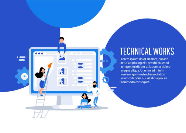
Introduction and Importance of Responsive Website Design in the Modern Era

In today’s digital world, where various devices with different screen dimensions, including smartphones, tablets, laptops, and even smart TVs, provide users with internet access, the importance of #responsive_website_design has become more evident than ever.
This approach in #web_design ensures that a website offers the best possible user experience, regardless of the device the user is employing.
It is no longer feasible to design a website optimized for only one specific display dimension; doing so would mean losing a significant portion of the audience and business opportunities.
#Responsive_website_design or #responsive_web is not just a trend, but an undeniable necessity for a successful online presence.
This concept means creating a flexible user interface that intelligently adapts itself to changes in screen size and device orientation.
This adaptability not only includes the layout of page elements but also ensures that images, fonts, and other content are optimized to be readable and accessible on any device.
From an explanatory perspective, responsive design means using smart CSS and JavaScript codes that apply different styles based on the user’s device characteristics (such as screen width, resolution, and orientation).
This educational approach helps developers to create a website that displays correctly on all devices with a single codebase, eliminating the need to design separate versions for mobile and desktop, which ultimately leads to savings in time and cost.
This major transformation in web design is a response to changing user behavior patterns, as users now access the internet via mobile devices more than ever before.
Ignoring this reality means falling behind the competition and losing a significant portion of the target market.
Is your e-commerce site ready to attract maximum customers and increase sales? Rasaweb transforms your online business with modern and efficient e-commerce website design.
✅ Increased speed and improved SEO
✅ Excellent user experience on mobile and desktop⚡ Get free e-commerce website design consultation from Rasaweb!
Principles and Fundamentals of Responsive Web Design

Responsive website design is built upon three fundamental principles, the understanding of which is crucial for every developer: Flexible Grids, Flexible Images, and Media Queries.
Flexible grids, instead of using fixed pixel units, utilize relative units such as percentages or viewport units for element widths.
This means that the width of columns and rows is defined based on a percentage of the screen width, rather than a fixed number, allowing the page layout to automatically change with screen size and always maintain correct proportions.
Flexible images work similarly; by using CSS properties like `max-width: 100%` and `height: auto`, it is ensured that images never exceed the width of their container and, if the screen shrinks, they scale down proportionally without losing quality or overflowing the page edges.
This principle is very important in #compatibility_with_different_devices, as image size can significantly impact site loading speed on mobile and, if not optimized, severely degrades the user experience.
Media queries are the beating heart of responsive website design.
These CSS commands allow designers to apply different styles based on specific device characteristics, such as screen width, height, resolution, and orientation (horizontal or vertical).
For example, one can define that if the screen width is less than 768 pixels, the navigation menu should transform into a hamburger icon, and texts should be displayed larger to improve readability.
This specialized capability enables the creation of entirely different and optimized user experiences for each category of devices.
A deep understanding of these three essential components is the cornerstone of building an efficient and professional #responsive_website and allows designers to implement the best layout for any screen size with an analytical approach.
Techniques for Implementing Responsive Design and Its Tools

For effective implementation of responsive website design, developers utilize various techniques and tools.
One of the most common approaches is the use of CSS frameworks like Bootstrap and Foundation.
These frameworks offer a collection of pre-designed components and flexible grid systems that significantly accelerate development speed and ensure compatibility across different browsers and devices.
They serve as practical guides, powerful tools for quickly starting responsive projects, and help developers rapidly achieve a strong initial structure.
In addition to frameworks, CSS techniques such as Flexbox and CSS Grid Layout also play a key role in creating complex and responsive layouts.
Flexbox is ideal for one-dimensional layouts (rows or columns), and CSS Grid is perfect for two-dimensional layouts (rows and columns simultaneously).
These powerful tools provide precise control over how elements are positioned and behave in response to screen size changes, enabling designers to implement more creative and complex designs without the need for heavy JavaScript codes.
The Mobile-First approach is also a vital strategy in responsive website design.
In this approach, the website is first designed and developed for the smallest screen (such as mobile), and then gradually optimized for larger screens using media queries.
This method, due to resource limitations on mobile devices (less bandwidth, more limited processing power), ensures that the focus is more on optimal performance and user experience on these devices, and the final result is typically lighter and faster.
This approach is a specialized and educational method that helps designers keep optimization in mind from the outset.
Below, a comparative table of common approaches in responsive web design is provided:
| Approach | Description | Advantages | Disadvantages |
|---|---|---|---|
| Mobile-First | Design starts from the smallest screen (mobile) and expands towards larger ones. | Optimal performance on mobile, focus on main content, better SEO for mobile. | Desktop design might become slightly complex due to initial constraints. |
| Desktop-First | Design starts from the largest screen (desktop) and scales down towards smaller ones. | Starting with more space, suitable for rich and complex content. | Might lead to loading unnecessary content on mobile, lower performance on mobile. |
| Adaptive Design | Several fixed layouts for specific screen dimensions (pre-defined breakpoints). | More precise control over appearance at each breakpoint, suitable for fundamental changes in design. | Requires designing and maintaining multiple layouts, less flexible for intermediate sizes. |
User Experience (UX) and Responsive Website Design

Responsive website design is directly related to user experience (UX), and its ultimate goal is to provide a desirable and seamless experience to users, regardless of the device they use.
A properly responsively designed website prevents content jumping, unnecessary horizontal scrolling, or inappropriate font sizes that cause eye strain.
This analytical aspect is very important as it shows how responsive web design directly impacts user interaction with the site and, ultimately, the website’s success.
The website should be designed so that navigation between pages is easy and all interactive elements are easily accessible and usable, especially on mobile touchscreens.
An excellent user experience on responsive sites means that navigating the site is easy, buttons and links are large enough to be easily clickable, and images and videos are properly loaded and optimally displayed.
This is especially critical for mobile users who may connect to the internet via slower data networks.
Ignoring these points can lead to high bounce rates and loss of customers, as users quickly become frustrated and leave sites with poor user experience.
A debatable content point in this section could be: Is merely having a responsive website enough for an excellent user experience? The answer is that while it is essential, it is not sufficient.
Responsive website design is just a foundation; for a truly excellent UX, aspects such as loading speed (Performance), ease of use (Usability), and accessibility (Accessibility) must also be considered.
For example, ensuring that users with visual impairments can use your site and that your content is understandable to screen readers is an important part of UX that should be considered alongside responsiveness.
A successful responsive design enables users to access the information they need without any obstacles and interact effectively with the website, which in turn increases user loyalty and conversion rates.
Are you concerned about your e-commerce site’s low conversion rate and not achieving your desired sales?
Rasaweb is your specialized solution for a successful e-commerce website.
✅ Significant increase in conversion rates and sales
✅ Professional and user-friendly design to attract customer satisfaction
⚡ Ready for a transformation in online sales? Get a free consultation!
SEO and the Position of Responsive Website Design

In the world of search engines, Google has clearly stated that it recommends responsive website design as the best method for mobile sites.
This recommendation is not just a suggestion but a requirement, especially with the introduction of Mobile-First Indexing in 2018.
This means that Google primarily considers the mobile version of your website for crawling, indexing, and ranking content.
Therefore, if your website is not optimized for mobile and provides a poor user experience on small devices, it may suffer in search results, even if its desktop version is flawless.
This is a serious news alert for every website owner.
The main advantage of responsive website design for SEO is that there is a single URL for all devices.
This helps Google crawl your site’s content more easily and prevents issues of duplicate content that occur with sites having separate versions (like m.example.com).
Furthermore, managing and maintaining a single site is significantly easier than managing two or more separate sites, which itself contributes to improved SEO by reducing technical errors, increasing efficiency in content updates, and consolidating backlinks to a single domain.
Site loading speed is also an important SEO factor, especially for mobile devices.
A well-designed responsive website should be optimized for fast loading, using compressed images and efficient coding.
This directly affects user experience and ranking in search results.
From an analytical perspective, businesses that have understood the importance of #responsive_website and its impact on SEO attract more organic traffic and ultimately contribute to their online growth.
News related to new Google algorithms consistently emphasize that mobile device compatibility and providing an optimal user experience are key priorities, and any negligence in this regard can lead to SEO penalties and a drop in search rankings.
Challenges and Solutions in Responsive Web Design
Although responsive website design offers numerous advantages, it also comes with its specific challenges that must be approached with a specialized and analytical perspective.
One of the main challenges is performance management.
While its goal is optimization for all devices, designers sometimes inadvertently slow down the site on mobile devices by including too much content or high-quality images suitable for desktops.
The solution to this problem involves using techniques such as Lazy Loading, Image Compression, utilizing optimized image formats like WebP and Jpeg 2000, and optimizing CSS and JavaScript codes.
Another challenge is designing complex layouts.
Converting a complex desktop layout into a simple and user-friendly mobile layout requires creativity and precise planning.
Sometimes it is necessary to hide certain elements or content in mobile versions or organize them differently to provide an appropriate user experience.
This can create questionable content: Does removing some content on mobile harm the user experience? The answer depends on the type and importance of the content; essential content should remain accessible, but non-essential or decorative elements can be removed.
Compatibility with older browsers can also be a challenge.
Although most users employ modern browsers, some companies or users still use older versions that may not support certain advanced CSS and JavaScript features.
Using Polyfills and Fallbacks can help mitigate this issue.
From an analytical perspective, choosing the right frameworks and development tools can also be effective in overcoming these challenges.
For example, selecting a lightweight and modular framework that allows for high customization can help designers create websites with excellent performance and high flexibility, avoiding unnecessary complexities in the responsive website design process.
The Future of Responsive Website Design and Emerging Trends

The future of responsive website design goes beyond merely adapting to screen size.
Emerging trends indicate that websites must not only respond to device dimensions but also consider the user’s context and environment of use.
This includes factors such as internet connection speed, user location, device preferences, and even battery charge level.
This approach is also referred to as Adaptive Design or even Context-Aware Design, signifying a more specialized step in the evolution of the web.
This analytical trend takes a deeper look into user behavior and their environmental conditions to provide the best possible experience.
One significant trend is personalized user experience using Artificial Intelligence (AI).
AI can dynamically change the site’s content and layout by analyzing user behavior to best match the individual user’s needs.
This could lead to designs far more advanced than what we currently know as responsive website design, where the site literally “learns” and optimizes itself for each user.
Progressive Web Apps (PWAs) also play an important role in the future.
PWAs offer a combination of the best features of web and native applications, including offline functionality, push notifications, and access to device hardware capabilities.
This technology is inherently responsive and provides a seamless user experience across all platforms, which is exciting news for developers and users.
From a news and analytical perspective, these developments indicate a shift in focus from “design for the device” to “design for the user and their experience.”
This table illustrates future trends in web design and their impact on responsiveness:
| Trend | Description | Impact on Responsive Design |
|---|---|---|
| Context-Aware Design | Adapting the site to the user’s environmental conditions (internet speed, location, battery charge). | Beyond dimensions, optimizing content and performance based on user context and conditions. |
| Progressive Web Apps (PWAs) | Native-like app experience in the browser, offline capability. | Inherent support for responsiveness, better performance, access to device capabilities. |
| Artificial Intelligence (AI) in Design | Dynamic personalization of content and user interface based on user behavior. | Creating highly personalized and adaptive experiences, continuous UX improvement. |
| Increased Importance of Accessibility | Ensuring accessibility for people with different abilities (visual, auditory, motor). | Inclusive design that everyone can use, beyond visual aesthetics. |
Successful Case Study of Responsive Website Design

To better understand the effectiveness of responsive website design, examining successful examples can be very illuminating.
One of the best global examples is the Google website, which inherently leverages responsive design.
Google’s search engine, the most widely used website in the world, functions flawlessly on every device, from the smallest smartphone to the largest desktop screen, providing a unified user experience.
This includes not only the search page but also many other Google services like Gmail and Google Maps, which have implemented responsive principles in the best possible way.
This example is both specialized and general, demonstrating how a simple yet powerful design can succeed on a large scale and serve as a benchmark for others.
Another example is large news websites like The New York Times or BBC News.
These websites, with their vast amount of text, image, and video content, face complex challenges in providing a responsive user experience.
However, by using flexible grids, optimized images, and priority-based content organization, they have managed to display content in a readable and navigable manner on every device.
This is crucial for news websites, which receive a large number of mobile visitors, and serves as an analytical example for understanding the importance of compatibility with various devices.
They also continuously collect user feedback to improve their experience.
A captivating example can also be e-commerce websites.
Sites like Amazon or Etsy host billions of products and have complex user interfaces that include filters, categories, and purchasing processes.
Nevertheless, their responsive web design allows users to easily search, view, and purchase products, whether with a mouse click on a desktop or a finger tap on a smartphone.
These successful cases demonstrate that with careful planning and correct implementation, responsive website design can lead to business goals and an excellent user experience, distinguishing businesses in today’s competitive market.
Are you tired of losing business opportunities due to not having a professional corporate website?
Rasaweb helps you with professional corporate website design:
✅ Build a powerful and reliable brand image for yourself
✅ Convert website visitors into loyal customers
⚡ Get a free consultation right now!
Key Tips for Choosing a Responsive Website Designer

Choosing the right designer or development team for implementing responsive website design is a critical decision that can significantly impact your business’s online success.
The first and most important tip is to review their past portfolios.
Ensure that the provided examples are truly responsive and perform well on various devices.
Ask them to show projects that faced similar challenges to yours and for which they provided suitable solutions.
This is a very important practical guide, as it demonstrates their ability to solve real-world problems.
The second tip is their expertise in responsive principles.
Are they fully familiar with concepts like mobile-first, Flexbox, CSS Grid, and Performance Optimization? A designer with strong technical knowledge can create a website that is not only beautiful but also technically efficient and fast.
Also, inquire whether they pay attention to the fundamentals of User Experience (UX) and responsive SEO, as these factors are as important as the site’s appearance and directly affect your site’s visibility and interactivity.
The third tip is their approach to testing and debugging.
Responsive website design requires continuous testing across various devices and browsers.
Ensure that the designer or team has precise processes for testing, reporting, and fixing bugs, and uses appropriate tools for simulating different devices.
Also, check if they use version control systems (like Git) for code management and if they allow for your collaboration and oversight of project progress.
Finally, communication and transparency throughout the project are very important.
A team specializing in #responsive_web_design should be able to clearly discuss the workflow, challenges, and solutions with you and keep you updated on the project’s progress to ensure that your final website is a #responsive_site and fully optimized.
Conclusion and Next Steps in Modern Web Design

In conclusion, it can be stated that responsive website design is no longer a luxury option, but an absolute necessity for any business or individual seeking an effective and sustainable online presence.
This approach means providing a seamless and optimized user experience across all devices, from smartphones to desktop computers.
Given the growing trend of mobile internet access, ignoring the principles of #responsive_design can lead to loss of traffic, reduced conversion rates, and damage to brand reputation.
This is an undeniable truth in the digital age, confirmed by statistical data.
The next steps in modern web design go beyond mere responsiveness.
As mentioned, trends such as AI-driven adaptive design and Progressive Web Apps (PWAs) indicate a future where websites will become even smarter and more personalized.
Therefore, developers and business owners must continuously update their knowledge of emerging technologies and be ready to embrace changes.
This is an ongoing educational process.
Furthermore, attention to website performance and optimizing its loading speed will remain a top priority.
A responsive site is only effective when it is fast and fluid.
For this purpose, using analytical tools to monitor performance and user experience (such as Google Analytics and Lighthouse) is essential.
As a final guide, investing in responsive website design is not just an expense but an investment in the future of your business.
This will help you not only keep pace with technological changes but also lead in digital competition, ensuring that your website remains accessible and efficient, regardless of time and place.
This analytical approach provides a clear path for any successful web design in the current era, bringing long-term positive results.
Frequently Asked Questions
| Question | Answer |
|---|---|
| What is Responsive Website Design? | Responsive Web Design is an approach that causes the design and layout of a website to change and be displayed in the best possible way based on the screen size of the user’s device (computer, tablet, mobile, etc.). |
| Why is responsive design important? | Its importance is due to the increasing use of various devices for internet access. Responsive design improves user experience (UX), reduces bounce rate, and is beneficial for SEO. |
| What techniques are used in responsive design? | The main techniques include using Fluid Grids, Flexible Images, and Media Queries in CSS. |
| What do Fluid Grids mean? | Instead of using fixed pixel units, relative units such as percentages or em are used to define the width and height of elements so that the layout is flexible with changes in screen size. |
| What is the use of Media Queries? | Media Queries allow you to apply different CSS styles based on user device characteristics such as screen width, height, orientation (horizontal or vertical), and resolution. |
And other advertising agency services from Rasaweb in the field of advertising
- Smart Brand Identity: Professional optimization to increase website traffic using user experience customization.
- Smart Custom Software: An innovative service to improve SEO ranking through SEO-driven content strategy.
- Smart Brand Identity: Designed for businesses seeking to improve SEO ranking through precise audience targeting.
- Smart Sales Automation: A professional solution to increase click-through rates by focusing on using real data.
- Smart Advertising Campaign: Professional optimization to increase website traffic using custom programming.
And over hundreds of other services in internet advertising, advertising consultation, and organizational solutions
Internet Advertising | Advertising Strategy | Advertorial
Resources
Responsive Design Guide
What is Responsive Design?
Principles of Responsive Website Design
Digital Future and Web Design
? With the specialized services of “Rasaweb Afarin” Digital Marketing Agency, from secure and attractive website design to professional optimization, achieve your digital marketing goals and have a powerful online presence.
📍 Tehran, Mirdamad Street, next to Bank Markazi, Kazerun South Alley, Ramin Alley, No. 6

