
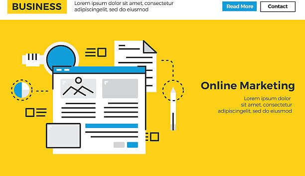
Introduction to Responsive Website Design and its Importance

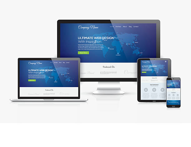
In today’s world, where various devices with different screen sizes are available to users, Responsive Web Design is no longer a luxury option but an undeniable necessity.
#Websites must be #seamlessly and #consistently viewable and usable on any device, from #desktop_computers to #tablets and #mobile_phones.
This approach, which means the automatic adaptation of a website’s layout and elements to the user’s screen dimensions, significantly improves the user experience and ensures that your content is presented in the best possible way.
The importance of this type of design goes beyond aesthetics; in fact, it directly impacts SEO, conversion rates, and ultimately, the overall success of your online business.
A website that is not properly responsive will disappoint users and cause them to quickly leave, which in turn leads to the loss of potential customers and a lower ranking in search engines.
Responsive website design, aiming to provide a seamless and optimal experience, not only meets the current needs of users but also prepares your website for future trends.
In this article, we delve deeply into various aspects of this technology.
Is your current e-commerce website design causing you to lose customers and sales?
Rasaweb is your solution with modern and user-friendly e-commerce website designs!
✅ Significant increase in conversion rates and sales
✅ Strong branding and building customer trust
⚡ Get a free e-commerce website design consultation from Rasaweb!
Principles and Foundations of Responsive Website Design

Responsive website design is built upon three fundamental principles that every developer should have a complete grasp of: Fluid Grids, Flexible Images, and Media Queries.
Instead of using fixed pixel units, Fluid Grids utilize relative units like percentages to define the width of columns and elements, so that the website’s layout changes dynamically with screen size variations.
Flexible Images are coded in such a way that their size adjusts to the width of their parent container, preventing them from overflowing or being cut off.
This is often achieved by setting the max-width: 100% property for images.
However, Media Queries are the beating heart of this type of design.
They allow developers to apply different CSS styles based on characteristics such as screen width, height, device orientation, and even image resolution.
For instance, you can specify that on mobile devices, columns should stack vertically instead of appearing side-by-side.
Proper implementation of these principles requires a deep understanding of CSS and HTML and gives designers full control over how the website is displayed at any size.
These foundations help you provide an optimal user experience on any platform.
Tools and Techniques for Implementing Responsive Website Design

For effective implementation of responsive website design, there are numerous tools and frameworks available that can accelerate and facilitate the development process.
CSS frameworks like Bootstrap and Tailwind CSS are among the most popular options, offering a collection of pre-built components and responsive grid systems.
Bootstrap, with its ready-to-use classes, quickly enables responsive designs, while Tailwind CSS with its Utility-First approach, provides greater flexibility for customization.
In addition to frameworks, the <meta name="viewport"> tag in HTML plays a vital role; this tag informs the browser that the page width should be set to the device width, preventing default zooming that could render the website unusable.
Browser development tools like Inspect Element in Chrome or Firefox allow for simulating various devices and quickly testing responsiveness.
Furthermore, Google Lighthouse and PageSpeed Insights are tools that help you evaluate the performance and optimization of your responsive website.
Intelligent use of these tools, alongside the “Mobile-First” approach (Mobile-First), which means designing for the smallest screens and then scaling up, greatly assists in building powerful responsive websites.
These techniques make the responsive website design process more efficient.
| Feature | Bootstrap | Tailwind CSS | Advantages | Disadvantages |
|---|---|---|---|---|
| Approach | Component-based, rapid prototyping | Utility-First, high flexibility | High development speed, large support community | Large CSS file size, repetitive styles |
| File Size | Typically larger (with customization options) | Smaller (optimized with PurgeCSS) | High customizability, full control over styles | More time needed for learning, verbose HTML coding |
| Learning Curve | Relatively easy for beginners | Requires deeper understanding of CSS | Access to a set of pre-designed components | Need to design components from scratch |
| Use Cases | Projects with tight deadlines, MVPs | Projects requiring high customization, scalability | Reduced coding time, increased productivity | Increased complexity in large projects without proper organization |
User Experience (UX) in Responsive Website Design
User Experience (UX) plays a pivotal role in responsive website design.
The ultimate goal of this type of design is to provide a seamless and enjoyable experience for the user, regardless of the device they are using.
This means that not only the page layout must adapt, but also user interactions, font sizes, buttons, and navigation elements must be optimized to be accessible and comfortable at any size.
The mobile-first approach, mentioned earlier, gains more importance here; by starting the design from the smallest screen, designers are forced to focus on the main content and critical functionality, which in itself helps improve UX across all devices.
Issues related to touch targets on mobile devices, sufficient spacing between clickable elements, and appropriate font sizes for readability are among the important considerations.
Users should not be forced to zoom or scroll horizontally to view content.
Page loading speed is also a critical factor in UX; responsive websites must be optimized to load quickly even on mobile devices with slower internet connections.
This includes optimizing images, minifying CSS and JavaScript code, and using caching.
A poor user experience, even on a visually appealing website, can lead to high bounce rates and user loss.
Therefore, responsive website design should always be user-centric.
Did you know that a poor corporate website loses many opportunities for you daily? Solve this problem forever with professional corporate website design by Rasaweb!
✅ Create a powerful and reliable image for your brand
✅ Attract new customers targetedly and increase sales
⚡ [Get free website design consultation]
SEO and Responsive Website Design

The relationship between SEO and responsive website design is very deep and vital.
Since 2015, Google explicitly stated that responsiveness is an important ranking factor for websites, and since then, with the introduction of “Mobile-First Indexing,” this importance has doubled.
This means that Google primarily considers the mobile version of your website for crawling and indexing, and if your website is not optimized for mobile, it may achieve a lower ranking in search results.
A responsive website helps Google crawl and index your content more effectively because there is only one URL for a piece of content that needs to be crawled and ranked, unlike separate mobile versions (e.g., m.example.com) which create complexities for search engines.
Furthermore, page loading speed, which is a ranking factor itself, is optimized in responsive websites with the correct approach.
Websites that load faster offer a better user experience and have lower bounce rates, which sends positive signals to Google.
From an SEO perspective, a responsive website design means that you have a single website that displays optimally on all devices, which simplifies SEO management and prevents duplicate content issues.
Also, a low bounce rate and high dwell time (which are results of good UX) also indirectly positively affect your SEO.
Therefore, investing in responsive website design is an investment in the future of your website’s SEO.
Challenges and Solutions in Responsive Website Design

Despite numerous advantages, responsive website design is not without its challenges.
One of the biggest concerns is image management.
Large images can significantly reduce page loading speed, especially on mobile devices with limited bandwidth.
The solution to this problem is using techniques like “responsive images” with <picture> tags or the srcset attribute in the <img> tag, which allows the browser to load the appropriate image for the screen size and device resolution.
Another challenge is the overall website performance.
Responsive design should not come at the cost of reduced speed.
Optimizing CSS and JavaScript code, compressing files, caching, and using Content Delivery Networks (CDNs) can help improve performance.
Lazy Loading for images and videos is also an effective method to display content only when the user needs it.
Managing complex content like data tables or maps can also be challenging.
For these cases, techniques such as horizontal scrolling for tables on small screens, or hiding some columns in mobile views can be used.
Furthermore, debugging and testing across various devices can be time-consuming due to the wide variety of hardware and browsers.
Using simulation tools and testing on real devices is essential to ensure the correct functioning of responsive website design.
The Future of Responsive Website Design and New Trends

The future of responsive website design is accompanied by exciting innovations aimed at simplifying and empowering this process.
One of the most significant advancements is CSS Grid Layout, which, alongside Flexbox, offers much more powerful tools for creating complex and responsive layouts.
While Flexbox is excellent for distributing content in one dimension (row or column), Grid allows for arranging elements in two dimensions (rows and columns), making the design of complex web pages much easier.
The concept of Container Queries is also emerging, which allows for responsiveness not based on the entire viewport size, but on the size of an element’s parent container.
This means that a component can reshape itself depending on the space it has available, regardless of where it is on the page or on what device.
This is a major paradigm shift that significantly increases modularity and reusability of components.
Other important trends include Progressive Web Apps (PWAs), which combine the best features of web and native applications to provide a seamless user experience, even offline.
Additionally, Dark Mode and optimization for foldable devices are among the factors that will soon impact responsive website design.
These advancements promise a brighter and more flexible future for responsive website design.
| CSS Feature | Description | Responsive Advantage | Browser Support Status (Approximate) |
|---|---|---|---|
| CSS Grid Layout | Two-dimensional layout system (rows and columns) for elements. | Enables building complex and flexible layouts with precise control over item placement. | Widespread support (IE11 partial, other modern full). |
| Flexbox | One-dimensional layout system (row or column) for distributing space. | Creates flexible layouts and distributes content in one direction, ideal for navigation and cards. | Widespread support (from IE10 onwards). |
| Container Queries | Ability to apply styles based on the parent container’s size, not the entire viewport. | Modularization of components, local responsiveness independent of the entire page. | Currently supported in modern browsers (Chrome, Edge, Firefox, Safari). |
clamp(), min(), max() |
CSS functions for defining dynamic sizes (e.g., minimum, maximum, and ideal). | More precise control over font size, spacing, and element width based on minimum and maximum values. | Widespread support in modern browsers. |
Review of Successful and Unsuccessful Responsive Website Design Examples
Examining real-world examples of responsive website design can teach us valuable lessons.
Successful websites like New York Times or Google are excellent examples of correct responsiveness implementation.
On these websites, the layout intelligently adapts to the screen size, images are optimized, and navigation is easy and intuitive on any device.
Texts are readable, and buttons are easily tappable.
These websites demonstrate how, by focusing on content and user experience, a powerful online presence can be created across all platforms.
They often leverage a Mobile-First approach, ensuring that core content and primary interactions are accessible to mobile users.
In contrast, unsuccessful examples are usually websites that are either not responsive at all, forcing mobile users to zoom and scroll horizontally, or have incomplete responsiveness.
For instance, images might not scale correctly, or elements might be jumbled and overlap.
Buttons might be too small or too close together, leading to accidental clicks.
Sometimes, loading speed on mobile devices drastically decreases due to a lack of image and script optimization.
These issues not only harm the user experience but also negatively impact SEO ranking and conversion rates.
The key lesson from these comparisons is that responsive website design is not merely about rearranging elements; it requires a comprehensive approach to deliver an optimal user experience in any environment.
Research shows that 80% of customers trust companies with professional websites more. Does your current website gain this trust?
With Rasaweb’s corporate website design services, permanently solve the problem of customer distrust and a weak online image!
✅ Create a professional image and increase customer trust
✅ Attract more sales leads and grow your business
⚡ Get a free consultation
Key Tips for Successful Responsive Website Design

To achieve successful responsive website design, adhering to key tips and strategies is essential.
First, embrace the “mobile-first” approach.
This means starting design and development from the smallest screen and then scaling up.
This method ensures that the most important content and functionality are optimized first for mobile users.
Second, properly utilize fluid grids and flexible images.
This is the foundation of responsiveness and allows your content to adapt to the screen size.
Third, intelligently employ Media Queries.
Use them to create appropriate breakpoints that make sense based on your content and design, not just standard device sizes.
Fourth, consider page loading speed as a priority.
Optimize images, use lazy loading, and compress CSS and JavaScript codes.
A fast website not only improves UX but is also crucial for SEO.
Fifth, do not forget Usability.
Ensure that buttons and clickable elements are large enough and have sufficient spacing between them, especially for touch users.
Finally, conduct continuous testing across various devices and browsers.
The world of devices is constantly changing, and only with regular testing can you ensure that your responsive website design functions well everywhere.
This comprehensive approach guarantees success in responsive website design.
Conclusion and Outlook of Responsive Website Design in Today’s World

In conclusion, it can be said that responsive website design is no longer an emerging trend but has become an industry standard.
Given the increasing use of mobile devices for internet access, a website that cannot adapt to this diversity is doomed to fail.
Responsive design not only improves user experience and makes content accessible to everyone but also directly impacts search engine rankings and, consequently, the visibility of your business.
The future outlook for responsive website design is also bright and full of innovation.
With the emergence of technologies like CSS Grid, Container Queries, and advancements in PWAs, developers will have more powerful tools to make web experiences even more flexible and efficient.
Investing in education and updating knowledge in the field of responsive website design is essential for any designer and developer who intends to succeed in today’s digital world.
This type of design is the backbone of a modern and successful website that can meet users’ needs anytime, anywhere, and create a powerful bridge between your business and its audience.
Responsive website design guarantees your strong and effective presence in the digital ecosystem of the future.
Frequently Asked Questions
| Question | Answer |
|---|---|
| What is Responsive Website Design? | It’s a web design approach that ensures a website displays correctly across various screen sizes (like mobile, tablet, desktop) and its layout adapts to the user’s screen size. |
| Why is Responsive Design important? | Given the widespread use of various devices for internet access, responsive design provides a consistent user experience for all users, reduces website bounce rates, and improves website SEO. |
| How is Responsive Design implemented? | This type of design is often implemented using CSS3 Media Queries, Flexible Grids, and Flexible Images. |
| What are the main components of Responsive Design? | Includes Media Queries for applying different styles based on device characteristics, using relative units (like percentage and em) for sizes and layout, and using flexible images and media whose dimensions change proportionally to the available space. |
| What are the main benefits of using Responsive Design? | Improved user experience, reduced development and maintenance costs (compared to having separate versions for mobile and desktop), improved search engine rankings (as Google prefers it), and increased accessibility of the site for all users. |
And other services of Rasaweb Advertising Agency in the field of advertising
Smart Brand Identity: A creative platform for improving website traffic with Google Ads management.
Smart Advertorial: A professional solution for analyzing customer behavior with a focus on smart data analysis.
Smart Marketplace: A professional solution for campaign management with a focus on precise audience targeting.
Smart Direct Marketing: Professional optimization for improving SEO ranking using Google Ads management.
Smart SEO: An effective tool for user engagement with the help of custom programming.
And over a hundred other services in the field of internet advertising, advertising consultation, and organizational solutions
Internet Advertising | Advertising Strategy | Advertorial
? Are you ready for your business to grow and shine in the digital world? Rasaweb Afarin Digital Marketing Agency, with its expertise and experience in Search Engine Optimization (SEO), intelligent social media management, and also personal website design, paves your way to reaching the peaks of success. With innovative and creative solutions, we guarantee a powerful and influential presence for your brand.
📍 Tehran, Mirdamad Street, next to Bank Markazi, Southern Kazeroon Alley, Ramin Alley, No. 6
