Introduction to Responsive Web Design and its Importance

In today’s world, where #digital_devices with various dimensions and resolutions dominate our lives, the importance of #responsive_website_design has become more evident than ever.
It is no longer possible to expect to provide a consistent user experience across all platforms with a fixed version of a website.
Responsive Web Design is the answer to this challenge; an approach that ensures your website is displayed in the best possible way and functions properly, regardless of the user’s device type – whether it’s a smartphone, tablet, laptop, or large desktop monitor.
This approach not only focuses on visual aesthetics and element arrangement but also emphasizes usability, loading speed, and easy access to content.
Imagine a user accessing your website on their mobile phone and having to constantly zoom or horizontally scroll to view content; this unpleasant experience will quickly drive them away from your website.
Therefore, a positive user experience is only possible with the correct implementation of responsiveness principles.
In the past, many businesses designed separate mobile and desktop versions, an approach that was both costly and difficult to manage.
However, with the advent of responsive design, a single code and one website can adapt itself to different screen dimensions, which is considered a revolution in web design.
This adaptability allows your website to convey its message correctly to the audience anytime and anywhere, preventing the loss of communication potential.
Ultimately, ignoring responsive design in the current era means overlooking a large segment of users and, consequently, missing out on business and communication opportunities.
Are you tired of losing customers due to poor e-commerce website design? With Rasawweb, solve this problem forever!
✅ Increase sales and visitor-to-customer conversion rates
✅ Smooth and engaging user experience for your customers⚡ Get a free consultation
Basic Principles of Responsive Web Design

Success in responsive web design is built upon three fundamental principles that every web designer must master.
These principles include #fluid_grids, #flexible_images, and #media_queries.
Fluid Grids means that instead of using fixed pixel units for element widths, relative units like percentage should be used.
This approach ensures that the website layout, instead of remaining static, adapts to the user’s screen dimensions.
For instance, if a column has a width of 20% of the total page width, this width will remain relatively constant on both a large monitor and a small phone, and its size will adjust based on the entire page.
This is particularly crucial in multi-column layouts.
The second principle is Flexible Images.
Images, like other elements, should not have a fixed width that causes them to overflow on small screens or appear too small on large screens.
Using CSS, you can set the maximum width of images to 100% so they never break out of their container, while proportionally scaling down or up with the available space.
This greatly helps maintain the website’s aesthetics and performance across various devices.
And now, the core of #responsiveness is Media Queries.
This CSS3 feature allows designers to apply different styles based on various device characteristics such as screen width, height, orientation (landscape or portrait), and even resolution.
For example, you can specify that if the screen width is less than 768 pixels (e.g., for tablets and mobiles), the navigation menu should transform into a hamburger icon and fonts should become smaller.
This enables #precise_control over the website’s appearance and behavior in different conditions, allowing the designer to provide a customized user experience for each device group.
By combining these three principles, a truly responsive website can be built that performs flawlessly in any environment.
Responsive Design Implementation Techniques
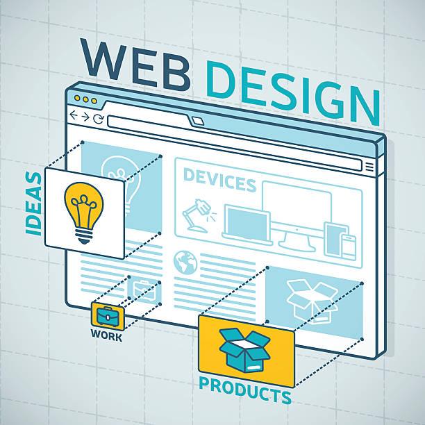
Implementing responsive web design goes beyond understanding basic principles and requires familiarity with advanced CSS techniques and features.
Two of the most powerful are #Flexbox and #CSS_Grid, both offering modern and efficient approaches for web page layouts.
Flexbox, ideal for one-dimensional layouts (row or column), provides unparalleled control over space distribution, element alignment, and display order.
This tool is particularly useful for building components like navigation bars, footers, or groups of cards.
With Flexbox, elements can be easily distributed within a container, spacing between them can be adjusted, and they can even be scaled based on content.
In contrast, CSS Grid is designed for two-dimensional layouts (simultaneous rows and columns) and provides the ability to create complex, grid-based layouts with greater ease.
Using Grid, the entire web page can be divided into a virtual grid, and elements can be placed in specific cells within this grid.
This capability is highly efficient for overall page layouts (such as header, sidebar, main content, and footer) as well as for magazine-style layouts or dashboards.
#Breakpoints are also an integral part of #responsive_design.
These points are specific screen widths at which the website’s layout changes to adapt to the new screen size.
The correct selection of these points is crucial and is usually determined based on content and design requirements, not merely on standard device dimensions.
The #Mobile-First approach is also a key strategy in this area.
Instead of designing for desktop first and then adapting it for mobile, this approach designs the website for the smallest screen (mobile) first, and then optimizes it for larger screens by adding styles using Media Queries.
This method ensures that the website is lightweight and fast by default, with only the necessary styles added for larger screens.
| Feature | Flexbox | CSS Grid |
|---|---|---|
| Main Purpose | One-dimensional layout (row or column) | Two-dimensional layout (simultaneous row and column) |
| Control over | Focus on space distribution and item alignment | Defining areas, rows, and columns |
| Common Use Cases | Navigation bars, cards, footers | Overall page layout (main layer), dashboards |
| Learning Complexity | Medium | Medium to High (due to more capabilities) |
User Experience and Responsive Design

One of the most important goals of #responsive_web_design is to provide an optimal #user_experience (UX) on any device.
Regardless of screen dimensions, the user should be able to easily interact with your website, find their desired content, and perform necessary actions.
This directly relates to a website’s success in achieving its goals.
A #mobile_friendly website means that all elements – from fonts and images to buttons and forms – must be designed to be readable, tappable, and usable even on small screens.
For example, buttons should be large enough to be tapped with a finger, and spacing between elements should prevent accidental taps.
Also, #simple_navigation and menu access on mobile devices are of particular importance; patterns like hamburger menus or bottom menus are often used for this purpose.
This focus on UX is crucial, especially given the significant increase in mobile users.
Today, a significant portion of web traffic comes from mobile devices, and if your website doesn’t provide a good experience on these platforms, you will practically lose a large segment of your audience.
#Responsive_design not only helps improve UX but also indirectly affects #SEO.
Search engines like Google rank mobile-friendly websites higher in their search results.
This means that a well-executed responsive web design can lead to greater visibility and higher organic traffic for your website.
In fact, user experience and SEO are closely intertwined in this regard; the more pleasant and usable your website is for users, the higher the likelihood of their return and the lower the bounce rate, all of which are positive signals for search engines.
Therefore, investing in responsive design is essential not only for user satisfaction but also for business survival and growth in the online space.
Are you losing business opportunities due to an outdated website? With Rasawweb, permanently solve the problem of not attracting potential customers through your website!
✅ Attract more high-quality leads
✅ Increase brand credibility in the eyes of customers
⚡ Get a free corporate website design consultation
Advantages and Challenges of Responsive Web Design

Responsive web design, despite its countless advantages, like any other approach, comes with challenges that every designer and business owner should be aware of.
Among its most important advantages is #code_integration; having a single codebase eliminates the need to maintain and update multiple versions of the website, which itself significantly saves time and cost.
Additionally, device-compatible design directly has a positive impact on #website_SEO.
Google and other search engines prefer responsive websites and rank them higher in search results because these websites provide a better user experience.
This leads to increased visibility and more traffic.
Improved user experience is another key advantage; users, regardless of their device, encounter a website that fully adapts to their screen, which increases satisfaction and reduces bounce rate.
Increased conversion rate is also a positive outcome of this approach, due to a better user experience and easier access to Call-to-Actions.
But alongside these advantages, there are also challenges.
One of the biggest is the #complexity_of_design and development.
Responsive web design requires a deeper knowledge of CSS and JavaScript, and the initial design process might be more time-consuming, especially for designers not sufficiently familiar with these principles.
Also, #content_management across different devices can be challenging.
An image or a text block that displays well on desktop might take up too much space or lose readability on mobile.
Therefore, precise planning for how content is displayed at each breakpoint is necessary.
The issue of #website_performance is also a significant challenge.
If not properly optimized, a responsive website might also load high-volume images for mobile devices, which can lead to slow loading and high data consumption.
However, this challenge can be managed with techniques like image optimization and Lazy Loading.
Despite these challenges, the long-term benefits of responsive web design far outweigh its drawbacks, making it a necessity in today’s world.
Popular Tools and Frameworks for Responsive Design
To facilitate the #responsive_web_design process and increase development speed, numerous tools and frameworks have been created by the web development community.
These tools, by providing pre-written CSS and JavaScript code, enable designers to easily implement responsive layouts and interactive components without needing to write every line of code from scratch.
Among these frameworks, #Bootstrap and #Tailwind_CSS are two of the most popular and widely used, each having a different approach to #responsive_web_development.
Bootstrap, developed by Twitter, is a comprehensive and pre-built framework that includes a wide range of CSS styles for buttons, forms, navigation bars, tables, and a powerful grid system for responsive layouts.
Using Bootstrap is very simple; you just need to add the relevant CSS classes to your HTML elements for your website to quickly acquire a professional and responsive appearance.
This framework is ideal for rapid project development and when you need standard and common designs.
But on the other hand, it might lead to Code Bloat, because even if you don’t use all its functionalities, the entire library is loaded.
In contrast, Tailwind CSS is a “utility-first” framework that takes a different approach.
Instead of providing complete components, Tailwind offers a vast collection of small, single-purpose CSS classes that allow you to apply styles directly in your HTML.
This approach gives the designer a very high level of control over the final appearance, and the final CSS output will be much more optimized and smaller, as only the classes you need are used.
Tailwind is more suitable for projects that require highly customized and unrestricted designs.
The choice between these two frameworks or other tools like Bulma, Foundation, or UIkit depends on project needs, the development team’s preference, and the required level of customization.
Each of these frameworks can make the responsive web design process more efficient and help produce high-quality websites.
Performance Optimization in Responsive Web Design

Alongside aesthetics and compatibility, #website_performance is one of the main pillars of responsive web design.
A responsive website that loads slowly can severely disrupt the user experience and lead to loss of visitors.
Performance optimization is doubly important for device-compatible websites because mobile users often rely on slower internet speeds or limited data.
One of the most important aspects of optimization is #image_management.
High-volume images can be a primary cause of slow loading.
To solve this problem, various techniques exist, including image compression (Compression) with tools like TinyPNG or Compressor.io, using next-generation image formats like WebP which have smaller sizes and offer good quality, and also Lazy Loading.
Lazy loading means that images and other heavy resources are loaded only when the user needs them and they come into view, not immediately upon entering the page.
This significantly reduces the initial page loading time.
In addition to images, optimizing #CSS and #JavaScript codes is also vital.
Minification and Concatenation of CSS and JS files can help reduce the number of server requests and file sizes.
Additionally, removing unused code and optimizing CSS structure to prevent Render-Blocking can increase the initial content display speed.
Using a #CDN (Content Delivery Network) is also an effective solution for improving loading speed.
A CDN stores your website’s static files on various servers worldwide, and when a user accesses your website, the files are delivered from the closest server to them, which reduces latency and increases loading speed.
Ultimately, responsive web design will only be successful if it is both visually attractive and functional, and also fast and optimized in performance.
By correctly implementing these techniques, a flawless and fast experience can be provided for all users on any device, thereby ensuring user retention and increased interaction with the website.
| Optimization Technique | Description | Impact on Performance |
|---|---|---|
| Image Compression | Reducing image file size without significant loss of quality. | Reduced image and overall page loading time. |
| Lazy Loading | Loading content (images/videos) only when they become visible to the user. | Increased initial page loading speed. |
| CSS/JS Minification and Concatenation | Removing whitespace, comments, and merging files to reduce size and number of requests. | Reduced server response time and faster loading of styles and scripts. |
| Using CDN | Distributing static files on global servers and serving them from the nearest location. | Reduced latency and increased content delivery speed to global users. |
The Future of Web Design and the Role of Responsiveness

With rapid advancements in technology, the #future_of_web_design is constantly evolving, and responsive web design plays a pivotal role in this evolution.
Beyond merely adapting to different screen sizes, new trends and technologies are emerging that make the web experience even more dynamic and immersive.
One of the most important of these trends is #Progressive_Web_Apps (PWAs).
PWAs offer a combination of the best features of websites and native mobile applications.
They are accessible via the browser but can have functionalities such as offline work, sending notifications, and installation on the device’s home screen, all of which contribute to improving the user experience across various devices.
Adaptive design is an essential foundation for PWA development, as they also need to function correctly on any screen size.
Furthermore, #component-based_design and the use of JavaScript frameworks like React, Angular, and Vue.js are shaping how websites are built.
These frameworks enable the creation of reusable and modular components, which makes the development of #complex and responsive websites simpler and more efficient.
#Virtual_Reality (VR) and #Augmented_Reality (AR) are also entering the web domain, creating new potentials for user interaction with content.
While still in their early stages, future websites might need to offer VR/AR content responsively to be accessible across various devices (from dedicated headsets to mobile phones).
#3D_web and #immersive_experiences are also on the rise, posing new challenges for responsive web design, as these rich contents also need to be optimally displayed on all devices.
All these advancements indicate that the importance of #responsive_design will not only not decrease but will increasingly become a fundamental basis for future web innovations.
The future of the web is, without a doubt, a responsive and adaptive future.
Does your company’s website perform as it deserves for your brand? In today’s competitive world, your website is your most important online tool. Rasawweb, a specialist in professional corporate website design, helps you to:
✅ Gain customer credibility and trust
✅ Convert website visitors into customers
⚡ Get a free corporate website design consultation
Common Mistakes in Responsive Design and Solutions
Although responsive web design is a powerful solution for today’s web challenges, designers and developers might make mistakes that can harm the user experience and website performance.
Awareness of these #common_mistakes and knowing their solutions is essential for creating a truly efficient website.
One of the biggest mistakes is the #incorrect_use_of_Media_Queries.
Some rely only on a few standard breakpoints, while breakpoints should be determined based on content and website layout needs, not merely on common device dimensions.
The solution is to continuously test the website by resizing the browser and define a new breakpoint wherever the layout breaks or content becomes unreadable.
Another mistake is #ignoring_content on small devices.
Some designers place a lot of complex content on desktop and expect it to look good automatically on mobile.
But in many cases, this leads to lengthy scrolling, tiny or confusing elements.
The solution is to prioritize and optimize content for small devices from the very beginning using a mobile-first approach, and avoid unnecessary deletion or hiding of important information.
#Not_optimizing_images is also a common mistake that leads to slow loading.
Loading high-resolution images for mobile devices that don’t need them is a waste of bandwidth and time.
The solution is to use `srcset` and `sizes` attributes in HTML, or CDN tools and image optimization services, to deliver images of appropriate sizes for each device.
#Overuse_of_frameworks without understanding their principles can also lead to bloated code and slowdowns.
While frameworks like Bootstrap make work easier, relying solely on them without a deep understanding of CSS and #responsive_design can lead to generic and heavy layouts.
The solution is to thoroughly learn the principles and use frameworks as tools to speed up work, not as a substitute for your own knowledge.
Finally, #insufficient_testing_on_real_devices is also a big mistake.
Simulators cannot fully replicate the actual user experience.
The website should be tested on various devices and browsers to ensure the correct functioning of responsive web design.
Conclusion and the Importance of Responsive Web Design in Today’s Business

In today’s digital world, where we witness new changes and innovations daily, #responsive_web_design is no longer a luxury option but an absolute necessity for any business that wants to have an effective and successful online presence.
From the #increase_in_mobile_users to the requirements of #modern_SEO, all evidence indicates that a website that is not fully responsive will face serious problems in the short or long term.
The importance of this approach in improving #user_experience is unparalleled; users who can easily interact with your website on any device are more likely to become loyal customers.
A positive user experience not only leads to increased customer satisfaction but also reduces bounce rate and improves conversion rate, all of which directly impact #business_profitability.
Also, from the perspective of #search_engines, mobile-friendly design is a crucial ranking factor.
Websites optimized for mobile gain a better position in search results, which means more organic traffic and ultimately, more business opportunities.
Investing in responsive web design means investing in the future of your business.
This approach not only reduces maintenance costs in the long term (by having a single codebase) but also allows you to plan with greater confidence regarding your website’s compatibility with future technologies and new devices.
Ultimately, responsive web design is not just about aesthetics and layout, but about creating a strong and stable communication bridge between your business and your audience, without any limitations regarding device or platform.
This is a commitment to quality, accessibility, and user experience in the digital age that every smart business should prioritize.
Frequently Asked Questions
| Question | Answer |
|---|---|
| What is responsive web design? | Responsive Web Design is an approach that causes a website’s design and layout to change based on the user’s device screen size (computer, tablet, mobile, etc.) and be displayed optimally. |
| Why is responsive design important? | Its importance is due to the increased use of various devices to access the internet. Responsive design improves user experience (UX), reduces bounce rate, and is beneficial for SEO. |
| What techniques are used in responsive design? | The main techniques include using Fluid Grids, Flexible Images, and Media Queries in CSS. |
| What do Fluid Grids mean? | Instead of using fixed pixel units, relative units like percentages or ems are used to define the width and height of elements, making the layout flexible with screen size changes. |
| What is the use of Media Queries? | Media Queries allow you to apply different CSS styles based on user device characteristics such as screen width, height, orientation (horizontal or vertical), and resolution. |
And other services of Rasawweb Advertising Agency in the field of advertising
Smart Link Building: A fast and efficient solution for customer acquisition with a focus on marketing automation.
Smart Brand Identity: Designed for businesses looking to improve SEO rankings through precise audience targeting.
Smart Social Media: A new service to increase user engagement through SEO-driven content strategy.
Smart Brand Identity: An exclusive service for growing click-through rates based on attractive UI design.
Smart Sales Automation: Professional optimization to increase sales using an SEO-driven content strategy.
And over hundreds of other services in internet advertising, advertising consultation, and organizational solutions
Internet Advertising | Advertising Strategy | Advertorial
Resources
- What is Responsive Design and Why is it Important for Every Website?
- What is Responsive Design (Responsive Design) for a Website?
- What is Responsive Design?
- Why is Responsive Website Design Important?
? To soar in the digital world and reach more customers, Rasawweb Afarin Digital Marketing Agency is by your side, offering creative and results-oriented solutions. From custom website design and SEO optimization to professional social media management, we give your business a powerful identity that will stick in the minds of your audience. Contact us and transform the future of your business.
📍 Tehran, Mirdamad Street, next to Bank Markazi, Kazeroon Janubi Alley, Ramin Alley, No. 6


