
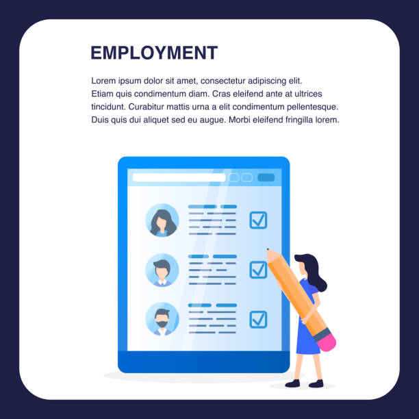
An Introduction to Responsive Web Design and its Importance in Today’s World
In the current digital age, where users connect to the internet through various devices such as #mobile, #tablet, laptops, and even smart TVs, the importance of #responsive_web_design has become more apparent than ever.
#Responsive_design or #responsive refers to a method where websites can adapt their appearance and functionality to the screen size of the user’s device.
This means that a single website, without the need for separate versions for each device, provides an optimal experience for every visitor.
The main goal of responsive web design is to improve #user_experience (UX) and ensure #easy_access to content, regardless of the platform used.
In the past, many businesses created separate versions for mobile and desktop, which was not only time-consuming and costly but also led to maintenance issues and content conflicts.
With the advent of this method, these challenges have largely been overcome.
Also, SEO (Search Engine Optimization) has been heavily influenced by this; search engines like Google prefer responsive websites in their search results.
This educational article will help you become familiar with the different aspects of responsive web design and understand its importance.
From technical principles to business benefits and implementation challenges, all aspects will be covered to provide a comprehensive picture of this important technology.
Understanding how a website can adapt to different screen dimensions is key to success in digital marketing and attracting a wider audience.
This technique is not just an option, but a necessity for any business looking for an effective and sustainable online presence.
Tired of your company’s website not being seen as it should be, losing potential customers? Solve this problem forever with professional and effective website design by Rasawweb!
✅ Increase brand credibility and attract customer trust
✅ Attract targeted sales leads
⚡ Contact us now for a free consultation!
Analytical Trends and the Necessity of Responsive Design in the Current Web Landscape

Why is responsive web design more vital today than ever before? The answer lies in the changing way users consume content.
Global statistics show that a significant portion of web traffic, especially in developing countries, comes from mobile devices.
This upward trend is not just a temporary shift but a fundamental paradigm change in how we interact with the internet.
Websites that provide a poor user experience on mobile not only lose visitors but also damage their brand credibility.
A non-responsive website may not display correctly on small devices, have difficult navigation, or have its elements run off the page.
These issues directly affect the Bounce Rate and quickly drive users away from the site.
From an analytical perspective, businesses must carefully examine their web traffic data to understand the share of mobile devices and confirm the necessity of investing in responsive web design.
Search engines, especially Google, have shifted their algorithms towards “mobile-first indexing,” meaning that the mobile version of a website is considered the primary version for ranking.
This change has very significant implications and results for online visibility.
A responsive website simultaneously addresses these SEO and user experience needs, acting as an integrated solution.
This means there is no longer a need to maintain two separate sites with different codes, which saves time, money, and effort.
Furthermore, page loading speed is also of high importance on mobile devices, and responsive web design is often accompanied by speed optimization techniques to ensure content is quickly accessible to users.
In summary, the current web landscape would be incomplete and inefficient without this design paradigm.
Key Principles and Elements in Implementing Responsive Web Design

Implementing an effective responsive web design is built upon three fundamental principles: Fluid Grids, Flexible Images, and Media Queries.
These three elements work together to ensure that website content adapts seamlessly to different screen sizes.
Fluid grids use relative units like percentages for element widths instead of fixed pixels.
This approach allows elements to adjust their size relative to the overall screen size without needing to rewrite code for each device.
Flexible images also follow the same logic; by using properties like max-width: 100% in CSS, images can resize relative to their container and prevent overflowing the page.
This ensures that images display well at any size without distortion or loss of quality.
However, the beating heart of responsive web design is media queries.
Media queries are CSS rules that allow you to apply specific styles only under certain conditions, such as when the screen width is less than or greater than a specified value.
This allows developers to optimize the website’s appearance for different breakpoints and apply visual changes such as font size, column layout, or hiding specific elements at different screen sizes.
For example, a website might have three columns on a desktop but convert to a single column on mobile.
Correct use of these three principles is key to creating a fully responsive and user-friendly website.
Below is a table of implementation principles and techniques:
| Key Principle | Explanation | Technology/Concept |
|---|---|---|
| Fluid Grids | Using relative units (e.g., percentages) for element widths instead of fixed pixels. | CSS (percent-based widths) |
| Flexible Images | Automatically resizing images based on available space without overflowing the container. | CSS (max-width: 100%) |
| Media Queries | Applying different CSS styles based on device characteristics (e.g., screen width). | CSS3 @media rules |
| Mobile-First | Designing and developing for smaller devices first, then expanding to larger devices. | Design Strategy |
Business Benefits and Improved User Experience with Adaptive Design

Investing in responsive web design brings significant benefits to businesses and users, going beyond just the “beauty” of a website.
One of the most important advantages is an increase in conversion rate.
When users experience a smooth and problem-free experience across different devices, they are more likely to take the desired action (such as purchasing a product, filling out a form, or signing up).
A website that doesn’t display correctly not only frustrates users but also causes them to quickly leave the website and go to your competitors.
Furthermore, responsive web design directly impacts Search Engine Optimization (SEO).
Google has explicitly stated that it prefers mobile-friendly websites in its mobile search results.
This means a responsive website will rank higher in mobile searches, leading to an increase in organic traffic.
Also, maintaining a single website for all devices significantly reduces development and maintenance costs.
Instead of managing multiple codebases and updating content across multiple platforms, you can manage everything from a single location.
This operational efficiency allows businesses to focus their resources on improving their core content and services.
From the user’s perspective, a unified and consistent user experience across different devices conveys a sense of trust and professionalism.
Users can easily navigate your site without needing to zoom, horizontal scroll, or struggle to find information.
This ease and accessibility increase customer loyalty and help create a positive brand image.
Ultimately, with the growing proliferation of smart devices, responsive web design is no longer a luxury option but a necessity for sustainable success in the online space.
Does your current site reflect your brand’s credibility as it should? Or does it scare away potential customers?
Rasawweb, with years of experience in professional corporate website design, is your comprehensive solution.
✅ A modern, beautiful site aligned with your brand identity
✅ Significant increase in lead generation and new customers
⚡ Contact Rasawweb now for a free corporate website design consultation!
Challenging Content: Common Obstacles and Difficulties in Responsive Web Design

Despite the countless advantages of responsive web design, its implementation is not without challenges.
One of the most important questions is: “Is the user experience truly consistent across all devices?” While the goal is to provide a seamless experience, hardware and software limitations of various devices can create challenges.
For example, internet speed on mobile might be slower, or touch capabilities might require a different design for buttons and forms.
The first challenge is Performance Management.
A responsive website that isn’t properly optimized can perform slowly on mobile devices, especially if it includes high-resolution images or heavy JavaScript files.
This issue becomes a major deterrent, particularly in areas with slow internet.
Content Prioritization is also a significant challenge.
How do we decide which elements should be hidden on smaller screens or which content should load first? This decision must be made carefully to ensure key information is not lost and the user experience is not compromised.
Sometimes, the need to create very different versions of an element for different devices increases code complexity.
Testing and Debugging are another set of challenges.
With the countless variety of devices, browsers, and operating systems, ensuring the website functions correctly across all of them is a difficult and time-consuming task.
The need for real devices or advanced simulators to ensure quality requires significant investment.
The last point is stakeholder expectation management.
Marketing or management teams might have unrealistic expectations of experience uniformity across all devices, while developers need to explain technical limitations.
However, with careful planning, adopting a mobile-first approach, and utilizing optimization techniques, these challenges can be overcome to implement a successful responsive web design.
Essential Tools and Frameworks for Responsive Web Design

To facilitate the responsive web design process, numerous tools and frameworks have been developed to help developers build adaptive websites more efficiently.
These tools, from CSS libraries to JavaScript frameworks, help accelerate the development process and maintain compatibility.
One of the most popular and well-known frameworks is Bootstrap.
Bootstrap is a free and open-source front-end framework that includes HTML and CSS-based design templates for typography, forms, buttons, tables, navigation, and other UI components.
Its most important feature is its responsive Grid System, which allows developers to easily create complex layouts for various screen sizes.
Tailwind CSS is another framework that has gained significant popularity with its “Utility-First” approach.
Instead of providing ready-made components, Tailwind offers a set of utility classes that can be directly used in HTML to style elements.
This approach gives designers more control over details and reduces the final CSS size.
For more precise layout control and greater flexibility in responsive web design, CSS Grid and Flexbox are also powerful tools natively implemented in CSS.
Flexbox is ideal for arranging elements in one dimension (a row or a column), while CSS Grid is highly suitable for two-dimensional layouts (rows and columns) and creating more complex structures.
These two techniques allow developers to create high-performance responsive layouts without the need for large frameworks.
Additionally, Browser Developer Tools are also essential for testing and debugging responsive websites.
The responsive mode in browsers like Chrome and Firefox allows developers to simulate the website on various sizes and devices and check its performance.
The choice of the right tool depends on project needs and developer preferences, but each of these tools plays an important role in facilitating the process of designing and implementing a successful responsive web design.
Performance Optimization in Responsive Websites: A Comprehensive Guide

One of the biggest concerns with responsive web design is its impact on website performance.
Responsive websites can load slower on smaller devices unless properly optimized.
Performance optimization not only improves user experience but is also crucial for SEO.
The first step is image optimization.
Images are often the biggest factor in website slowdowns.
Using appropriate image formats (like WebP), compressing images without losing quality, and providing images with different dimensions via the srcset attribute in HTML, can significantly reduce loading times.
The “Lazy Loading” technique is also very effective for images and videos; this technique ensures that images only load when the user scrolls to the relevant section of the page, not from the very beginning.
File Compression (Minification and Gzip Compression) for CSS, JavaScript, and HTML is also highly important.
Removing extra characters, whitespace, and comments, reduces file size and increases loading speed.
Using a Content Delivery Network CDN can also help distribute content from the nearest server to the user and minimize latency.
Browser Caching is also a key solution that allows the browser to store website resources for subsequent visits and prevents their re-loading.
Finally, optimizing CSS and JavaScript code by removing unused code and adopting a Mobile-First approach in design, can have a significant impact on overall performance.
This approach ensures that your site is first optimized for small and limited devices, and then additional features are added for larger screens.
These guidelines will help you ensure that your responsive web design is not only beautiful but also fast and efficient.
| Optimization Technique | Explanation | Tool/Method |
|---|---|---|
| Image Optimization | Compression, choosing appropriate format (WebP), providing different sizes (srcset). | Image optimizers, HTML srcset |
| Lazy Loading | Loading content (images, videos) only when the user needs it. | Native browser support, JavaScript libraries |
| Code Compression (Minification & Gzip) | Reducing the size of CSS, JS, HTML files by removing extra spaces. | Build tools (Webpack, Gulp), Server configuration |
| Using CDN | Distributing content from servers closer to the user to reduce latency. | Cloudflare, Akamai |
| Browser Caching | Storing website resources in the user’s browser for faster loading on subsequent visits. | HTTP Headers (Cache-Control) |
The Future of Responsive Web Design and Upcoming Innovations

The future of responsive web design is not limited to adapting to existing devices; rather, it involves anticipating and responding to new trends and emerging technologies.
One of the most important innovations is Artificial Intelligence (AI) and Machine Learning (ML) in website design and optimization.
It is expected that design tools using AI will be able to suggest optimal layouts, elements, and even content based on user behavior and the device used.
This can make the design process more automated and personalized.
The emergence of Progressive Web Apps (PWAs) is also a significant step in the evolution of responsive web design.
PWAs are websites that can offer a user experience similar to native applications, including the ability to install on the home screen, offline access, and send notifications.
This technology blurs the line between web and native applications and makes responsive web design even more essential to provide a seamless experience across both platforms.
Furthermore, with the growing prevalence of wearable devices, Virtual Reality (VR), and Augmented Reality (AR), responsive web design must think beyond traditional screen dimensions.
How will content be displayed in a VR environment, or how will a website interact with a smartwatch? These are questions that web designers will face in the near future.
New CSS technologies like Container Queries are also under development, allowing elements to react to the size of their parent container rather than the entire screen.
This provides more flexibility and control in designing complex websites.
Finally, the focus on Accessibility and Sustainability will also be of particular importance in the future of responsive web design.
Designing websites that are usable for all users, including people with disabilities, and also operate efficiently in terms of energy consumption, will become a standard.
Do you have an e-commerce site, but your sales are not as expected? Rasawweb solves your problem forever with professional e-commerce website design!
✅ Significant increase in conversion rates and sales
✅ Outstanding user experience for your customers
⚡ Click now to get a free consultation with Rasawweb!
Case Studies and Successful Examples of Responsive Web Design

To better understand the potential of responsive web design, looking at successful examples and case studies of large businesses that have implemented this technology well can be very inspiring.
These examples show how an adaptive website can lead to improved user experience, increased engagement, and ultimately, commercial success.
One of the classic examples is The Guardian website.
This news site was a pioneer in implementing responsive design and demonstrated how a massive amount of content can be optimally presented across various devices.
They focused on content prioritization and intelligent use of media queries, providing a readable and user-friendly experience for their readers on any platform.
This helped them maintain their position as a credible news source in the mobile age.
Another example is the Microsoft website.
Their responsive web design, using a flexible grid system and adaptive images, ensures that their products and services are displayed beautifully and efficiently on any device.
This approach is crucial for a technology company dealing with users on diverse devices, demonstrating their commitment to accessibility and user experience.
Even Apple, renowned for its design precision, utilizes a responsive web design approach.
Their product pages are meticulously optimized for display on various screen sizes, from large desktop monitors to small iPhones.
This shows that even for brands with highly controlled designs, flexibility and adaptability are a priority.
These case studies demonstrate that responsive web design is not just a trend but a successful strategy for both large and small brands to remain competitive in today’s digital landscape and meet the needs of their users.
Specialized Methods and Practical Steps in Implementing Responsive Design

Successful implementation of responsive web design requires a systematic approach and specific practical steps.
The first and most important step is adopting a Mobile-First approach.
This means you start designing and developing the website for the smallest screens (like mobile) first, and then gradually add features and complexities for larger screens.
This approach ensures that your website is optimized for limited environments from the outset, offering fast loading and a suitable user experience on mobile.
The next step is Grid Design.
You should choose a flexible grid system (e.g., 12-column) and use relative units (percentages or EM/REM) instead of fixed pixels to define column widths and margins.
This automatically makes your layout adapt to the screen size.
Managing images and media is also crucial.
Use techniques like max-width: 100% for images and, if necessary, use the srcset attribute in the <img> tag to provide different image sizes based on screen size.
For videos, ensure they are properly scalable using CSS.
Using Media Queries to define Breakpoints is highly important.
These points are specific screen widths at which the website’s layout changes.
For example, you can convert the navigation menu to a hamburger button at widths less than 768 pixels.
Continuous testing and validation throughout the development process is very important.
Use browser developer tools, simulators, and even real devices to check website performance across different sizes and orientations.
These steps and techniques provide a strong foundation for implementing a successful and efficient responsive web design that meets the needs of current and future users.
Frequently Asked Questions
| Question | Answer |
|---|---|
| What is Responsive Web Design? | A method for designing and implementing websites that automatically adjusts the layout and content of the page to display optimally based on the user’s device screen size (desktop, tablet, mobile, etc.). |
| Why is Responsive Design important? | With the increasing use of various devices to access the web, responsive site design improves user experience, reduces bounce rate, strengthens site SEO, and makes site management and maintenance easier (instead of having separate versions for mobile and desktop). |
| How does Responsive Design work? | This type of design uses techniques such as flexible grids and layouts (Flexbox, CSS Grid), flexible images and media, and most importantly, CSS Media Queries to change the page styles and layout based on screen characteristics (width, height, resolution, etc.). |
| What are the main tools for implementing Responsive Design? | The main tools include HTML5 (for content structure), CSS3 (especially Media Queries, Flexbox, Grid for responsive styling and layout), and sometimes JavaScript for more complex interactions. |
| What are the main benefits of using Responsive Design? | The main benefits include increased user accessibility (covering a wide range of devices), improved user experience, improved site ranking in search engines (especially Google), reduced development and maintenance costs, and increased conversion rate of visitors to customers. |
And other services of Rasawweb Advertising Agency in the field of advertising
Smart Advertising Campaign: A new service to increase customer behavior analysis through precise audience targeting.
Smart Sales Automation: A fast and efficient solution to increase click-through rates by focusing on Google Ads management.
Smart Sales Automation: Professional optimization for online growth using user experience customization.
Smart Social Media: An effective tool to increase sales by using real data.
Smart Data Analysis: Professional optimization for digital branding using SEO-driven content strategy.
And over hundreds of other services in the field of internet advertising, advertising consultation, and organizational solutions
Internet Advertising | Advertising Strategy | Advertorials
Resources
- Digital Transformation and its Importance in Organizations
- What is Digital Transformation?
- Responsive Web Design
- Advantages of Responsive Web Design
? For a significant leap in your business in the digital space, Rasawweb Digital Marketing Agency, with a modern and specialized approach, is ready to offer services such as professional website design and comprehensive online marketing strategies.
📍 Tehran, Mirdamad Street, next to Central Bank, Southern Kazeroun Alley, Ramin Alley, No. 6

