
What is Responsive Web Design and Why is it Important?
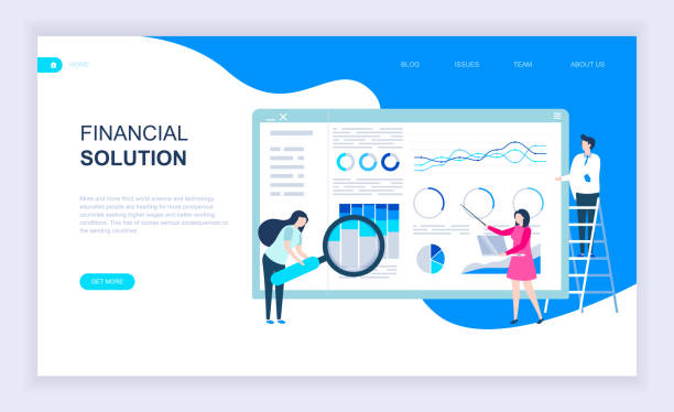
In today’s world, where users access the internet from various devices such as smartphones, tablets, laptops, and even smart TVs, responsive web design has become a necessity.
#Responsive or #Responsive Web Design refers to a web design approach where the website automatically adjusts its appearance and layout to suit the size and resolution of the user’s device screen.
This means that the user experience, regardless of the type of device the user is employing, will always be ideal and smooth.
The importance of this type of design is not limited to increasing user satisfaction; it also has a direct impact on SEO and website ranking in search engines.
For years, Google has preferred responsive websites in its search results, as these websites provide a better experience for mobile users.
In fact, neglecting responsive design in the current era means losing a large portion of the audience and business opportunities.
This approach is vital, especially for businesses looking to expand their digital presence and attract the maximum audience, and is considered an essential investment.
Are you concerned about your e-commerce site’s low conversion rate and not achieving your desired sales?
Rasaweb is your specialized solution for a successful e-commerce website.
✅ Significant increase in conversion rate and sales
✅ Professional and user-friendly design to attract customer satisfaction
⚡ Ready for a transformation in online sales? Get a free consultation!
Fundamental Principles of Responsive Design
Implementing responsive design is based on three key principles: Fluid Grids, Flexible Images, and Media Queries.
Fluid grids, instead of using fixed pixel units, use relative units like percentages to automatically adjust the website’s layout to screen dimensions.
This method ensures that content is displayed correctly at any screen size, without the need for horizontal scrolling.
Flexible images, using CSS and setting the `max-width: 100%` property, ensure that images never exceed the available space in their container, thus preventing layout breakage.
However, the main and driving element of responsive design is media queries.
These CSS rules allow designers to define different styles for various screen dimensions.
For example, it can be specified that on mobile devices, the navigation menu appears as a hamburger icon, while on desktops it is fully open.
These three principles together provide the necessary stability and flexibility for responsive website design, allowing the website to offer a unified and optimized experience on any platform.
This specialized approach not only preserves visual aesthetics but also significantly improves website performance and accessibility.
Popular Tools and Frameworks for Adaptive Website Design
To facilitate the process of adaptive website design, numerous tools and frameworks have been developed that greatly simplify the work of designers and developers.
Bootstrap is undoubtedly one of the most popular and powerful of these frameworks, offering a comprehensive set of ready-to-use UI components, a flexible grid system, and JavaScript plugins.
This framework helps developers build responsive websites with high speed and efficiency.
Tailwind CSS takes a different approach, providing a set of utility classes instead of pre-built components, which allows developers to quickly create custom styles inline.
Foundation is another powerful framework that focuses on high performance and flexibility and is suitable for larger and more complex projects.
Choosing the right framework depends on the project’s needs and complexity.
Some of these tools even offer Drag & Drop visual design capabilities, which makes the design process accessible even for non-specialists.
Below is a comparative table of some of these tools to help you better understand their differences and applications.
| Framework Name | Key Features | Primary Use Case | Popularity |
|---|---|---|---|
| Bootstrap | Ready-made components, powerful grid system, JavaScript | Rapid development of websites and web applications | Very high, most common framework |
| Tailwind CSS | Utility classes, high flexibility, deep customization | Projects with custom and unique designs | Growing, popular among frontend developers |
| Foundation | Extensive set of tools, high performance | Large-scale and enterprise projects, complex designs | Medium to high, powerful option |
Benefits of Responsive Design for User Experience and SEO

Responsive design is not just a trend but a critical factor for online success that simultaneously improves User Experience (UX) and Search Engine Optimization (SEO).
From a user experience perspective, a responsive website ensures that users, regardless of the device they use, encounter a consistent and readable interface.
This means a reduction in Bounce Rate, an increase in time spent on the site, and ultimately a higher probability of converting visitors into customers.
The absence of a need for zooming or horizontal scrolling on mobile devices provides a pleasant and hassle-free experience for users.
On the other hand, the SEO benefits of responsive website design are numerous.
Google has explicitly stated its preference for responsive websites, and these websites enjoy a higher ranking in search results, especially with the introduction of Mobile-First Indexing.
A responsive website has only one URL for all devices, which simplifies link management, crawling, and indexing by search engines.
This prevents duplicate content issues that occur with separate mobile sites (e.g., m.example.com).
Furthermore, page loading speed improves on optimized responsive websites, which is itself an important factor in SEO ranking and user satisfaction.
This analysis shows that responsive website design is not just an investment in improving website aesthetics, but a smart strategy for achieving business goals and enhancing one’s position in the competitive digital space.
Did you know that 94% of a first impression about a company is related to its website design?
Rasaweb, by providing professional corporate website design services, helps you create the best first impression.
✅ Create a professional and trustworthy image for your brand
✅ Easier attraction of potential customers and improvement of online positioning
⚡ Get a free consultation for corporate website design
Common Challenges in Implementing Responsive Design and Their Solutions
Despite the countless benefits of responsive design, its implementation is not without challenges.
One of the biggest issues is managing complex content and large images.
How can one ensure that all images are displayed optimally across all dimensions without sacrificing website loading speed? Solutions such as using Responsive Images with `
Another challenge relates to development time and initial costs.
Designing for a wide range of devices can increase the complexity and time consumption of the project.
However, the initial investment in responsive website design pays off in the long run by reducing maintenance costs (due to a single codebase) and increasing conversion rates.
Also, compatibility with Legacy Browsers is an important issue.
Some older browsers do not support modern CSS and JavaScript features essential for responsive design.
Using Polyfills or providing a basic, simpler version (Graceful Degradation) for these browsers can be helpful.
Furthermore, testing the website on various devices and ensuring its proper functioning can be time-consuming.
Using simulation tools and Automated Testing Tools facilitates this process.
Finally, responsive design requires a “Mobile-First” approach, where design begins for the smallest screens and then scales up for larger ones, which helps resolve many challenges.
Testing and Debugging Responsive Websites

After implementing responsive website design, the critical phase of Testing and Debugging begins to ensure the website functions correctly across all devices and screen sizes.
Browser Developer Tools, such as Chrome DevTools, offer the ability to simulate various devices, allowing designers to observe website behavior across different sizes.
However, simulation cannot always fully reproduce actual device behavior, so testing on real physical devices is highly recommended.
Online tools like Responsinator or BrowserStack also allow you to test your website on multiple devices and browsers simultaneously, saving you significant time and effort.
Additionally, paying attention to website loading speed on mobile devices is crucial.
Tools like Google PageSpeed Insights or GTmetrix can analyze your site’s performance and offer optimization suggestions.
Debugging responsive issues can be complex, especially when CSS-related problems appear at specific Breakpoints.
Proper use of media queries and careful examination of styles in different states are key to resolving these issues.
In general, a comprehensive testing and debugging plan, including manual testing on various devices, using simulation tools, and automating performance tests, is essential to ensure the quality and efficiency of responsive design.
The Future of Responsive Website Design
The future of responsive website design extends beyond simply adjusting content for different screen sizes and moves towards smarter and more advanced user experiences.
One significant trend is Progressive Web Apps (PWAs), which bring native app capabilities to the web, including offline functionality, push notifications, and access via an icon on the device’s home screen.
This combination allows websites to offer an experience very similar to native applications while still retaining their web nature.
Furthermore, with the advent of new devices such as smartwatches, flexible displays, and even augmented and virtual reality, the concept of responsiveness expands to new dimensions beyond just screen size, encompassing aspects like inputs (touch, voice, gestures), spatial context, and even the user’s psychological state.
Designing for Dark Mode, which has gained popularity due to reduced eye strain and battery saving, is also part of this evolution that websites must adapt to.
Artificial intelligence and machine learning will also play an increasing role in responsive design, for instance, in providing personalized content or automatically optimizing layouts based on user behavior.
These trends indicate that responsive website design will not only endure but will move at an accelerating pace towards full intelligence and adaptability.
| Technology/Concept | Description | Impact on Responsive Design |
|---|---|---|
| Progressive Web Apps (PWA) | Combines web and native app capabilities | Increased speed, offline access, app-like user experience |
| Dark Mode | Provides a user interface with a dark background | Reduces eye strain, saves battery, user preference |
| Design for Non-Screen Devices (Beyond Screens) | Design for voice inputs, wearables, AR/VR | Expands the concept of responsiveness to context and interaction methods |
Successful Examples of Responsive Website Design in the Real World

Witnessing the success of responsive website design in today’s world, there are countless examples of large and small websites that, by employing this approach, have optimized their user experience and achieved their business goals.
Many large news platforms like BBC News or The New York Times use responsive design to ensure their readers, whether browsing news via smartphone on a bus or via laptop at home, can easily access content.
E-commerce sites like Amazon have also implemented this concept effectively.
The shopping experience on Amazon, whether through a desktop browser or a mobile application, is remarkably seamless and user-friendly, thanks to responsive design.
Even government and banking service websites have moved in this direction to simplify access to services for all citizens and customers, regardless of their device.
These successful examples demonstrate that responsive website design is not merely a luxury choice but an industry standard essential for survival and competition in today’s digital market.
They have proven that investing in this area not only improves user experience but also directly leads to increased engagement, customer loyalty, and ultimately, business growth.
Is your e-commerce site ready to attract maximum customers and increase sales? Rasaweb transforms your online business with modern and efficient e-commerce website designs.
✅ Increased speed and improved SEO
✅ Excellent user experience on mobile and desktop⚡ Get a free e-commerce website design consultation from Rasaweb!
Investment in Responsive Design: Returns and Costs

The initial investment in responsive design may seem expensive at first, but a detailed analysis reveals it is a smart investment with a high Return on Investment (ROI) in the long term.
In the past, businesses had to develop two separate versions of their website: one for desktop and one for mobile.
This approach meant dual development, dual maintenance, and consequently, double the costs.
But with responsive design, you have only one website with a single codebase that automatically adapts to any screen size.
This not only significantly reduces development and maintenance costs but also simplifies content management and updates.
In addition to saving operational costs, responsive design also positively impacts business revenues directly.
Improved user experience leads to an increased Conversion Rate, as users can easily browse products, find services, and complete the purchasing process.
Also, as previously mentioned, Google prefers responsive websites in its search results, which leads to increased organic traffic and the acquisition of new customers.
Finally, given the continuous increase in mobile device usage for internet access, not investing in responsive website design means losing a significant market share and falling behind competitors.
Therefore, this is not just an expense, but an essential investment for the future of your online business.
Summary and the Necessity of Responsive Website Design

In conclusion, it is clear that responsive website design is no longer an option, but a necessity for any business or individual seeking an effective online presence.
Given the increasing diversity of devices users employ to access the internet, providing a unified, smooth, and efficient experience across all platforms is crucial.
Responsive design not only increases user satisfaction and allows them to access your content without device limitations but also brings countless benefits for your website’s SEO.
From improved search engine rankings to reduced bounce rates and increased conversion rates, all these factors contribute to the growth and success of your online business.
The challenges in implementing this type of design are manageable and solvable by using appropriate tools and frameworks, as well as adhering to correct principles.
Investing in responsive website design is not an expense that can be overlooked, but a long-term investment to ensure your digital sustainability and growth.
For anyone who values their online presence’s future, moving towards responsive website design is a fundamental and unavoidable step.
This approach not only prepares your website for today but also equips it to face future technological developments, ensuring your audience always has the best possible experience.
Frequently Asked Questions
| Question | Answer |
|---|---|
| What is responsive website design? | Designing a website whose appearance and layout automatically adapt to the screen size of the user’s device (such as a computer, tablet, mobile) to provide an optimal user experience. |
| Why is responsive design important? | Given the variety of devices users employ to view websites, responsive design improves user experience, reduces bounce rate, increases time spent on the site, and enhances SEO. |
| What are the main principles of responsive design? | The three main principles include Fluid Grids, Flexible Images, and Media Queries. |
| What is a Media Query and what role does it play in responsive design? | A Media Query is a CSS capability that allows you to apply different styles based on display device characteristics such as screen width, height, resolution, and media type. This tool is considered the heart of responsive design. |
| What is the difference between Mobile First and Desktop First approaches in responsive design? | In the Mobile First approach, design and coding are initially done for small screens (mobile), and then styles are added for larger screens using media queries. In the Desktop First approach, the opposite is done; it’s designed for desktop first and then adapted for smaller screens. The Mobile First approach is generally recommended. |
And other services of Rasaweb Advertising Agency in the field of advertising:
Smart Sales Automation: A novel service to increase sales through custom programming.
Smart Google Ads: An effective tool to improve SEO ranking with the help of SEO-driven content strategy.
Smart Custom Software: A combination of creativity and technology to increase click-through rates by using real data.
Smart Conversion Rate Optimization: A creative platform to improve click-through rates using real data.
Smart UI/UX: A fast and efficient solution to attract customers by focusing on attractive user interface design.
And over a hundred other services in the field of internet advertising, advertising consultation, and organizational solutions.
Internet Advertising | Advertising Strategy | Advertorials
Resources
Source 1: Digital TransformationSource 2: Responsive Website DesignSource 3: Comprehensive Guide to Responsive DesignSource 4: Benefits of Responsive Website
💡 Rasaweb Afarin Digital Marketing Agency, by providing comprehensive and innovative solutions, paves the way for your business’s growth and prominence in the digital world. From modern UI website design and search engine optimization to targeted advertising campaigns, we are committed to building a bright future for your brand.
📍 Tehran, Mirdamad Street, next to Bank Markazi, Southern Kazeroon Alley, Ramin Alley, No. 6


