
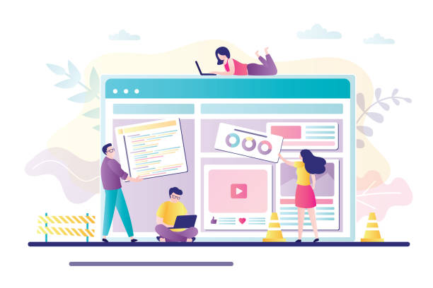
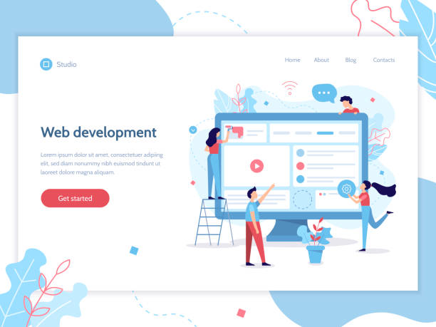
Introduction to the Concept of Responsive Web Design and Its Importance

In today’s world, where digital devices of various sizes and capabilities are constantly in use, the concept of Responsive Web Design has become more vital than ever.
This approach allows websites to intelligently adapt to the user’s screen size, from desktop computers to tablets and smartphones.
#Responsive_Web_Design essentially means creating a unified and optimized user experience on any device.
It is a comprehensive solution to the problem of device fragmentation and varying screen dimensions that visitors encounter.
This concept not only provides explanatory content but also allows users to easily view information without the need for zooming or horizontal scrolling.
The main goal is for content and user interface elements to be displayed in the best possible way, regardless of the device used.
Global standards also emphasize this.
This section provides an initial guide to understanding why your website needs responsive web design.
Suppose a user is browsing your website on their smartphone; if your site is not responsive, they will have to zoom in and perform unnecessary scrolling to read text or click buttons.
This poor user experience leads to losing visitors.
Therefore, the educational nature of this topic is vital for anyone intending to enter the world of web design.
In fact, responsive design is no longer a luxury option, but a necessity for survival in the competitive web space.
Businesses and personal websites both urgently need this capability to retain their audience on any platform.
This approach means providing the best experience to the user, regardless of their screen size.
Did you know that 85% of customers check your company’s website before any interaction?
With Rasaweb, build a corporate website worthy of your credibility.
✅ Increase customer credibility and trust
✅ Attract high-quality leads
⚡ Get free website design consultation
Why Responsive Web Design is Essential for Online Success

Today, statistics show that a major portion of web traffic comes from mobile devices.
Therefore, if your website is not optimized for these devices, you practically lose a large segment of your potential audience.
Google and other search engines also prioritize websites that have responsive web design.
This means that if your site is not responsive, you will have a lower ranking in search results, which directly impacts your visibility.
This is an in-depth analysis of the importance of SEO in the current era, which is closely linked to responsive design.
In addition to SEO, user experience (UX) also plays a pivotal role.
A well-responsive website has a lower bounce rate and users spend more time on the site.
This not only helps increase engagement but also leads to higher conversion rates.
For example, an e-commerce website with responsive web design, allows customers to easily view and purchase products on their mobile, whereas a non-responsive site can lead to a frustrating experience and abandoned carts.
This raises a question-provoking content: Is your business ready to lose these great opportunities? The answer is clear: No.
Consequently, the importance of responsive web design for any online business is undeniable.
This is an investment that will yield a significant return on investment, and the specialized nature of this approach makes it a competitive advantage.
Key Principles and Supporting Technologies of Responsive Web Design

For successful implementation of responsive web design, several fundamental principles and technologies must be understood and applied.
The first and most important principle is the use of Media Queries in CSS.
Media queries allow you to apply different CSS rules based on device characteristics, such as screen width.
This means you can change how content is displayed for different devices.
The second principle is the use of Flexible Grids, which use relative units like percentages instead of fixed pixel units.
This allows website elements to adjust their size based on the available space.
This section educates on these principles.
The third principle is Flexible Images.
Images must also be able to resize to prevent content overflow and maintain user experience.
Using the max-width: 100%; property for images in CSS is a simple and effective solution.
Additionally, the use of Fluid Typography, where font sizes adjust based on screen size, significantly aids overall readability.
These are all specialized aspects that must be considered.
Finally, the Mobile-First approach, where design is first done for the smallest screen and then extended to larger devices, is recognized as an effective strategy for responsive web design.
This approach provides a comprehensive explanation of how to start a responsive project.
Table 1: Key Technologies in Responsive Design

| Technology | Description | Importance in Responsive Design |
|---|---|---|
| Media Queries | CSS rules applied based on device characteristics (e.g., width). | Adjusting website appearance for different screen dimensions. |
| Flexible Grids | Using relative units (percentage, em, rem) for element layout. | Ensuring elements adapt to available space. |
| Flexible Images | Dynamically adjusting image sizes (max-width: 100%). | Preventing content overflow and improving loading. |
| Fluid Typography | Changing font size based on screen size. | Improving text readability across all devices. |
Does your current website build the trust that potential customers should have in your business? If not, it’s time to have a professional and impactful corporate website with Rasaweb.
✅ Fully custom design tailored to your brand identity
✅ Increased lead generation and business credibility in the eyes of customers⚡ Contact us for a free consultation!
SEO and User Experience Benefits of Responsive Web Design

One of the biggest advantages of responsive web design is its positive impact on SEO (Search Engine Optimization).
Google and other search engines prefer responsive websites because providing a single URL for all devices simplifies the crawling and indexing process.
This prevents duplicate content issues that can occur with separate mobile and desktop versions.
Additionally, responsive websites usually have a lower bounce rate and record higher user dwell time, which sends positive signals to search engines and helps improve rankings.
This is a comprehensive analysis of the technical and strategic benefits of this approach.
Alongside SEO, user experience (UX) greatly benefits from responsive web design.
Today’s users expect websites to function correctly regardless of the device they use.
A responsive site provides a smooth and enjoyable browsing experience by offering optimized layouts, appropriate font sizes, and scalable images.
This leads to greater user satisfaction, increased engagement, and ultimately, higher conversion rates.
Providing practical guidance to businesses shows that investing in responsive design is vital not only for visibility in searches but also for retaining and attracting customers.
This raises question-provoking content: Are you willing to lose your customers due to lack of optimization? The answer is clear: No.
Therefore, focusing on responsive web design is not just a choice, but a necessity.
Common Challenges in Implementing Responsive Web Design and Solutions

Despite numerous benefits, implementing responsive web design can come with challenges.
One of the most common challenges is image management and site performance.
High-quality images designed for large screens can be heavy on mobile devices and increase loading times.
Solutions to this challenge include using optimized image formats (like WebP), compressing images, and implementing “Lazy Loading” techniques that load images only when needed.
This aspect of the topic requires expertise and deep understanding.
Another challenge is organizing content and navigation across different screen sizes.
A website with extensive menus on desktop must transform into a hamburger menu or more compact options on mobile.
This requires careful planning and continuous testing to ensure users can easily navigate the site.
This raises question-provoking content: How can we simplify the user interface while maintaining access to all content? The answer lies in intelligent design and guidance based on user experience.
Complexities related to forms, tables, and videos can also be challenging, but they can be overcome by using Accessibility principles and modern CSS techniques.
The educational nature of these steps is crucial for developers to effectively identify and solve challenges in responsive web design.
Popular Tools and Frameworks for Responsive Web Design

To facilitate and speed up the process of responsive web design, numerous tools and frameworks are available for developers to utilize.
One of the most widely used frameworks is Bootstrap, which provides a collection of HTML, CSS, and JavaScript tools for building responsive and mobile-first websites.
Bootstrap features a powerful grid system that allows you to easily adjust layouts across different screen sizes.
This is a practical tutorial for getting started with frameworks.
Other frameworks like Tailwind CSS have also gained significant popularity.
Tailwind CSS is a Utility-First framework that allows you to use small, composable CSS classes directly in your HTML.
This approach provides high flexibility for customization.
For managing more complex content, Content Management Systems (CMS) like WordPress, with responsive themes and plugins, simplify the design process even for non-technical users.
Additionally, browser responsive testing tools (such as Responsive Design Mode in Chrome and Firefox) help developers test and debug their website across different screen sizes.
These tools are essential and specialized for anyone working in responsive web design.
Using these tools makes the development process considerably more efficient.
Mobile-First Approach: A Modern Strategy in Responsive Web Design

The Mobile-First approach is a pivotal strategy in responsive web design that, unlike traditional approaches that first designed for desktop and then adapted for mobile, focuses on the smallest screen (usually mobile) from the outset.
This design philosophy believes that by starting with the constraints of mobile space, you are forced to prioritize the core content and functionality of the website.
This is a fundamental explanation for understanding the depth of this strategy.
The advantages of the mobile-first approach are numerous.
Firstly, due to mobile constraints, designers and developers are compelled to focus on the most important information and functionalities of the website, leading to a cleaner and more efficient user interface.
Secondly, this approach helps improve site performance on mobile devices, as it prevents the loading of unnecessary CSS and JavaScript codes designed only for desktop.
Thirdly, since Google prioritizes mobile indexing, websites designed with this approach will have a significant SEO advantage.
This is a detailed analysis of the impact of this strategy on online success.
Using this approach is not only specialized but also answers a question-provoking content about the effectiveness of older methods: Why should we start with a method that is not optimized for the majority of today’s users? Responsive web design with a mobile-first focus is the future-proof solution for the web.
Table 2: Comparison of Desktop-First and Mobile-First Approaches
| Feature | Desktop-First (Traditional) | Mobile-First (Responsive) |
|---|---|---|
| Design starting point | Large screens (Desktop) | Small screens (Mobile) |
| CSS code complexity | Adding media queries for reduction (min-width) | Adding media queries for increase (max-width) |
| Content priority | Tendency to add more details | Focus on essential content and core functionality |
| Performance on mobile | Unnecessary codes may be loaded | Better performance and faster loading |
| SEO benefits | Risk of hidden content or poor mobile user experience | Better support for Google’s mobile indexing |
Are you frustrated with your e-commerce site’s low conversion rate? Rasaweb transforms your online store into a powerful tool for attracting and converting customers!
✅ Significant increase in visitor-to-buyer conversion rate
✅ Unparalleled user experience to boost customer satisfaction and loyalty⚡ Get a free consultation from Rasaweb!
The Future of Responsive Web Design and Emerging Technologies
With the ever-advancing technology and the emergence of new devices like smartwatches, flexible displays, and virtual/augmented reality, the future of responsive web design is also evolving.
It is expected that the concept of responsiveness will go beyond mere screen dimensions and react to factors such as user location, internet connection speed, and even ambient light.
This is important news for the future of the web that designers should pay attention to.
Technologies like Intersection Observer API and CSS Container Queries, which are under development, give developers more precise control over how elements are displayed based on the available space within their parent container, rather than the entire viewport.
This paradigm shift provides unprecedented flexibility in design.
Furthermore, the focus on personalized user experience and adaptive user interfaces (UIs) that intelligently change based on user behavior and preferences is increasing.
Artificial intelligence (AI) and machine learning (ML) can also play a significant role in automating the content optimization process for various devices.
These advancements raise question-provoking content about the current boundaries of responsive web design and pave the way for a renewed responsive web design.
Web developers and designers must prepare themselves for these changes and continuously update their knowledge in this field to build websites that are relevant and efficient not only today but also in the future.
This is a specialized analysis of the path forward.
Case Studies and Best Practices in Responsive Web Design
To better understand the effectiveness of responsive web design, examining case studies of successful websites can be very educational and inspiring.
Companies like Airbnb, The Boston Globe, and Dropbox all have fully responsive websites that provide a seamless user experience across devices.
For instance, The Boston Globe was one of the first major news websites to fully adopt a responsive approach and saw positive results in increased user engagement and improved mobile traffic.
These cases offer practical guidance for businesses planning to migrate to this method.
Best practices in responsive web design include: Mobile-first design; this means starting the design and development process by considering the limitations of small devices.
Optimal use of media queries to adjust layouts and styles.
Optimizing images and videos to prevent slow site loading on mobile devices.
Continuous testing across different devices and browsers to ensure proper functionality.
Focus on Accessibility so that the website is usable for all users, including those with disabilities.
And finally, simplifying navigation and content to ensure a smooth user experience.
These are all specialized tips that not only help you build a responsive website but also create a responsive website with excellent performance and outstanding user experience.
Seeing these successful websites is also entertaining and brings new ideas to mind.
Frequently Asked Questions
| Question | Answer |
|---|---|
| What is Responsive Web Design? | It is a method for designing and implementing websites that automatically adjusts the layout and content of the display to be shown optimally based on the user’s device screen size (desktop, tablet, mobile, etc.). |
| Why is responsive design important? | With increasing use of various devices to access the web, site responsiveness improves user experience, reduces bounce rate, strengthens site SEO, and makes site management and maintenance easier (instead of having separate versions for mobile and desktop). |
| How does responsive design work? | This type of design uses techniques such as flexible grids and layouts (Flexbox, CSS Grid), flexible images and media, and most importantly, CSS Media Queries, to change the styles and layout of the page based on screen characteristics (width, height, resolution, etc.). |
| What are the main tools for implementing responsive design? | The main tools include HTML5 (for content structure), CSS3 (especially Media Queries, Flexbox, Grid for responsive styling and layout), and sometimes JavaScript for more complex interactions. |
| What are the main advantages of using responsive design? | The main advantages include increased user accessibility (covering a wide range of devices), improved user experience, improved site ranking in search engines (especially Google), reduced development and maintenance costs, and increased visitor-to-customer conversion rates. |
And other advertising services of Rasaweb Advertising Agency
Smart Sales Automation: Revolutionize customer acquisition with the help of Google Ads management.
Smart UI/UX: Designed for businesses looking to increase click-through rates through user experience customization.
Smart Custom Software: An innovative service for increasing customer acquisition through the use of real data.
Smart Advertorial: A dedicated service for improving SEO ranking based on user experience customization.
Smart Custom Software: A creative platform for improving digital branding with attractive user interface design.
And over hundreds of other services in the field of online advertising, advertising consulting, and organizational solutions
Online Advertising | Advertising Strategy | Advertorial
Resources
Comprehensive Responsive Design ArticleDigital Revolution and WebsitesFuture of Responsive Web DesignAdvanced Responsive Web Design Tutorial
? To achieve your big business goals in the digital world, Rasaweb Afarin Digital Marketing Agency is by your side with a professional and results-oriented approach. From personal website design to comprehensive SEO strategies and content marketing, we provide everything you need for visibility and growth.
📍 Tehran, Mirdamad Street, next to Central Bank, Southern Kazeroun Alley, Ramin Alley, No. 6
