
Introduction to Responsive Design and its Importance in the Digital Age

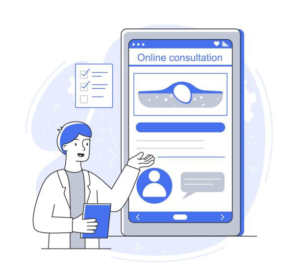
In today’s world, where #users utilize a wide range of #devices to access the internet, from desktop computers to tablets and smartphones, the need for websites that can adapt to any screen size has become more critical than ever.
Responsive Web Design is the answer to this growing need.
This approach ensures that your website looks and performs excellently on any device, providing a seamless user experience.
In fact, the main goal of responsive web design is to create a seamless and optimized user experience for all visitors, regardless of their screen dimensions.
Ignoring this issue can lead to losing a significant portion of the audience, especially given that the share of mobile traffic in total web traffic is increasing day by day.
A non-responsive website not only looks inappropriate on different devices but can also lead to user frustration, increased bounce rates, and ultimately, a decrease in search engine rankings.
Therefore, if you are looking for success in the online space, investing in SEO and improving user experience requires proper implementation of responsive design principles.
This is no longer a competitive advantage, but an undeniable necessity for any online business.
Is your online sales not as expected? With Rasawweb, solve the problem of low sales and poor user experience forever!
✅ Increase conversion rate from visitor to customer
✅ Create an enjoyable user experience and increase customer trust
⚡ Act now to receive free consultation!
Technical Principles and Standards in Building Responsive Websites

Building a responsive website requires a deep understanding of three core concepts: Fluid Grids, Flexible Images, and Media Queries.
Fluid grids use relative units like percentages instead of fixed pixel units to define column and element widths.
This allows the page layout to automatically adjust as the screen size changes.
Flexible images, using the max-width: 100% property in CSS, ensure that images never overflow their containers and are always displayed correctly.
But the key to responsive design is media queries.
This CSS3 feature allows developers to apply different styles based on device characteristics such as width, height, orientation, and screen type (e.g., print or screen).
For example, you can define that for widths less than 768 pixels, the navigation menu changes to a hamburger icon, and columns stack vertically instead of side-by-side.
Proper implementation of these principles helps developers create a robust and efficient website that is not only visually appealing but also delivers high performance across a wide range of devices.
The importance of adhering to these standards for ensuring compatibility and accessibility of the website in the future is undeniable.
Challenges and Solutions for Implementing Responsive Design

Despite its numerous advantages, implementing responsive web design is not without its challenges.
One of the biggest hurdles is managing complex content and high-resolution images on smaller devices.
For example, an unoptimized image can cause slow site loading, even if its design is responsive.
The solution to this challenge involves using techniques like lazy loading, smart image compression, and next-generation image formats like WebP.
Another challenge is maintaining performance and loading speed.
While responsive design is based on a single code for all devices, this does not mean there is no need for optimization for different devices.
Optimizing HTML, CSS, and JavaScript code, minimizing HTTP requests, and using a CDN (Content Delivery Network) are among the effective solutions.
Testing on different devices is also a crucial challenge; to ensure the website functions correctly on all platforms, it is necessary to use simulators and real-device testing.
This is time-consuming but essential for delivering an excellent user experience.
Finally, the complexity of managing navigation and menus across different sizes is another area that designers must pay special attention to, employing creative solutions such as hamburger or dropdown menus.
| Feature | Responsive Design | Adaptive Design | Separate Mobile Site |
|---|---|---|---|
| Number of Templates | A single template | Multiple fixed templates | Completely separate template |
| Change Mechanism | Flexibility based on screen size | Loading appropriate template for specific breakpoints | Redirecting users to mobile URL |
| Development Complexity | Medium to High | Medium | Low to Medium (but maintaining two sites) |
| Maintenance Cost | Lower (one codebase) | Medium | Higher (two codebases) |
| SEO Optimization | Very suitable (one URL) | Suitable (one URL) | More challenging (two URLs and need for canonical) |
How Does User Experience (UX) Transform with Responsive Design?
Responsive web design not only impacts the website’s appearance but also plays a crucial role in shaping the User Experience (UX). By automatically adapting to the screen size, responsive websites ensure that users always have access to the main content and that navigation is easy and intuitive.
This approach makes users feel more comfortable interacting with the site, as they are not forced to zoom, scroll horizontally, or struggle to find information on a disorganized page.
This is especially critical on touch devices where users expect everything to be easily accessible with their fingers.
Increased user satisfaction directly impacts conversion rates and customer loyalty.
A poor user experience can cause users to quickly leave the site and go to a competitor’s website.
Therefore, focusing on responsive web design is essentially focusing on the user and their needs. This means prioritizing important content, designing easily clickable buttons and links, and providing forms that are simple to fill out on any device.
Responsive design helps your website not only perform well but also be recognized by users as a professional and user-friendly brand.
Does your company’s current website not appear as professional and trustworthy as it should? With specialized corporate website design by Rasawweb, create an online presence that reflects your credibility and attracts more customers!
✅ Build a powerful and professional image for your brand
✅ Convert visitors into real customers
⚡ Get a free consultation right now!
Modern Tools and Popular Frameworks for Responsive Development
Today’s web developers have access to a wide range of tools and frameworks that simplify and make the responsive web design process more efficient.
One of the most well-known and widely used frameworks is Bootstrap.
This CSS/JavaScript framework provides a comprehensive set of ready-made components and a 12-column grid system, allowing developers to quickly build responsive user interfaces.
Another framework that has gained significant popularity is Tailwind CSS. Unlike Bootstrap, which has pre-defined classes for components, Tailwind is a “utility-first” framework that gives the developer full control over styling and allows for deeper customization.
In addition to these frameworks, other tools such as Sass or Less (CSS preprocessors) help organize CSS code better and create dynamic styles, which are very useful in responsive design.
Responsive testing tools, such as Chrome Developer Tools which can simulate different devices, are also an integral part of the development and debugging process.
Using these tools not only increases development speed but also significantly helps ensure the final product’s quality and compatibility.
The Future of Web Design with a Focus on Responsive and Adaptive Approaches

The future of web design is inextricably linked with responsive web design.
With the advent of new technologies such as Virtual Reality (VR) and Augmented Reality (AR), Internet of Things (IoT), and wearables, the importance of website flexibility and adaptability becomes more evident than ever.
Optimizing only for mobile and desktop is no longer enough; websites must be able to provide an optimal user experience on highly diverse devices with different dimensions and inputs.
New concepts like “Mobile First,” where design is initially done for mobile devices and then scaled up for larger screens, are becoming an industry standard. This approach not only helps improve mobile performance but also assists designers and developers in prioritizing essential and critical content.
Furthermore, more advanced approaches such as Adaptive Design, where the website is designed for several specific breakpoints, are used alongside responsive design to achieve the best possible results.
Given the rapid pace of technological advancement, the stability and flexibility of a website against future changes acquire vital importance, and responsive web design is a reliable way to guarantee this stability.
Case Study of Successes and Failures in Responsive Website Design

There are many success stories in responsive web design where companies, by correctly implementing it, have significantly increased their mobile traffic and improved conversion rates.
For example, major brands like Apple or Google have designed their websites responsively for years, resulting in a seamless experience for millions of users worldwide.
These successes often stem from meticulous planning, continuous testing, and a focus on real user needs.
However, there are also unsuccessful examples that can teach us valuable lessons.
Some websites, due to lack of image optimization or incorrect use of media queries, have very slow loading speeds on mobile, severely disrupting the user experience.
Others, due to cluttered and unnecessary code, cause slowdowns and complexity instead of improving performance.
A common example of failure is when a company merely implements responsive design as a “checklist” item, without considering the actual content or performance on smaller devices.
The result is a site that is technically responsive but disastrous in terms of user experience.
Examining these cases helps us learn from past mistakes and implement responsive web design with a more open and purposeful perspective.
| Factor | Success Factors | Failure Factors |
|---|---|---|
| Content | Prioritizing key content for mobile, reducing unnecessary content | Displaying all desktop content without optimization |
| Images | Optimizing image size, format, and lazy loading | Using high-resolution and heavy images for all devices |
| Performance | Optimizing loading speed, reducing requests | Ignoring loading speed on mobile devices |
| Navigation | User-friendly and accessible mobile menus (e.g., hamburger) | Complex and unusable menus on small screens |
| Testing | Continuous testing on real devices and browsers | Relying on simulators and not testing in real environments |
Performance and Speed Optimization in Responsive Web Design

Website loading speed is one of the most important factors in user experience and SEO ranking, and its importance doubles in responsive web design.
Many mobile users have slower internet access, and therefore, every millisecond of delay can mean losing a visitor.
To optimize speed, one of the key actions is code compression and optimization (HTML, CSS, JavaScript).
Removing extra characters, comments, and white spaces can significantly reduce file sizes.
Furthermore, using responsive images that load an optimized version based on screen size is essential.
This prevents heavy and unnecessary images from loading on smaller devices.
Implementing server-side and client-side caching also helps reduce loading times for subsequent visits.
Using a Content Delivery Network (CDN) can also deliver content from the closest server to the user, minimizing latency.
Finally, continuous monitoring of site performance with tools like Google PageSpeed Insights helps you identify and resolve potential issues and achieve an excellent-performing responsive web design.
Does your current e-commerce website design lead to lost customers and sales?
Rasawweb is your solution with modern and user-friendly e-commerce website designs!
✅ Significantly increase conversion rate and sales
✅ Create strong branding and build customer trust
⚡ Get a free e-commerce website design consultation from Rasawweb now!
Key Tips for Choosing an Expert Responsive Website Designer

Choosing a specialist or team for responsive web design can make a big difference in the success of your project.
This choice is not just about finding someone who knows how to code, but about finding someone with a deep understanding of user experience (UX), SEO, and digital strategy.
The first key point is to review their portfolio.
Are their previous projects truly responsive? Test them on different devices and ensure smooth navigation and correct content display.
Second, pay attention to their technical knowledge.
Are they familiar with the latest standards, frameworks, and best practices in responsive development? Asking about their approach to performance optimization and SEO for mobile devices can give you good insight.
Third, their ability to communicate and understand your needs. A good designer should be able to transform your ideas into a practical and functional website and maintain transparency and effective communication throughout the process.
Fourth, the importance of post-project delivery support.
Responsive web design is not a static process, and it may require updates or changes in the future.
Ensure that your chosen designer provides the necessary support.
By considering these tips, you can choose a specialist designer or company that will create a quality and future-proof website for you.
Frequently Asked Questions About Responsive Website Design

On the path to familiarizing and implementing responsive web design, common questions arise for users and businesses, some of which we answer in this section.
Question: Is responsive design better for SEO?
Answer: Yes, Google officially recommends responsive design as the preferred approach for mobile-friendly websites. This is because a single URL exists for all devices, which simplifies crawling and indexing for search engines and prevents duplicate content issues.
Question: Does responsive design slow down the site?
Answer: No, if implemented correctly, it not only doesn’t cause slowdowns but can also improve loading speed on mobile devices.
Slowdown issues are usually due to lack of image optimization, heavy JavaScript code, or not using caching techniques, rather than the nature of responsive web design.
Question: Can an existing website be converted to responsive?
Answer: Yes, in many cases, it is possible to convert existing websites to responsive, but this process may require a fundamental review of the CSS and sometimes HTML structure.
The complexity of this task depends on the current state of the website’s code and is best done by a specialist.
Question: How much does responsive website design cost?
Answer: The cost varies greatly depending on the design complexity, number of pages, required features, and the development team’s experience.
However, it should be considered a long-term investment that will improve your user experience and business growth.
Frequently Asked Questions
| Question | Answer |
|---|---|
| What is Responsive Web Design? | A web design approach that ensures a website displays well across various screen sizes and devices (such as mobile, tablet, desktop) and provides a suitable user experience. |
| Why is responsive design important? | Improved user experience, better SEO (Google prefers responsive sites), time and cost savings (no need to build a separate mobile site). |
| What are the main techniques in responsive design? | Using flexible grids and layouts (Fluid Grid), flexible images and media (Flexible Images), and employing Media Queries in CSS. |
| What are Media Queries in responsive design? | A part of CSS3 that allows you to apply different styles based on the characteristics of the device on which the website is displayed (such as screen width, resolution, media type). |
| What are the benefits of using responsive design? | Reaching more users (especially mobile), improving user engagement rate, reducing maintenance costs (one site for all devices), and improving conversion rates. |
And other advertising services from Rasawweb Advertising Agency
Smart Advertorials: A professional solution for analyzing customer behavior with a focus on smart data analysis.
Smart Google Ads: A new service for enhancing campaign management through precise audience targeting.
Smart Customer Journey Map: A new service for increasing digital branding through smart data analysis.
Smart Conversion Rate Optimization: A professional solution for increasing website traffic with a focus on marketing automation.
Smart Customer Journey Map: A new service for increasing click-through rates through attractive user interface design.
And over hundreds of other services in internet advertising, advertising consultation, and organizational solutions
Internet Advertising | Advertising Strategy | Advertorials
Resources
What is Responsive Website Design?
Responsive Site Design
Responsive Website Design
What is Responsive Design?
? To elevate your business in the digital world, Rasawweb Afarin Digital Marketing Agency smooths your path to growth and success by offering comprehensive services, including professional website design, SEO optimization, and social media management.
📍 Tehran, Mirdamad Street, next to Bank Markazi, Southern Kazeroun Alley, Ramin Alley, No. 6
