💡 An Introduction to the Importance of the “Contact Us” Page and Its Magic in UI/UX
# Remember those days when you had to search through websites and directories just to find a business’s phone number or address? Well, those days are over. Today, the “Contact Us” page is no longer just a dry list of an address and phone number – not at all! This page is actually a gateway through which users enter your world, where the first sense of trust or disappointment is formed. When we talk about UI/UX design for this page, we don’t just mean aesthetics; it’s much more than that. It’s an investment in user experience, in the feeling that the audience gets from interacting with you, and whether they want to work with you or not. For us at Rasaweb Afarin, this part of the job, which is the initial communication bridge with the customer, is very important.
Imagine a potential customer visits your website, has browsed extensively, seen your services, reviewed your products, and is now ready to take a step further and talk to you. What if their contact page is confusing, information is hard to find, or the form is so long and complex that they give up and leave? Then all the marketing, content, and SEO efforts you’ve put in will be wasted. So, you see, the proper design of this page directly impacts conversion rates and customer loyalty. An excellent contact page not only simplifies the communication channel but also loudly proclaims your professionalism and accessibility. A good user experience in this section means you value the customer’s time and patience.
The question is, how can we design this page so that users not only easily find contact information but also enjoy the process? How can smart design build their trust and instill a sense of brand confidence in their hearts? This is where UI and UX principles come into play. From choosing the right font and color to arranging elements and forms, everything must be done with precision and purpose. We, at Rasaweb Afarin, as digital marketing specialists, know that every small component on a website tells its own story, and the contact page is one of the most prominent parts of this story. So, stay with us to discover the secrets of successful user interface and user experience design for this vital page.
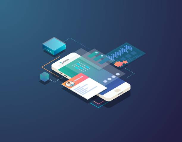
🎯 Understanding the Audience and Smart Goal Setting: The Foundation of Every Design
![]()
![]()
# Well, before we even start designing or writing a single line of code, we need to ask ourselves a fundamental question: “Who is going to contact me and why?” Without an answer to this question, any design is like shooting in the dark. This is where audience understanding acts like a compass. It might be a potential customer looking for a service price, an existing customer facing a problem, a business partner wanting to collaborate, or even a journalist seeking information. Each of these has different needs and expectations; in a way, their tone of voice is also different, isn’t it?
Once we understand who our main audience is and what their purpose in contacting us is, we can then design the page in a way that truly serves them. For example, if most inquiries are for support, we should highlight the support section and provide direct links to FAQs or a ticketing system. If we’re looking to generate leads, the contact form should be optimized and encouraging. If we want to attract business partners, it might be necessary to separate contact information for different departments. This means smart goal-setting; it means deciding in advance what we want this page to achieve for us and what we expect from the user. These goals can be derived by analyzing previous data or even by surveying current customers.
Creating “user personas” for the contact page is very useful here. For instance, “Hesitant Customer”: This person probably has many questions and needs more assurance. So, we should highlight the phone number and online chat for them. Or “Hasty Customer”: This one just wants to ask a quick question and leave, so a short form or a chat bot is a good start. This personalization in UI/UX design makes the page not only effective but also gives the user a more personal feeling. This precise understanding helps us at Rasaweb Afarin to provide unique design solutions for each business, closely tied to its specific goals. Remember, the goal isn’t just a contact page; the goal is to create a meaningful connection.
Is your website content not optimized for search engines? Rasaweb Afarin, with its content marketing and SEO services, produces content that is both engaging for users and improves your site’s ranking on Google.
✅ Production of unique content with relevant keywords
✅ Improvement of readability and content structure
✅ Increasing site authority and achieving high rankings
Be seen at the top of Google’s results with us!
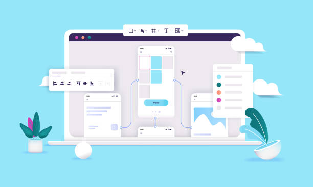
✨ Essential Principles of User-Friendly UI Design for Your Contact Page
# Okay, now that we know who will contact us and why, it’s time to get to the exciting part: the layout and appearance of the page. This is where User Interface (UI) design comes into play and can truly make a difference. The first and last principle of user-friendly UI is “clarity” and “simplicity.” The “Contact Us” page shouldn’t be a puzzle that the user has to rack their brain to solve. Information should be crystal clear and accessible, without any unnecessary complexity, you know what I mean? It should be like a roadmap in a strange city, showing the way directly and unambiguously.
“Visual hierarchy” is also very important. This means the user’s eyes should naturally be guided to the most important information. Usually, this means the phone number, email, and contact form should be more prominent than the rest. Use whitespace correctly so that page elements don’t look cluttered and can breathe. This prevents eye fatigue and allows users to process information more easily. Also, the choice of fonts and colors is not just about aesthetics. Fonts should be readable, and colors should align with your brand identity while conveying a sense of trust and professionalism. Calm, corporate colors are usually more suitable for this page. By the way, don’t forget “Accessibility”; ensure that people of all abilities can use your page.
When designing the UI/UX of the contact form, pay attention: labels should be clear, fields should be appropriately sized, and the submit button should be completely obvious. A common mistake is making the submit button small and faded, so the user doesn’t even see it. The table below summarizes the key UI principles you should always keep in mind:

Click here to preview your posts with PRO themes ››
| UI Principle | Explanation | Why is it important? |
|---|---|---|
| Clarity | Information should be unambiguous and direct. | Prevents user confusion. |
| Visual Hierarchy | More important elements should be more prominent. | Guides the user’s eye to key information. |
| Whitespace | Optimal use of empty space around elements. | Increases readability and reduces clutter. |
| Readability | Fonts and colors should be easily readable. | Facilitates understanding of content. |
| Consistency | The contact page design should be consistent with other pages on the site. | Creates a sense of familiarity and trust. |
These principles are the foundation of any successful design, something we at Rasaweb Afarin value greatly. If you follow these, you’re halfway there; the rest is user experience, which we’ll get to now.
🚀 How to Create an Unforgettable User Experience (UX)
![]()
![]()
# Well, we’ve reached the heart of the matter, which is user experience (UX). UI is like a person’s clothes, but UX is the feeling one gets from interacting with them. A contact page with a fantastic appearance, if it can’t provide a smooth and hassle-free experience to the user, is practically worthless. The main goal here is for the user to be able to reach what they want without any friction or obstacles. From the moment they decide to make contact until they send their message or dial the number, everything should be as easy as pie.
To start, map out the “user journey” for your contact us page. Where does the user come from? (e.g., from a product page, or the homepage) What steps do they take to reach their goal? Where might they get stuck? Where might questions arise for them? By answering these questions, you can identify and eliminate potential obstacles. Reducing friction means the less we force the user to think or exert effort, the better. Minimize the number of form fields; ask for only essential information as much as possible. If the form is long, divide it into several steps and add a progress bar so the user knows where they are and how much is left to finish.
Also, provide “multiple contact options” to the user. Not everyone likes to fill out forms; some prefer to call, some to send an email, and some prefer online chat. The more options you offer, the higher the chance that the user will connect with you using their preferred method. Let’s not forget that positive and negative feedback, or even confirmation messages after submitting the form, give the user a good feeling. For example, a thank you message and notification that “Your message has been received and will be answered shortly” reinforces a sense of confidence. Error handling should also be empathetic; if a user makes a mistake, instead of showing a dry red message, kindly and clearly tell them what needs to be corrected. These subtleties in UI/UX design are what create an unforgettable experience, and at Rasaweb Afarin, we always pay attention to these details.
✍️ The Ideal Contact Form: Less Is More!
# Okay, we’ve reached one of the most important parts of the contact page: the contact form. Really, this part can make or break everything. A good form is like a good friend: concise and useful, without asking irrelevant things. The philosophy of “Less is More” reaches its peak here. Every field you put in your form must have a logical reason; otherwise, it’s just an extra obstacle that discourages the user from sending a message. Ask yourself, do I really need “national ID” or “full postal address” in the first contact? Probably not!
Try to choose fields intelligently. For example, if you want to get a phone number, use a numeric field. Or if a date is important, use a Date Picker. These both help the user to enter information more easily and prevent potential errors. Regarding labels and placeholder texts, there’s a point. It’s better for labels to always be above the field so the user doesn’t forget what each field is for when filling out the form. Placeholder texts are good too, but they shouldn’t replace the main label; they are just for further guidance, like “Example: info@rasawebafarin.com.”
If you absolutely need to have a long form, use “Progressive Disclosure.” This means only showing essential fields first, and then, after they are filled, revealing more fields. This makes the form look less intimidating. Oh, before I forget, CAPTCHA should also be used with caution. Those old CAPTCHAs where you had to type crooked letters were a nightmare! Fortunately, Google’s “reCAPTCHA” now does the job with a simple tick, which is easy for the user and prevents spam. The right choice in UI/UX design for the contact form not only improves the user experience but also helps you get higher quality leads and avoid wasting your time with irrelevant messages.
Do you need a powerful advertising campaign to introduce your new product or service? Rasaweb Afarin, with its creative and targeted advertising campaign design and execution, broadcasts your message to the world!
✅ Creating innovative ideas to attract audience
✅ Campaign execution on diverse and high-yield platforms
✅ Precise results analysis and optimization for maximum effectiveness
Join us to see your brand in the best possible light!
🎨 Visual and Graphic Elements: Your Common Language with the User
# Okay, let’s momentarily step away from logic and functionality and move towards the emotional and visual part of the story. When we say “UI/UX design,” it means both beauty and functionality, doesn’t it? Visual and graphic elements on the contact page are like the tone of your voice in a conversation. They can convey a sense of trust, intimacy, or, conversely, indifference and coldness. Visual branding speaks volumes here. Colors, fonts, and the overall graphic style should be consistent with your brand identity across the entire site. This “visual consistency” makes the user feel like they are still in your world and haven’t gotten lost.
Using icons can be very effective. A phone icon next to the number, or an envelope icon next to the email, subconsciously tells the user what that information relates to. Remember, icons should be simple, clear, and understandable. You can also use images and photos, but with care. For example, a photo of your support team or office can increase the sense of humanity and intimacy. But be careful that photos are not too heavy and don’t slow down page loading speed. Maps also have a special place, especially for businesses with a physical office or those looking for local customers (GEO SEO). An interactive Google Map showing the exact address is very useful for the user and makes their job easier.

Click here to preview your posts with PRO themes ››
Visual cues for interaction are also very important. For example, the “Send” button should be completely clear and prominent, perhaps with a different color or a small hover effect. These are the “micro-interactions” that can make the user experience more engaging. For instance, when a user correctly fills a field, show a small green checkmark. These small, yet impactful, things make the user feel like they are interacting with a live site, not a dry and lifeless page. At Rasaweb Afarin, we pay close attention to these details, because we know that it’s these nuances in UI/UX design that make the difference and transform your contact page from an ordinary page into a powerful tool.
🌐 SEO and Contact Page Optimization: Beyond Imagination
# You might think the “Contact Us” page isn’t that SEO-centric. “Who searches for a contact page on Google?” You’re right, few people directly search for “contact us page,” but this page has many hidden potentials for SEO that shouldn’t be overlooked. Especially when “Local SEO” comes into play, its importance doubles. When someone searches for “Rasaweb Afarin phone number” or “Rasaweb Afarin company address,” you want your contact page to show up, right? So, optimizing this page for brand-related keywords and contact information is crucial.
One of the most important things is using “Schema Markup” for contact information. This is a type of code that tells search engines like Google that these numbers and addresses are actually contact information for a business. With this, Google can display your information more prominently and attractively in search results (for example, in the Knowledge Panel or Local Pack). This means more visibility and higher trust. Include your physical address, phone number, business hours, and even links to social media profiles in your Schema Markup. Also, make sure this information is accurate and up-to-date and consistent across all platforms (website, Google My Business, social media). Inconsistency here will lead to confusion for both users and Google.
The next point is Google’s “Mobile-First Indexing.” Most users today view websites on their mobile phones, so your contact page must be fully responsive and user-friendly on mobile. Contact buttons should be large and clickable, forms should be easy to fill out, and the map should display correctly. Page loading speed, of course, goes without saying. A heavy and slow page will destroy your SEO. At Rasaweb Afarin, as SEO and UI/UX design specialists, we take these points seriously so that your contact page is not only beautiful and functional but also strong and efficient from an SEO perspective, guiding more local customers towards you. It’s this attention to detail that makes a business stand out from its competitors, remember that!
📊 Continuous Testing and Improvement: The Secret to Excellent UI/UX Longevity

# You know what? The design work doesn’t end with the page launch, no! That’s just the beginning. Like a garden that always needs tending, your contact page also needs continuous watering and care. The world changes, user expectations change, and if you stay static, you’ll fall behind. This is where “continuous testing and improvement” comes into play and becomes the secret to the longevity of excellent UI/UX design.
One of the best methods is “A/B testing.” What does that mean? It means showing two different versions of an element (e.g., the color of the “Send” button or its text) simultaneously to two groups of users and seeing which one performs better. Which one gets more clicks? Which one generates more conversions? This is a great way to understand what really works and what doesn’t. Also, “user testing” is very important. Sit down with a few real users (even if they’re friends and acquaintances!) and ask them to fill out the form or find contact information. Pay attention to their behavior, where they get stuck, the questions they ask. This first-hand information is gold.
“Heatmaps” and web analytics tools (like Google Analytics) are also your good friends on this journey. Using these tools, you can see where users click more, where they hold their mouse, and where they leave the page. For example, if you see many people abandoning the form halfway, it probably means you have a problem with the fields or the length of the form. Collecting feedback should always be part of your plan. A short survey after submitting the form, or even a small comment box next to the page, can give you brilliant ideas. Don’t forget, the design process is “iterative,” meaning you must always be ready to change, improve, and test again. The table below provides an overview of testing and improvement tools:
| Testing Method | Goal | Advantages |
|---|---|---|
| A/B Testing | Comparing two versions of an element to find the best performance. | Decision-making based on real data. |
| User Testing | Observing real users interacting with the page. | Discovering unexpected problems and getting direct feedback. |
| Heatmaps | Analyzing user behavior (clicks, mouse movement, scrolling). | Identifying attractive and problematic visual points. |
| Analytics | Tracking performance metrics (conversion rate, bounce rate). | Understanding overall user behavior patterns. |
| Surveys | Collecting direct feedback from users. | Receiving valuable opinions and ideas for improvement. |
We at Rasaweb Afarin strongly believe in this process because it helps us always find the best solutions for our clients and avoids presenting a static and outdated design.
🌟 A Few Golden Tips from Rasaweb Afarin Specialists for Superior Design

# Well, we’ve covered a lot together so far, from the initial importance of the contact page to the details of UI/UX design and SEO optimization. But let me share a few special, golden tips from our own experience at Rasaweb Afarin that you might not have heard elsewhere. These are things that, in practice, make big differences and are kind of your trump card.
The first tip: “Build trust, don’t just display information.” The contact page, apart from being a communication channel, is a place to build trust. How? For example, if you have customers you’ve provided excellent service to, a small testimonial, or even a short quote from them, next to the contact form, can give new users a sense of assurance. Or, if you operate in a specific industry, display relevant security badges or licenses. Similarly, transparency about response times and waiting periods also builds trust. State that “We will respond to you within 24 business hours.” This manages expectations and doesn’t leave the user in uncertainty.
Click here to preview your posts with PRO themes ››
Second tip: “Don’t forget reasonable personalization.” What does that mean? It means if a user comes from a specific product page, you might be able to add a hidden field in the contact form to record that product. This way, when their message reaches you, you know which product they’re asking about and can respond faster and more accurately. This seemingly small action gives the user a sense of “importance” and makes them feel like you’re paying attention to their needs. In a way, it gives the feeling that “we know what you’re looking for and we’re here to help you.” These subtleties turn a good user experience into an excellent one.
And finally, “look to the future.” The digital world is constantly changing. The AI chatbots that are popular now can completely revolutionize the contact page experience. Be ready to try new methods. At Rasaweb Afarin, we are constantly monitoring these changes and try to always be one step ahead to implement the best for our customers. These tips are the essence of our years of experience in UI/UX design and digital marketing and can make a real difference in the performance of your contact page. Think about them, I’m serious!
Did you know that Artificial Intelligence can transform your business? Rasaweb Afarin, leveraging AI, offers innovative solutions to increase your efficiency and reduce costs.
✅ Automate repetitive and time-consuming processes to save resources.
✅ Analyze complex data to identify patterns and new opportunities.
✅ Increase customer satisfaction through smart and personalized systems.
⚡ Smarten your business with the power of Rasaweb Afarin’s AI!
🚀 Conclusion and Next Steps for Your Business
![]()
![]()
# Well, we’ve reached the end of this comprehensive guide. Throughout this journey, we’ve seen together that the “Contact Us” page is much more than just a collection of contact information; this page is a vital point for establishing communication, building trust, and ultimately, converting visitors into loyal customers. From precise audience understanding and smart goal-setting to the nuances of UI/UX design, SEO optimization, and the importance of continuous testing and improvement, we’ve put all of this together to give you a complete picture of an ideal contact page. Remember, this is an evolutionary process that never truly ends.
The most important thing to remember from this discussion is that every element placed on the “Contact Us” page must be purposeful and enhance the user experience. If something doesn’t benefit the user or only causes confusion, it’s better to remove it. Simplicity, clarity, and accessibility are the three main pillars of this design. A well-designed contact page not only makes it easier for users to connect with you but also conveys your professionalism and customer-centric approach. This itself is a big advantage in today’s competitive market.
So, what are your next steps? Well, it’s time to take a close look at your website’s current contact page. Does it follow these principles? Can users really easily contact you? Is your information complete and up-to-date? If the answer is “no” or you even have doubts, it’s time to take action and make a fundamental change. You know, investing in UI/UX design and optimizing your contact page is actually an investment in the future of your business, in attracting more leads, in customer loyalty, and in your brand.
We at Rasaweb Afarin, with years of experience in digital marketing, SEO, and website design, are here to help you implement this transformation in the best possible way. If you need expert consultation or want to turn your contact page into a UI/UX masterpiece, just contact us. Together, we can build a communication page that is not only functional but also inspiring and attracts customers to you.
| Question | Answer |
|---|---|
| Why is the design of the “Contact Us” page so important? | The “Contact Us” page is a crucial point for building trust, providing an easy communication channel, and converting visitors into customers. Poor design can lead to lost business opportunities. |
| What is the most important principle in designing the UI of a contact page? | Clarity, simplicity, and visual hierarchy are the most important principles. Information should be easily and unambiguously accessible. |
| How can the User Experience (UX) of the contact page be improved? | By understanding the audience’s needs, offering multiple contact options, reducing friction in forms, and providing appropriate feedback to the user, UX can be enhanced. |
| How many fields should an ideal contact form have? | Adhere to the “less is more” principle. Include only essential fields and use smart fields (like a date picker). |
| What is the role of SEO on the “Contact Us” page? | Local SEO and using Schema Markup for contact information (address, phone number, business hours) help Google better identify your business and display it in search results. |
| Is it essential to use a map on the contact page? | For businesses with a physical address or those offering local services, yes, an interactive map is very useful and helps with GEO SEO. |
| How can user trust be built through design on the contact page? | Trust can be built through transparency in information, displaying licenses or certifications, providing quick feedback, and visual consistency with the brand. |
| What is A/B testing and why is it important for the contact page? | A/B testing compares two different versions of an element to find the best performance. This method helps you make design decisions based on real data and optimize the page. |
| Is it recommended to use online chat on the contact page? | Yes, offering multiple contact options, including online chat, improves user experience and allows users to connect using their preferred method. |
| Why should the contact page be optimized for mobile? | Most users access websites via mobile, and Google also uses Mobile-First Indexing. Lack of mobile optimization can reduce user experience and SEO ranking. |
And other advertising services from Rasaweb Agency in the field of advertising
• SEO optimization for videos
• Management of local profiles on Google Maps
• Long-term content marketing campaigns
• Customer Touchpoints analysis
• Consulting and implementation of reporting automation
And over hundreds of other services in the field of internet advertising, advertising consultation, and organizational solutions
Internet Advertising | Advertising Strategy | Advertorials
How can financial risks be minimized?
By analyzing economic and market data, predict and manage financial risks.
✅ Smart financial risk management
✉️ info@idiads.com
📱 09124438174
📞 02126406207
Tehran, Mirdamad Street, next to Bank Markazi, Kazerun Jonubi Alley, Ramin Alley, No. 6