
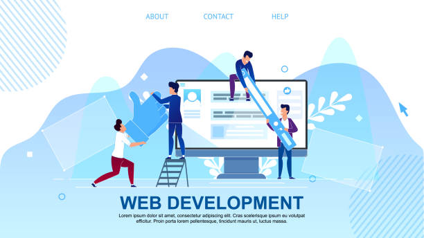
The Basic Concept of Responsive Web Design

In today’s digital world, where users access websites with a wide range of devices, from smartphones and tablets to laptops and large monitors, having a website that displays correctly at any size is not a luxury, but a necessity.
This is where the concept of #Responsive_Web_Design comes into play.
Responsive Web Design is an approach aimed at creating websites that can automatically adjust their layout and visual elements according to the user’s device screen size and orientation.
This means providing an optimal user experience, regardless of the device the user is employing.
In the past, supporting different devices often required developing separate versions of a website; for example, a desktop version and a mobile version.
This approach was not only time-consuming and costly but also made content management and updates more complex.
With the advent of responsive web design, these challenges have largely been overcome.
Now, with just one set of code and one database, it’s possible to create a website that intelligently responds to changes in screen size.
This not only improves the accessibility of your website but also significantly impacts user satisfaction and ultimately the online success of your business.
Understanding this concept is the foundation for entering the more advanced world of modern web design and is the first step towards creating high-performing websites in any environment.
This explanation is for those seeking a foundational and comprehensive understanding of this vital technology.
Don’t have a corporate website yet and are missing out on online opportunities? With professional corporate website design by RasaWeb,
✅ Double your business credibility
✅ Attract new customers
⚡ Free consultation for your corporate website!
Core Principles and Technologies of Responsive Design

#Responsive_Design is built upon three key principles, each playing a critical role in adapting the website to different environments: Media Queries, Fluid Grids, and Flexible Images and Media.
A deep understanding of these principles is essential for any developer intending to implement a responsive website.
Media Queries: This CSS3 feature allows developers to apply different styles based on device characteristics, such as width, height, orientation, or even display resolution.
For example, you can define rules that if the screen width is less than 768 pixels, the menu displays vertically instead of horizontally.
This powerful technology is the mastermind behind website responsiveness, allowing the website to “know” what environment it is being displayed in.
Fluid Grids: Instead of using fixed widths (pixels), fluid grids use relative units like percentages.
This means that the width of page elements (such as columns or sections) is adjusted based on a percentage of the available space, not a fixed value.
This way, when the screen size changes, elements automatically scale and optimally fill the available space.
This approach forms the foundation of responsive website design and ensures that the website layout displays correctly at any screen size.
Flexible Images and Media: Images and videos can be a major challenge in responsive design, as they may exceed their container, disrupt the layout, or not display well on smaller devices.
To solve this, CSS properties like `max-width: 100%` are used for images, ensuring the image never exceeds its container’s width.
For videos, similar techniques are employed to maintain aspect ratios and scale them correctly.
These three principles together form the main pillars of responsive design, and any modern web design must utilize them.
This section is highly specialized and educational, delving into technical details.
Tools and Frameworks for Responsive Design

Implementing #Responsive_Website_Design from scratch can be complex and time-consuming, which is why numerous frameworks and tools have been developed to simplify this process.
These tools provide a set of pre-built components, styles, and scripts that developers can use to build responsive websites more quickly and efficiently.
This section introduces and compares some of the most commonly used tools that are widely applied in responsive website design.
One of the most popular frameworks is Bootstrap.
This HTML, CSS, and JavaScript framework offers a comprehensive set of ready-to-use tools for building responsive websites, including a 12-column grid system, navigation components, forms, buttons, and much more.
Its ease of use and large user community have made Bootstrap a popular choice for many projects.
Foundation is another powerful framework known for its flexibility and focus on mobile-first development.
Foundation is suitable for larger, more complex projects that require greater customization.
Additionally, Material-UI (for React), inspired by Google’s Material Design principles, is an excellent option for developers seeking modern aesthetics and a unified user experience.
Using CSS preprocessors like Sass or Less can also make style management easier in larger projects.
Comparison Table of Popular Responsive Design Frameworks:
| Framework Name | Key Features | Suitable Use Cases |
|---|---|---|
| Bootstrap | Comprehensive, large community, numerous ready-made components, 12-column grid | Quick projects, MVPs, general websites |
| Foundation | Flexible, mobile-first, focus on customization | Large and complex projects, web applications |
| Material-UI | Based on React, Google Material Design, modern aesthetics | React web applications, projects requiring specific UI |
Choosing the right framework depends on project needs, team skills, and the ultimate goal of the website.
Each of these tools has its specific advantages and can help you build a professional responsive website.
This content has a specialized and guidance-oriented aspect.
The Impact of Responsive Design on SEO and User Experience

#Responsive_Design is not only a necessity for user experience but also plays a vital role in search engine optimization (#Mobile_SEO).
Google and other search engines prefer responsive websites over those that have separate mobile versions.
This preference is based on several key reasons that further emphasize the importance of responsive website design.
Firstly, Google uses the Mobile-First Indexing algorithm.
This means that Google bots first crawl and index the mobile version of your website.
If your website does not display well on mobile or its content is not optimized for smaller devices, it may rank lower in mobile and even desktop search results.
A responsive design ensures that your website’s content and functionalities are fully accessible across all devices, thereby boosting your SEO.
Secondly, site loading speed on mobile devices is a critical factor in Google’s ranking.
Responsive websites often come with image and code optimization techniques that help reduce loading times.
User experience (UX) is also directly linked to SEO.
When users have a good experience on your website (they can easily navigate, read content, and interact with it), they spend more time on your site, and the Bounce Rate decreases.
These signals indicate to search engines that your website is high-quality and useful, which in turn leads to improved rankings.
Furthermore, managing a single URL for all devices simplifies link building and content sharing, and avoids the complexities associated with managing multiple versions of a site.
This is a news and analytical insight that shows why investing in responsive web design is a smart investment for the future of your online business.
Are you tired of your e-commerce site having visitors but no sales? RasaWeb solves your main problem with professional e-commerce website design!
✅ Significantly increase sales with targeted design
✅ Flawless user experience for your customers
⚡ Get a free consultation!
Best Practices for Responsive Images and Media

Images and media files can significantly impact a website’s performance and aesthetics, especially in #Responsive_Design.
Proper management of them is essential to ensure fast loading and correct display on various devices.
This section discusses best practices for optimizing images and videos in a responsive website design.
One of the main challenges is the file size of images.
Sending high-resolution images to mobile devices can lead to slower loading speeds and wasted bandwidth.
To solve this, HTML5 features like `srcset` and `sizes` are used for the `` tag.
`srcset` allows the browser to choose between multiple versions of an image with different resolutions or dimensions.
`sizes` also tells the browser what space the image will occupy in the final layout.
This way, the browser can select and load the most optimal image for the user’s device and screen size.
Additionally, using the `
This tag allows you to manage more complex scenarios, such as providing different versions of an image for specific devices (Art Direction) or modern image formats like WebP that have smaller file sizes.
`
For videos, similar principles apply.
Ensuring that videos are fluid and scale automatically is very important.
This is typically done by placing the `
Common Challenges and Pitfalls in Responsive Design

While #Responsive_Design offers many advantages, its implementation is not without challenges.
Developers may encounter problems in the process of creating a responsive website that can affect performance, maintenance, and even the final user experience.
Recognizing these pitfalls is crucial to avoid them and build a successful website.
This section examines some common challenges and how to address them.
One of the biggest challenges is managing complex content and elements.
While text scales easily, complex data tables, charts, and lengthy forms can be difficult to use on small screens.
Sometimes, content display needs to be completely altered or even partially removed for mobile devices, a decision that requires careful planning.
Performance is also a major concern.
Loading all CSS and JavaScript for every device, regardless of its needs, can lead to slow loading.
Using efficient media queries, conditional resource loading, and image optimization (as mentioned in the previous section) can help mitigate this problem.
Also, thorough testing on real devices is essential to ensure proper performance under various network and hardware conditions.
CSS complexity and maintenance can also be a challenge.
As the number of media queries and style rules for different screen sizes increases, CSS files can quickly become large and unmanageable.
Using methodologies like BEM, SMACSS, or OOCSS, and organizing code with CSS preprocessors, can help reduce this complexity.
Finally, ignoring mobile user experience is one of the biggest pitfalls.
Designing merely to be “responsive” is not enough; it must be ensured that the user experience is genuinely positive on every device.
This includes attention to button size (for easy touching), adequate spacing between elements, and intuitive navigation.
By considering these challenges, we can protect our responsive website design projects and achieve better results.
This section contains thought-provoking and analytical content.
Testing and Debugging Responsive Websites

After implementing #Responsive_Web_Design, the critical stage of testing and debugging begins.
This stage ensures that the website functions correctly across all devices and browsers, providing a consistent user experience.
Neglecting testing can lead to display issues, poor performance, and ultimately, user loss.
The first step in testing is to use browser developer tools.
Browsers like Chrome, Firefox, and Edge have device simulation modes that allow you to view your website at different screen sizes and even with predefined devices.
These tools are very useful for quick, initial testing, but they also have limitations; they cannot accurately simulate the behavior of real devices (such as touch performance, processor speed, or network conditions).
For more comprehensive testing, using real devices is essential.
Testing the website on multiple smartphones and tablets with different operating systems (iOS and Android) and various browsers can reveal hidden problems not visible in simulators.
Also, testing under different network conditions (e.g., 3G, 4G, and Wi-Fi) is important to evaluate loading performance, especially for mobile devices.
Online tools are also available for testing responsiveness.
Some can display your website simultaneously at multiple screen sizes, while others provide more detailed reports on responsiveness issues.
For debugging, using the browser console and performance profiling tools can help identify problematic CSS, slow scripts, and loading issues.
Remember that the ultimate goal is to deliver a responsive site that performs flawlessly under all conditions.
This section has a specialized and guidance-oriented aspect.
Table of Popular Responsive Testing Tools:
| Tool Name | Type | Primary Use |
|---|---|---|
| Chrome DevTools | Browser Tool | Device simulation, CSS/JS debugging, performance review |
| Responsivator | Online Tool | Simultaneous display of site at different dimensions |
| BrowserStack / LambdaTest | Cloud Testing Platform | Testing on real (virtual) devices and browsers |
Future Trends in Responsive Web Design

The world of the web is rapidly changing, and #Responsive_Web_Design is no exception.
With the emergence of new technologies and increasing user expectations, design approaches also evolve.
Understanding future trends is essential for anyone involved in web design to create websites that remain relevant and effective in the future.
This section explores some of the most important upcoming trends in responsive website design.
One of the key trends is a greater focus on Component-Based Design.
Using frameworks like React, Vue.js, and Angular, developers build websites through independent building blocks (components).
This approach is particularly beneficial for responsive design principles, as each component can be independently responsive and function correctly across different screen sizes.
This increases code reusability and simplifies maintenance.
Progressive Web Apps (PWAs) also play an increasingly important role in the future of the web.
PWAs offer an experience similar to native mobile applications through the browser, including features such as offline functionality, push notifications, and access to device capabilities.
They are inherently responsive and automatically adapt to the device’s screen size, making them a powerful option for the next generation of user experience.
Furthermore, we are witnessing the evolution of new devices such as foldable screens and wearables, which require novel approaches in responsive approach.
Designing for Dark Mode, which is supported by many operating systems, is also becoming a standard feature and should be considered.
These trends indicate that responsive web design is not a destination but a continuous journey that evolves with every new innovation.
This section includes news and analytical content.
Does your current corporate website not reflect your brand’s credibility and strength as it should? RasaWeb solves this challenge for you with professional corporate website design.
✅ Increase credibility and visitor trust
✅ Attract more targeted customers
⚡ Click for a free consultation!
Successful Examples and Stories of Responsive Design

To better understand the power and impact of #Responsive_Design, a look at real-world examples and success stories can be inspiring.
Numerous companies and organizations, by adopting this approach, have significantly improved their user experience and achieved positive business results.
This section introduces a few successful #Responsive_Website_Examples and the lessons that can be learned from them.
One of the classic and highly successful examples is Google‘s website.
Although Google initially had separate mobile versions, it evolved into a responsive website that provides a seamless and optimized experience on every device, from smartwatches to smart TVs.
This demonstrates that even tech giants have understood the importance of this approach.
Many large news sites like BBC News or The New York Times also use responsive website design.
They need to make their news content quickly and easily accessible on any device.
These sites clearly show how extensive content can be displayed on small screens with easy navigation and optimized images.
Users can easily read the news without needing to zoom or scroll horizontally.
In the e-commerce sector, many large online stores such as Amazon and eBay have also embraced responsive designs.
They know that a large portion of shoppers access their websites via mobile devices.
By providing a smooth mobile shopping experience, these companies have been able to increase their conversion rates and improve customer loyalty.
These are clear examples of how a responsive website directly impacts business success.
This section is entertaining and illustrative, aiming to inspire you.
Responsive Web Design and the Future of the Internet
Since “Ethan Marcotte” introduced the term #Responsive_Web_Design in 2010, this approach has become one of the most important pillars of modern web development.
Today, it is no longer just an option but an industry standard for any website that wants to succeed in the competitive online space.
The importance of responsive web design goes beyond mere visual aesthetics; it is a critical strategy for businesses, content publishers, and anyone who wants to disseminate their content widely and effectively.
As previously discussed, a responsive website means a flawless user experience on every device.
This allows users to easily access content without needing to zoom or perform extra scrolling, leading to increased satisfaction and loyalty.
From an SEO perspective, Google has clearly stated its preference for responsive websites, which translates to better rankings in search results and greater visibility.
In the future, with the emergence of new devices such as virtual and augmented reality, as well as greater diversity in screen sizes and form factors, the need for responsive web design will only increase.
Websites must be able to respond not only to different dimensions but also to new interaction methods and emerging environments.
This approach future-proofs websites and ensures they can keep pace with technological changes.
Ultimately, fully embracing responsive web design means a commitment to providing the best possible experience for your users.
This investment not only leads to a return on investment in the form of increased traffic and higher conversion rates but also lends credibility and innovation to your brand.
Therefore, in every web development project, this principle should be at the forefront.
This section is analytical and explanatory, highlighting the importance of the responsive approach in the future landscape of the web.
Frequently Asked Questions
| Question | Answer |
|---|---|
| What is responsive website design? | It is a web design method that ensures websites display well and are usable across various screen sizes (mobile, tablet, desktop). |
| Why is responsive design important? | Due to the increasing use of diverse devices with different screen sizes (such as mobile and tablet) by users to access websites. |
| What are the main technologies used in responsive design? | Techniques such as Media Queries in CSS, Flexible Grids, and Flexible Images are used. |
| What are the benefits of responsive design? | Providing a better user experience across all devices, improving website SEO, reducing maintenance costs (compared to having a separate mobile site). |
| Is responsive design necessary for all websites? | Mostly yes, as it ensures your site is accessible and functional for a wide range of users and the devices they use. |
And other digital marketing services by RasaWeb Advertising Agency
Smart Content Strategy: A dedicated service for growth and increasing click-through rates based on user experience customization.
Smart Google Ads: An innovative service for increasing website visits through user experience customization.
Smart Marketplace: A combination of creativity and technology for user interaction by optimizing key pages.
Smart Social Media: A dedicated service for growth and increasing sales based on precise audience targeting.
Smart Digital Advertising: Designed for businesses seeking online growth through attractive user interface design.
And over a hundred other services in the field of internet advertising, advertising consultation, and organizational solutions
Internet Advertising | Advertising Strategy | Advertorials
Resources
What is Responsive Design and Why is it Important?Principles of Responsive Website Design for BeginnersResponsive Website Design Tutorial with HTML and CSSThe Impact of Responsive Design on Website SEO
RasaWeb Afarin offers comprehensive digital marketing services, from multilingual website design and SEO to content marketing and social media, guiding your business to new horizons of success. Contact us for consultation and to enhance your online presence.
📍 Tehran, Mirdamad Street, next to Bank Markazi, Kazeroon Jonoubi Alley, Ramin Alley No. 6


