")
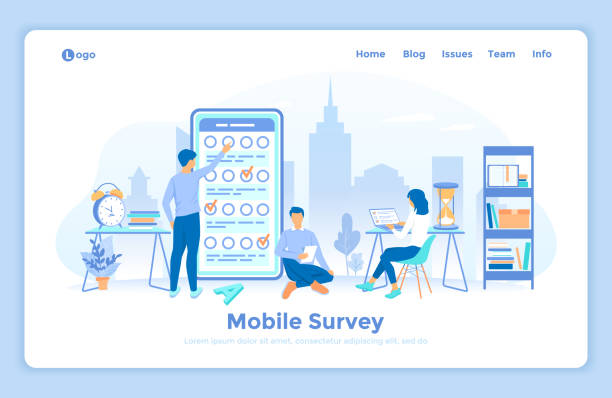
Introduction to the Importance of Responsive Website Design

In today’s world, where various devices with different screen sizes, from smartphones to tablets and desktops, are used to access the internet, #Responsive_Website_Design is no longer a luxury option, but an unavoidable necessity.
Users expect websites to display correctly and provide a seamless user experience regardless of the device they use.
This need has significantly increased the importance of responsive web design.
The goal of this type of design is to create websites that can intelligently adapt their layout and content to the user’s screen size.
This explanatory approach not only helps improve user experience but also plays a key role in the online success of businesses.
A website that is not well-optimized for various devices will disappoint its users and have a high bounce rate.
From an SEO perspective, Google and other search engines prioritize responsive websites and rank them higher in search results because these websites provide a better user experience.
In the rest of this article, we will delve deeper into the principles, benefits, challenges, and future of responsive website design.
This guide will be a complete educational and specialized resource for anyone looking to enhance their online presence.
Adaptive websites are the heart of the modern web, and a deep understanding of them is essential for every developer and business owner.
Are you worried about losing customers because you don’t have a professional e-commerce site?
With e-commerce website design by Rasaweb, forget these worries!
✅ Significant increase in sales and visitor-to-customer conversion rate
✅ Professional and user-friendly design that builds customer trust
⚡ Get free consultation from Rasaweb
Fundamental Principles of Responsive Design

#Principles_of_Responsive_Design are based on three main pillars: Fluid Grids, Flexible Images, and Media Queries.
These three elements work together to ensure that your website’s content is displayed beautifully and functionally on any device.
Fluid Grids use relative units like percentages instead of fixed pixel units to define the width of columns and elements.
This allows your website’s layout to automatically change with the screen dimensions.
Flexible Images mean that images must also be able to resize themselves to prevent overflow or excessive shrinking on different devices.
This is usually done by setting the `max-width: 100%` property for images in CSS.
Media Queries are the heart of responsive website design.
They allow developers to apply different CSS rules based on device characteristics, such as screen width, height, orientation, and screen type (print, screen, etc.).
For example, you can define that on screens with a width less than 768 pixels, the navigation menu turns into a hamburger icon.
A deep understanding of these principles is vital for anyone planning to build an efficient responsive website.
This educational and specialized section provides the necessary foundations for entering the world of responsive website design and helps you build websites that perform flawlessly in any environment.
Why Your Business Needs a Responsive Website
#The_Importance_of_Responsive_Website_Design_for_Businesses goes beyond a web design trend; it is a strategic investment for your digital future.
In an era where mobile usage for internet access has surpassed desktop, not having a responsive website means losing a large segment of potential customers.
A website that is not well-adapted to all devices not only provides a poor user experience but also harms your brand’s credibility.
The benefits of having a responsive website design include increased conversion rates, improved SEO, reduced maintenance costs, and increased accessibility.
With a single website that works correctly everywhere, there is no longer a need to maintain multiple separate versions (e.g., a desktop version and a mobile version) that significantly reduces costs and management time.
This analytical and guidance section aims to show you how an adaptive website can help your business grow.
A thought-provoking question arises here: Did you know that websites not optimized for mobile might be penalized by Google and ranked lower in search results? This is a crucial factor for your business.
| Benefit | Explanation |
|---|---|
| Improved User Experience | Users will be satisfied with your website on any device. |
| Improved SEO and Google Ranking | Google promotes responsive websites in search results. |
| Reduced Maintenance Costs | One codebase for all devices makes management easier. |
| Increased Conversion Rate | Better user experience leads to increased sales and engagement. |
| Wider Accessibility | Coverage for all devices and users, without limitations. |

Key Techniques and Tools in Responsive Website Design

#Responsive_Design_Techniques and available tools have made the implementation process of responsive website design easier for developers.
In addition to the fundamental principles mentioned earlier, there are more advanced techniques that help improve performance and user experience.
One of the most important of these techniques is “Mobile-First.”
In this approach, design and development begin first for the smallest screen (usually mobile) and then gradually scale up for larger screens.
This method ensures that your website is optimized for mobile from the outset and performs better on mobile devices.
Using CSS frameworks like Bootstrap or Foundation can also significantly accelerate the responsive website design process.
These frameworks provide ready-made components and responsive grid systems, automating many adaptability tasks.
Browser Developer Tools also play a vital role in testing and debugging responsive design.
Using these tools, you can easily simulate your website in various screen dimensions and identify and resolve issues.
This specialized and guidance section helps developers get acquainted with the latest and most efficient methods in adaptive website design.
Understanding these tools and techniques is essential for anyone looking to build modern and efficient websites.
Are you worried about your e-commerce site’s low conversion rate and not achieving your desired sales?
Rasaweb is your specialized solution for a successful e-commerce site.
✅ Significant increase in conversion rate and sales
✅ Professional and user-friendly design to gain customer satisfaction
⚡ Ready for an online sales transformation? Get a free consultation!
User Experience and Responsive Design

#User_Experience_in_Responsive_Design is at the heart of a responsive website’s success.
The ultimate goal of responsive website design is to provide a flawless and seamless user experience (UX) across all devices.
This means that not only should the website’s appearance be correctly displayed across various screen dimensions, but interacting with it should also be easy and enjoyable.
Navigation elements, forms, and buttons should be designed to be easily usable on touchscreens, and content should be displayed legibly without the need for frequent zooming.
Optimizing loading speed is also an important part of the user experience.
Mobile users often have access to slower internet speeds, so responsive websites should be lightweight and load quickly.
Using optimized images, clean coding, and file compression are among the solutions that help improve loading speed.
A thought-provoking question arises here: Did you know that even a few seconds’ delay in page loading can lead to losing a significant portion of visitors? This is a key fact in responsive website design.
Responsive design is not just about changing layouts; it means a complete rethinking of how users interact with your content.
This explanatory and analytical section helps designers and developers build truly user-friendly and adaptive websites with a deeper understanding of user needs.
This comprehensive view of UX in responsive design is crucial.
SEO Optimization with Responsive Websites

#SEO_and_Responsive_Website_Design are closely intertwined.
Search engines, especially Google, prefer responsive websites over separate mobile and desktop websites.
The reason for this is that a responsive website has only one URL and one HTML, which makes crawling and indexing easier for search engine robots.
This prevents issues of duplicate content and complexities related to managing multiple versions of the website.
Google has explicitly stated that Mobile-Friendliness is an important ranking factor.
Websites that are well-optimized for mobile appear higher in mobile search results.
This means that if your website is not responsive, you might fall behind competitors who have this feature.
Furthermore, page loading speed, which is an important UX factor in responsive design, directly affects SEO.
Faster websites achieve better rankings.
Using appropriate viewport tags, optimizing images and CSS, and compressing files all help improve SEO in adaptive websites.
This analytical and specialized section demonstrates the strategic importance of responsive website design for SEO success and helps you attract more organic traffic.
Google’s recommendations for mobile-friendliness are the best guide in this area.
Click here to preview your posts with PRO themes ››
Challenges and Solutions in Responsive Website Design

#Challenges_of_Responsive_Design and their solutions are a topic that every designer and developer encounters when working with responsive website design.
Despite numerous benefits, its correct implementation can have complexities.
One of the biggest challenges is content management across different screen dimensions.
Sometimes, content that displays well on desktop occupies too much space or becomes unreadable on mobile.
The solution to this problem is a “Content-First” approach; first think about the content, and then shape the design based on it.
Loading speed, especially on mobile devices, is another challenge.
High-quality images, heavy scripts, and excessive CSS can severely slow down the site.
Solutions include image optimization (such as using next-gen formats like WebP), Lazy Loading for images and videos, code compression, and using a CDN (Content Delivery Network).
Testing and debugging across different devices and browsers can also be time-consuming.
Browser simulation tools and actual tests on physical devices are essential to ensure proper functioning.
This explanatory and guidance section aims to show you how you can face common challenges in responsive website design and find practical solutions for them.
A thought-provoking question: Did you know that some of these challenges can turn into opportunities for innovation?
| Challenge | Solution |
|---|---|
| Complex Content Management | Content-first design, information prioritization. |
| Slow Loading Speed | Image optimization, code compression, Lazy Loading. |
| Cross-device Testing and Debugging | Using DevTools, testing on real devices, BrowserStack. |
| Correct Breakpoint Selection | Based on content, not specific devices. |
| CSS/JavaScript Code Complexity | Using CSS methodologies (BEM, OOCSS), frameworks. |
The Future of Responsive Web Design and New Trends

#The_Future_of_Responsive_Design is rapidly evolving, and with the emergence of new technologies, responsive website design is also undergoing changes and developments.
One significant trend is Advanced Adaptive Design, which alongside responsive design, allows for a more personalized user experience.
While responsive design adjusts based on screen size, adaptive design can change content based on other characteristics such as internet connection speed, location, and even user behavior.
The use of Artificial Intelligence (AI) and Machine Learning (ML) in optimizing and personalizing user experience on responsive websites is also increasing.
These technologies can automatically adjust layouts, images, and even textual content based on user preferences and usage patterns.
Furthermore, with the advent of wearable devices and the Internet of Things (IoT), responsive web design must be prepared for diverse environments.
Focusing on Inclusive UX and Accessibility is also of paramount importance to ensure that websites are accessible to everyone, regardless of their abilities.
This news and analytical section forecasts future trends in adaptive web design and helps developers prepare for the future of the web.
A thought-provoking question: Is your website ready for a future world full of connected devices?
Are you dissatisfied with your e-commerce site’s low sales?
Rasaweb is your solution for having a professional and high-selling e-commerce site.
✅ Significant increase in sales and revenue
✅ Easy and enjoyable shopping experience for customers
⚡ Get a free consultation from Rasaweb now!
Comparing Responsive Website Design with Other Approaches

#Comparing_Responsive_Design with other mobile design approaches helps in better understanding the pros and cons of each.
Before the widespread adoption of responsive website design, other approaches like “separate mobile websites” and “traditional adaptive design” were used.
Separate mobile websites (like m.example.com) involved building a completely separate version of the website for mobile devices.
This method allowed for precise control over the mobile user experience but came with disadvantages such as increased development and maintenance costs, SEO issues (duplicate content), and the need to manage two separate codebases.
Responsive website design solves these problems by having only one codebase and one URL.
Traditional Adaptive Web Design is also an approach that changes content based on specific breakpoints, but unlike responsive design, which is based on fluid grids, it provides fixed, predefined layout versions for specific devices.
This approach offers less flexibility than responsive website design, as a separate layout must be designed for each popular screen size.
This analytical and explanatory section helps you understand the key differences between these approaches and choose the best option for your project.
Currently, responsive website design is recognized as the standard and recommended method due to its flexibility, efficiency, and SEO benefits.
Click here to preview your posts with PRO themes ››
Step-by-Step Tutorial for Responsive Website Design for Beginners

#Responsive_Design_Tutorial for beginners can be a fun yet challenging path.
This educational and guidance section aims to familiarize you with the basic steps of building a responsive website.
Step One: Add the Viewport tag.
This tag tells the browser to set the page dimensions based on the user’s device dimensions.
Place it in the `
<meta name="viewport" content="width=device-width, initial-scale=1.0">
Step Two: Use relative units for layout.
Instead of fixed pixels, use percentages or `em`/`rem` for element widths.
For example:
.container { width: 90%; margin: 0 auto; }
Step Three: Optimize images.
Make images flexible so they scale with their container:
img { max-width: 100%; height: auto; display: block; }
Step Four: Use Media Queries.
This is the most important part of responsive website design.
You can apply specific CSS rules for different screen sizes:
@media (max-width: 768px) {

    /* Styles for tablets and smaller screens */

    nav ul {

        flex-direction: column;

    }

}

@media (max-width: 480px) {

    /* Styles for mobile phones */

    h1 {

        font-size: 1.5em;

    }

}
Step Five: Continuous testing.
Test your website in different browsers and with developer tools.
This step-by-step exercise will help you on your path to becoming a professional responsive website designer.
Get started and enjoy the results of your responsive website design!
Frequently Asked Questions
| Question | Answer |
|---|---|
| What is Responsive Website Design? | It is a web design approach that ensures a website displays correctly across various screen sizes (such as mobile, tablet, desktop) and its layout adapts to the user’s screen size. |
| Why is Responsive Design important? | Given the widespread use of different devices to access the internet, responsive design provides a consistent user experience for all users, reduces website bounce rate, and improves website SEO. |
| How is Responsive Design implemented? | This type of design is often implemented using CSS3 Media Queries, Flexible Grids, and Flexible Images. |
| What are the main components of Responsive Design? | They include Media Queries for applying different styles based on device characteristics, using relative units (like percentages and em) for sizes and layout, and employing flexible images and media whose dimensions change proportionally to the available space. |
| What are the main benefits of using Responsive Design? | Improved user experience, reduced development and maintenance costs (compared to having separate versions for mobile and desktop), improved ranking in search engines (as Google prefers it), and increased website accessibility for all users. |
And other services of Rasaweb Advertising Agency in the field of advertising
Smart Conversion Rate Optimization: A professional solution for user engagement focusing on marketing automation.
Smart Marketplace: A professional solution for increasing sales by focusing on optimizing key pages.
Smart Sales Automation: An innovative service for enhancing digital branding through user experience customization.
Smart Marketplace: A professional solution for digital branding with a focus on intelligent data analysis.
Smart Conversion Rate Optimization: Designed for businesses seeking to improve SEO ranking through precise audience targeting.
And over hundreds of other services in the field of internet advertising, advertising consultation, and organizational solutions
Internet Advertising | Advertising Strategy | Advertorial
Resources
- Responsive Web Design Guide at Iran IT
- Responsive Design Tutorial at WebDesign
- Importance of Responsive Site at Tarahsazan
- What is Responsive Design? at Alborz Web
❓ Rasaweb Afarin Digital Marketing Agency is your companion and guide on the challenging path of the digital world. By providing services such as website design with a modern user interface, professional SEO, and specialized content creation, we elevate your business to its peak and establish a powerful online presence for you.
📍 Tehran, Mirdamad Street, next to Central Bank, Southern Kazeroun Alley, Ramin Alley, No. 6

