
Introduction to Responsive Website Design and its Importance
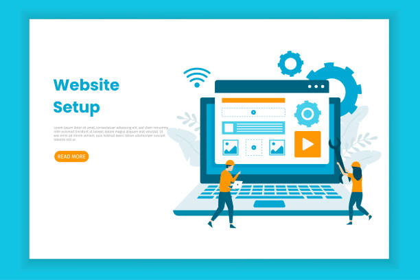
In today’s world, where users access the internet from a variety of devices, #Responsive_Website_Design is no longer a luxury option, but an undeniable necessity.
This approach in #Web_Design means that your website automatically adjusts its layout and content to the screen size of the user’s device (from large desktops to tablets and smartphones) to provide the best possible user experience.
The importance of this issue has doubled due to the significant increase in mobile web browsing and the policies of search engines like Google, which place a strong emphasis on mobile compatibility.
A #Responsive website not only makes information more accessible to users but also significantly helps improve SEO and reduce bounce rates.
Responsive website design allows businesses to have an effective presence on all platforms with a single development effort, preventing content scattering and additional costs.
This concept goes beyond merely resizing images or fonts; it means intelligently redesigning the visual and functional components of the site to ensure optimal performance in all conditions.
Are you unhappy with the low conversion rate of visitors to customers on your e-commerce site?
Solve this problem forever with professional e-commerce website design by Rasawab!
✅ Increase visitor-to-customer conversion rate
✅ Create an excellent user experience and build customer trust
⚡ Get free consultation
Core Principles of Responsive Design

To deeply understand responsive website design, we must become familiar with its three basic principles: Fluid Grids, Flexible Images, and Media Queries.
Fluid grids use relative units like percentages for element widths instead of fixed pixels.
This approach ensures that the website layout continuously and smoothly adapts to screen size changes.
For example, if a column occupies 20% of the page width, it will always be 20% of the width, regardless of screen size.
Flexible images, by using properties like max-width: 100% in CSS, ensure that images never overflow their container and are always displayed in appropriate dimensions.
This prevents unwanted horizontal scrollbars and ensures faster page loading on mobile devices.
Media queries are the most important tool in responsive design.
These CSS commands allow you to apply specific styles based on device characteristics (such as screen width, height, orientation, and resolution).
For instance, you can define that on screens smaller than 600 pixels, the navigation menu appears as a hamburger button instead of horizontally, or that column layouts change from two columns to one.
This combination of principles gives designers incredible power to provide an optimal and personalized experience for every user, regardless of the device they use.
These three pillars are the main foundations of any responsive website design project.
Common Tools and Frameworks in Responsive Design
Implementing responsive website design is facilitated by numerous tools and frameworks, each with its unique features and benefits.
One of the most popular and well-known frameworks is Bootstrap.
Bootstrap includes a collection of HTML and CSS-based design templates for typography, forms, buttons, tables, navigation, and other user interface elements, as well as optional JavaScript plugins.
Using Bootstrap can significantly increase development speed, as many common components are pre-built and responsive.
In addition to Bootstrap, frameworks like Foundation are also powerful options that offer greater flexibility for designers and adopt a “mobile-first” approach.
Alongside frameworks, native CSS technologies such as CSS Grid and Flexbox have revolutionized how elements are laid out on web pages.
Flexbox is very powerful for one-dimensional layouts (a single row or column), and Grid is excellent for two-dimensional layouts (rows and columns simultaneously).
These technologies enable the implementation of complex and fully responsive designs without the need for large frameworks, giving web designers much greater control over layout.
The choice between these tools depends on the project’s complexity, the need for development speed, and the level of control required over the design.
Ultimately, whatever tool is chosen, the final goal is to provide an unparalleled user experience through responsive website design.
| Framework/Technology | Advantages | Disadvantages | Recommended Use Cases |
|---|---|---|---|
| Bootstrap | Quick start, ready components, large community, excellent documentation | Relatively high file size, generic look | Quick projects, MVP (Minimum Viable Product), prototyping |
| Foundation | High flexibility, mobile-first approach, email compatibility | More complex than Bootstrap for beginners | Custom projects requiring high flexibility |
| CSS Flexbox | Excellent control over one-dimensional layout, alignment and space distribution | Not suitable for complex two-dimensional layouts | Navigation bars, aligning items in a row/column |
| CSS Grid | Excellent control over two-dimensional layout (rows and columns), overall page structure | May be complex for simple one-dimensional layouts | Overall page structure (Layout), image galleries |
User Experience in Responsive Website Design

User Experience (UX) plays a vital role in responsive website design.
The main goal is to provide a consistent and enjoyable experience for the user, regardless of screen dimensions.
This means that not only should the site’s appearance change, but its functionality and interactivity must also be appropriate for the device.
For example, buttons and links on touch devices should be large enough to be easily tappable (a minimum of 44×44 pixels is recommended), while on desktops, they might have a smaller size.
Also, site navigation should be simpler and more accessible on mobile devices; often displayed as a hamburger menu or more condensed options.
Content prioritization is also an important part of UX in responsive website design.
On small screens, space is limited, so the most important information must be displayed first and clearly.
Secondary content may be moved to lower sections or made accessible through “more” options.
Furthermore, site loading speed directly impacts user experience, especially on mobile devices with slower internet connections.
Therefore, optimizing images, reducing CSS and JavaScript codes, and using a CDN (Content Delivery Network) are among the measures that should be considered.
A good responsive design not only visually adapts the site but also intelligently improves the user’s interaction experience with the content, ensuring that users can easily achieve their goals on any device.
Are you worried that your company’s old website will drive away new customers? Rasawab solves this problem with modern and efficient corporate website design.
✅ Increases your brand’s credibility.
✅ Helps attract targeted customers.
⚡ Contact Rasawab for a free consultation!
SEO and Responsive Website Design: An Inseparable Connection

The relationship between responsive website design and Search Engine Optimization (SEO) is very deep and vital.
Since 2015, Google, with the introduction of the “Mobilegeddon” algorithm and then with the “Mobile-First Indexing” approach, has placed special emphasis on the importance of website compatibility with mobile devices.
This means that Google primarily uses the mobile version of your website for evaluation and ranking.
Therefore, if your site is not properly responsive, you will likely face a drop in search results rankings.
A responsive website has only one URL for all devices, which makes it easier for Google and other search engines to crawl and index your site.
In contrast, separate designs for mobile (m.example.com) can lead to duplicate content issues and crawling complexities.
Furthermore, page loading speed, which is an important factor in SEO ranking, is optimized on responsive sites, especially when combined with image and code optimization techniques.
Lower bounce rates and longer user dwell times on the site, which are results of a good user experience in responsive design, also send positive signals to search engines.
In summary, responsive website design is a key and mandatory element not only for users but also for success in SEO strategies, helping you achieve a better position in the competitive digital space.
Challenges of Implementing Responsive Design

Despite the many advantages of responsive website design, its implementation is not without challenges.
One of the biggest obstacles is website performance, especially on mobile devices.
If images are not properly optimized or CSS and JavaScript codes are too heavy, the site can load very slowly on smartphones.
This problem, especially in areas with slower internet speeds, severely degrades the user experience and can lead to high bounce rates.
Developers must consider precise strategies for Lazy Loading images, code compression, and the use of next-generation image formats.
Another challenge is testing and ensuring compatibility across a wide range of devices and browsers.
Given the countless varieties of screen sizes, operating systems, and browsers, ensuring correct site display on all of them is a complex and time-consuming task.
This requires the use of Emulators, physical devices, and cloud testing platforms.
Also, managing content for display across different sizes can be challenging; sometimes a table or a complex form that looks great on a desktop gets messed up on a mobile screen and requires specific approaches for responsive display.
However, with careful planning, the use of best practices and appropriate tools, these challenges can be overcome, and a successful and efficient responsive website design can be implemented.
Successful Case Study in Responsive Design

To illustrate the importance and effectiveness of responsive website design, let’s examine a successful example.
The website of The New York Times is one of the best examples in this regard.
This website not only provides an unparalleled user experience on desktop but is also extraordinarily accessible and readable on mobile devices.
The designers and developers of The New York Times, using advanced responsive design techniques, have ensured that their extensive news content is displayed in the best possible way, whether on a large monitor or a small smartphone.
They have utilized fluid grids, flexible images, and intelligent use of Media Queries to adapt page layouts to screen size.
For example, on smaller screens, news columns transform into a single column, font sizes are adjusted, and site navigation changes to a condensed hamburger menu.
Optimized images are loaded only when needed to maintain site speed.
This approach has enabled The New York Times to attract millions of mobile users and become one of the leading news sources in the digital world.
This case demonstrates that investing in responsive website design is not just a technical measure, but a successful business strategy for retaining and expanding an audience, and how a seamless user experience can play a vital role in the success of a digital platform.
| Factor | Explanation | Importance in Responsive Design |
|---|---|---|
| Page Load Speed | Time required to display full page content | Crucial for mobile users and SEO. Optimized images, compressed CSS/JS |
| Bounce Rate | Percentage of visitors who view only one page and leave | Poor user experience on a specific device increases it |
| Avg. Session Duration |
Amount of time a user spends on the site | A responsive and user-friendly site increases dwell time |
| Mobile Traffic | Percentage of visitors using mobile devices | Indicates an urgent need for responsive website design |
The Future of Responsive Web Design

The future of responsive website design is moving towards evolution and adaptation to new technologies.
While its core principles will remain, new approaches like Progressive Web Apps (PWAs) and Adaptive Design will play a more prominent role.
PWAs elevate the user experience to a new level by offering capabilities similar to native applications, such as offline access, push notifications, and installation on the home screen.
These technologies complement responsive website design and help it to be optimal not only across different dimensions but also under various network conditions.
Furthermore, with the advent of new devices such as smartwatches, wearables, and even curved or foldable screens, the concept of “responsiveness” will go beyond mere screen width.
Designers must consider designs that adapt not only to dimensions but also to the shape and manner of user interaction with these novel devices.
Artificial intelligence and machine learning can also play a role in the future in automatically optimizing layouts and content based on user behavior and preferences.
These developments show that responsive website design is not a static concept but a dynamic approach that is constantly changing and improving to keep pace with user needs and technological advancements.
Is your current e-commerce website design causing you to lose customers and sales?
Rasawab is your solution with modern and user-friendly e-commerce website designs!
✅ Significantly increase conversion rates and sales
✅ Create strong branding and build customer trust
⚡ Get a free e-commerce website design consultation from Rasawab!
Golden Tips for Beginner Web Designers

For beginner web designers who intend to enter the world of responsive website design, adhering to a few key tips can smooth the learning and implementation path.
First and foremost, internalize the “Mobile-First” mindset.
This means starting your design from the smallest screens and then gradually moving towards larger screens.
This approach helps you focus on core content and essential functionality, avoiding the addition of unnecessary details that can make the site heavy.
Second, become thoroughly familiar with Flexbox and CSS Grid.
These two powerful CSS technologies are your primary tools for creating flexible and complex layouts.
Extensive practice with them will increase your mastery.
Third, always use browser Developer Tools to test your designs across different sizes.
These tools allow for simulating various devices and help you quickly identify and fix issues.
Fourth, take image optimization seriously.
Large and unoptimized images can severely slow down site loading speed.
Use appropriate image formats and compression techniques.
Finally, always be ready to learn and adapt.
The web world is constantly changing, and responsive website design is no exception.
Continuous study, following the latest trends, and practical exercises will lead you to success on this path.
Conclusion and Next Steps in Modern Web Design

As discussed in this article, responsive website design is more than a trend; it’s a fundamental standard in the modern web world.
This approach allows businesses to reach a wide range of users with diverse devices through a single strategy.
Its benefits range from improved user experience and increased conversion rates to enhanced search engine rankings.
Understanding the basic principles, using appropriate tools, and being prepared for challenges are essential for success in this field.
For designers and developers, mastering responsive website design is not only a valuable skill but a necessity to remain competitive.
Given the growing use of mobile devices and the emergence of new technologies, the future of the web is moving towards more integrated and flexible user experiences.
Therefore, the next step for businesses and web professionals is to invest more in this area and continuously update their knowledge and tools.
Fully embracing this approach and going beyond the minimums will keep your website resilient and efficient for years to come, providing immense growth potential for your digital presence.
Responsive website design is the key to success in today’s and tomorrow’s online ecosystem.
Frequently Asked Questions
| Question | Answer |
|---|---|
| What is responsive website design? | A method in web design that automatically adjusts and optimizes the layout and content of a site for display on various devices (mobile, tablet, desktop). |
| Why is responsive design important? | Due to the variety of devices users employ to access the web; better user experience, stronger SEO, and reduced bounce rate are its advantages. |
| What are the main techniques in responsive design? | Using Media Queries in CSS, Fluid Grids, and Flexible Images. |
| What is a Media Query? | A CSS rule that allows you to apply different styles based on device characteristics (such as screen width, height, orientation). |
| Is responsive design different from Mobile-First design? | Mobile-First is an approach within responsive design that initially designs the site for the smallest screen (mobile) and then gradually improves it for larger screens. |
And other advertising agency services by Rasaweb in the field of advertising
Smart Sales Automation: A fast and efficient solution for online growth with a focus on marketing automation.
Smart Digital Branding: A fast and efficient solution for increasing sales with a focus on intelligent data analysis.
Smart Direct Marketing: An effective tool for increasing sales with the help of marketing automation.
Smart Digital Advertising: Professional optimization for user engagement using attractive user interface design.
Smart Conversion Rate Optimization: A new service to increase sales through Google Ads management.
And over hundreds of other services in the field of internet advertising, advertising consultation, and organizational solutions
Internet Advertising | Advertising Strategy | Advertorials
Resources
Comprehensive Guide to Responsive Design in Websima, Benefits of Responsive Websites from Iranian Host’s Perspective, Web Design for Modern Businesses in Rayasite, SEO and Responsive Design in Hamyarweb
? To reach the peak in the digital world and experience fast website design and targeted, join Rasaweb Afarin Digital Marketing Agency.
📍 Tehran, Mirdamad Street, next to Bank Markazi, Kazerun Jonubi Alley, Ramin Alley, No. 6


