
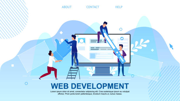
What is an Introduction to Responsive Web Design?
#Responsive_Web_Design is a critical approach to website development that ensures your website displays optimally and provides a consistent user experience on any device, from large desktop computers to small tablets and smartphones.
In the past, developers had to create separate versions of a website for each screen size or device, which was both time-consuming and costly.
However, with the advent of responsiveness, this problem was significantly solved.
The main goal of responsive design is to create a single website that, with high flexibility, adapts itself to the user’s screen size and orientation.
This is achieved through the use of Media Queries in CSS, flexible grids, and adjustable images.
In fact, content, images, and page layouts are adjusted to display correctly without the need for manual changes by the user or developer.
This technique makes websites not only visually appealing but also highly functional, facilitating access to information for all users, regardless of the device they are using.
In today’s world, where device diversity is growing daily, the importance of responsive web design has become more evident and has turned into an industry standard.
Is your e-commerce site ready to attract maximum customers and increase sales? Rasawweb transforms your online business with modern and efficient e-commerce website designs.
✅ Increased speed and improved SEO
✅ Excellent user experience on mobile and desktop⚡ Get a free consultation for e-commerce website design from Rasawweb!
Why is Responsive Design Crucial Today?

#The_Importance_of_Responsive_Design in today’s digital age is no longer an option, but an undeniable necessity.
Given the significant increase in mobile device usage for internet access, having a website that displays correctly on all these devices is vital.
Statistics show that a significant portion of web traffic comes from smartphones and tablets, and this trend continues to grow.
If your website is not optimized for mobile devices, mobile users will face issues such as unwanted horizontal scrolling, tiny buttons, and unreadable text, which quickly leads to them leaving the site and a negative user experience.
This not only leads to a high bounce rate for your site but also receives negative points from search engines like Google.
Google has announced for years that responsive web design is an important factor in SEO ranking, and websites optimized for mobile perform better in mobile search results.
This approach means providing a seamless and optimized user experience for all visitors, regardless of their device’s screen size.
Furthermore, maintaining and updating a responsive website is much simpler and less costly than maintaining several separate versions of a website, which is a big advantage for businesses.
Therefore, investing in responsive web design means investing in the future of your business and ensuring an effective online presence.
Foundational Principles and Techniques of Responsive Design

#Foundational_Principles_of_Responsive_Design are built upon three main pillars, each playing a crucial role in creating a consistent and device-compatible user experience.
The first pillar is Fluid Grids.
Instead of using fixed pixel units for element widths, relative units like percentages are used.
This means that the width of page elements changes based on the device’s screen size, adapting to it so that the page layout always remains proportionate and readable.
The second pillar is Flexible Images.
Images and videos should be coded to resize proportionally to their parent container to prevent overflowing the page or appearing excessively large.
This is often done using CSS properties like `max-width: 100%;` for images.
And finally, the most important pillar is Media Queries.
This CSS feature allows developers to apply different styles based on device characteristics such as screen width, height, orientation (portrait or landscape), and even resolution.
For example, you can define rules that transform the navigation menu into a hamburger icon or reduce font sizes when the screen width is less than 768 pixels.
These three principles together enable responsive web design and allow a website to intelligently adapt to various display environments.
Understanding and correctly implementing these principles is essential for any developer intending to build modern and efficient websites.
| Feature | Responsive Design | Adaptive Design | Fixed Design |
|---|---|---|---|
| Number of Site Versions | One single, flexible version | Several fixed versions for specific sizes | One fixed version for all devices |
| Layout Change Mechanism | Fluid and continuous with screen resizing | Jumping between predefined breakpoints | No change, requires horizontal scrolling |
| Implementation Complexity | Medium to High | High (requires managing multiple layouts) | Low |
| User Experience | Excellent and consistent across all devices | Good, but may be uneven between breakpoints | Poor on small and large devices |
| Maintenance | Medium, one codebase for all | High, requires managing multiple codebases | Low |

Mobile-First Approach in Web Design

#Mobile_First_Approach is one of the most important developments in the world of responsive web design that has fundamentally changed how web developers think and plan.
In the past, designers would first design for desktop and then try to adapt it for smaller devices, often leading to performance issues and poor mobile user experience.
But the Mobile-First approach does the exact opposite: the design and development process begins with the smallest possible screen (usually smartphones).
This approach means focusing on essential content and functionalities and eliminating any extra or complex elements that might disrupt the mobile user experience.
By doing so, developers are forced to think about the minimum necessary features and content, which often results in a lighter, faster, and better-performing website.
After ensuring excellent performance and proper appearance on mobile, gradually more complex features, layouts, and styles are added for tablets and desktops.
This process often uses Media Queries, which allow applying specific styles for larger screen sizes.
The advantages of this approach are numerous: improved site performance on mobile, better optimization for search engines (which greatly value mobile-friendly websites), and ensuring an excellent user experience for a large portion of web traffic.
This method not only helps produce better websites for mobile devices but also makes responsive web design generally more efficient and logical.
Are you tired of your e-commerce site having visitors but no sales? Rasawweb solves your main problem with professional e-commerce website design!
✅ Significant increase in sales with targeted design
✅ Flawless user experience for your customers⚡ Get a free consultation!
Challenges and Solutions in Responsive Web Design

#Responsive_Design_Challenges are numerous and often go beyond just correct coding.
One of the biggest challenges is content management.
Sometimes, content designed for display on a large desktop screen loses its readability or appeal on a small mobile screen.
The solution is to think from the beginning about how content will display on different sizes and even consider different content for specific sizes (though with caution to avoid SEO issues).
Another challenge is high-quality images.
Large images can increase site loading time on mobile devices with slow internet.
Using responsive images (with the `<picture>` tag or `srcset` attribute in `<img>`) that provide different versions of an image for various screen sizes is an effective solution.
Also, Performance is a serious concern.
Responsive websites must not only look good but also load quickly.
Optimizing CSS and JavaScript code, compressing resources, and using a CDN (Content Delivery Network) can help improve performance.
Testing and debugging can also be complex, as it requires testing on a large number of devices and browsers.
Using simulators, browser developer tools, and online testing tools is essential.
Finally, navigation design for mobile is often a challenge; traditional desktop menus don’t work on mobile.
Using common patterns like the hamburger menu or bottom navigation menu are solutions that improve user experience on small devices.
By recognizing these challenges and applying appropriate solutions, a successful and efficient responsive web design can be implemented.
Popular Tools and Frameworks for Responsive Design

#Tools_and_Frameworks play a very important role in simplifying and accelerating the responsive web design process.
Today, developers have many options, each with its own advantages and features.
One of the most popular and well-known frameworks is Bootstrap.
This CSS, HTML, and JavaScript framework offers a rich set of ready-made components such as forms, buttons, navigation menus, and a powerful grid system that are responsive by default.
Bootstrap is the first choice for many developers due to its excellent documentation and large user community.
Another is Foundation, which, similar to Bootstrap, is an advanced and flexible framework for building responsive websites and mobile web applications.
Foundation is particularly suitable for larger and more complex projects that require more design flexibility.
Beyond complete frameworks, CSS libraries like Tailwind CSS have also gained significant popularity.
Tailwind takes a different approach, and instead of providing predefined components, it offers an extensive set of utility classes that allow the developer to build the design from scratch and have more control over styling.
Also, helper tools like Chrome DevTools with its ability to simulate various devices, and testing platforms like BrowserStack, are essential for testing and ensuring the correctness of responsive web design in different environments.
The choice of the right tool depends on the project’s complexity, the development team’s preferences, and the available timeline, but all these tools are designed to facilitate and improve the quality of responsive websites.

Click here to preview your posts with PRO themes ››
The Future of Responsive Design and New Trends

#The_Future_of_Responsive_Design is constantly evolving, and with advancements in web technologies, new trends emerge that improve the responsive web design process.
One of the most prominent advancements is the widespread use of CSS Grid Layout and Flexbox.
These two CSS modules provide powerful tools for page layout that are much more flexible and efficient than older methods (like floating elements) and allow for building complex and responsive layouts with less code.
While Flexbox is excellent for arranging elements in one dimension (row or column), Grid Layout allows developers to implement two-dimensional designs with high precision, which is essential for modern websites.
Another trend is Container Queries, which allow developers to apply styles based on the size of an element’s parent container, not just the entire viewport.
This capability provides a new level of responsiveness and makes designing independent and reusable components much simpler.
Also, the focus on Web Performance Optimization (WPO) and Google’s Core Web Vitals indicates that site speed and efficiency are as important as its appearance.
Developers are looking for ways to load pages faster, even on mobile devices with slow internet connections.
Techniques such as Lazy Loading of images and videos, font optimization, and using Service Workers for resource caching are among the important methods in this area.
With these advancements, responsive web design is moving towards greater intelligence and efficiency, to provide an unparalleled experience for users anytime, anywhere.
| Tool/Technique | Description | Primary Use |
|---|---|---|
| CSS Grid Layout | Two-dimensional layout system for web pages. | Designing complex and fully responsive layouts. |
| Flexbox | One-dimensional layout system for distributing space and aligning items. | Arranging elements in a row or column, building components. |
| Container Queries | Applying styles based on the size of the parent container, not the viewport. | Building independent and reusable components. |
| Lazy Loading | Loading images and videos only when they are in the user’s viewport. | Increasing initial page load speed and optimizing performance. |
| WebP/AVIF Images | New image formats with better compression and high quality. | Reducing image size and improving loading speed. |
Impact of Responsive Design on SEO and Google Ranking

#Impact_of_Responsive_Design_on_SEO is a critical aspect that every website owner and digital marketer must pay attention to.
Google, as the world’s largest search engine, has adopted a Mobile-First Indexing approach for years.
This means that Google primarily looks at the mobile version of a website when ranking pages.
If your website has a responsive web design, meaning a single codebase for all devices, Google can easily crawl and index your content.
This means Google processes only one version of your site, which simplifies and streamlines the indexing process and prevents duplicate content issues that can occur on sites with separate mobile and desktop versions.
Furthermore, the improved user experience that responsive web design provides directly impacts SEO metrics such as bounce rate and user dwell time on the site.
When users can easily navigate your site and consume content, they are more likely to stay on the site longer and visit more pages.
These signals are very positive for Google and can improve your site’s ranking.
Finally, given that a large portion of searches today are conducted via mobile devices, having a responsive website helps you reach this large audience and avoid missing out on traffic and conversion opportunities.
In summary, responsive web design is an essential investment for any business that wants to be visible in search results and remain competitive.
Research shows 80% of customers trust companies with a professional website more. Does your current site inspire this trust?
With Rasawweb’s corporate website design services, solve the problem of customer distrust and a weak online image forever!
✅ Create a professional image and increase customer trust
✅ Attract more sales leads and grow your business⚡ Get a free consultation
Key Tips for Successful Responsive Design Implementation

#Key_Implementation_Tips for successful responsive web design go beyond mere technical knowledge and include strategic approaches and best development practices.
The first tip is thorough planning from the start.
Decisions about the Mobile-First approach, choosing the right framework (if using one), and defining breakpoints for Media Queries should be made in the early stages of the project.
This prevents costly revisions in later stages.
The second tip is to focus on content.
Before making any design decisions, consider how your content should be displayed on different screen sizes.
Should some content be hidden on mobile? Should the order of elements change? These questions will help you correctly structure your HTML and CSS.
The third tip is image optimization.
Images can be one of the biggest obstacles to responsive site performance.
Using optimized images, Lazy Loading, and modern image formats like WebP is essential.
The fourth tip is continuous testing.
Regularly test your website on various devices, screen sizes, and browsers.
Use simulation tools and actual testing to ensure proper functioning in all scenarios.
The fifth tip is to pay attention to Performance.
Even a responsive website will provide a poor user experience if it loads slowly.
Code compression, minimizing HTTP requests, and using a CDN can help improve speed.
By following these tips, you can ensure that your responsive web design is not only beautiful but also efficient and user-friendly.
Click here to preview your posts with PRO themes ››
Frequently Asked Questions About Responsive Web Design

#Frequently_Asked_Questions_Responsive indicates ambiguities that many people may have about responsive web design.
One common question is: “Is responsive design the same as a separate mobile version?” The emphatic answer is no.
While both aim to improve mobile user experience, responsive web design uses a single codebase that intelligently adapts to screen size, whereas a separate mobile version (usually with an m.example.com subdomain) involves two completely separate websites, which are much more complex to maintain and manage.
Another question is: “Does responsive design negatively affect site speed?” Although some may think that loading extra code to support responsiveness causes slowness, in fact, with proper implementation and resource optimization, a responsive site can be very fast.
Using optimized images, Lazy Loading, and compressed CSS and JavaScript all contribute to loading speed.
It is even asked: “Can I still use fixed design?” Technically yes, but it is strongly not recommended.
In today’s mobile-first world, a fixed website provides a very poor user experience and suffers greatly in terms of SEO.
Responsive web design is the industry standard and essential for online success.
The last question is: “Is responsive design always the best solution?” In most cases, yes.
However, for very specific projects or web applications that require a completely different user experience on each device, other approaches such as Adaptive Design or even building a Native App might be considered.
But for typical and commercial websites, responsive web design is the best, most efficient, and most cost-effective option.
Frequently Asked Questions
| Question | Answer |
|---|---|
| What is responsive web design? | A web design method that ensures websites display well and are usable across various screen sizes (mobile, tablet, desktop). |
| Why is responsive design important? | Due to the increasing use of diverse devices with different screen sizes (such as mobile phones and tablets) by users to access websites. |
| What are the main technologies used in responsive design? | It uses techniques such as Media Queries in CSS, Flexible Grids, and Flexible Images. |
| What are the benefits of responsive design? | Provides a better user experience on all devices, improves site SEO, reduces maintenance costs (compared to having a separate site for mobile). |
| Is responsive design essential for all websites? | Mostly yes, as it ensures your site is accessible and functional for a wide range of users and the devices they use. |
And other services of Rasa Web advertising agency in the field of advertising
Smart Sales Automation: A combination of creativity and technology for campaign management through custom programming.
Hermart Brand Identity: Professional optimization for digital branding using Google Ads management.
Smart Marketing Automation: An effective tool to improve SEO ranking with precise audience targeting.
Smart UI/UX: A creative platform to improve customer behavior analysis with attractive user interface design.
Smart Digital Advertising: A novel service to increase user engagement through attractive user interface design.
And over hundreds of other services in the field of internet advertising, advertising consultation, and organizational solutions
Internet Advertising | Advertising Strategy | Advertorials
Resources
Responsive Web Design TutorialWhat is Responsive Design?How is Responsive Web Design?Comprehensive Guide to Responsive Design
? Are you ready to fly in the digital world? Rasawweb Afarin Digital Marketing Agency is your strategic partner for online growth and success. We elevate your business with services such as SEO, online advertising, and multilingual website design.
📍 Tehran, Mirdamad Street, next to Bank Markazi, Kazeroun Jonoubi Alley, Ramin Alley, No. 6


