
An Introduction to Responsive Web Design and Its Importance in the Digital Age

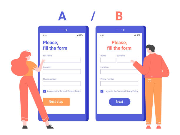
In today’s world, where users access the internet from various devices such as mobile phones, tablets, laptops, and large monitors, #responsive_website_design is no longer a luxury option, but a vital necessity.
This approach in #web_design allows your website to automatically adapt to the user’s screen dimensions and provide the best user experience.
Responsive Web Design means building a single website that displays correctly across all devices, eliminating the need to develop separate mobile or desktop versions.
This capability not only reduces development costs and time but also significantly helps maintain brand and content consistency.
The absence of a responsive design can lead to a poor user experience, high bounce rates, and ultimately, the loss of potential customers.
In this era where speed and accessibility are paramount, a website that doesn’t display well on every device will practically lose a portion of its audience.
Therefore, understanding the importance and implementing the principles of responsive web design is crucial for any business seeking success in the online space.
This is an educational approach that helps you prepare your website for the future.
Losing business opportunities because of an outdated website? With Rasaweb, permanently solve the problem of not attracting potential customers through your website!
✅ Attract more high-quality leads
✅ Increase brand credibility in customers’ eyes
⚡ Get free corporate website design consultation
Fundamental Principles and Key Concepts of Responsive Design

For a deeper understanding of responsive web design, familiarity with its three fundamental principles is essential: fluid grids, flexible images, and media queries.
Fluid Grids use relative units like percentages for element widths instead of fixed pixels.
This approach ensures that the page layout automatically expands or contracts with screen dimension changes, and content is always displayed proportionally to the available space.
The second principle is Flexible Images; images and multimedia files should be coded to adjust their size based on the available space, without overflowing or being excessively zoomed.
This is typically achieved by using CSS properties such as `max-width: 100%` for images.
Finally, Media Queries, a core component of responsive design, are powerful tools in CSS that allow you to apply specific styles based on device characteristics such as screen width, height, orientation (landscape or portrait), and even resolution.
This means, for example, you can transform the site navigation into a hamburger menu on mobile devices or change column layouts from horizontal to vertical.
Understanding these specialized principles is essential for any web developer to implement a professional responsive website design and optimize the website for a wide range of devices.
Common Tools and Frameworks in Responsive Design
To accelerate and facilitate the responsive website design process, developers turn to various frameworks and libraries.
These tools provide a collection of pre-written CSS and JavaScript codes that can significantly reduce development time and ensure your website is compatible across different browsers and devices.
Among the most popular and powerful of these frameworks is Bootstrap.
Bootstrap is a free and open-source front-end framework that includes HTML and CSS-based design templates for typography, forms, buttons, tables, navigation, and other interface components, as well as optional JavaScript plugins.
Another is Foundation, which is considered a more flexible and advanced framework for complex designs.
Additionally, CSS frameworks like Bulma and Tailwind CSS have gained significant popularity due to their modular and utility-first approach.
These frameworks, by providing a robust grid system, ready-made components, and responsive tools, help developers quickly create high-quality responsive websites.
Using these tools provides practical and specialized guidance for designing a website that is not only beautiful but also accessible on any screen.
| Framework/Library Name | Main Use | Key Features |
|---|---|---|
| Bootstrap | Comprehensive Front-end Framework | Robust grid system, ready-made UI components, high compatibility |
| Foundation | Advanced Front-end Framework | High flexibility, deep customization, optimized performance |
| Tailwind CSS | Utility-First CSS Framework | Utility classes for rapid UI building, no default components |
| Bulma | Modern CSS Framework | Flexbox-based, simple and elegant design, no JavaScript |
Challenges and Solutions for Implementing Responsive Design

Despite the countless benefits of responsive web design, its implementation is not without challenges.
One of the biggest questions is how we can ensure optimal website performance across all devices, especially on mobile where loading speed is a crucial factor? High-resolution images suitable for large displays can slow down loading on mobile devices.
The solution to this challenge is to use techniques like “responsive images” with the `<picture>` tag or the `srcset` attribute, which allows the browser to download the appropriate image based on screen dimensions.
Another challenge is managing complex content and user interfaces on smaller screens; sometimes, parts of the content need to be hidden or navigation completely altered.
This requires careful planning and analysis for the user experience.
Furthermore, testing and debugging across various devices and different browsers can be time-consuming.
Using browser emulators and actual devices for testing is a critical part of the process.
Development teams must be prepared to face these issues and anticipate appropriate solutions.
Implementing responsive design requires a comprehensive and planned approach to optimize the website not only in appearance but also in performance across all platforms.
Are you bothered by losing customers due to your e-commerce site’s outdated appearance or slow speed? Rasaweb’s expert team solves these problems with professional e-commerce website design!
✅ Increase customer trust and your brand’s credibility
✅ Stunning speed and excellent user experience
Get a free consultation with Rasaweb now ⚡
User Experience (UX) in Responsive Web Design

User Experience (UX) in responsive web design holds special importance, as the ultimate goal of this design type is to provide a flawless and enjoyable experience for the user, regardless of the device they are using.
A responsive website is not just about resizing elements, but about intelligently redesigning interactions and user flows for each environment.
This becomes even more crucial for touch devices; buttons and links must be large enough to be easily tapped with a finger, and there should be sufficient space between them to prevent accidental clicks.
Navigation should be simple and accessible, and content should be organized in a way that ensures high readability and scannability even on small screens.
Adaptive web design must pay special attention to content prioritization, meaning the most important information should be clearly visible at every screen size.
Furthermore, page loading time is an integral part of the user experience; mobile users are highly sensitive to loading speed, and a website that loads slowly, even if responsive, will still provide a poor experience.
Therefore, optimizing images, code, and utilizing caching are also essential for improving the user experience of a responsive website.
This section is an educational and explanatory topic for developers and UX designers.
The Impact of Responsive Design on SEO and Google Ranking

Google, the world’s largest search engine, has long recognized the importance of responsive web design and has incorporated it as a crucial ranking factor in its algorithms.
Since 2015, and especially with the introduction of “Mobile-First Indexing” in 2018, Google primarily indexes and ranks websites based on their mobile version.
This means that if your website is not optimized for mobile devices, even if it performs well on desktop, it may lose its ranking in search results.
A responsive website has only one URL for all devices, which simplifies the crawling and indexing process for search engines and prevents duplicate content issues.
Furthermore, the improved user experience provided by responsive design (such as reduced bounce rate and increased user dwell time) sends positive signals to Google and can indirectly impact the site’s SEO.
Websites with high loading speeds and excellent mobile user experience have a greater chance of achieving higher rankings in search results.
This is important news for all businesses and webmasters, indicating that investing in responsive web design is crucial not only for users but also for online visibility.
This analysis shows how important this topic is for online success.
Testing and Optimization of Responsive Websites

After implementing responsive web design, the crucial phase of testing and optimization begins.
Ensuring that the website functions correctly across all devices and screen sizes requires a thorough testing process.
These tests include checking element layouts, form functionality, navigation, and loading speed across different browsers (Chrome, Firefox, Safari, etc.) and multiple devices (mobile, tablet, desktop).
Many tools are available to assist with this process.
For example, browser Developer Tools in Chrome and Firefox allow you to simulate the website at various sizes.
Google Mobile-Friendly Test is also an official Google tool that indicates whether your page is optimized for mobile.
Furthermore, performance tools like Google PageSpeed Insights can help you identify weaknesses related to loading speed and provide optimization solutions.
After identifying issues, actions such as image optimization (compression, using next-gen formats like WebP), CSS and JavaScript compression, browser caching, and CDN usage can help increase the speed of a responsive website.
This specialized and guiding phase ensures that your site is not only beautiful but also performs flawlessly.
| Tool Name | Tool Type | Application |
|---|---|---|
| Google Mobile-Friendly Test | Mobile Compatibility Test | Checking responsiveness status and mobile optimization |
| Google PageSpeed Insights | Performance and Speed Test | Evaluating loading speed and providing optimization suggestions |
| Browser Developer Tools | Browser Developer Tools | Simulating various screen dimensions, debugging CSS and JS |
| Responsinator | Online Responsiveness Test | Displaying the site on popular devices simultaneously |
The Future of Web Design and the Role of Responsive Design

The future of web design is evolving at an increasing pace, and responsive web design will maintain its role as a solid foundation.
While responsive design helps websites adapt to any screen size, new concepts such as “Adaptive Design” and “Progressive Web Apps” (PWAs) are also emerging, taking the user experience beyond dimensional compatibility.
Adaptive design, instead of fluidly reacting, provides separate layouts for specific screen sizes.
PWAs also provide a much richer user experience by combining the best features of web and mobile applications (such as offline functionality, push notifications, and home screen access).
However, even in these advanced approaches, the fundamental principles of flexible web design and media queries still apply.
It is predicted that with the proliferation of wearable devices and the Internet of Things (IoT), the need for websites capable of adapting to a wide variety of much smaller displays will increase even further.
Therefore, responsive web design is not just a temporary trend but a permanent standard and the starting point for every successful web project in the future.
This engaging and analytical look at the future of the web shows that the importance of this concept has not diminished, but rather increased.
Are you tired of your company’s website not meeting your expectations? With Rasaweb, design a professional website that truly represents your business.
✅ Increase attraction of new customers and sales leads
✅ Boost your brand’s credibility and trust among your audience
⚡ Get a free website design consultation!
Important Tips for Choosing a Responsive Web Designer or Company
Choosing a designer or company to handle your responsive website design is a crucial step for your business’s online success.
Given the importance of this topic, there are a few key points to consider.
First and foremost, pay attention to their previous portfolios.
Do the websites they have designed display well on various devices? Is the user experience optimized for mobile versions as well? Responsive website design is not just about appearance; it must also be technically robust and optimized.
Second, consider their expertise in SEO and website performance.
A good design company should have sufficient knowledge of optimizing loading speed and search engine compatibility.
Ask how they ensure your website will rank well in Google results after project completion.
Third, consider post-project support and maintenance.
Do they offer technical support and necessary updates? This is essential for maintaining the site’s security and optimal performance in the long run.
Also, transparency in pricing and the work process is very important.
Choose a company that provides clear answers to your questions and involves you throughout the project stages.
This guide helps you make the best choice for flexible and efficient web design.
Conclusion and Final Outlook on Responsive Design

In this article, we thoroughly discussed responsive web design, covering its fundamental importance in today’s digital ecosystem, technical principles, tools, challenges, impact on user experience and SEO, and even its future outlook.
It is clear that responsive website design is no longer an optional feature but a fundamental prerequisite for any business seeking an effective online presence and wishing to reach all its audiences on any device.
This approach not only saves development time and costs but also significantly helps improve SEO ranking, increase conversion rates, and ultimately, grow and sustain your business.
Given the growing trend of mobile device usage and the emergence of new technologies, the importance of responsive web design will continue to increase in the future.
Therefore, investing in a responsive web design and continuously optimizing it is a smart and essential strategy for anyone seeking success in today’s competitive digital world.
We hope these comprehensive explanations have assisted you on the path to successful responsive website design.
Frequently Asked Questions
| Question | Answer |
|---|---|
| What is Responsive Web Design? | It is an approach that ensures your website layout displays well on any device (such as mobile, tablet, and desktop) and adapts to the user’s screen size. |
| Why is responsive design important? | Improved user experience across different devices, increased traffic and conversion rates, better search engine ranking (SEO), and reduced need for developing separate mobile versions. |
| How is responsive design implemented? | By using CSS media queries to apply different styles based on device characteristics (like screen width), and by utilizing fluid grids and flexible images. |
| What are the main technologies used in responsive design? | HTML5, CSS3 (especially Media Queries), and JavaScript. |
| What are the main benefits of responsive design? | Seamless user experience across different devices, easier website maintenance, better SEO (as Google prefers responsive sites), and cost and time savings compared to developing a mobile application or a separate site. |
And other services of Rasaweb Advertising Agency in the field of advertising
Smart Brand Identity: A combination of creativity and technology for user engagement through precise audience targeting.
Smart Social Media: Professional optimization for digital branding using marketing automation.
Smart Social Media: A professional solution for customer acquisition with a focus on precise audience targeting.
Smart Advertorials: An innovative service for increasing customer acquisition through marketing automation.
Smart Customer Journey Map: A specialized service for sales growth based on precise audience targeting.
And over hundreds of other services in the field of internet advertising, advertising consultation, and organizational solutions
Internet Advertising | Advertising Strategy | Advertorials
Resources
- Responsive Website Design and Its Importance for Businesses
- Benefits and Principles of Responsive Design in Web
- Complete Guide to Responsive Design
- Why is Responsive Website Design Essential?
✍️ For your business to thrive in the digital world, Rasaweb Digital Marketing Agency is your smart companion. With us, you will have a complete experience of professional services, from website design with a modern user interface to comprehensive SEO strategies and content marketing.
📍 Tehran, Mirdamad Street, next to Bank Markazi, Kazeroon Jonoubi Alley, Ramin Alley, No. 6
