
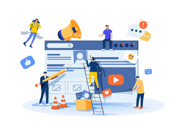
Introduction to Responsive Website Design and its Importance in the Digital Age

In today’s world, where users access the internet from various devices such as smartphones, tablets, laptops, and even smart TVs, having a website that can provide a seamless and optimized user experience on any screen size is crucial.
This is where the concept of #Responsive_Web_Design comes in.
Responsive design refers to an approach where the layout and content of a website automatically and dynamically adjust to the screen size of the user’s device.
This capability ensures that your website is displayed correctly on any device, from a small phone to a large monitor, and the user does not need to zoom or scroll horizontally.
The importance of this approach is not limited to visual aesthetics; a #responsive site significantly impacts #User_Experience (UX) and #SEO.
Google and other search engines prioritize mobile-friendly websites, which is a key factor in search rankings and ultimately, your business’s visibility.
Responsive website design is no longer a luxury option but a necessity for any online business that wants to succeed in today’s competitive market and retain its audience.
This is an explanatory and educational content that provides the foundation for a deeper understanding of this topic.
Tired of your company’s website not getting the visibility it deserves and losing potential customers? Solve this problem forever with professional and effective website design by Rasawweb!
✅ Increase brand credibility and gain customer trust
✅ Attract targeted sales leads
⚡ Contact us now for a free consultation!
Core Principles and Key Components in Responsive Design

To understand how responsive website design works, we need to familiarize ourselves with its three fundamental principles: Fluid Grids, Flexible Images, and Media Queries.
Fluid Grids mean that your website’s layout uses relative units like percentages instead of fixed pixel units.
This allows page components to proportionally shrink or grow and align with each other as the screen size changes.
Flexible Images work similarly to fluid grids; by setting CSS properties for images (such as max-width: 100%), it’s ensured that images never exceed their parent containers and scale correctly across various screen sizes.
This prevents layout breakage and provides an appropriate visual experience.
The most important component is Media Queries, which allow designers to apply different CSS rules based on device characteristics such as screen width, height, orientation (portrait or landscape), and even resolution.
For example, you can define that on screens with a width less than 768 pixels, the navigation menu appears as a hamburger button instead of horizontally.
This combination of principles forms the core of any responsive website.
Understanding these fundamentals is the first step into the world of responsive website design and has a specialized and educational aspect.
Implementation Techniques for Responsive Design

When implementing responsive website design, there are two main approaches: “Mobile First” and “Desktop First”.
In the Mobile First approach, design and coding are first done for the smallest screen (usually mobile), and then the layout is optimized for larger devices using media queries.
This approach is highly recommended due to its performance benefits and better user experience, as the main focus is on providing essential content and fast loading on mobile devices.
In contrast, the Desktop First approach begins designing for larger screens and then adapts it for smaller devices, which may require more optimizations.
For implementing these techniques, modern CSS tools like Flexbox and CSS Grid play a vital role.
Flexbox is highly efficient for one-dimensional layouts (rows or columns) and allows elements to share or fill available space.
CSS Grid, however, is designed for two-dimensional layouts (both rows and columns) and allows for the creation of more complex structures with precise control.
These tools, alongside JavaScript, empower developers to create fully responsive and dynamic websites.
Choosing the right approach and tools is key to success in responsive website design and requires specialized knowledge and precise guidance.
User Experience (UX) in Responsive Website Design
One of the greatest advantages of responsive website design is the significant improvement in User Experience (UX).
The primary goal of UX is for users to be able to interact with your website easily and effortlessly.
A well-designed responsive website presents content in a way that is readable and navigable on any device.
This means navigation elements like menus, buttons, and links should be large enough to be easily clickable on a phone’s touch screen, and there should be sufficient spacing between them to prevent touch errors.
Images and videos should be optimized to load quickly while maintaining appropriate quality.
Additionally, online forms should be designed to be easy to complete on smaller devices, for example, by using optimized keyboards for specific fields (like a numeric keyboard for phone numbers).
The main challenge here is maintaining experience consistency across different devices; the user should feel as if they are viewing a single website, regardless of the device they are using.
This consistency means preserving visual identity, logical content structure, and ease of access to information.
Responsive design significantly helps in overcoming these challenges and plays a crucial role in user satisfaction and conversion rates.
This aspect of responsive website design is highly analytical and focuses on real user needs.
Does your current website convert visitors into customers or drive them away? Solve this problem forever with professional corporate website design by Rasawweb!
✅ Build strong credibility and branding
✅ Attract target customers and increase sales
⚡ Get a free consultation now!
SEO and Website Performance in the Context of Responsive Design

The relationship between responsive website design and SEO is very direct and crucial.
Google, as the largest search engine, has officially announced that it prefers mobile-friendly websites in its search results.
This means that if your website is not responsive, it will likely have a lower ranking in mobile searches, even if its content is excellent.
A responsive website also simplifies SEO management and avoids duplicate content issues because it has only one URL and one HTML code for all devices.
In addition to SEO, website performance is also a key aspect that improves with responsive design.
Page loading speed, especially on mobile devices where internet speeds may be lower, is of high importance.
Responsive design helps optimize images, reduce unnecessary code, and improve script loading, all of which lead to a better user experience and higher SEO rankings.
Tools like Google PageSpeed Insights and Mobile-Friendly Test can help you measure your website’s performance and compatibility and identify potential issues.
Optimization for Google’s Core Web Vitals (LCP, FID, CLS) is also easily achievable through an optimized responsive design.
This is analytical and guidance content that helps you understand the importance of SEO in responsive website design.
Challenges and Common Mistakes in Implementing Responsive Design

Although responsive website design has numerous advantages, its implementation is not without challenges.
One common mistake is neglecting image loading speed on mobile devices.
Using high-resolution images optimized for desktops can lead to significant site slowdown on mobile.
The solution is to use techniques such as “Responsive Images” or Lazy Loading, which load images with appropriate size and resolution for the user’s device.
Another challenge is managing extra content that is useful on desktop but causes clutter and confusion on mobile.
A good responsive design should be able to display content based on priorities and either omit additional information on smaller screens or display it as collapsible.
Insufficient testing on real devices and various browsers is also a common mistake; a website might look good in simulators but encounter performance or display issues on real devices.
Failing to consider touch interactions and having small clickable elements can also ruin the user experience.
These challenges show that responsive website design goes beyond merely resizing elements and requires deep thought about the user experience on every screen size.
This is thought-provoking and guidance content to help prevent potential issues.
Popular Tools and Frameworks for Responsive Design

To accelerate and facilitate the responsive website design process, developers use various tools and frameworks.
One of the most popular and well-known frameworks is Bootstrap.
Bootstrap is an HTML, CSS, and JavaScript framework that includes design templates for typography, forms, buttons, navigation, and other UI components, and uses a responsive 12-column grid system.
This framework simplifies building responsive websites immensely with its ready-to-use classes.
Tailwind CSS is another CSS framework that takes a different approach; instead of pre-built components, it provides a set of utility classes that allow you to build your user interface directly in HTML.
This approach offers more flexibility for designers.
In addition to frameworks, various tools exist for testing and validating responsive design, such as browser developer tools that allow simulating different screen sizes.
Platforms like BrowserStack also provide cloud-based testing across real browsers and devices.
Choosing the right tool depends on your needs and workflow, but using these tools can make the responsive website design process more efficient.
This section provides specialized and guidance information.
The Future of Web Design: Evolution of Responsive Website Design

Responsive website design has proven to be a stable standard in web design, but the web world is never static and is always evolving.
The future of this field is also intertwined with new innovations.
One of the most important upcoming trends is Progressive Web Apps (PWAs).
PWAs are websites that can function like native applications on mobile devices; they have offline capability, push notifications, and access to device hardware features.
These capabilities elevate the user experience to a new level and are in a way considered the natural evolution of responsive design.
Also, with the widespread adoption of Dark Mode in operating systems and applications, web design is also moving towards offering dark theme options, which not only prevents eye strain but also reduces battery consumption.
The role of Artificial Intelligence (AI) in web design is also increasing; AI-based tools can help automate parts of the responsive design process, suggest automatic optimizations, or even provide more suitable designs by analyzing user data.
With the emergence of new devices such as smartwatches, flexible screens, and even voice user interfaces, responsive website design must also adapt to these more diverse platforms.
These developments indicate that responsive website design will always be updating and adapting to the future needs of the web, and it also has news and entertaining aspects.
Is your e-commerce site ready to attract maximum customers and increase sales? Rasawweb transforms your online business with modern and efficient e-commerce website designs.
✅ Increased speed and improved SEO
✅ Excellent user experience on mobile and desktop⚡ Get a free e-commerce website design consultation from Rasawweb!
Key Tips for Choosing a Responsive Website Designer
Choosing a designer or a specialized team for responsive website design is a crucial decision that can significantly impact your business’s online success.
The first criterion is to review their portfolio.
The designer’s previous work should include websites that display well on various devices and provide a smooth user experience.
Pay attention to navigation capabilities, loading speed, and compatibility with different screen sizes in the portfolio.
Second, their experience and technical knowledge in CSS Grid, Flexbox, Media Queries, and responsive frameworks like Bootstrap are important.
An experienced designer can choose the best approach (such as Mobile First) for your project and anticipate and resolve potential challenges.
Third, the ability to communicate effectively and understand your business needs is highly important.
The designer should be able to transform your vision into a responsive digital reality.
Fourth, providing support and maintenance services after project completion.
Websites require continuous updates and maintenance, especially in the field of responsive website design where web standards change rapidly.
Reviewing feedback and recommendations from previous clients can also provide a good insight into the quality of work and the designer’s commitment.
By considering these tips, you can choose a skilled designer who will create a high-quality and fully responsive website for you.
This section provides guidance and explanation to help you with this important choice.
Conclusion and Next Steps in Responsive Website Design

In this article, we comprehensively examined the concept of responsive website design, its importance in the digital age, core principles, implementation techniques, its impact on user experience and SEO, challenges and solutions, as well as popular tools and frameworks.
It became clear that responsive design is no longer just a trend but the backbone of any successful online presence.
With the ever-increasing use of mobile devices to access the internet, your website must be able to provide a seamless user experience on any screen size to attract and retain your audience.
The next step for you, whether you are a business owner or a web developer, is to invest in the knowledge or implementation of this approach.
If your website is not yet responsive, it’s time to consider updating it.
If you are designing a new website, prioritize the mobile-first approach in responsive website design.
Continuously test your website’s performance with various tools and use the latest technologies and frameworks to improve it.
The web world is changing rapidly, and only through adaptability and continuous updates can one survive and succeed in this competitive space.
This is educational and explanatory content aimed at encouraging action and providing an overall outlook on the path ahead in responsive website design.
Frequently Asked Questions
| Question | Answer |
|---|---|
| What is responsive website design? | It’s the design of a website whose appearance and layout automatically adapt to the screen size of the user’s device (such as computer, tablet, mobile) to provide an optimal user experience. |
| Why is responsive design important? | Given the variety of devices users employ to view websites, responsive design improves user experience, reduces bounce rate, increases time spent on site, and enhances SEO. |
| What are the main principles of responsive design? | The three main principles include Fluid Grids, Flexible Images, and Media Queries. |
| What is a Media Query and what is its role in responsive design? | A Media Query is a CSS feature that allows you to apply different styles based on display device characteristics such as screen width, height, resolution, and media type. This tool is considered the heart of responsive design. |
| What is the difference between Mobile First and Desktop First approaches in responsive design? | In the Mobile First approach, design and coding are initially done for small screens (mobile), and then styles are added for larger screens using media queries. In the Desktop First approach, the reverse is true; it’s first designed for desktop and then adapted for smaller screens. The Mobile First approach is generally recommended. |
And other services of Rasawweb Advertising Agency in the field of advertising
Posting ads for herbal shampoo sales on industrial platforms
Advertising handmade soaps on specialized commercial websites
Registering ads for moisturizing cream production services in industrial directories
Introducing hand sanitizer gel vendors on commercial technology websites
Advertising natural face masks for sale on industrial websites
And over a hundred other services in the field of internet advertising, advertising consultation, and organizational solutions
Internet Advertising | Advertising Strategy | Advertorial
🚀 Ready to transform your business in the digital world? Rasawweb Afarin Digital Marketing Agency paves the way for your greater visibility by offering comprehensive services including SEO-optimized website design, search engine optimization, and content marketing.
📍 Tehran, Mirdamad Street, next to Central Bank, Kazeroon Southern Alley, Ramin Alley No. 6
