
Introduction to the Necessity of Responsive Design in Today’s World

In the current era, where users access the internet from a variety of devices including smartphones, tablets, laptops, and even smart TVs, #Responsive_Website_Design is no longer a luxury option, but a vital necessity.
The main goal of #Responsive_Design is for a website to automatically adapt its appearance and layout to the screen size of the user’s device, thereby providing an optimal and consistent User Experience across every platform.
Imagine a user opening your website on their phone and having to constantly zoom and scroll around to read text or view images; this experience will quickly drive them away from your site.
With the continuous increase in mobile device usage for searching and online shopping, neglecting this aspect of web design can lead to the loss of a large segment of your audience and business opportunities.
In the past, many businesses developed separate versions of their website for mobile devices, but this approach, in addition to being costly, also made content management and updates difficult.
#Web_trends and new standards are moving towards integration and flexibility.
Today, responsive website design is accepted as the best solution to ensure site accessibility and performance across all devices.
This approach not only improves user experience but also plays a key role in search engine optimization (SEO), as search engines like Google prefer responsive websites in their rankings.
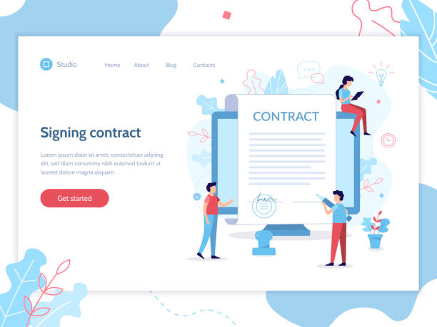
Does your current website convert visitors into customers or drive them away? With professional corporate website design by Rasawp, solve this problem forever!
✅ Build credibility and powerful branding
✅ Attract target customers and increase sales
⚡ Get a free consultation now!
Core Principles and Pillars of Responsive Design

To implement a successful responsive website design, three main pillars must be considered: Flexible Grids, Flexible Images, and Media Queries.
Flexible grids mean that instead of using fixed pixel units for element widths, relative units like percentages are used.
This ensures that the website’s layout automatically expands or contracts with screen size changes, filling the available space in the best possible way.
For example, if you have three columns side-by-side, instead of assigning a fixed width of 300 pixels to each, you can assign 33.33% width to each column to maintain their proportion on any screen size.
Flexible images work with the same logic; instead of defining a fixed width, properties like max-width: 100% in CSS can be used to ensure the image never overflows its container and adjusts its size relative to the available space.
This approach prevents unwanted horizontal scrolling and enables faster image loading on smaller devices by utilizing optimized image versions.
Finally, media queries are the beating heart of responsive design.
They allow you to apply different CSS styles based on device characteristics such as screen width, device type (print, screen, speech), orientation (portrait or landscape), and even resolution.
For example, you can define that on screens smaller than 768 pixels, the navigation menu transforms into a hamburger icon, or font sizes are reduced to maintain readability.
By combining these three principles, developers can provide a smooth and optimized user experience for all visitors, regardless of the device they use.
These three elements together ensure that your website is fully responsive not only in appearance but also in functionality.
Comparing Responsive Design with Other Web Approaches

In the past, websites were primarily designed for desktop monitors, and with the advent of mobile devices, developers faced a significant challenge.
To solve this problem, several approaches emerged, with responsive website design being one of the most pioneering and effective.
But let’s compare it with more traditional approaches.
One such approach was creating “separate mobile sites.”
In this method, a completely separate version of the website with a different URL (usually with an m.
or mobile. prefix) was developed for mobile devices.
Although this method offers complete control over the mobile experience, it has significant drawbacks.
Maintaining two separate codebases means doubling the effort for updates and bug fixes.
Also, SEO becomes more complex, as search engines have to crawl and index two versions of the content, which can lead to duplicate content issues.
Another approach is “Adaptive Design,” which is sometimes confused with responsive design.
In adaptive design, the site is designed at several specific breakpoints, and when the page loads, the server detects what device the user is using and delivers the appropriate layout.
This approach provides fixed layouts based on specific screen sizes, rather than continuous flexibility.
While adaptive design can perform well, it is not as flexible as responsive website design and may not offer full optimization for screen sizes between breakpoints.
In contrast, responsive design, using flexible grids, flexible images, and media queries, provides a fluid and continuous experience across all screen sizes, from the smallest phone to the largest monitor.
This approach supports a single codebase, which makes maintenance, updates, and SEO optimization much easier.
The table below provides a summary comparison of these three approaches:
| Feature | Responsive Design | Adaptive Design | Separate Mobile Site |
|---|---|---|---|
| Number of Codebases | Single | Single | Multiple |
| Flexibility | Very High (Fluid and Continuous) | Medium (Based on Breakpoints) | High (Dedicated Mobile Design) |
| Maintenance Complexity | Medium | Medium | High |
| SEO Optimization | Excellent (Google Preferred) | Good | Complex (Duplicate Content Risk) |
| Initial Development Cost | Medium to High | Medium | High |
Popular Tools and Frameworks for Responsive Design
Developing responsive website design has become much more efficient today, thanks to numerous tools and frameworks that simplify the work for developers.
One of the most popular CSS frameworks is Bootstrap.
Bootstrap is a comprehensive collection of ready-to-use HTML, CSS, and JavaScript components, including a powerful and responsive grid system.
This framework allows developers to quickly implement complex and fully responsive layouts without needing to write large amounts of CSS code from scratch.
Simply by adding specific classes to HTML elements, you can control their responsive behavior.
Tailwind CSS is another framework that takes a different approach.
Instead of pre-designed components, Tailwind provides a set of utility classes that allow you to apply styles directly within your HTML.
This method offers immense flexibility and enables designers to create completely custom designs without unnecessary bloat.
For larger projects, using CSS preprocessors like Sass or Less can improve the development process.
These tools add features like variables, functions, and nested rules to CSS, making style management and responsive design more organized and efficient.
In the realm of JavaScript, frameworks like React, Vue.js, and Angular, with their component-based architecture, also significantly contribute to building interactive and responsive user interfaces.
These frameworks facilitate the management of complex user interactions and dynamic content updates, which is crucial in responsive environments.
Additionally, testing tools like Chrome DevTools, BrowserStack, and LambdTest allow you to simulate and inspect your site’s performance and display across various devices and screen sizes.
Choosing the right tools depends on your project’s needs and complexity, but using them can significantly boost the speed and quality of responsive website design implementation.
Is your company’s website as professional and trustworthy as it should be? With specialized corporate website design by Rasawp, create an online presence that reflects your credibility and attracts more customers.
✅ Build a powerful and professional image for your brand
✅ Convert visitors into real customers
⚡ Get a free consultation now!
Impact of Responsive Design on SEO and Website Rankings

In today’s competitive web world, having a website is not just about online presence; it must also be optimized from a search engine perspective to attract target audiences.
Responsive website design plays a crucial role in search engine optimization (SEO) and consequently in your site’s ranking.
Google, as the world’s largest search engine, has officially announced that it prioritizes responsive websites and considers them a positive factor in its ranking algorithm.
The main reason for this preference is the improved user experience that these sites provide; Google always aims to deliver the best results to its users, and a site that displays well on all devices certainly meets this goal.
One of the most important reasons for this is Google’s Mobile-First Indexing.
This means that Google primarily considers the mobile version of your website for crawling and indexing content, rather than the desktop version.
If your site is not optimized for mobile, its content might not be properly identified by Google’s bots, resulting in a low rank in search results or even not being displayed at all.
Furthermore, the existence of a single URL for all devices in responsive website design simplifies the crawling and indexing process for search engines.
This prevents issues like duplicate content that occur with separate mobile site approaches.
Moreover, the bounce rate on responsive websites is usually lower because users have a positive experience and are more inclined to stay on the site and explore its content.
This also indirectly affects SEO, as it sends a positive signal to search engines that users are satisfied with your site.
Finally, site loading speed, which is improved in responsive design through image optimization techniques and CSS/JS code, is also a crucial Google ranking factor.
Common Challenges and Solutions in Implementing Responsive Design

Despite countless benefits, implementing responsive website design is not without challenges, and developers may encounter various issues.
One of the main challenges is Performance Management.
If images are not properly optimized or CSS and JavaScript codes are heavy, the site might load slowly on mobile devices, disrupting the user experience.
The solution is to serve images in optimized formats and appropriate sizes, use Lazy Loading for off-screen content, and Minify and Concatenate CSS and JS files.
Another challenge is the complexity of managing media queries.
With an increasing number of breakpoints and various device scenarios, managing the styles for each can become very complex and challenging.
To overcome this, a Mobile-First approach can be used, meaning designing and coding for the smallest screen first, and then gradually adding styles for larger screens with media queries.
This approach helps in better code organization and reduced file size.
Testing and Debugging on different devices is also a significant challenge.
One cannot expect a site to work perfectly in a simulator, and actual testing on multiple physical devices is necessary.
Using tools like BrowserStack or device labs is essential to ensure full compatibility across different browsers and devices.
Also, extensive and complex content can be challenging on small screens.
Organizing content hierarchically and using well-known mobile design patterns (such as hamburger menus, accordions for hidden content) can help solve this problem.
Finally, the issue of converting desktop design to responsive arises.
If a website has not been designed responsively from the outset, converting it can be time-consuming and costly.
In these cases, a complete redesign with a Mobile-First approach is often the best solution.
With careful planning, applying best practices, and using appropriate tools, many of these challenges can be minimized, leading to a successful responsive design.
Optimizing Images and Media in Responsive Design

One of the most important aspects of implementing an effective responsive website design is the proper optimization of images and other media.
Images constitute a significant portion of a web page’s size, and if not managed correctly, they can drastically reduce the site’s loading speed, especially on mobile devices with slower internet connections.
There are several solutions to ensure optimal image display across all devices.
The first and most important approach is to use the <img> tag with srcset and sizes attributes.
These attributes allow the browser to load the most appropriate image version from several options with different sizes and resolutions, based on the screen size and device resolution.
This prevents loading overly large images on small devices, saving bandwidth and increasing loading speed.
For more complex scenarios requiring Art Direction (meaning you want to display completely different images for various screen sizes), the <picture> tag is the ideal solution.
This tag allows you to define multiple <source> tags with different media queries so the browser can choose the best image based on the conditions.
| Technique | Explanation | Advantages | Application |
|---|---|---|---|
srcset and sizes |
Defining multiple versions of an image with different resolutions and dimensions for the browser to choose from | Bandwidth saving, faster loading, performance optimization | Most content images |
<picture> tag |
Allows defining multiple <source> elements for different scenarios (Art Direction) |
Full control over image display, larger visual changes based on breakpoint | Logo images, headers, main images with design variations |
| Lazy Loading | Loading images and videos only when the user scrolls near them | Increased initial page load speed, improved overall performance | Images and videos below the fold |
| Next-Gen Formats | Using formats like WebP or AVIF instead of JPEG/PNG | Smaller file size with similar or better quality | All images (with fallback for older browsers) |
In addition to images, optimizing videos is also crucial.
Using the <video> tag with controls, preload="none" attributes, and defining multiple sources with different formats (like MP4, WebM) can lead to a better user experience in responsive website design.
Lazy Loading is highly beneficial not only for images but also for videos that are not initially visible on the page.
This technique ensures that heavy media content is only loaded when the user scrolls to it, which significantly increases the initial page load speed.
Furthermore, using a CDN (Content Delivery Network) to serve images and videos can improve user access speed from various geographical locations.
Proper image compression without noticeable quality loss and choosing optimized formats like WebP, which have smaller file sizes than JPEG and PNG, are other essential steps for having a responsive site with excellent performance.
User Experience (UX) in Responsive Design
Responsive website design is not only about the appearance of the website on different devices but also profoundly affects the User Experience (UX).
A successful responsive site, beyond merely resizing elements, must be designed so that interaction with it is smooth and enjoyable on any device.
This means a deep understanding of user behavior across different platforms.
For example, mobile users often touch the screen with their fingers, so buttons and links should be large enough to be easily tappable and prevent accidental touches.
This principle is called “Tap Target Size”.
The minimum recommended size for these areas is usually 48 pixels.
Also, text readability on small screens is of utmost importance.
Using appropriate font sizes and sufficient line spacing ensures that users do not have to zoom.
Designing for Navigation is also a significant challenge on mobile devices.
Traditional desktop menus typically do not fit in the limited space of a mobile screen, so patterns like hamburger menus or off-canvas navigation have become prevalent.
These menus must be easily accessible and should not obscure the main content.
Organizing content hierarchically and prioritizing information on smaller screens is also crucial.
Mobile users are often in a hurry and looking for specific information, so the most important information should be displayed prominently and clearly at the beginning.
Interactive elements such as forms should also be optimized for mobile.
Using numeric keyboards for phone number fields, enabling autofill, and avoiding excessive fields can improve the form-filling experience.
Finally, visual and functional feedback when interacting with the site is also very important.
Users should immediately notice the site’s response after touching a button or link.
This could include a button color change, displaying a loader, or a quick page transition.
By focusing on these user experience aspects throughout all stages of responsive website design, one can ensure that visitors on any device enjoy your site and easily achieve their goals.
Does your current website convert visitors into customers or drive them away? With professional corporate website design by Rasawp, solve this problem forever!
✅ Build credibility and powerful branding
✅ Attract target customers and increase sales
⚡ Get a free consultation now!
The Future of Responsive Design and Emerging Trends

Responsive website design is constantly evolving, and with the advancement of web technology, new trends are emerging that open new horizons for it.
One of the most exciting of these advancements is Container Queries.
Currently, media queries operate based on the viewport size (overall screen size), but container queries allow developers to apply styles based on the size of an element’s container or parent.
This feature brings incredible flexibility, especially for reusable components in design systems, as a component can change its appearance depending on the space it has available, without needing to know the size of the entire screen.
This is a big step forward for component-based responsive website design.
Another trend is the expansion of Progressive Web Apps (PWAs).
PWAs are websites that, using modern web technologies, offer a user experience similar to native applications; including installability to the home screen, offline access, and push notifications.
PWAs are inherently responsive and accessible on any device, and they can be the next step for user interaction with web content.
The emergence of Dark Mode is also an important trend that should be considered in responsive design.
Many operating systems and browsers now support this feature, and providing a dark mode version of a website can improve user experience and reduce eye strain, especially in low-light environments.
Practical Steps to Start a Responsive Design Project

Starting a responsive website design project can seem a bit daunting at first, but with systematic planning and following practical steps, you can create a fully optimized and efficient website.
The first step is designing with a Mobile-First approach.
This means designing your layout and content for the smallest screen (usually mobile) first, and then gradually expanding it for larger screens.
This approach ensures that the most important content and functionality are prioritized and prevents overloading elements on mobile devices.
After designing wireframes and mockups for different sizes, it’s time for coding.
At this stage, using Semantic HTML and proper content structuring is very important.
For styling, as mentioned before, use flexible grids (with percentage units or flexbox/CSS Grid) and flexible images (with max-width: 100%, srcset, and picture).
Apply media queries correctly to implement changes at different breakpoints.
One of the critical stages in implementing responsive website design is continuous testing and validation.
Test your website across various browsers (Chrome, Firefox, Safari, Edge) and on multiple physical devices (Android and iOS smartphones, tablets).
Using browser developer tools (like Chrome DevTools) to simulate different screen sizes is very helpful, but it never replaces testing on actual devices.
Tools like Google Search Console and PageSpeed Insights can also help you identify performance and compatibility issues.
Optimizing website loading speed by compressing code, images, and enabling caching is also of high importance.
Finally, remember that responsive design is a continuous process.
With the emergence of new devices and technologies, you may need to update and adapt your site.
By following these principles and staying up-to-date with the latest techniques, you can build a powerful and future-proof responsive website that provides an excellent user experience on any platform.
Frequently Asked Questions
| Question | Answer |
|---|---|
| What is Responsive Web Design? | A web design method that ensures a website displays well across various screen sizes and devices (like mobile, tablet, desktop) and provides an optimal user experience. |
| Why is Responsive Design important? | Improved user experience, better SEO (Google prefers responsive sites), time and cost savings (no need to build a separate mobile site). |
| What are the main techniques in Responsive Design? | Using flexible grids and layouts (Fluid Grid), flexible images and media, and employing Media Queries in CSS. |
| What are Media Queries in Responsive Design? | A part of CSS3 that allows you to apply different styles based on the characteristics of the device on which the website is displayed (such as screen width, resolution, media type). |
| What are the benefits of using Responsive Design? | Access to more users (especially mobile), improved user engagement rate, reduced maintenance costs (one site for all devices), and improved conversion rate. |
And other services of Rasa Web Advertising Agency in the field of advertising
Smart Custom Software: Transform digital branding with dedicated programming.
Smart Marketplace: A combination of creativity and technology for campaign management through marketing automation.
Smart UI/UX: An effective tool for improving SEO rankings with the help of real data.
Smart SEO: Revolutionize SEO ranking improvement with dedicated programming.
Smart Advertising Campaign: An innovative service for enhancing customer behavior analysis through precise audience targeting.
And more than hundreds of other services in the field of internet advertising, advertising consultation, and organizational solutions.
Internet Advertising | Advertising Strategy | Advertorial
Resources
- What is Responsive Design and Why is it Crucial for Your Business?
- Step-by-step Tutorial for Responsive Website Design with CSS and HTML
- Principles and Techniques for Implementing Responsive Design on the Web
- The Future of Web Design: Why Your Site Must Be Responsive?
? For a powerful presence in the digital world, Rasawp Afarin accompanies your business by offering the best digital marketing services, including corporate website design.
📍 Tehran, Mirdamad Street, next to Bank Markazi, Kazeroun Jonoubi Alley, Ramin Alley, No. 6


