
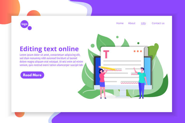
Introduction to the Importance of Responsive Website Design in Today’s World

In the current digital age, where various devices from smartphones and tablets to laptops and smart TVs are used to access the internet, the importance of #Responsive_Website_Design has become more evident than ever.
The era of static, desktop-only websites is over.
Users expect a seamless and optimized user experience on any device.
Responsive Web Design (RWD) is a web design approach that aims to create websites that can adapt to the screen size and orientation of the user’s device.
This means automatically adjusting layout, images, and fonts for optimal content display.
The concept of responsive web design was first introduced by Ethan Marcotte in 2010 and quickly became an industry standard.
Before that, companies often had to develop separate mobile versions of their websites, which was costly and difficult to maintain.
Today, with the significant increase in mobile internet usage, ignoring responsive design can lead to losing a large segment of your audience and customers.
This is a specialized and vital need for any online business.
The important question is, is your website ready to welcome mobile users?
Lack of optimization for different devices not only reduces user experience but can also harm the site’s ranking in search engines.
Responsive web design means providing high-quality, accessible content for all users, regardless of their device.
This approach is considered a long-term investment in your digital success.
So let’s dive deep into this topic together and see how we can build a fully responsive website.
Are visitors abandoning your e-commerce site before making a purchase? Don’t worry anymore! With Rasaweb’s professional e-commerce website design services, solve the problem of converting visitors into customers forever!
✅ Significant increase in conversion rate and sales
✅ Unique and engaging user experience
⚡ Contact us now for a free consultation!
Key Principles of Responsive Web Design and Basic Concepts

To deeply understand responsive web design, we need to become familiar with its fundamental principles and concepts.
These principles not only provide a framework for implementation but also give us a correct understanding of how an adaptive website functions.
The three main pillars of responsive web design include Fluid Grids, Flexible Images, and Media Queries.
Fluid grid means that the website layout is designed based on percentages and relative values, rather than fixed pixels.
This ensures that page elements scale up or down proportionally with the screen size.
For example, a column that occupies 50% of the screen width on a desktop will also occupy 50% of the mobile screen width, thereby maintaining the layout.
Flexible images work similarly; instead of defining fixed dimensions for images, CSS properties like `max-width: 100%` are used so that images never exceed their container’s width and scale proportionally with the screen size.
This feature ensures that images display well on any device, enhancing the visual user experience.
But the most important component is Media Queries.
These are CSS rules that tell the browser how to apply specific styles based on device characteristics (such as screen width, height, orientation, or even resolution).
For example, you can write a media query to enlarge fonts or convert the navigation menu into a hamburger icon if the screen width is less than 768 pixels.
This capability gives developers precise control over how the website is displayed on various devices.
Have you ever wondered how a website can completely transform itself in a matter of seconds?
The answer lies in the intelligent combination of these three principles, which together lead to responsive website design.
Understanding these basic concepts is the first step towards building a specialized and modern website.
For more information on design principles, you can refer to reputable web design resources.
Challenges and Solutions for Implementing Responsive Web Design
Implementing responsive web design, despite its numerous benefits, is not without challenges.
One of the biggest concerns is performance management.
When a website is designed for a wide range of devices, loading speed might decrease on resource-limited devices like older phones.
High-resolution images suitable for desktops can increase page size and slow down loading on mobile devices.
The solution is to use techniques such as lazy loading for images, optimizing images for different breakpoints using the `
Another challenge is content organization and prioritization.
What content should be prioritized for display on a small mobile screen, and what can be hidden or moved to other sections?
This decision-making requires an analytical perspective and a deep understanding of user needs.
Adopting a Mobile-First approach (designing for mobile first) can be very helpful in this regard, as it forces you to think about the most essential content and functionality from the beginning, and then gradually add features for larger screens.
Also, navigation on small devices can be challenging.
Large desktop menus must be transformed into a smaller, more touch-friendly format, such as a hamburger menu.
Ensuring that touch targets are easily tappable for mobile users is also crucial so they can click on buttons and links effortlessly.
These specialized issues require precision and experience.
For better planning, you can use the table below to evaluate the challenges and solutions related to responsive web design:
| Main Challenge | Proposed Solution | Importance |
|---|---|---|
| Performance (Loading Speed) | Image optimization, code compression, Lazy Loading | Very High |
| Content Management and Prioritization | Mobile-First approach, essential content first | High |
| Navigation and Touch Interaction | Hamburger menus, larger buttons | Medium to High |
| Testing and Browser Compatibility | Use of responsiveness testing tools, testing in various browsers | Very High |
Each of these challenges requires precise and planned solutions to implement responsive web design in the best possible way.
The Impact of Responsive Web Design on SEO and User Experience (UX)

One of the most important reasons businesses should embrace responsive web design is its direct and positive impact on SEO and User Experience (UX).
Google, the world’s largest search engine, has explicitly stated that it prioritizes responsive websites.
In fact, since 2015, Google has activated its “Mobile-Friendly” algorithm, and since 2018, it has moved towards “Mobile-First Indexing.”
This means that Google first examines the mobile version of your website for ranking in search results.
If your website is not optimized for mobile, its ranking in searches may decrease.
Therefore, responsive web design is no longer an option, but a necessity for visibility in search results.
From a user experience perspective, a responsive website allows users to view your content effortlessly on any device, without needing to zoom or scroll horizontally.
This significantly increases user satisfaction.
Imagine a website that is disorganized and unreadable on mobile; users quickly exit it (high bounce rate).
However, a website with responsive design reduces the bounce rate and increases the user’s time spent on the site, which itself is considered a positive signal for search engines.
Furthermore, maintaining a single website for all devices greatly simplifies content management and updates.
This means one codebase, one URL, and one SEO strategy.
This approach is more efficient compared to having separate desktop and mobile versions and prevents potential errors.
Are you ready to revolutionize your website’s SEO ranking and user experience?
By correctly implementing responsive web design, you can take a significant step towards attracting more audience and converting them into customers.
This is a smart strategy for sustainable online growth.
Are you bothered by losing customers due to your e-commerce site’s outdated appearance or slow speed? Rasaweb’s expert team solves these problems with professional e-commerce website design!
✅ Increase customer trust and your brand’s credibility
✅ Stunning speed and excellent user experience
Get a free consultation with Rasaweb right now ⚡
Popular Tools and Frameworks for Responsive Web Design

With the advancement of web technology, numerous tools and frameworks have been developed to facilitate the responsive web design process.
Using these tools can help developers create efficient and responsive websites with greater speed and accuracy.
One of the most popular frameworks for responsive web design is Bootstrap.
Bootstrap is a CSS, HTML, and JavaScript framework that includes a set of predefined and responsive UI (user interface) templates and components.
This framework, with its 12-column grid system, allows developers to easily implement complex and responsive layouts.
Another framework is Foundation, which is very similar to Bootstrap but might be more suitable for more complex projects requiring greater customization.
In addition to frameworks, core CSS technologies like Flexbox and CSS Grid have also revolutionized how responsive layouts are built.
Flexbox is very powerful for designing one-dimensional layouts (row or column) and provides a highly flexible way to align, distribute space, and reorder elements.
This tool is ideal for designing components such as navigation bars or product cards.
On the other hand, CSS Grid is designed for two-dimensional layouts (both rows and columns simultaneously).
Using CSS Grid, you can define the entire page layout as a grid and specify the placement of each element within this grid.
These two native CSS tools give developers unparalleled control over layout and eliminate the need for heavy frameworks in some cases.
The important question that arises is, which tool is more suitable for your project?
The answer depends on the project’s complexity, available time and resources, and the team’s familiarity with different tools.
In any case, familiarity with these tools is essential for anyone involved in responsive web design.
Specialized knowledge in this field helps you find the best solution for any design challenge.
The Future of Responsive Web Design and Emerging Trends

The future of responsive web design goes beyond merely adapting to screen sizes; this field is evolving towards fully integrated and intelligent user experiences.
Emerging trends indicate that the focus will be on new areas such as Wearables, Internet of Things (IoT), and Augmented Reality (AR).
How can a website be displayed correctly on a smartwatch or even on a smart refrigerator?
These questions open new horizons for responsive design.
One of the most important future trends is the growing rise of Progressive Web Apps (PWAs).
PWAs are websites that can offer a user experience similar to a native application; including the ability to be installed on the home screen, work offline, receive push notifications, and access device capabilities.
This technology allows websites to access the full potential of mobile devices and provide a much richer user experience, without the need to develop separate applications for iOS and Android.
Furthermore, the focus on Web Performance and optimization for Google’s Core Web Vitals (loading speed, interactivity, and visual stability) will continue.
Websites that load faster and offer a better user experience will not only be more successful in SEO but also attract more users.
Artificial intelligence (AI) and machine learning (ML) will also gradually play a more prominent role in web design.
From design tools that automatically optimize layouts to content management systems that optimize content based on the user’s device, AI can help increase the efficiency of the responsive web design process.
Also, designing for Dark Mode and Reduced Motion will gain more importance as part of more accessible design.
These news and analytical trends show that responsive web design is literally evolving and will never be a static subject.
There are always new things to learn and explore to keep websites aligned with technological advancements.
Case Study of Successful Websites with Responsive Design

To better understand the effectiveness of responsive web design, nothing beats examining real and successful examples.
Analyzing websites that have successfully implemented these principles can teach us valuable lessons and inspire future projects.
One classic and successful example of responsive web design is the New York Times website.
This news website, with its vast amount of content, beautifully adapts to various screen sizes.
You can open it on a large desktop, tablet, or mobile phone and always have an optimized reading experience.
Navigation menus intelligently change, images are properly scaled, and fonts remain readable.
This is an excellent example of managing a large amount of content in a responsive environment.
Another example is large e-commerce websites like Amazon.
Despite the many complexities in displaying products, filters, and purchasing processes, Amazon provides a flawless shopping experience across all devices.
These websites demonstrate the importance of user experience in the customer conversion process; the easier and more pleasant the website, the higher the likelihood of a purchase.
Additionally, many service and corporate websites have also successfully implemented responsive web design.
For example, websites of banks or telecommunications companies that provide important information and require easy access anytime, anywhere.
Have you ever paid attention to the details of these websites when using them on mobile?
They continuously work on optimizing and improving their user experience.
These entertaining yet instructive case studies show that with careful planning and proper use of responsive web design techniques, great success can be achieved.
They are not only visually appealing but also highly efficient in terms of functionality.
For comparison, consider the table below:
| Sample Website | Industry Type | Prominent Responsive Feature |
|---|---|---|
| New York Times | News/Media | High content management, adaptive navigation |
| Amazon | E-commerce | Seamless purchasing process, flexible product display |
| Search Engine/Web Services | Speed and simplicity, minimalist and optimized design |
These analytical examples prove that responsive web design is not only possible but also essential for success in the digital world.
Each of these companies has specialized in optimizing their user experience and has achieved positive results.
This is a practical guide for every developer and business owner.
Common Mistakes in Responsive Web Design and How to Avoid Them

Despite abundant guides and tools, some common mistakes in implementing responsive web design can harm user experience and render your efforts fruitless.
Recognizing these mistakes and knowing how to avoid them is crucial for a specialized and successful design.
One of the most common mistakes is overlooking the size of touch targets.
On a touch screen, buttons and links should be large enough and spaced appropriately so that users can tap them easily and without errors.
Google recommends a minimum size of 48×48 pixels for touchable elements.
Many designers forget this, creating small and closely spaced elements, which leads to user frustration.
Another mistake is the lack of image optimization.
Using very high-resolution images without compression for all devices severely reduces website loading speed.
Even with good responsive web design, if images are not optimized, the mobile experience will still be slow and unpleasant.
The solution is to use modern image formats like WebP, optimize image sizes for different breakpoints, and implement Lazy Loading.
Also, overlooking the user experience in landscape mode on tablets and large phones is a frequent mistake.
Sometimes, designers only consider portrait mode, and the layout gets distorted in landscape mode.
Both orientations should always be tested and optimized.
Another significant mistake is insufficient testing on real devices and various browsers.
Emulators and browser developer tools are useful, but they cannot always mimic the actual behavior of the site on various devices.
Testing on real devices is crucial for discovering unexpected issues in responsive web design.
Did you know that very small or unreadable fonts can also severely degrade the user experience?
Many websites on mobile use fonts that are difficult to read, which discourages users.
Always use a minimum font size of 16 pixels for body text and keep line lengths short to improve readability.
By avoiding these common mistakes, you can ensure that your responsive web design will be truly effective and user-friendly.
Are you frustrated by your e-commerce site’s low conversion rate? Rasaweb transforms your e-commerce site into a powerful tool for attracting and converting customers!
✅ Significant increase in visitor-to-buyer conversion rate
✅ Unparalleled user experience to boost customer satisfaction and loyalty⚡ Get a free consultation from Rasaweb!
Important Tips for Testing and Optimizing Responsive Web Design
After implementing responsive web design, the testing and optimization phase is of particular importance.
Without thorough testing, it’s impossible to ensure that the website functions correctly across all devices and conditions, and provides an optimal user experience.
The first step is testing on real devices.
As mentioned earlier, emulators and browser developer tools (like Chrome’s Responsive Design Mode) can be useful, but they cannot replace testing on actual smartphones, tablets, and laptops with various sizes and operating systems.
Testing on physical devices reveals subtle differences in rendering, touch interaction, and performance.
The second important point is to check the Page Load Speed on mobile devices.
Tools like Google PageSpeed Insights, GTmetrix, and WebPageTest can help you analyze site performance and identify bottlenecks.
It is crucial to optimize initial load time and Core Web Vitals for mobile users.
Image compression, CSS and JavaScript optimization, and using a CDN (Content Delivery Network) are among the key solutions for increasing speed.
Third, don’t forget Browser Compatibility testing.
Your website should function correctly in popular browsers such as Chrome, Firefox, Safari, and Edge.
Cross-Browser Testing tools like BrowserStack or LambdaTest can be helpful in this regard.
Fourth, test the User Interface (UI) and User Experience (UX).
Is mobile navigation easy?
Are buttons easily tappable?
Are forms displayed well and usable on small devices?
You should put yourself in the user’s shoes and go through various user paths on different devices to identify any potential issues in responsive web design.
The fifth tip is to ensure Accessibility.
A responsive website should also be usable for people with special needs.
This includes ensuring proper color contrast, keyboard navigation support, and appropriate ARIA labels for screen reader readability.
This is a specialized yet crucial aspect of modern web design.
Sixth, continuous monitoring and collecting user feedback are important.
After launch, use tools like Google Analytics to monitor mobile user behavior and identify potential weaknesses.
Direct user feedback can also help you continuously improve your responsive web design.
Optimization is an ongoing process, not a one-time step.
Why Iranian Businesses Should Embrace Responsive Web Design?

In the Iranian market, internet usage via smartphones is rapidly growing, and a significant portion of users access online services and content through mobile devices.
This is an analytical and statistical reality that Iranian businesses must take seriously.
Ignoring responsive web design under these circumstances means losing a significant market share and falling behind competitors.
The first reason is high mobile penetration.
Statistics show that a high percentage of internet users in Iran go online via mobile.
If your website doesn’t display well on mobile, not only will you lose potential customers, but your brand’s credibility will also be damaged.
This is a great opportunity for any business in Iran that can gain a larger market share by investing in responsive design.
The second reason is the importance of Local SEO.
Many Iranian users use their mobile phones when searching for products and services.
Google and other search engines prioritize mobile-friendly websites.
Having a responsive website helps you achieve a better ranking in search results for local businesses and attract more traffic to your site.
This is a strategic guide for the growth of small and large businesses in Iran.
The third reason is improved user experience and increased conversion rates.
When users can easily navigate your website, view products, and complete the purchasing process, their likelihood of converting into customers increases.
A poor mobile user experience causes users to quickly leave your site and go to competitors.
Fourth, it reduces costs and simplifies maintenance.
Instead of developing and maintaining two separate versions of your website (one for desktop and one for mobile), responsive web design allows you to manage a single version.
This reduces development and maintenance costs and simplifies the content update process.
Fifth, creating a modern and professional brand image.
An up-to-date and responsive website design shows that your business is aware of technology and its customers’ needs, and values them.
This greatly helps in building brand trust and credibility.
Is your business ready to embrace this change and capitalize on its benefits?
This is no longer a question mark, but a strategic necessity for survival and growth in Iran’s digital market.
Frequently Asked Questions
| Question | Answer |
|---|---|
| What is Responsive Web Design? | A web design approach that ensures a website displays well across various screen sizes and devices (like mobile, tablet, desktop) and provides an appropriate user experience. |
| Why is responsive design important? | Improved user experience, better SEO (Google prefers responsive sites), time and cost savings (no need to build a separate site for mobile). |
| What are the main techniques in responsive design? | Use of flexible grids and layouts (Fluid Grid), flexible images and media (Flexible Images), and the use of Media Queries in CSS. |
| What are Media Queries in responsive design? | A part of CSS3 that allows you to apply different styles based on the characteristics of the device on which the website is displayed (such as screen width, resolution, media type). |
| What are the benefits of using responsive design? | Access to more users (especially mobile), improved user engagement rate, reduced maintenance costs (one site for all devices), and improved conversion rate. |
And other services of Rasaweb Advertising Agency in the field of advertising
Smart Link Building: A combination of creativity and technology for campaign management through precise audience targeting.
Smart Data Analysis: A fast and efficient solution to increase click-through rates by focusing on marketing automation.
Smart Sales Automation: A professional solution for digital branding with a focus on intelligent data analysis.
Smart Social Media: An effective tool for increasing sales with the help of proprietary programming.
Smart Brand Identity: A fast and efficient solution to improve SEO ranking with a focus on marketing automation.
And over a hundred other services in the field of internet advertising, advertising consultation, and organizational solutions
Internet Advertising | Advertising Strategy | Advertorial
Resources
Responsive Design Guide in Webramz
Complete Responsive Website Design Tutorial
What is Responsive Web Design?
Principles of Building a Responsive Website in Webnolog
Are you looking for a big leap in your online business? ? Rasaweb Afarin Digital Marketing Agency provides specialized services including WordPress website design, SEO, and digital advertising, offering smart solutions for your growth and visibility in the online space. With us, your digital business future is brighter.
📍 Tehran, Mirdamad Street, next to Bank Markazi, Kazerun South Alley, Ramin Alley, No. 6
