
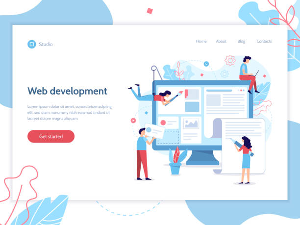
Introduction: What is Responsive Web Design and Why is it Important?

In today’s world, where technology is advancing at an unprecedented pace, an online presence is vital for every business and individual.
However, merely having a website is not enough; it’s crucial that your website is displayed correctly and with a flawless user experience on every device, from small smartphones to tablets and large desktops.
This is where the concept of #Responsive_Web_Design comes into play.
Responsive web design is an approach that ensures your website’s layout automatically adjusts and adapts to the screen size of the user’s device.
This is not just a luxury option; it’s a strategic necessity in the digital age.
Given the significant increase in mobile usage for internet access, ignoring this aspect of web design can lead to losing a large portion of your audience.
This approach means building a single website that matches the diverse needs of users and their devices, providing a seamless and optimal experience instead of creating separate versions for each platform.
This chapter will help you gain a deeper understanding of the nature of responsive web design and realize why this approach is crucial for your online success.
This is an #educational and #explanatory discussion that provides the foundation for understanding subsequent topics.
In fact, the ultimate goal of responsive design is to increase user satisfaction, reduce Bounce Rate, and ultimately improve website performance in search results.
Does your current corporate website not reflect your brand’s credibility and power as it should? Rasaweb solves this challenge for you with professional corporate website design.
✅ Increase visitor credibility and trust
✅ Targeted attraction of more customers
⚡ Click to receive free consultation!
The Evolution of the Web and the Emergence of Responsive Design

To fully understand the importance of responsive web design, it’s essential to look at the history and evolution of web design.
Initially, websites were designed with Fixed Layouts; meaning the page width was constant and optimized for a specific display resolution.
This approach was efficient during an era when users primarily accessed the internet with desktop monitors and similar resolutions.
However, with the sudden emergence of smartphones and tablets in the late 2000s, this design model quickly became inefficient.
Fixed websites on small mobile screens were unreadable, unusable, and required constant zooming and scrolling.
This situation led to a very poor user experience and highlighted the need for a new solution.
Some developers opted to create separate mobile versions of websites (M.dot sites), but this method was costly, time-consuming, and difficult to maintain, often leading to SEO issues and duplicate content.
In 2010, Ethan Marcotte introduced the concept of Responsive Web Design.
By introducing the concepts of media queries, Flexible Grids, and Fluid Images, he proposed a unified solution that enabled optimal display of a single website across all devices.
This approach not only reduced maintenance burden but also ensured a consistent user experience across platforms.
The emergence of responsive design was a turning point in the web industry and quickly became an industry standard that continues to evolve.
This evolution underscores the importance of flexibility and adaptability in today’s digital world.
Foundational Principles and Key Technologies in Responsive Design

Responsive web design is built upon three main pillars: Fluid Grids, Flexible Images, and Media Queries.
Understanding these principles is essential for effective responsive design implementation.
**1.
Fluid Grids:** Instead of using fixed pixel units for element widths, this approach uses relative units like percentages.
This means that the width of a column or a section of the page is set based on a percentage of the total page width, and its size automatically changes as the browser window resizes.
This principle ensures that the website layout always fits the available space and content is arranged correctly.
**2.
Flexible Images:** Images and other media elements must also be scalable.
By using properties like `max-width: 100%` in CSS, you can ensure that images never overflow their container and always scale proportionally with their parent’s width.
This prevents unwanted horizontal scrolling and layout disarray, and displays optimized images.
**3.
Media Queries:** This section is considered the heart of responsive design.
Media queries allow developers to apply different CSS rules based on various device characteristics, such as viewport width, height, orientation, or even resolution.
For example, you can define rules that change the layout from multi-column to single-column on smaller screens (e.g., below 768 pixels), adjust font sizes, or hide/show specific elements.
This powerful tool provides precise control over the user experience across different devices and makes responsive web design practical.
| Feature | Fixed Layout | Responsive Design |
|---|---|---|
| Page Width | Fixed (e.g., 960px) | Flexible (based on percentage) |
| Device Compatibility | Limited to specific resolution | Compatible with all devices |
| Number of Site Versions | One main version + possibly a separate mobile version | One single version for all |
| Maintenance and Updates | More complex (multiple codebases) | Simpler (one codebase) |
Additionally, the concept of the Viewport Meta Tag is crucial.
This HTML tag is placed in the <head> section of the page and instructs the browser to display the page with the device’s width, rather than the default desktop width.
This is a fundamental step for enabling responsive behavior on mobile devices.
Without this tag, even with media queries, mobile browsers might shrink the page, eliminating the benefits of responsive web design.
These core concepts are the backbone of any responsive design project.
Benefits of Responsive Design for Users and Businesses

Responsive web design, beyond being merely a technical approach, brings countless benefits to users and ultimately to businesses.
These advantages not only lead to a better user experience but also have a direct impact on SEO, digital marketing, and businesses’ Return on Investment (ROI).
**1.
Improved User Experience (UX):** This is the most significant advantage.
Today’s users expect websites to be easily navigable and readable regardless of the device they are using.
A responsive site ensures that content, images, and navigation are displayed optimally, without the need for zooming, horizontal scrolling, or switching between different versions of the site.
This greatly contributes to increased user satisfaction and reduced bounce rates.
**2.
SEO Benefits:** Google and other search engines have explicitly stated that they prefer responsive websites.
Having a single website with one consistent URL, instead of separate mobile versions, helps search engines crawl and index your content more easily.
Furthermore, better loading speed and an optimal user experience provided by responsive design are important factors in SEO ranking.
Since 2015, Google has considered “mobile-friendliness” as a ranking factor, and with the introduction of “Mobile-First Indexing” since 2018, its importance has doubled.
**3.
Reduced Development and Maintenance Costs:** Instead of developing and maintaining multiple versions of a website for different platforms, responsive web design allows for managing a single codebase.
This significantly reduces initial development, maintenance, update, and bug-fixing costs.
**4.
Increased Conversion Rates:** A smooth and optimized user experience directly impacts conversion rates.
When users can easily navigate your website, find the information they need, and perform desired actions (such as purchasing, signing up, or contacting), the likelihood of completing these actions increases.
**5.
Future-Proofing:** Given the increasing diversity of devices with different screen sizes entering the market, responsive design allows your website to adapt to new devices without major redesigns and remain relevant and functional for years to come.
This is a #guidance and #analytical advantage for long-term investment.
Did you know that your company’s website is the first point of contact for 75% of potential customers?
Your website is the face of your brand. With **Rasaweb**’s corporate website design services, build an online presence that earns customer trust.
✅ Create a professional and lasting image for your brand
✅ Attract target customers and increase online credibility
⚡ Get free consultation from **Rasaweb** experts!
Common Challenges and Pitfalls in Implementing Responsive Design

Despite its many benefits, responsive web design is not without its challenges.
Web developers and designers must be aware of common pitfalls to successfully complete a responsive design project.
Understanding these challenges is of particular importance to make necessary predictions and adopt appropriate solutions.
This section serves as a #thought-provoking_content that introduces you to the more complex dimensions of this field.
**1.
Performance and Loading Speed:** One of the biggest challenges is ensuring adequate loading speed across all devices, especially on mobile with slower internet connections.
High-resolution images optimized for desktop can create a heavy load on mobile.
Lack of optimization for images, scripts, and CSS files can lead to a frustrating user experience and lower SEO rankings.
Solutions like Lazy Loading and proper file compression are crucial.
**2.
Complexity in Design and Development:** Responsive web design requires deeper thinking about how content is displayed across different screen sizes.
Sometimes, translating a complex desktop layout to a small screen can be challenging.
This demands careful planning, the use of appropriate responsive design patterns, and sufficient expertise in CSS and JavaScript.
**3.
Testing and Browser Compatibility:** Testing a responsive website across a large number of devices, browsers, and operating systems can be time-consuming and complex.
Ensuring that the website functions correctly in every environment requires a comprehensive testing strategy.
Simulator tools are useful, but testing on real devices always yields the best results.
This is a #critical_news aspect for developers.
**4.
Content Management:** Heavy content, complex tables, or long forms can be difficult to manage on small screens.
Designers must consider how to prioritize and display content across different sizes to maintain an optimal user experience.
This sometimes means hiding or reordering certain elements on mobile.
**5.
SEO Challenges with Incorrect Implementation:** If responsive web design is not implemented correctly, it can harm SEO instead of helping it.
Issues such as duplicate content, slow mobile loading speed, or errors in using the viewport meta tag can lead to penalties from search engines.
Therefore, correct implementation in accordance with SEO principles is crucial.
Popular Tools and Frameworks for Responsive Web Design

To facilitate and accelerate the responsive web design process, numerous tools and frameworks have been developed to help designers and developers achieve optimal results.
Familiarity with these tools is essential for anyone working in web development.
This section includes #technical and #guidance tips for choosing the right tools.
**1.
Bootstrap:** Undoubtedly, Bootstrap is one of the most popular CSS frameworks for responsive design.
This framework includes a wide range of pre-built HTML, CSS, and JavaScript components (such as navigation bars, forms, buttons, and a grid system) that allow developers to quickly build responsive websites with minimal coding.
Its 12-column grid system is very powerful for creating flexible layouts across different screen sizes.
**2.
Foundation:** Foundation is another powerful responsive framework developed by ZURB.
Like Bootstrap, this framework offers a set of tools and components, but it is often preferred by developers seeking more control over the final output due to its greater flexibility and more minimalistic coding.
Foundation also has a flexible grid system and is suitable for building complex web applications.
**3.
CSS Flexbox and CSS Grid:** These are not frameworks, but native CSS modules that have revolutionized how responsive layouts are designed.
- **Flexbox (Flexible Box Layout):** Is excellent for one-dimensional layout of elements (in a single row or column).
This module provides highly flexible alignment, space distribution, and ordering of elements, making it ideal for building navigations, forms, and smaller components. - **CSS Grid (CSS Grid Layout):** Is designed for two-dimensional layout of elements (both in rows and columns).
CSS Grid enables the creation of complex and responsive layouts in a highly visual and powerful way, and is ideal for building overall webpage layouts.
**4.
CSS Preprocessors:** Tools like Sass and Less add programming capabilities to CSS (such as variables, functions, and inheritance) which make managing complex CSS code for responsive web design easier.
These tools significantly help in better organization and reducing code repetition.
The choice of the right tool depends on project needs, team skills, and the required level of control.
However, using any of these tools can make the responsive design process simpler and more efficient.
Testing and Optimizing Responsive Websites
After implementing responsive web design, the critical phase of testing and optimization begins.
A responsive site is only successful if it performs flawlessly across all devices, browsers, and network conditions.
This section includes #technical and #educational tips to ensure the final quality of your product.
**1.
Real Device Testing:** Although simulators and browser developer tools are very useful, nothing can replace testing on real devices.
Subtle differences in browser rendering, screen size, and processing speed between real devices can only be identified through physical testing.
Creating a diverse set of mobile devices and tablets for testing is essential.
**2.
Browser Developer Tools:** Modern browsers like Chrome, Firefox, and Edge offer powerful developer tools that include Device Mode for simulating various screen sizes and testing media queries.
These tools are very practical for quick debugging and initial adjustments.
**3.
Online Responsive Testing Tools:** Websites like Responsive Design Checker and Am I Responsive are free online tools that allow you to view your website simultaneously on different screen sizes.
These tools provide a good overall view of how responsive your layout is.
**4.
Performance Optimization:**
- **Responsive Images:** Using HTML attributes like `srcset` and `sizes` or the `
` element to deliver optimally sized images for each device is essential.
Additionally, compressing images and using next-generation formats (like WebP) can significantly improve loading speed. - **Lazy Loading:** Ensure that off-screen images and videos are loaded only when the user scrolls towards them.
This lightens the initial page load. - **Minification and Gzip Compression:** Compressing CSS, JavaScript, and HTML files can dramatically reduce file sizes and improve loading speed.
- **Caching:** Using browser and server caching to temporarily store static website files makes subsequent user visits faster.
| Category | Tool/Metric | Description |
|---|---|---|
| Compatibility Testing | Chrome DevTools – Device Mode | Simulating different devices in the browser |
| Compatibility Testing | BrowserStack / LambdaTest | Testing on real and cloud virtual devices |
| Speed Optimization | Google PageSpeed Insights | Speed analysis and optimization suggestions |
| Speed Optimization | Lighthouse (in Chrome DevTools) | Comprehensive report on performance, accessibility, and SEO |
By conducting thorough tests and necessary optimizations, you can ensure that your responsive web design is not only aesthetically pleasing but also performs at its best, providing a flawless user experience for all visitors.
This approach signifies completing the development cycle and ensuring the delivery of a high-quality final product.
The Future of Web Design: Beyond Responsiveness

While responsive web design continues to be a golden standard in the web industry, technological developments are always advancing.
A look into the future shows new concepts and approaches emerging that can further enhance the user experience.
This section delves into the #news and #analytical aspects of future web design developments.
**1.
Adaptive Design:** While responsive design smoothly and fluidly adapts to screen size, adaptive design uses several fixed layouts for specific screen sizes.
The website intelligently delivers the best layout based on the identified device.
This approach can be useful for more precise content control at specific breakpoints, although it offers less flexibility than responsive design.
**2.
Mobile-First Approach:** This is a design philosophy that starts designing and developing a website for mobile devices first, and then gradually adds features and complexities for larger screens.
This approach ensures that the core and critical experience is optimized for mobile users and prevents overloading smaller devices with unnecessary content and features.
Google has also doubled the importance of this approach with Mobile-First Indexing.
**3.
Progressive Web Apps (PWAs):** PWAs are websites that offer functionality similar to native mobile applications.
This includes capabilities such as offline operation, Push Notifications, and the ability to add to the device’s home screen.
PWAs leverage standard web technologies and are rapidly becoming a powerful option for delivering rich and responsive user experiences.
**4.
Advanced CSS and JavaScript Capabilities:** Continuous advancements in CSS (such as `container queries` and `subgrid`) and JavaScript (such as WebAssembly and Web Workers) provide new possibilities for building highly dynamic and responsive user interfaces.
These technologies give developers unprecedented control over how elements behave in different environments.
**5.
Importance of Accessibility:** In the future, web design will not be limited to responsiveness across different sizes but must also be accessible to all users, including individuals with disabilities.
This includes the correct use of Semantic HTML, proper color contrast design, and providing text alternatives for non-text content.
This is a more comprehensive approach to responsive web design that considers diverse users.
Are you dissatisfied with the low conversion rate of visitors to customers on your e-commerce site?
Solve this problem forever with professional e-commerce website design by Rasaweb!
✅ Increase visitor-to-customer conversion rate
✅ Create an excellent user experience and build customer trust
⚡ Get free consultation
Successful and Inspiring Examples of Responsive Design

Seeing practical and successful examples of responsive web design can be very inspiring and help in better understanding how to implement this approach.
This section includes #engaging and #analytical several websites that have been pioneers in this field.
These examples demonstrate how a seamless and optimized user experience can be provided on any device through correct implementation of responsive principles.
**1.
Medium:** The Medium platform is known for its minimalist design and excellent reading experience.
Its responsive design ensures that content is easily readable on any screen size.
Fonts, images, and layout are adjusted so that the user’s focus remains on the text, whether on a large desktop screen or a small smartphone.
This website is a prime example of the importance of simplicity and readability in responsive design.
**2.
Shopify:** The e-commerce platform Shopify is itself an excellent example of responsive web design.
Its dashboard and tools for store managers, as well as the online stores built on this platform, are all designed responsively.
This means that business owners can manage their stores from any device, and customers can easily make purchases from any platform.
This example demonstrates the importance of a unified user experience in commercial environments.
**3.
The Guardian:** This British newspaper was one of the first major news organizations to fully embrace responsive design.
Their website demonstrates well how a large volume of news and media content can be presented in an organized and accessible manner across different screen sizes.
They use a modular approach to content, allowing for layout changes based on available space.
**4.
Google (and its products):** Google itself and most of its products (such as Google Search Console, Google Analytics, Gmail) are prominent examples of responsive web design.
Using their Material Design principles, they provide a consistent and optimized user experience across platforms.
This includes changes in navigation, font size, and the display of interactive elements.
**5.
Dropbox:** The Dropbox website and web tools are also well-responsive.
They allow users to access and manage their files, regardless of the device they are using.
This website is an example of how a cloud service can provide a reliable and consistent user experience across different platforms.
These examples demonstrate that responsive web design is not only possible but also essential for online success in today’s era.
By studying and drawing inspiration from these websites, valuable insights can be gained for your own projects.
Conclusion and Next Steps in the Responsive Design Journey

As explored in this comprehensive article, responsive web design is no longer an optional choice, but a fundamental requirement for any successful online presence.
From improved user experience and SEO benefits to reduced development and maintenance costs, the advantages of this approach are undeniable.
Understanding the foundational principles, being aware of challenges, and utilizing appropriate tools and frameworks are all crucial for successful responsive design implementation.
The future of the web is moving towards more integrated, faster, and more accessible user experiences, and responsive design is the cornerstone of this future.
This chapter, as a final #guidance and #explanation, summarizes the most important points and outlines a clear path for your next steps.
**Key Takeaways:**
- **User Experience First Priority:** Always start your design by considering the user and their needs on different devices.
The goal is to provide a seamless experience. - **Performance Optimization:** Your website’s loading speed on mobile is critically important.
Don’t forget image optimization, code minification, and using caching techniques. - **Continuous Testing:** Given the countless variety of devices and browsers, regular and comprehensive testing on real devices is essential for identifying and resolving issues.
- **Smart Use of Tools:** CSS frameworks and tools like Bootstrap, Flexbox, and Grid can significantly accelerate and simplify the development process.
- **Future Outlook:** Always stay aware of the latest trends and technologies (like PWAs and Mobile-First) to ensure your website is future-ready.
**Next Steps for You:**
- **Analyze Your Current Website:** If you have an existing website, use tools like Google PageSpeed Insights and Google’s Mobile-Friendly Test to evaluate its performance and responsiveness.
- **Detailed Planning:** Before starting any responsive web design project, prepare a detailed plan for your layout, content, and breakpoints.
- **Continuous Learning:** The web industry is constantly changing.
Stay ahead of the competition by updating your knowledge in CSS, JavaScript, and new tools. - **Focus on Content:** Ensure that your content is also optimized for display on various devices and is easily consumable.
- **Collaborate with Experts:** If you lack sufficient resources or knowledge, collaborate with specialized web developers and designers in responsive design.
Responsive web design is not just a trend, but the backbone of a successful presence in the web world.
By embracing and implementing these principles, you can ensure that your website will be accessible and enjoyable for every user, anytime and anywhere.
This investment is vital for the future of your business and your connection with your audience.
Frequently Asked Questions
| Question | Answer |
|---|---|
| What is responsive web design? | It is a web design approach that ensures a website is displayed correctly on various screen sizes (such as mobile, tablet, desktop) and its layout adapts to the user’s screen size. |
| Why is responsive design important? | Given the widespread use of various devices to access the internet, responsive design provides a consistent user experience for all users, reduces the site’s bounce rate, and improves the site’s SEO. |
| How is responsive design implemented? | This type of design is often implemented using CSS3 Media Queries, Flexible Grids, and Flexible Images. |
| What are the main components of responsive design? | It includes Media Queries for applying different styles based on device characteristics, using relative units (like percentages and ems) for sizes and layout, and using flexible images and media whose dimensions change proportionally to the available space. |
| What are the main advantages of using responsive design? | Improved user experience, reduced development and maintenance costs (compared to having separate versions for mobile and desktop), improved search engine rankings (because Google prefers it), and increased site accessibility for all users. |
And other advertising services from Rasa Web Advertising Agency
Smart Link Building: A fast and efficient solution for online growth focusing on optimizing key pages.
Smart Conversion Rate Optimization: A professional solution for analyzing customer behavior, focusing on optimizing key pages.
Smart Advertorial: A novel service to increase user engagement through attractive UI design.
Smart Advertising Campaign: An effective tool for customer acquisition with the help of SEO-driven content strategy.
Smart Google Ads: A combination of creativity and technology to increase click-through rate through custom programming.
And over hundreds of other services in the field of internet advertising, advertising consultation, and organizational solutions
Internet Advertising | Advertising Strategy | Advertorial
Resources
- An article on responsive design in Virgool
- Responsive design guide in Webramz
- Principles of responsive web design in Faradars
- Best practices for responsive design in Tosinso
? Rasaweb Afarin, your strategic partner in the digital world. From search engine optimization to multilingual website design and content marketing, we guarantee your business’s growth and visibility.
📍 Tehran, Mirdamad Street, next to Bank Markazi, Southern Kazeroon Alley, Ramin Alley No. 6


