
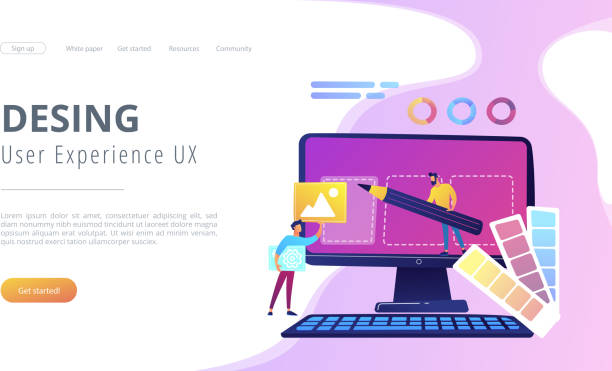
What is Responsive Web Design: An Introduction?

In today’s digital world, where users access the internet from a variety of devices, the concept of #طراحی_سایت_واکنش_گرا or #Responsive_Web_Design has become more important than ever.
This website design approach means building web pages that can automatically adjust their size and content to the user’s screen dimensions, whether it’s a small smartphone, a medium tablet, or a large desktop monitor.
The main goal of #طراحی_سایت_ریسپانسیو (responsive design) is to provide the best possible user experience regardless of the device.
This concept goes beyond simply resizing images; it includes flexibility in layout, fonts, navigation, and other visual elements.
In the past, websites were often designed for desktops, and the mobile user experience was neglected.
But with the significant increase in mobile usage for web browsing, the need for an efficient responsive website design became inevitable. This approach allows designers and developers to ensure that the website displays correctly on all platforms with a single design and development effort.
Therefore, development costs and time are also reduced, as there is no need to develop separate versions for each device.
In this educational article, we will comprehensively explore this topic and explain all its aspects, from the most basic concepts to advanced techniques.
We will also discuss its numerous benefits for businesses and users and demonstrate how a responsive website design can help your online success.
This explanatory section will serve as a foundation for a deeper understanding of subsequent topics and answer your initial questions.
Does your company’s website perform as it should, befitting your brand? In today’s competitive world, your website is your most important online tool. Rasaweb, a specialist in professional corporate website design, helps you to:
✅ Gain customer credibility and trust
✅ Convert website visitors into customers
⚡ Get a free consultation!
Why is Responsive Design Crucial in the Current Era?

In the last decade, internet usage patterns have undergone fundamental changes.
The majority of users no longer access the web only through desktop computers; smartphones and tablets have become the primary tools for web browsing. This shift has doubled the importance of responsive web design.
According to global statistics, over half of web traffic currently originates from mobile devices.
Therefore, if your website is not optimized for these devices, you will lose a large portion of your potential audience.
A non-responsive website provides a very unpleasant user experience; users are forced to zoom or scroll horizontally to view content, which quickly leads to them leaving the site.
This not only harms your business but also negatively affects your ranking in search engines.
Google, as the largest search engine, has clearly stated that it prioritizes websites with responsive web design.
Google’s Mobile-First Indexing algorithm means that the mobile version of your website is used as the primary basis for indexing and ranking.
This is important and analytical news for any business with an online presence.
Mobile-incompatible websites not only drop in search results but also have higher bounce rates and lower conversion rates.
Therefore, investing in responsive web design is not just an option but a necessity to survive and grow in today’s competitive market.
This is even more critical, especially for online stores and service businesses that require continuous customer interaction.
Fundamental Principles and Techniques of Responsive Web Design

To implement a successful responsive web design, understanding the basic principles and techniques is essential.
These principles include three key elements: Fluid Grids, Fluid Images, and Media Queries.
Fluid grids mean using relative units like percentages for element widths instead of fixed pixel units.
This allows the page layout to flexibly change with screen size.
For example, if a column occupies 20% of the page width, this ratio will be maintained regardless of the screen size.
Fluid images are also designed to proportionally change their dimensions with screen size changes to prevent them from overflowing or becoming too large.
Using max-width: 100%; in CSS for images is a common method to ensure their fluidity.
Ultimately, Media Queries are the heart of responsive web design.
These CSS commands allow developers to apply different style rules based on device characteristics such as screen width, orientation (horizontal or vertical), and even resolution.
For example, you can define that on pages with a width less than 768 pixels, the site’s navigation changes to a hamburger menu.
This specialized approach ensures that every part of the website is optimally displayed at any size.
| Feature | Responsive Design | Fixed Design |
|---|---|---|
| Device Compatibility | Excellent (Compatible with all dimensions) | Poor (Only one specific dimension) |
| Coding | A single codebase | May require separate versions |
| User Experience | Optimized on all devices | Low on incompatible devices |
| SEO | Google-approved, better ranking | May have lower ranking |
In addition, more advanced techniques exist, such as using Viewports to control page scaling and using Flexbox or CSS Grid to build more complex and flexible layouts.
These powerful tools allow designers to have more control over how content is displayed at different sizes.
Learning and applying these principles is the first step to becoming a specialist in adaptive web design and will help you build websites that are not only beautiful but also perform well and are enjoyable for users in all circumstances.
Mobile-First Approach in Responsive Design

The mobile-first approach is one of the most important philosophies in responsive web design, placing strong emphasis on starting the design and development process from the smallest screens (mobile) and then gradually progressing to larger screens.
This approach contrasts with the traditional method where design began with desktop and was then adapted for mobile.
The main reason for the importance of this approach is the inherent limitations of mobile devices, such as small screen size, limited internet speed, and the need for touch interaction.
By designing for mobile first, designers are forced to focus on the most essential content and functionalities and avoid clutter and information overload.
This naturally leads to simpler, faster, and more user-friendly designs.
When you start with mobile, you are compelled to prioritize content in the best possible way and consider what information the user truly needs on a mobile device.
This analytical approach helps eliminate unnecessary elements and focus on user experience.
After designing for mobile, more features and details can gradually be added for tablets and desktops using media queries.
This process, sometimes called “Progressive Enhancement,” ensures that the website has a strong foundation at any size.
Implementing a responsive web design with a mobile-first approach not only improves the user experience but also has a positive impact on SEO.
Google favors websites optimized for mobile, which can lead to better rankings in search results.
This specialized guidance is vital for anyone who wants to have a truly effective and user-friendly website and moves towards true mobile web optimization.
Dissatisfied with your e-commerce site’s low sales?
Rasaweb is your solution for a professional and high-selling e-commerce site.
✅ Significant increase in sales and revenue
✅ Easy and enjoyable shopping experience for customers
⚡ Get a free consultation from Rasaweb now!
Responsive Design Tools and Frameworks
To facilitate the responsive web design process, numerous tools and frameworks have been developed to help designers and developers build device-compatible websites with greater speed and efficiency.
One of the most widely used frameworks is Bootstrap.
This framework includes a set of predefined CSS and JavaScript that allows you to quickly create responsive layouts, UI components (like menus, forms, buttons), and grid systems.
Bootstrap is a popular choice for many projects, from small personal websites to enterprise platforms, due to its excellent documentation and large user community.
Another framework with a different approach is Foundation.
This framework also offers similar capabilities to Bootstrap but is often considered a more flexible and less “opinionated” option, which is more suitable for developers seeking greater control over the final styling.
In addition to these frameworks, CSS grid systems like CSS Grid Layout and Flexbox are powerful tools in themselves for creating responsive layouts.
CSS Grid is highly efficient for two-dimensional layouts (rows and columns), and Flexbox is very effective for one-dimensional layouts (row or column).
Both, as native CSS components, provide precise control over how elements are positioned and behave in response to screen size changes.
Using these tools can significantly simplify the responsive web design process and allow you to focus on user experience and site content instead of worrying about technical compatibility details.
This instructional and guiding section helps you choose the best tools for your project and have an effective adaptive web design.
Testing and Optimizing Responsive Design

After implementing a responsive web design, the critical stage of testing and optimization arrives.
This stage ensures that your website displays correctly and performs well across all devices and browsers.
The first step in testing is to use browser developer tools.
Most modern browsers like Chrome, Firefox, and Edge have a mode that allows you to simulate the website at various screen dimensions.
This feature helps you quickly identify layout and display issues at different sizes.
In addition to testing in the development environment, testing on real devices (mobile, tablet, various laptops) is also crucial.
This allows you to understand the actual user experience and discover potential issues related to touch, loading speed, and specific device interactions.
To speed up this process, you can use cloud testing services like BrowserStack or CrossBrowserTesting, which provide access to hundreds of virtual devices and browsers.
Performance optimization is also an important part of responsive web design.
High-volume images, unnecessary JavaScript scripts, and large CSS files can slow down site loading on mobile devices, which severely degrades the user experience.
Using Responsive Images with attributes like srcset and sizes to provide images with appropriate resolution for each device, image compression, optimizing CSS and JavaScript code, and leveraging caching techniques all help improve loading speed.
This explanatory and specialized process ensures that your website not only looks good but also performs excellently and leads to user satisfaction.
The Impact of Responsive Design on SEO and User Experience
Responsive web design is not just a design trend; it is a fundamental factor in improving SEO (Search Engine Optimization) and enhancing User Experience (UX).
From an SEO perspective, Google has officially stated that it prefers responsive websites over separate mobile websites (with separate addresses like m.example.com).
The reason for this preference is that with a single URL, Google does not need to crawl and index two different versions of a site, which simplifies and makes the indexing process more efficient.
This is important news and analysis for SEO specialists.
Responsive websites typically have a lower bounce rate because users are not forced to zoom or scroll horizontally and can easily interact with the content.
Also, user dwell time on these sites is longer, and these factors send positive signals to search engines, which can help improve rankings.
| Metric | Responsive Design | Non-Responsive Design |
|---|---|---|
| Google Ranking | Improvement | Potential drop |
| Bounce Rate | Decrease | Increase |
| Dwell Time | Increase | Decrease |
| Conversion Rate | Increase | Decrease |
| Mobile Loading Speed | Optimized | Slow |
From a user experience perspective, a good responsive web design means that users can easily access their desired content without needing to constantly resize or scroll the page.
This not only increases user satisfaction but also raises the likelihood of their return to the site and performing desired actions (such as purchasing or signing up).
Responsive websites are particularly vital for businesses looking to attract a wide audience and establish a strong presence across all digital channels.
This type of design allows your website to effectively compete in the digital age and attract more audiences.
This thought-provoking content shows whether your business is ready to face future digital challenges.
Common Challenges and Solutions in Responsive Design

Despite its many advantages, responsive web design also comes with challenges that developers must be aware of.
One of the most common challenges is image management.
High-resolution images suitable for large displays can cause slow loading speeds on mobile devices.
The solution to this problem is to use Responsive Images with picture and srcset tags, which allow the browser to load the appropriate image for the screen size and device resolution.
Another challenge is the complexity of navigation on small screens.
Large, multi-level menus that work well on desktops may take up too much space on mobile or be difficult to use.
A common solution is to convert navigation to a “hamburger menu” or “dropdown menu” on smaller dimensions, which takes up less space and improves the user experience.
Also, managing tabular content and videos can be challenging.
Tables may overflow on small screens, and videos may not scale correctly.
For tables, horizontal scrolling or converting them to card-like lists on mobile can be used.
For videos, using a flexible container with a fixed aspect ratio (like padding-bottom: 56.25%; for 16:9 videos) is a suitable solution.
Compatibility with older browsers can also be a challenge, as these browsers may not fully support some new CSS features like Flexbox or Grid.
Using “Polyfills” or “Graceful Degradation” (designing for the latest features and ensuring basic functionality on older browsers) can help solve this problem.
This specialized guidance section helps you approach professional responsive web design with greater preparedness and prevent common issues.
Is your company’s website as professional and trustworthy as it should be? With specialized corporate website design by Rasaweb, create an online presence that represents your credibility and attracts more customers.
✅ Build a powerful and professional image for your brand
✅ Convert visitors into real customers
⚡ Get a free consultation now!
The Future of Responsive Design and Emerging Trends
The world of web is constantly evolving, and responsive web design is no exception.
While its fundamental principles remain constant, emerging trends and new technologies are shaping its future.
One of the most important future trends is a greater focus on performance and speed.
With the advent of Progressive Web Apps (PWAs) and Google’s emphasis on Core Web Vitals, website loading speed and responsiveness have become a higher priority.
This means more code optimization, using next-generation images (like WebP), and employing pre-loading techniques to maximize the user experience on all devices, especially mobile.
Another trend is Component-Based Design.
With frameworks like React, Vue, and Angular, websites are divided into a collection of independent components, each of which can be designed responsively.
This approach simplifies the development and maintenance of complex websites and increases code reusability.
Also, designing for less common devices such as smartwatches, wearables, and even smart TVs presents new challenges for adaptive web design.
This means thinking beyond typical rectangular screens and considering different inputs (voice, limited touch).
Artificial Intelligence and Machine Learning can also play an increasing role in the future of responsive web design, for example, in personalizing content based on device and user behavior.
This analytical and news section shows how a successful responsive web design must constantly evolve to keep pace with user needs and technological advancements, helping you prepare for a challenging future.
Conclusion and Next Steps in Responsive Design

Throughout this article, we have comprehensively examined responsive web design, explaining its importance, principles, tools, challenges, and future.
It is clear that responsive web design is no longer a luxury option but a necessity for any business or individual seeking a successful online presence.
This approach not only improves user experience and increases customer satisfaction but also plays a vital role in search engine optimization and, ultimately, the growth of your business.
Given the increasing use of mobile devices, neglecting responsive design means losing a significant portion of your audience and business opportunities.
The next step for anyone who wants to succeed in this field is continuous learning and updating your knowledge.
The web world is rapidly changing, and new technologies are constantly being introduced.
Familiarity with the latest frameworks, tools, and best practices will help you always build efficient and up-to-date websites.
Additionally, practical exercise is crucial for solidifying concepts and techniques.
Starting with small projects, experimenting with media queries, Flexbox, and CSS Grid, and then moving towards larger projects can smooth your learning path.
This final educational and guiding section emphasizes that success in adaptive web design requires a commitment to learning and innovation.
By correctly implementing the principles of responsive web design, you can ensure that your website provides the best possible experience for every user, on every device, not only now but also in the future, and helps you achieve your online goals.
Frequently Asked Questions
| Question | Answer |
|---|---|
| What is Responsive Web Design? | A web design approach that ensures a website displays well across various screen sizes and devices (like mobile, tablet, desktop) and provides an optimal user experience. |
| Why is responsive design important? | Improved user experience, better SEO (Google prefers responsive sites), time and cost savings (no need to build separate sites for mobile). |
| What are the main techniques in responsive design? | Using flexible grids and layouts (Fluid Grid), flexible images and media (Flexible Images), and employing Media Queries in CSS. |
| What are Media Queries in responsive design? | A part of CSS3 that allows you to apply different styles based on the characteristics of the device on which the website is displayed (such as screen width, resolution, media type). |
| What are the benefits of using responsive design? | Reaching more users (especially mobile), improved user engagement rate, reduced maintenance costs (one site for all devices), and improved conversion rate. |
And other advertising services by Rasa Web Advertising Agency
Smart Website Development: An exclusive service for digital branding growth based on attractive UI design.
Smart Google Ads: An innovative service for increasing customer acquisition through the use of real data.
Smart UI/UX: Professional optimization for campaign management using real data.
Smart Data Analysis: An innovative service for increasing customer acquisition through marketing automation.
Smart UI/UX: A creative platform for improving customer acquisition with an SEO-driven content strategy.
And over hundreds of other services in the field of internet advertising, advertising consultation, and organizational solutions
Internet Advertising | Advertising Strategy | Advertorial
Sources
Responsive Design Basics
Responsive Web Development
Mobile-First Design Guide
Responsive Testing Tools
? Are you ready to take your business to the top? Rasaweb Afarin Digital Marketing Agency, specializing in SEO, content marketing, and multilingual website design, paves your path to digital success.
📍 Tehran, Mirdamad Street, next to Bank Markazi, Kazeroon South Alley, Ramin Alley, No. 6


