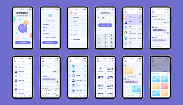
## 🎨 Comprehensive Guide to Choosing a Color Palette in UI/UX Design (Tips and Tricks)

In today’s #digital marketing world, #UI/UX design plays a vital role in the success of any online product or service. One of the essential and influential aspects of this design is choosing the right color palette. A good color palette can improve user experience, strengthen brand identity, and ultimately increase conversion rates. This guide, by Rasaweb Afarin, a specialist in #internet marketing, #SEO, and #website development, will help you choose the best color palette for your UI/UX design by considering key tips and tricks. The right choice of colors not only creates visual appeal but also helps users easily interact with the site. For example, using warm colors can evoke a sense of energy and excitement, while cool colors convey a sense of calm and trust. These choices should be made carefully, taking into account the target audience.
🤔 Why is Choosing the Right Color Palette Important in UI/UX Design?

Choosing the right color palette goes beyond aesthetics. Colors have a profound impact on users’ emotions and perceptions. A carefully thought-out color palette can:
1. Improve User Experience (UX): Using contrasting colors for buttons and interactive elements increases usability.
2. Strengthen Brand Identity: Colors can reflect your brand’s personality and values. Color consistency across all platforms increases brand recognition.
3. Increase Conversion Rates: Specific colors can encourage users to take desired actions (such as purchasing or signing up). For example, using red for call-to-action (CTA) buttons can attract more attention.
4. Improve Accessibility: Ensure your color palette is accessible to people with visual impairments. Checking color contrast is crucial to ensure text readability. UI/UX design should always serve the user, and colors play a significant role in this. Rasaweb Afarin, by providing specialized services in #UX / UI design, helps you create the best user experience for your audience. Responsive website design means compatibility with all devices.
Do you want your content to be properly targeted and lead to customer acquisition? With content marketing from Rasaweb Afarin, we develop a comprehensive content strategy for your business that increases sales!
✅ Development of a precise audience persona
✅ Planning and production of SEO-optimized content
✅ Increase brand credibility and thought leadership
Contact us for your content strategy!
🧐 Understanding Color Theory; A Foundation for Choosing a Color Palette in UI/UX Design
Before anything else, understanding color theory is essential. Consider the following concepts:
1. The Color Wheel: A visual tool that shows the relationships between colors.
2. Primary, Secondary, and Tertiary Colors: Recognizing these categories helps you create balanced palettes.
3. Color Harmony: Methods of combining colors to create visually appealing effects (such as complementary, analogous, triadic, etc.).
4. Color Value and Saturation: Value refers to the lightness or darkness of a color, while saturation refers to its purity. Adjusting these two features can have a significant impact on your color palette.
5. Color Psychology: Understanding the impact each color has on human emotions and behavior. For example, blue is often associated with trust and tranquility, while yellow is associated with happiness and optimism. Choosing a color palette should be based on these principles, taking into account the purpose and audience of the UI/UX design. Rasaweb Afarin, with its experienced specialists, helps you in this field.
Click here to preview your posts with PRO themes ››
| Color | Psychological Effects |
|---|---|
| Red | Energy, Excitement, Danger |
| Blue | Trust, Tranquility, Security |
| Yellow | Happiness, Optimism, Warning |
| Green | Nature, Growth, Health |
| Purple | Luxury, Creativity, Spirituality |
👩💻 Step-by-Step; How to Choose a Color Palette in UI/UX Design
1. Determine the Goal: What is the main purpose of your website or application? What feeling do you want to create in users?
2. Know Your Target Audience: Who are your users? What preferences and expectations do they have?
3. Analyze Competitors: What is the color palette of your competitors? How can you differentiate yourself?
4. Choose a Primary Color: This color should be most closely associated with your brand.
5. Choose Secondary and Accent Colors: These colors should be harmonious with the primary color and used to highlight important elements.
6. Test and Feedback: Test your color palette with real users and consider their feedback.
UI/UX design is an iterative process. Don’t be afraid to experiment and refine your color palette. Rasaweb Afarin, by providing #optimization consulting services, helps you choose the optimal color palette for your UI/UX design.
Useful Tools for Creating and Choosing a Color Palette in UI/UX Design

Fortunately, there are numerous online tools to help you create and choose a color palette. Some of the most popular include:
1. Adobe Color: A powerful tool for creating and editing color palettes.
2. Coolors: A quick and easy color palette generator.
3. Paletton: A tool for creating color palettes based on color theory.
4. Color Hunt: A collection of inspiring color palettes.
5. Khroma: Personalized color palettes based on your preferences.
These tools can help you find suitable and harmonious color palettes and facilitate the UI/UX design process. Using these tools allows you to find the color palette you want with greater speed and accuracy. Rasaweb Afarin, by providing #visual content production services, helps you use your chosen color palette in your visual content in the best way possible.
Does your business need a sustainable Growth Engine? Rasaweb Afarin, with Growth Engine Consulting, offers you proven strategies and tactics to experience rapid and measurable growth!
✅ Identifying growth bottlenecks in your business
✅ Developing data-driven growth strategies
✅ Optimizing marketing and sales processes
Accelerate your business growth with us!
⚠️ Common Mistakes in Choosing a Color Palette and How to Avoid Them in UI/UX Design

1. Using Too Many Colors: Limit your palette to 3-5 colors.
2. Ignoring Contrast: Ensure the text and background are sufficiently contrasting.
3. Using Trendy Colors Without Considering the Brand: Your color palette should match your brand identity.
4. Not Testing the Color Palette: Test your color palette in different conditions before finalizing it.
5. Ignoring Accessibility: Ensure your color palette is accessible to all users.
By avoiding these mistakes, you can create a more effective and attractive color palette for your UI/UX design. Rasaweb Afarin, by providing #infrastructure consulting services, helps you build your design from the beginning based on correct principles. A suitable color palette greatly helps UI/UX design.
🎨 Impact of Colors on Users; Psychological Aspects in Choosing a Color Palette in UI/UX Design
Colors are not just aesthetic; they have strong psychological effects on users. Understanding these effects can help you choose the right color palette:

Click here to preview your posts with PRO themes ››
1. Blue: Conveys a sense of trust, security, and tranquility. Suitable for the financial and healthcare industries.
2. Green: Associated with nature, health, and growth. Suitable for companies active in the environment and organic food fields.
3. Yellow: Conveys a sense of happiness, optimism, and energy. Suitable for young and creative brands.
4. Red: Attracts attention, conveys a sense of excitement and energy. Suitable for calls-to-action (CTAs) and discounts.
5. Purple: Associated with luxury, creativity, and spirituality. Suitable for luxury brands and the arts.
In UI/UX design, the choice of colors should be made carefully, taking these psychological aspects into account. Rasaweb Afarin, by providing #brand visual identity services, helps you choose colors that best reflect your brand’s personality and values. For example, using red colors for purchase buttons can increase conversion rates.
| Design Element | Suggested Color | Reason |
|---|---|---|
| Call to Action (CTA) Button | Red or Orange | Attract attention and create a sense of urgency |
| Background | White or Light Gray | Create a sense of cleanliness and focus on content |
| Main Text | Black or Dark Gray | High readability and prevent eye strain |
| Links | Blue | Recognized and creates a sense of trust |
💡 Successful Examples of Color Palettes in UI/UX Design

1. Spotify: Using bright green as the primary color conveys a sense of freshness and dynamism.
2. Airbnb: Using red as an accent color draws attention to important elements.
3. Dropbox: Using blue as the primary color conveys a sense of trust and security.
4. Medium: Using white as the primary color conveys a sense of cleanliness and focus on content.
By reviewing these examples, you can be inspired and choose a suitable color palette for your UI/UX design. In #advertising campaigns, the use of appropriate colors can have a significant impact on conversion rates. Rasaweb Afarin, by providing #product marketing campaign services, helps you convey your message to your audience in the best way possible using appropriate colors. Choosing a suitable color palette in UI/UX design has a significant impact.
📱 Considerations for Different Devices in Choosing a Color Palette for UI/UX Design

Your color palette should display well on different devices (mobile, tablet, desktop). Points to consider:
1. Screen Brightness: Colors may look different on brighter or darker screens.
2. Screen Size: Your color palette should be visible on different screen sizes.
3. Dark Mode: Your color palette should also work well in dark mode.
By considering these considerations, you can ensure that your UI/UX design displays well on all devices. Rasaweb Afarin, by providing #website and application development services, helps you have a website and application that are compatible with all devices. Paying attention to these points in UI/UX design is essential.
Do you need a comprehensive digital marketing strategy? Rasaweb Afarin, by developing an internet marketing strategy, draws a clear path for the online growth of your business so you can achieve your goals with careful planning!
✅ Strategic and targeted planning
✅ Increase online presence and market share
✅ Achieving marketing goals systematically
Contact us now for a flawless strategy! 09124438174
✔️ Summary and Key Points in Choosing a Color Palette for UI/UX Design

Choosing the right color palette is an important and sensitive process in UI/UX design. By considering the points mentioned in this guide, you can choose an effective color palette for your website or application. Remember that the main goal is to create a user experience that is attractive, accessible, and consistent with your brand identity.
Click here to preview your posts with PRO themes ››
Key Points:
1. Know Your Goal and Audience.
2. Understand Color Theory.
3. Use Online Tools.
4. Avoid Common Mistakes.
5. Test Your Color Palette.
By following these points, you can choose the right color palette for your UI/UX design and help the success of your online product or service. Rasaweb Afarin, by providing comprehensive #digital marketing services, is with you to achieve your business goals. Remember that UI/UX design is an art and science that requires a lot of attention and accuracy. In the end, UI/UX design should be beautiful and functional.
| Question | Answer |
|---|---|
| How do I choose a harmonious color palette? | Use online tools like Adobe Color or Coolors and try different color harmonies (like complementary, analogous, etc.). |
| What colors are suitable for Call-to-Action (CTA) buttons? | Red and orange colors are usually suitable for CTA buttons because they attract attention and create a sense of urgency. |
| How do I ensure that my color palette is accessible to all users? | Check the color contrast between the text and the background and use accessibility testing tools. |
| Should I use trendy colors? | Only if they match your brand identity. The harmony and effectiveness of the color palette are more important than being trendy. |
| How do I test my color palette? | Get feedback from real users and test your color palette on different devices and in different lighting conditions. |
| Does the number of colors used in the color palette matter? | Yes, using too many colors can cause confusion and visual clutter. It is better to limit your palette to 3-5 colors. |
| What is the effect of cool and warm colors? | Cool colors (like blue and green) convey a sense of calm and trust, while warm colors (like red and yellow) convey a sense of energy and excitement. |
| How do I choose the primary color? | The primary color should be most closely associated with your brand and reflect its personality and values. |
| What is the difference between color value and saturation? | Value refers to the lightness or darkness of a color, while saturation refers to its purity. |
| Is color psychology important? | Yes, understanding the impact that each color has on human emotions and behavior can help you choose the right color palette. |
And other services of Rasaweb Advertising Agency in the field of advertising
• Development of Knowledge Management Platforms
• Ethical Marketing in the Digital Space
• Design and Implementation of Marketing Campaigns to Attract Talent (Employer Branding)
• Optimization for Server Response Time
• Marketing Strategy Consulting for Financial Services
And more than hundreds of other services in the field of internet advertising, advertising consulting, and organizational solutions
Internet Advertising | Advertising Strategy | Advertorial Report
Does your business have global potential?
Discover export and global development opportunities by analyzing international markets.
✅ Expansion into global markets.
✉️ info@idiads.com
📱 09124438174
📞 02126406207
Tehran, Mirdamad Street, next to the Central Bank, South Kazerun Alley, Ramin Alley No. 6