A Comprehensive Guide to Responsive Website and Mobile Application Design
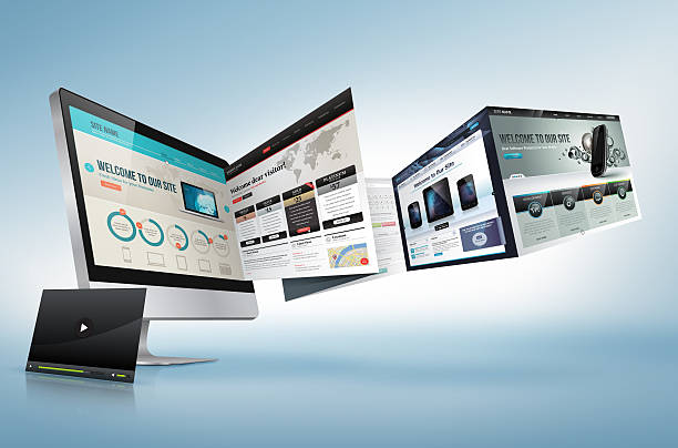
In today’s world, where the use of smart mobile phones has increased dramatically, having a #responsive website and #application is essential for any business. Responsive website and application design means that your website or application automatically adapts to the screen size of various devices such as mobile phones, tablets, and computers. This provides a better user experience for visitors and increases engagement and conversion rates.
In this comprehensive guide, we will examine the basic principles of #website and application design, and provide tips for creating a great user experience. Our goal is to equip you with the knowledge to create a modern and efficient website and application that can best meet the needs of your users. The importance of responsive design can no longer be ignored.
Rasaweb Afarin, by offering diverse services in the field of internet marketing, SEO and website optimization, website and application design, and social media management, can help you achieve your goals.
Understanding the Principles of Responsive Design
Responsive design is based on three basic principles #websitedesign and #appdesign:
- Flexible Grid A flexible grid means that your website’s layout uses relative units, such as percentages, instead of fixed units such as pixels. This allows the website layout to automatically adapt to the screen size of different devices.
- Flexible Images Flexible images means that the size of your images automatically adjusts to the screen size of different devices. This prevents large images from loading on small devices and slowing down the website.
- Media Queries Media queries allow you to apply different CSS rules based on the characteristics of the visitor’s device, such as screen size, orientation (portrait or landscape), and resolution. This allows you to optimize the appearance and performance of your website for different devices.
Understanding these principles is crucial for creating a responsive website and application. By using these principles, you can ensure that your website displays well on any device and provides a great user experience for visitors. Rasaweb Afarin, leveraging these principles, offers you the best #websitedesignservices.
Are you looking for ways to sell more on online platforms? Rasaweb Afarin, with its online sales services, helps you have a successful online store.
✅ Online Store Design
✅ Purchase Process Optimization
✅ Conversion Rate Increase
⚡ Increase your online sales!
Choosing the Right Framework for Responsive Design
CSS frameworks like Bootstrap and Foundation are powerful tools that can significantly accelerate the responsive design process. These frameworks provide a collection of pre-defined components, grids, and styles that you can use to create a responsive website and application.
Advantages of using a CSS framework:
- Time Saving Frameworks provide pre-defined components that do not require coding from scratch.
- Compatibility Frameworks are extensively tested and ensure compatibility with different browsers.
- Maintainability Frameworks provide a defined structure that makes code maintenance easier.
Disadvantages of using a CSS framework:
- Limited Customization Frameworks may limit layout customization.
- File Size Frameworks can increase the file size of the website.
Choosing the right framework depends on the specific needs of your project. If you are looking for a quick and easy solution, Bootstrap is a great option. If you need more customization, Foundation might be a better option. Rasaweb Afarin helps you choose the best framework for your #website design project.

Click here to preview your posts with PRO themes ››
| Feature | Bootstrap | Foundation |
|---|---|---|
| Learning | Easy | Moderate |
| Customization | Limited | Extensive |
| Size | Larger | Smaller |
The Importance of Mobile-First Design

The mobile-first design approach means that you first design the #website and application for mobile devices and then extend it to larger devices like tablets and computers. This approach has several advantages:
- Improved User Experience Designing for mobile allows you to focus on the most important aspects of your website and provide a simple and efficient user experience.
- Improved Performance Websites designed with a mobile-first approach are usually faster and more efficient.
- Improved SEO Google gives better search engine rankings to websites that are optimized for mobile.
To implement a mobile-first approach, you need to use media queries to apply different styles based on the device’s screen size. You should also optimize images and other website assets for mobile devices. Rasaweb Afarin, with expertise in #websiteoptimization, implements the mobile-first approach in all its projects.
Optimizing Images for Mobile Devices

Images can add a lot of data to your website and slow down its loading speed. To optimize images for mobile devices, you can use the following methods:
- Image Compression By compressing images, you can significantly reduce their file size without reducing quality.
- Using Appropriate Image Formats Image formats like JPEG and PNG are suitable for different images. For example, JPEG is suitable for photographic images and PNG is suitable for graphic images with limited colors.
- Using Responsive Images Responsive images allow you to display different images based on the device’s screen size. This prevents large images from loading on small devices.
Rasaweb Afarin, using advanced tools, fully optimizes your website’s images to improve its loading speed and provide a better user experience. Rasaweb Afarin’s #visualcontentproduction services are also provided considering the principles of image optimization for mobile.
Doesn’t your website content have the necessary impact on your audience? Rasaweb Afarin, with professional and strategic content production, will make you a thought leader in your industry!
✅ Creating unique and valuable content to attract the audience
✅ Improving user interaction and increasing brand credibility
✅ Organic and sustainable growth in search results
For expert advice, contact 09124438174!
Testing and Experimenting with Responsive Design

After designing a responsive website and application, it is very important to test it on different devices with different sizes and resolutions. This will help you make sure that your website displays well on every device and provides a great user experience.
Responsive Testing Tools:
- Browser Developer Tools Modern browsers like Chrome and Firefox have developer tools that allow you to simulate your website on different devices.
- Responsive Testing Websites There are many websites that allow you to test your website on different devices.
- Real Devices The best way to test a responsive website is to test it on real devices.
Rasaweb Afarin, using advanced tools and real devices, fully tests your #website design to ensure its high quality and performance. This is part of Rasaweb Afarin’s quality assurance process.
Click here to preview your posts with PRO themes ››
Optimizing Website Speed for Mobile

Website speed is one of the most important factors in user experience, especially for mobile users. Slow websites can frustrate users and increase the bounce rate. To optimize website speed for mobile, you can use the following methods:
- Image Optimization (as explained in the previous chapter)
- Reduce HTTP Requests The fewer HTTP requests sent to the server, the faster your website will load.
- Enable Gzip Compression Gzip compression reduces the size of your website’s files and increases its loading speed.
- Use Content Delivery Networks (CDNs) CDNs store your website’s content on multiple servers around the world and allow users to receive content from the nearest server.
- Optimize #coding Optimizing the codes increases the website speed.
Rasaweb Afarin, by providing #optimizationconsultation services, helps you fully optimize your website speed and provide a better user experience for visitors.
| Factor | Impact | Solution |
|---|---|---|
| Image Size | Slower loading speed | Compression, Appropriate Format |
| Number of HTTP Requests | Slower loading speed | File Merging, Reducing Elements |
| Lack of Compression | Slower loading speed | Enabling Gzip |
Optimizing Navigation and Usability on Mobile

Your website’s navigation should be easy and intuitive for mobile users. Complex menus and small links can frustrate users. To optimize navigation and usability on mobile, you can use the following methods:
- Using Hamburger Menus Hamburger menus save screen space and make it easy to access navigation links.
- Using Large and Touchable Buttons Large and touchable buttons are easier for mobile users.
- Placing Important Links at the Top of the Page Mobile users usually see the links at the top of the page more often.
- Using Search A good search feature allows users to quickly find the content they are looking for.
Rasaweb Afarin, by designing an optimized user interface (UI) and user experience (UX), makes your website’s navigation easy and enjoyable for mobile users. This increases engagement and conversion rates. Professional website and application design with SEO plays a significant role in your progress.
Using Appropriate Typography on Mobile
Choosing the right typography for your website can have a big impact on readability and user experience. On mobile devices, readability is even more important because the screen is smaller. To choose the right typography on mobile, you can use the following tips:
- Using Readable Fonts Sans-serif fonts are usually more readable on mobile devices.
- Using Appropriate Font Size The font size should be large enough to be easily read, but not so large that it takes up too much space.
- Using Sufficient Contrast Sufficient contrast between text and background helps with readability.
- Using Appropriate Line Height Appropriate line height between lines of text helps with readability.
Rasaweb Afarin, considering the principles of typography, chooses appropriate fonts for your website to improve readability and user experience. Your #brandvisualidentity is strengthened by the precise design of typography.
Do you need extensive and targeted advertising to boost your business? Rasaweb Afarin, by designing and implementing online advertising campaigns, delivers your message to millions of online users.
✅ Access to a wide and diverse audience
✅ Reduced advertising costs
✅ Increased brand awareness and credibility
Entrust your advertising to experts!
The Future of Responsive Website and Application Design

Responsive website and application design is constantly evolving. With the advent of new devices and new technologies, #webdesigners must be familiar with the latest trends and best practices. Some of the important trends in responsive design include:
- Artificial Intelligence (AI) AI can be used to automate some aspects of responsive design such as optimizing images and selecting typography.
- Augmented Reality (AR) and Virtual Reality (VR) AR and VR offer new opportunities to create rich and interactive user experiences.
- Progressive Web Applications (PWA) PWAs are web applications that behave like native applications.
Click here to preview your posts with PRO themes ››
Rasaweb Afarin, anticipating future trends, is a leader in providing responsive website and application design services. Using the latest technologies and best practices, we help you create a modern and efficient website and application that can best meet the needs of your users. This company also provides services related to #artificialintelligence and building artificial intelligence agents.
In this article, we examined the basic principles of responsive website and application design. By using these principles and tips, you can create a modern and efficient website and application that provides a great user experience for visitors. For more information about Rasaweb Afarin’s website and application design services, contact us.
What is Responsive Design?
Responsive Website Design Tutorial with Real Examples
What is Responsive (Reactive) Website Design? With Advantages and Disadvantages
Responsive Design
| Question | Answer |
|---|---|
| What is responsive design? | Responsive design means that your website adapts to different screen sizes. |
| Why is responsive design important? | To improve user experience, website performance and SEO. |
| What is mobile-first? | An approach where design is first done for mobile. |
| How do we optimize images for mobile? | By compressing, using the appropriate format and responsive images. |
| How do we increase website speed for mobile? | By optimizing images, reducing HTTP requests and enabling Gzip. |
| What are hamburger menus? | Menus that save screen space. |
| Why is choosing the right font important on mobile? | To improve readability and user experience. |
| What role does artificial intelligence play in responsive design? | To automate some aspects of design. |
| What is PWA? | Web applications that behave like native applications. |
| What services does Rasaweb Afarin offer? | Internet marketing, website design, SEO and optimization, and social media management. |
• and other services of Rasa Web Advertising Agency in the field of advertising
• Crisis Communication Campaign Management
• Optimization for Core Web Vitals (INP)
• Marketing Consulting for SaaS Companies
• Long-form Content Production
• Analysis and Optimization of User Dwell Time
• And more than hundreds of other services in the field of internet advertising, advertising consulting and organizational solutions
Internet Advertising | Advertising Strategy | Advertorial
Do you know how to join the global healthcare team? Providing job offers and degree equivalency for healthcare professionals in Oman and Dubai. ✅ Obtaining approvals from health organizations.
✉️ info@dayantak.com
📱 09163105022
📱 02188698837
📍 Tehran, Shahrak-e Gharb, Farahzadi Blvd., corner of Abbas Anari No. 51, Unit 10, Building 101


