
An Introduction to the World of Responsive Design and Its Necessity

In today’s world, where users access the internet from various devices with different screen sizes, #responsive_website_design is no longer a luxury option but a vital necessity.
Websites that are not properly optimized for display on mobile, tablet, laptop, and desktop quickly lose their visitors and diminish their credibility with search engines.
This evolution is a direct response to changes in user behavior in the digital age, where web browsing is not limited to a specific device.
Today, smartphones and tablets account for a significant portion of web traffic, which doubles the importance of #responsive_design.
A responsive website not only provides a better user experience (UX) but also significantly helps improve your position in search results.
This approach is the foundation for building websites that are accessible and usable in all conditions, without the need for separate versions for each device.
The main challenge is how to design in such a way that it works correctly across various screen dimensions without compromising quality. This chapter explains the general concept and importance of this pioneering approach in the world of web design and prepares you for delving deeper into subsequent topics.
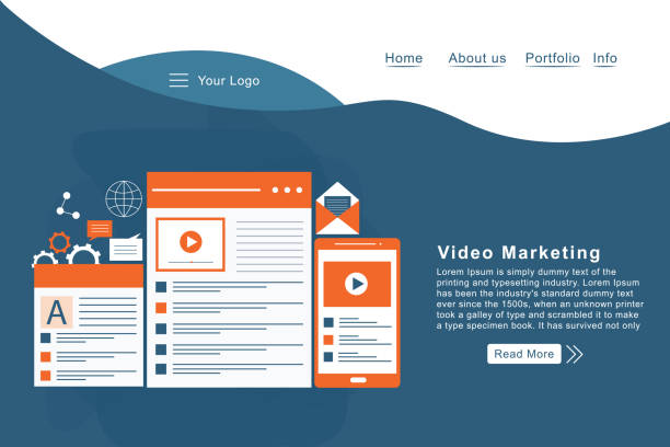
Worried about losing customers because you don’t have a professional e-commerce site?
With e-commerce website design by Rasaweb, forget these worries!
✅ Significant increase in sales and conversion rate from visitor to customer
✅ Professional and user-friendly design that builds customer trust
⚡ Get free consultation from Rasaweb
Technical Principles of Responsive Design in Web Development

To understand how responsive website design works, three key concepts must be familiarized: “Media Queries”, “Flexible Grids”, and “Flexible Images”.
Media Queries are the backbone of this approach, allowing the browser to apply different CSS styles based on device characteristics such as screen width, orientation, and screen type (touch or non-touch).
This means a website can be displayed in a three-column layout on a large screen and a single-column layout on a mobile phone, without needing two different HTML files.
Flexible Grids, instead of using fixed pixels, use relative units like percentages to determine the width of elements.
This ensures that elements automatically adjust to the screen size and fill the available space optimally.
Flexible Images, by using properties like `max-width: 100%` in CSS, ensure that images never exceed their container’s width and scale correctly across different screen sizes.
These technical principles are the cornerstone of any responsive website and their correct implementation requires advanced knowledge of CSS and HTML.
This section explains these concepts in detail and paves the way for a deeper understanding of the architecture of a responsive design.
Benefits of User Experience and SEO in Responsive Design

One of the most important reasons businesses turn to responsive website design is the significant improvement in User Experience (UX) and Search Engine Optimization (SEO).
When a user encounters a website that doesn’t display correctly on their device, there’s a high probability they will leave.
A responsive site, by providing a unified visual and functional experience, prevents this from happening and increases user loyalty.
From an SEO perspective, Google officially recommends responsive design as the preferred method for mobile websites.
Having a single URL and codebase for all devices simplifies content crawling and indexing for search bots and prevents duplicate content issues.
Also, page loading speed, which is an important Google ranking factor, is often better on responsive sites because there’s no need for multiple redirects or loading separate versions.
These benefits not only help increase organic traffic but also improve conversion rates.
Optimizing time spent on site and reducing the Bounce Rate are other positive outcomes of this approach that directly impact a business’s digital success.
Below is a comparative table of the main advantages of responsive design:
| Advantage | Description |
|---|---|
| Improved User Experience | Automatic adaptation to different screen sizes, easier navigation, and greater user satisfaction. |
| Better SEO Optimization | One URL for all devices, reduced duplicate content, official Google recommendation, and improved ranking. |
| Reduced Maintenance Costs | Need to manage only one codebase instead of multiple separate versions of the site. |
| Increased Conversion Rate | Smoother user experience leads to increased engagement and goal completion (purchase, registration). |
| Future-proofing | Readiness for new devices and technologies that may emerge in the future. |
Common Tools and Frameworks in Responsive Design

Building a responsive website from scratch can be time-consuming and complex, but fortunately, there are many tools and frameworks available to simplify this process.
Bootstrap, the most popular front-end framework in the world, offers a comprehensive set of HTML, CSS, and JavaScript components that are fully responsive.
This framework allows developers to create responsive user interfaces with high speed and efficiency.
Foundation is another powerful framework that offers high flexibility and customization, suitable for more complex projects.
In addition to frameworks, various tools are available for testing and debugging responsive design.
Browser Developer Tools, such as those found in Chrome, Firefox, and Edge, allow simulating the website’s display on different screen sizes and devices.
These tools are essential for quick and accurate testing of responsive web design.
Furthermore, platforms like Figma or Adobe XD enable responsive design and prototyping before coding begins, which can help save time and cost.
The choice of the right tool depends on the project’s complexity, the development team’s skill, and the available budget, but using any of these tools can significantly facilitate the responsive design process.
Are your online sales not as expected? Rasaweb solves your low sales and poor user experience problem forever with professional e-commerce website designs!
✅ Significant increase in conversion rate from visitor to customer
✅ Create a delightful user experience and increase customer trust
⚡ Get a free consultation now!
Challenges and Solutions in Implementing Responsive Design
Although responsive website design offers many benefits, its implementation is not without challenges.
One of the biggest concerns is performance management and loading speed.
If heavy images or scripts are not properly optimized, loading times can become very long on mobile devices with slow internet, disrupting the user experience.
The solution to this problem is using optimized images (responsive images with `srcset` and `sizes`), Lazy Loading for off-screen content, and compressing code and resources.
Another challenge is maintaining a consistent user experience across different devices.
A design might look great on a desktop but have poor readability or navigation on mobile.
This is where the importance of extensive testing and Usability Testing on real devices becomes apparent.
Should content be reduced for mobile display? Should all elements be present at all sizes? These are important questions that need to be answered.
The complexity of CSS and JavaScript for managing display in different states can also be a challenge, which can be managed by using appropriate architectures and coding standards.
Finally, compatibility with older browsers has always been an issue; although most users use modern browsers, a decision must be made regarding the extent to which support for obsolete browsers is needed.
This section helps you take steps towards responsive development with greater readiness and avoid common pitfalls.
What Promises Does the Future of Web Design and Responsiveness Hold?

The world of web design is constantly evolving, and responsive website design is no exception.
The future of responsiveness goes beyond merely adjusting screen size; this approach is moving towards optimizing the user experience based on the user’s context.
This includes factors such as network speed, connection type (Wi-Fi, mobile data), location, and even personal user preferences.
The emergence of technologies like Progressive Web Apps (PWA) and Accelerated Mobile Pages (AMP) indicates this trend, where the ultimate goal is to provide a fast, reliable, and pervasive web experience on any device and under any circumstances.
New discussions are being held about “Hybrid Responsive Design” and the use of Container Queries (as opposed to Media Queries), which give developers more control over how elements are displayed within their containers, not just based on the overall page size.
These new capabilities can allow designers to create much more dynamic and intelligent websites.
Furthermore, with the expansion of wearables and the Internet of Things (IoT), the concept of “responsiveness” extends to new spaces beyond just web pages.
These trends indicate that responsive design will remain at the heart of web innovations, and its role in the future of the web will be more prominent than ever.
The Impact of Responsive Design on Business and Conversion Rate

Ultimately, all efforts in responsive website design must lead to business objectives, and one of the most important of these objectives is increasing the Conversion Rate.
Did you know that websites with a poor mobile user experience can lose up to 70% of their users in the very first moment? This staggering statistic reveals the importance of investing in Conversion Rate Optimization (CRO) through responsive design.
When users can easily navigate your website, fill out forms, or view and purchase products, they are more likely to become customers.
A responsive website directly contributes to these goals by reducing the bounce rate, increasing time on site, and improving content accessibility on any device.
Furthermore, from a management perspective, having only one website instead of maintaining separate versions for mobile and desktop drastically reduces development and maintenance costs.
This means saving resources, time, and money that can be allocated to other parts of the business.
The Return on Investment (ROI) from responsive design is very significant in the long run, as this investment not only leads to an improved customer experience but also contributes to the sustainability and growth of the business in a competitive market.
Below, the table shows how responsive design directly impacts key business performance indicators (KPIs):
| Key Performance Indicator (KPI) | Impact of Responsive Design | How it Improves |
|---|---|---|
| Bounce Rate | Decrease | Smooth user experience, reduced need for zooming or horizontal scrolling. |
| Time on Site | Increase | Easy access to content and intuitive navigation. |
| Conversion Rate | Increase | Easier and frictionless purchase or registration process. |
| SEO Ranking | Improvement | Google’s recommendation, reduced errors, and higher speed. |
| Maintenance Costs | Decrease | Unified codebase and content management. |
Successful Examples of Responsive Design and Their Lessons

Examining successful examples of responsive website design can be inspiring and offer valuable lessons.
Websites like Amazon or The New York Times are prominent examples of successful responsive design implementation, having faced complex challenges such as high content volume and product variety.
These sites clearly demonstrate how to maintain a flawless user experience on any device.
Amazon, with its modular design and content organization in a way that makes sense on any screen size, has become a benchmark in responsive design.
The New York Times has also provided an excellent experience for its readers by focusing on content readability and image optimization for various devices.
The main lesson from these examples is that responsiveness is not just about making elements smaller, but about reorganizing content and user experience based on device and user needs.
This involves deciding which elements should be prioritized, how to simplify navigation, and what content can be hidden in smaller dimensions.
These examples prove that with careful planning, flexible design, and user focus, amazing results can be achieved in responsive web design.
Case studies of these websites show us how the challenges of scalability and maintaining brand integrity across different platforms can be solved.
Are you tired of your e-commerce site having visitors but no sales? Rasaweb solves your core problem with professional e-commerce website designs!
✅ Significant sales increase with targeted design
✅ Flawless user experience for your customers
⚡ Get a free consultation now!
Best Practices for Effective Responsive Website Design

To ensure your responsive website design performs at its best, adhering to a few principles and best practices is essential.
First and foremost, adopt a “Mobile-First” approach.
This means starting design and development for the smallest screens first and then progressively scaling up for larger devices.
This approach helps you focus on essential content and functionality and prevents the addition of unnecessary elements that can be intrusive on mobile.
Secondly, take image optimization seriously.
Using appropriate image formats (like WebP), compressing images, and implementing `srcset` and `sizes` for responsive images can significantly improve loading speed.
Thirdly, keep navigation simple and accessible.
Hamburger Menus or other hidden navigation methods are very efficient for mobile.
Fourthly, don’t forget continuous testing on real devices.
Simulators are useful, but nothing replaces the experience of working with the website on a real phone.
Also, ensure that Accessibility is maintained for all users, including people with disabilities.
Using semantic HTML code, appropriate color contrast, and keyboard navigation are important considerations in this regard.
By observing these points, you can achieve a strong and effective responsive development that meets user needs in any environment.
Why Responsive Design Is No Longer an Option, But a Necessity?

At the end of this comprehensive review, it is clear that responsive website design is no longer considered a competitive advantage, but an industry standard and a requirement for any business or individual aiming for an effective presence in the digital space.
Given the increasing use of mobile devices to access the internet and Google’s prioritization of mobile-friendly websites, ignoring this approach can mean losing a significant portion of traffic, potential customers, and ultimately revenue.
Investing in responsive design is an investment in the future of your business.
This not only provides a better user experience and improves your search engine rankings but also reduces maintenance costs and simplifies development processes.
In a world where technology and user behavior are rapidly changing, having a flexible and adaptable website ensures that your brand remains accessible and relevant.
Therefore, if your website is not yet fully responsive, it’s time to prioritize this change.
This is a crucial step to stay in the competitive arena and build a sustainable and successful online presence.
The future of the web is responsive, and you must be a part of it.
Frequently Asked Questions
| Question | Answer |
|---|---|
| What is Responsive Web Design? | It is a method for designing and implementing websites that automatically adjusts the layout and content of the page based on the user’s device screen size (desktop, tablet, mobile, etc.) to display in the best possible way. |
| Why is responsive design important? | With the increasing use of various devices to access the web, site responsiveness improves user experience, reduces bounce rate, enhances site SEO, and makes site management and maintenance easier (instead of having separate versions for mobile and desktop). |
| How does responsive design work? | This type of design uses techniques such as flexible grids and layouts (Flexbox, CSS Grid), flexible images and media, and most importantly, CSS Media Queries to change page styles and layouts based on screen characteristics (width, height, resolution, etc.). |
| What are the main tools for implementing responsive design? | The main tools include HTML5 (for content structure), CSS3 (especially Media Queries, Flexbox, Grid for responsive styling and layout), and sometimes JavaScript for more complex interactions. |
| What are the main benefits of using responsive design? | The main benefits include increased user accessibility (covering a wide range of devices), improved user experience, better site ranking in search engines (especially Google), reduced development and maintenance costs, and increased conversion rate from visitor to customer. |
And other services of Rasa Web advertising agency in the field of advertising
Smart Link Building: An innovative service for increasing campaign management through marketing automation.
Smart Advertising Campaign: Designed for businesses seeking to attract customers through intelligent data analysis.
Smart Conversion Rate Optimization: An innovative service for increasing click-through rates through Google Ads management.
Smart Brand Identity: An innovative service for increasing campaign management through user experience customization.
Smart Advertising Campaign: Transform user interaction with dedicated programming.
And over a hundred other services in the field of online advertising, advertising consultation, and organizational solutions
Online Advertising | Advertising Strategy | Advertorial
Resources
Responsive Website DesignFuture of Web DesignFundamentals of Responsive DesignFuture Web Trends
? To reach the peaks of success in the digital world, Rasaweb Afarin Digital Marketing Agency, with expertise in user-friendly website design and comprehensive online marketing strategies, is your reliable partner.
📍 Tehran, Mirdamad Street, next to Bank Markazi, Southern Kazeroon Alley, Ramin Alley, No. 6

