
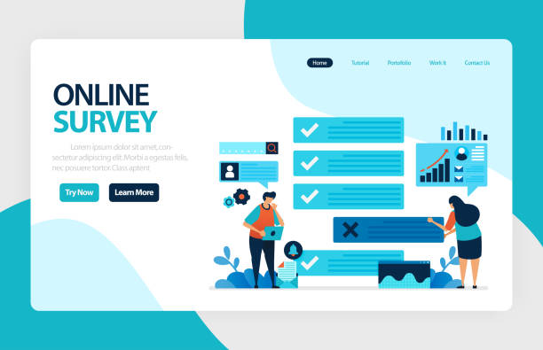
The Importance of Responsive Website Design in Today’s World

In the current era, where the diversity of internet-connected devices has peaked, from smartphones and tablets to laptops and smart TVs, the need for websites that can adapt to any screen size is felt more than ever.
This is where the concept of #Responsive_Web_Design or Responsive Web Design emerges as a necessity.
Responsive website design means that your website provides an optimal and consistent experience regardless of the type of device the user is using.
This approach not only significantly improves user experience (UX) but also plays a key role in retaining and attracting audiences.
Imagine a user accessing your site with a smartphone and having to constantly zoom or horizontally scroll to view content; in this case, they will most likely leave your site.
Being #mobile_friendly is no longer a luxury, but a requirement.
Therefore, paying attention to responsive website design is vital for any business or individual operating in the online space.
This type of design allows websites to intelligently react to the dimensions and orientation of the user’s device, ensuring that all elements, including text, images, and videos, are displayed correctly and maintain their optimal functionality.
This approach is the cornerstone of successful online presence today.
Does your current corporate website present a worthy image of your brand and attract new customers?
If not, turn this challenge into an opportunity with Rasaweb’s professional corporate website design services.
✅ Significantly improves your brand’s credibility and image.
✅ Paves the way for attracting new leads and customers for you.
⚡ For free and expert consultation, contact Rasaweb now!
Technical Principles and Main Pillars of Responsive Design
To understand how to implement responsive website design, it’s essential to familiarize ourselves with its three main pillars: Flexible Grids, Fluid Images, and Media Queries.
CSS Media Queries are the key elements that allow a website to apply different styles based on the user’s device characteristics such as screen width, height, orientation, and even resolution.
For example, you can define rules that in smaller screens, columns stack vertically instead of side-by-side, or font sizes change.
Flexible grids use relative units like percentages instead of fixed pixels.
This means that the width and height of page elements are adjusted based on the available space, and this flexibility ensures that the site’s layout scales well across different screen sizes.
Fluid images are based on the same principle; by using properties like `max-width: 100%` in CSS, it’s ensured that images never overflow their container and are always displayed at appropriate dimensions.
Additionally, by using the `<picture>` tag or the `srcset` attribute in `<img>`, different images can be loaded for various devices to improve both loading speed and image quality on each device.
These three principles together provide a robust structure for responsive design, resulting in a seamless user experience.
Intelligent use of these techniques enables a powerful implementation for responsive website design.
SEO and User Experience Benefits with Adaptive Design

Responsive website design goes beyond aesthetics and user convenience; this approach has a profound impact on SEO and site ranking in search engines.
Google has explicitly stated that it prefers responsive websites over separate mobile websites, as this approach simplifies content management and prevents duplicate content issues.
A responsive website with a single URL and codebase helps search engine crawling bots to index content more easily, which significantly contributes to improving SEO ranking.
In addition to SEO, improved user experience directly impacts SEO.
When users are satisfied with your site, they spend more time on it, view more pages, and the bounce rate decreases.
All these factors send positive signals to search engines, indicating the high quality and relevance of your site to user searches.
Device-compatible design ensures that regardless of the device type, the user always has access to the main content and full functionality of the site.
This is not only vital for a positive user experience but also increases customer loyalty.
Ultimately, investing in responsive website design means investing in the future of your online business, as it covers both SEO and UX aspects simultaneously.
This is a fundamental step towards achieving sustainable success in the digital space.
| Advantage | Explanation |
|---|---|
| Improved SEO | Google prefers responsive websites in mobile rankings, and with a single URL and codebase, the crawling and indexing process becomes simpler. |
| Better User Experience | Providing a consistent appearance and proper functionality across all devices leads to greater user satisfaction and a reduced bounce rate. |
| Reduced Maintenance Costs | Managing only one website instead of separate versions for desktop and mobile reduces development and maintenance costs. |
| Increased Conversion Rate | A smoother user experience and easier access to information can lead to increased user engagement and conversion rates. |
Common Tools and Frameworks for Implementing Responsiveness

Implementing responsive website design has become much easier with modern tools and frameworks.
One of the most popular and widely used frameworks is Bootstrap.
This CSS/JavaScript framework greatly accelerates the development of responsive websites by providing a flexible grid system, ready-made components, and various tools.
Bootstrap allows developers to create complex and device-compatible layouts with minimal coding, creating complex and adaptable layouts.
Another framework with a different approach is Foundation, developed by ZURB, which offers similar features but is designed with a “Mobile First” philosophy, prioritizing optimization for smaller devices.
In addition to frameworks, CSS preprocessors like Sass and Less also play a significant role in facilitating responsive design.
These tools enable the use of variables, functions, and Nestings in CSS, making Media Queries code cleaner and more efficient.
For testing and debugging responsive website design, browser developer tools (Developer Tools) like Chrome DevTools provide the ability to simulate different devices and quickly test responsiveness.
Furthermore, tools like Responsinator or Am I Responsive allow you to view your website on multiple screen sizes simultaneously.
The choice of appropriate tools depends on the project’s needs and complexity, but using these tools definitely improves the implementation process of a responsive website design and ensures that your site is displayed correctly on any device.
Don’t have a corporate website yet and missing out on online opportunities? With professional corporate website design by Rasaweb,
✅ Double your business credibility
✅ Attract new customers
⚡ Free consultation for your corporate website!
Challenges and Common Errors in Responsive Website Design

Despite its numerous benefits, implementing responsive website design is not without challenges.
One of the biggest issues is managing performance and loading speed on mobile devices.
Websites designed for desktops may contain high-resolution images and heavy scripts, which will be slow and time-consuming to load on mobile internet connections.
This slowness not only disrupts user experience but also negatively impacts SEO.
Another challenge is the complexity of CSS code.
With the addition of Media Queries and different styles for various Breakpoints, CSS files can become very large and disorganized, making them difficult to manage and maintain.
Also, neglecting priority content on smaller devices can lead to important information being hidden.
Designers must carefully determine which elements are essential for mobile screens and which can be removed or displayed differently.
Common errors include improper use of relative units (such as `em` or `rem` instead of `px` for fonts), insufficient testing on real devices, and overlooking how users interact with touch elements (such as buttons and forms).
To overcome these challenges, meticulous planning, use of appropriate tools, a “Mobile First” approach in design, and continuous testing on diverse devices are crucial.
Responsive website design requires critical thinking and anticipating user behavior in various scenarios.
Future Trends in Responsive Design and Web Evolution

The world of web design is constantly evolving, and responsive website design is no exception.
Future trends indicate that beyond merely adapting to screen size, websites are moving towards more advanced responsiveness and adaptation to device capabilities.
One such trend is Component-Based Responsiveness, where instead of the entire page, each component reacts independently based on its available space.
This approach makes layout management easier on a larger scale.
Furthermore, designing for Dark Mode and Reduced Motion are also increasingly popular, allowing websites to react to user preferred settings in the operating system and personalize the user experience.
The emergence of new devices such as Foldable Screens and Augmented Reality also creates new challenges and opportunities for responsive website design.
Progressive Web Apps (PWAs) also play an important role in the future; by combining the best features of web and native applications, they offer a fast, reliable, and engaging experience across all devices.
Finally, focusing on Performance-Driven UX and optimizing for Google’s Core Web Vitals further highlights the importance of speed and stability in responsive design.
These changes drive us towards smarter and more responsive designs that are not only beautiful but also highly efficient.
Practical Tips and Best Practices for Developers

For any developer intending to implement a successful responsive website design, adhering to certain tips and best practices is essential.
The “Mobile First” approach means starting design and development for the smallest screen (mobile) first, and then gradually scaling up for larger devices.
This method ensures that the most critical content and functionality are optimized first for mobile users and prevents overloading with unnecessary elements.
Using relative units such as percentages, `em`, `rem`, and `vw/vh` instead of fixed pixels ensures layout flexibility across various screen sizes.
Image optimization is also one of the most crucial steps.
Using next-generation image formats (like WebP), compressing images without losing quality, and leveraging the `srcset` attribute or the `<picture>` tag to provide images with different resolutions significantly helps increase loading speed.
Furthermore, continuous testing on real devices (not just simulators) throughout the development process is essential for identifying and resolving potential issues.
Paying attention to touch user experience, such as appropriate button and link sizes and spacing to prevent touch errors, is of high importance.
JavaScript can also be used to add responsive interactions, but it should be used cautiously so as not to harm site performance.
By observing these tips, a robust and efficient responsive website design can be created that provides an excellent user experience across all platforms.
| Best Practice | Why it Matters? |
|---|---|
| Mobile First Design | Ensuring high performance and speed on small devices and prioritizing critical content. |
| Using Relative Units | Creating layout flexibility and proper display at any screen size. |
| Optimizing Images and Media | Reducing page load times and improving user experience, especially on mobile. |
| Testing on Real Devices | Discovering display or performance issues that simulators might not reveal. |
| Attention to Touch Targets | Improving navigation for mobile users and preventing accidental errors. |
Successful Examples of Adaptive Websites

Reviewing successful examples of responsive website design can be inspiring and a good guide for designers and developers.
Many well-known and highly visited brands worldwide use the responsive design approach to provide a seamless experience to their audience.
For example, the Netflix website is one of the best examples, performing excellently across various devices, from smart TVs and computers to tablets and mobile phones.
Its user interface intelligently adjusts to the screen size without compromising content quality or feature accessibility.
The The Boston Globe website was also a pioneer in this field, implementing a responsive design for a major news site for the first time in 2011, demonstrating how this approach can improve readability and content accessibility across different devices.
Airbnb is another example that, with its adaptive website design, has made booking accommodation simple and pleasant on any device.
High-quality photos, easy navigation, and simple forms all adapt well to different screen sizes.
These examples show that with a thoughtful responsive website design, business goals can be achieved and customer satisfaction guaranteed on any platform.
These successes are the result of meticulous planning, attention to detail, and extensive testing to ensure that the user experience remains optimal under all conditions.
By focusing on responsiveness, these websites have not only met technical requirements but have also managed to effectively communicate with their audience at any time and on any device.
Tired of losing business opportunities due to not having a professional corporate website? Worry no more! With Rasaweb’s corporate website design services:
✅ Your brand’s credibility and professionalism will increase.
✅ You will attract more customers and sales leads.
⚡ Get a free consultation now to start!
Impact of Responsive Design on Business and Conversion Rate

Responsive website design is not just a technical standard but a strategic investment for any business seeking online success.
The impact of this type of design on Conversion Rate is significant.
When users have a positive experience on your website, they are more likely to take your desired action, whether it’s purchasing a product, subscribing to a newsletter, or filling out a contact form.
Ease of access and navigation across all devices leads to a reduced bounce rate and an increased duration of user presence on the site.
Given that a significant portion of web traffic occurs via mobile devices, a website that is not properly responsive effectively loses a large portion of its target market.
A responsive website design increases your brand’s trust and credibility and shows that you care about your users’ needs.
This is especially critical for e-commerce businesses, where a poor shopping experience can quickly lead to customer loss.
Reduced maintenance costs and managing a single codebase allow businesses to focus their resources on improving their product or service instead of managing multiple site versions.
In summary, responsive design is not only beneficial for SEO and user experience but also directly impacts business profitability and growth, preparing it to face the challenges of the future online market.
The Future of Websites: Commitment to Responsiveness

In conclusion, it can be said that responsive website design is no longer a luxury option, but rather a fundamental standard for successful presence in the digital world.
Given the increasing use of various devices to access the internet, ignoring the principles of responsive design can mean losing a significant portion of your audience and business opportunities.
The future of the web is moving towards websites that must not only be responsive to screen size but also react to device capabilities, user settings, and even the surrounding environment.
Commitment to responsiveness means ensuring optimal accessibility, performance, and user experience for everyone, at any time and in any place.
This approach implies “Mobile First” thinking, using the right tools, and continuous and precise testing.
Challenges exist, but the benefits, including improved SEO, increased conversion rates, and strengthened brand credibility, are far greater.
Responsive website design is not just a trend, but the foundation of modern web that helps businesses and developers remain relevant and competitive in a constantly changing digital ecosystem.
Embracing this approach not only guarantees the future of your website but also brings about user satisfaction and loyalty.
Frequently Asked Questions
| Question | Answer |
|---|---|
| What is responsive website design? | It is a web design approach aimed at creating websites that can automatically adapt to the screen size and device of the user (computer, tablet, mobile) and provide the best user experience. |
| Why is responsive design important? | Its importance has increased due to the growing diversity of devices people use to access the internet. This design improves user experience, increases search engine rankings (SEO), and reduces maintenance costs. |
| How is responsive design implemented? | By using CSS techniques such as Media Queries (which allow you to change styles based on device characteristics like screen width), Fluid Grids, and Flexible Images. |
| What are the key principles of responsive design? | The three main principles are: Fluid Grids (using relative units like percentages instead of pixels for widths), Flexible Images (adapting image sizes to available space), and Media Queries (applying different styles based on screen characteristics). |
| What are the benefits of having a responsive website? | Providing a unified user experience across all devices, improving SEO, increasing user time on site, reducing bounce rate, and simplifying site management and updates (as there is only one codebase). |
And other services of Rasa Web Advertising Agency in the field of advertising
Smart Reportage: A professional solution to increase sales with a focus on precise audience targeting.
Smart Sales Automation: An effective tool to increase click-through rates by utilizing real data.
Smart UI/UX: A new service to increase online growth through marketing automation.
Smart UI/UX: Designed for businesses looking for digital branding through optimizing key pages.
Smart Social Media: A creative platform for improving SEO ranking by optimizing key pages.
And over hundreds of other services in the field of internet advertising, advertising consultation, and organizational solutions
Internet Advertising | Advertising Strategy | Advertorial
Sources
The Importance of Responsive Design in SEO
The Future of Web and New Technologies
Challenges of the Digital Age for Businesses
Mobile-First Design Guide
Ready to revolutionize your business in the digital world? Rasaweb Afarin Digital Marketing Agency, by providing comprehensive and innovative services including responsive website design, professional SEO, and smart social media management, is your strategic partner on the path to growth and success.
📍 Tehran, Mirdamad Street, next to Bank Markazi, Kazeroon Jonubi Alley, Ramin Alley, No. 6

